2. Digital Marketplace
Any online business owner looks for a sophisticated online marketplace that offers a blend of scalability, flexibility, and extensibility. The Digital Marketplace is an easy-to-use online service that provides an open digital platform, bringing buyers and sellers together. It simplifies the procurement process and makes it easier to perform business transactions for all types of business units. Digital Marketplace is a unique marketing solution that comes with a powerful blend of highly scalable design and a wide range of support networks. Besides having rich features, it offers users the flexibility to manage the functionality and redesign their stores to widen the market.
Advantages of Marketplace:
- Offers easy sign up for buyers and digital sellers.
- Provides an option to search for services, identify suppliers, and procure offers with the best-value.
- Breaks large-scale digital requirements- including information and communications technology into smaller parts.
- Provides an online shopping network where other retailers can sell their products.
- Displays products from other sites that are part of the Digital Marketplace.
- Allows resale of items.
A Marketplace allows online businesses to:
Design, develop, strategize, and maintain the platform.
Manage and monitor their sales.
Manage operations.
- Manage Products and services smoothly and efficiently.
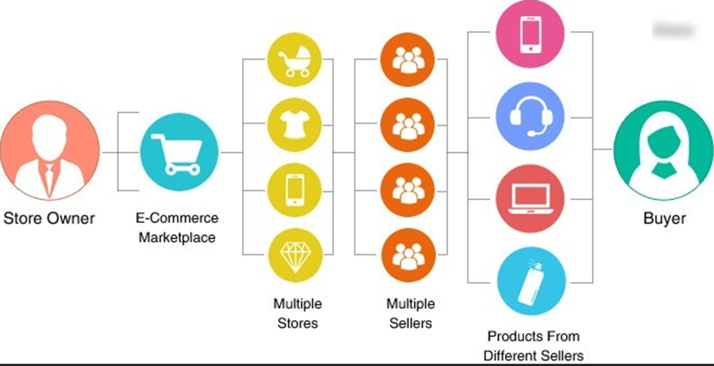
Fig. 2.1 Digital marketplace
2.1. DigitMarket™- The Product
The demand for online shopping is booming in the digital world. DigitMarket™(DM) is the better choice on this account.
The DigitMarketTM platform enables powerful features required for business operations by integrating it with common business tools. This enables bbusinesses to centralize their operations and run their operations in their own way with little-to-no-code. DigitMarket™ is a unique online marketplace that can support business partners, contributors, any kind of store user, vendors, vendors, third-party and customer ecosystems. DigitMarketTM is critical in establishing B2B2X ecosystems and achieving business success with minimal effort.
There are many different marketplaces, where goods are bought and sold, but the distinctiveness lies in the services offered to store users, vendors, vendors’ third parties, and buyers with different business models and the market spheres they occupy. Let us dig deeper into the scope and potential of DigitMarket™.
Technology
Successful online marketplaces are usually coded from scratch, from the backend frameworks to the front-end frameworks, but DigitMarket™ promises to achieve all from little-to-no-code. Features like DM users-customer chat, invite, split invoice generation, custom search, review and rating systems are also integrated into this. Adding headless architecture and APIs for the use of third-party developers can add substantial value to our marketplace. It also extends the opportunities to collaborate and provide third party access control safely and securely. DigitMarket™ promises an end-to-end payments solution. Our integrated payment system designed for payment handling and payouts method helps you scale across all channels and all around the world. Even though all of that requires advanced programming skills, but we offer little-to-no-code and will also ensure a high-performance platform with a custom structure that has a better chance at meeting and exceeding user expectations.
DigitMarket™ is not just opening an opportunity to create stores and onboard vendors, but it is extended to onboard vendor’s third parties. This add-on feature for vendors helps to partly offload their order journey to the third parties. The store users, vendors and vendor third-party can quickly be built with straightforward plug-and-play solutions offered by invite features. Onboarding of any users in DM user levels is further simplified by integrating user forms and forms sets along with invites. DigitMarket™ promises a multi-tenant platform. It allows multiple stores to exist on the platform with clear boundaries on their tenancy privacy. A busy online store will be receiving a bucket load of orders by the hour, notifications regarding orders is another great way to add value for users. These notifications alert customers about the progress of their orders. Rating scales are a crucial element designed to elicit information about a quantitative or a qualitative attribute. Rating questions and question option evaluate a variety of topics or stimuli including statements or options.
DigitMarket™ supports `SCIM `__-complaint local user store, role-based access control mechanisms and social authentication. It gives the user freedom to configure their trusted third-party identity services that can be used for authentication and `XACML `__ based access control.
For the ease of inventory management, DigitMarket™ allows vendors to easily publish and clone their offerings in addition to basic features like categorizing, designing, defining, creating, and keeping accounts for their products.
DigitMarket™ supports an out-of-the-box storefront that intelligently differentiates the storefront user experience while browsing the products. The below-listed types of products coexist with the DigitMarket™ to facilitate the same.
- Buyable products.
- Subscription-based products.
- Form/Application based products.
- Bookable products.
Site navigation and user interfaces
To attract customers to the marketplace, DigitMarket™ gives you an intuitive user experience that smoothly onboards both buyers and sellers. Sellers should be able to set up shop and display their products or services quickly, while buyers should be able to browse, compare, select, and make purchases with ease.
DigitMarket™ platforms include user dashboards for buyers and sellers. Since DigitMarket™ is a multi-vendor marketplace it provides an analytics dashboard to track revenue and user metrics. Marketplace owner dashboards tend to be more elaborate to accommodate both buyer and seller behaviour that must be tracked and monitored. The specialized nature of DigitMarket™ necessitates careful alignment of custom metrics with business goals so that they can manage their live profiles, product listings, preferences, and activities like reviews and ratings.
With the correct vetting process to address poor quality transactions, marketplaces can offer a rewarding, long-term payoff. A marketplace can establish a rapidly growing community of sellers and buyers in a way that most e-commerce sites cannot. If executed in the right manner by delivering the right products to the right customers, marketplaces can scale incredibly fast.
DigitMarket™ Expansion
The goal is to build a framework to support the platform-based business model, which includes the below key features:
- Easy to customize as per the business needs.
- Functional architecture is designed with a greater focus on extensibility and to empower any type of business model.
- Ability to deploy B2C, B2B, I2I, C2C platform business models.
- Provides unique features to ease customer operations, deployments, and marketing.
- Ability to support SAAS and on-premises deployments.
DigitMarket™ ’s framework expands both vertically (Business Model) and horizontally (Functionalities provided) as shown below:
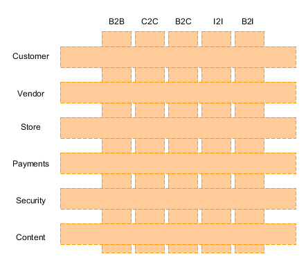
Fig. 2.2 DigitMarket™ Expansion
Roles and Responsibilities of DigitMarket™ Users:
- Creating Peers- DigitMarket™ users can create other users at the same level, next level users and entities.
- Sharing and Moving assets- DigitMarket™ users can share/move any DigitMarket™ entity like the store, vendors or features like chats, Enquires, orders with other relevant DigitMarket™ users.
- Define scope- Helps to limit the visibility of DigitMarket™ assets among other DigitMarket™ users while creating features like products, forms/form-set.
- Self- Specific DigitMarket™ user.
- To Peers- All DigitMarket™ users of the same entity and user level.
- To Specific- Selected DigitMarket™ users.
- To All- All DigitMarket™ users who have access privileges. This indicates no scope related limitation needed.
Depending on the user role, each user is required to perform specific functions. Role-based access control allows the user to perform only those activities that are approved for that role, thereby preventing unauthorized access. User activities can be controlled via menu-based access or group-based access.
2.2. Generic Concepts of DigitMarket™
2.2.1. User group and permissions
The user group is the role-based access control mechanism of the DigitMarket™. Each table/functionality in DigitMarket™ can be considered as an asset and can be linked with the CRUD permissions. User groups help the DM platform users to create new groups and assign them with the permissions for creating/viewing/modifying DM assets. The first DigitMarket™ administrator who is also called the superuser has all permissions and is the person who starts the process of creating user groups. Any other DM user created on the DM platform will be assigned to a set of user groups and can create further user groups only from the permissions that he/she owns.
2.2.2. User Types
The user type is a sub-grouping that can be created at each level of DM and is entirely different from the DM user levels. It is a type of grouping used in DigitMarket™ to group related entities and then assign them the needed assets collectively. Though they are like the user groups in terms of grouping. They are not associated with access control but help to handle a set of people with the same guidelines. While generating the invite to onboard store and store users, the DM administrator can simply select the pre-configured store user type to generate the invite with no need to worry about the on-boarding form and message per Invite. Along with the same line, store users can create vendor user types (Premium vendors, Type 1 vendors, Street vendors, etc.) and link them with a needed onboarding journey.
For example, DM administrators can create store level user types like Retail stores, Class 1 stores, Class 2 stores, etc. and then collectively assign them with a related onboarding form set, on-boarding message, etc.
2.2.3. Forms and Form-set
DigitMarket™ supports a dynamic way to create real-life forms by defining each attribute at the needed level of granularity by relating N such attributes (basic type, UI type, sensitivity, etc.) to create a single form. Click here to see in detail.
2.2.4. Modules and Journey
Modules help to define the action (manual/external/automated) associated with each step of such flow. DM allows the users to create manual or automatic modules and use them to create journeys. Click here to see in detail.
DM journeys help DM users to define the flows they need. A journey is a DigitMarket™ way to orchestrate a logical flow by linking modules and mapping them to the next success or failure phase. DM Journies allow users to define modules and link them up to define journies they would need.
Journies can be used in different DM scenarios like:
- User onboarding via invites or manual onboarding etc.
- Product/Order journey. via manual or automatic module. Click here to see in detail.
2.2.5. Notification
Notification is an effective tool to engage with the customer and increase sales in the online store. A busy online store will be receiving a bucket load of orders by the hour, notifications regarding orders are another great way to add value for users. These notifications alert customers about the progress of their orders. They contain information like order confirmations, order status updates, Incomplete action or transaction and tracking information. Click here to see in detail.
2.2.6. Rating Scale
A rating scale is a set of categories designed to elicit information about a quantitative or a qualitative attribute. Rating scales allow participants to weigh or assign numerical values as answers via a simple star rating graphical interface system. Rating scales are a crucial element in the surveys, and it is important to understand how to use them appropriately. Click here to see in detail.
2.2.7. Questions and Question Options
Rating questions help to understand how the customer feels about a particular product, the preference of the customer and compare the results. Here users can provide the questions from a range of options — which are scaled between two extremes — like Excellent to Terrible and responders can choose from a range of options or provide the textual information according to the type of question. Questions posed in the surveys tend to take a range of different forms like:
- Descriptive: Respondents are provided with text-area where they can provide textual information.
- SingleSelectOption Respondents are presented with several answer options to choose one from it.
- MultiSelectOption: Respondents are presented with several answer options and to choose from.
Question Options is used to evaluate a variety of topics. As every customer experience professional knows, surveys represent an invaluable tool for improving the customer experience, by understanding the strong and weak points about the business, and ultimately boosting revenues. Click here to see in detail.
2.2.8. Invites
An invite is a way to broadcast specific information or query to a whole user type. DM users at any level can be on-boarded to the DM platform via manual process or via invites. Users can create an invite for specific functionality (eg: user on-boarding), select a user type, set a lifetime (start date and expiry) for the invite. Once these invites are accepted by the recipients and after they furnish the required details and submitted, the invite initiator can view the submitted data. Then it travels through an approval life cycle and take appropriate final action. Click here to see in detail.
2.2.9. DM Messages
Users can create/design messages at user type level and use the same in DM flows. For example, message to be sent along with user invite, etc. Click here to see in detail.
2.2.10. DM Coupons
Everything has evolved over time and shopping is no exception. The variety of online options for buying the same thing has trained customers to hunt for the best deals on everything. With twenty people selling a particular model of the widget, it is always wise to comparison-shop and your take their time to find the best deal on that particular item. Coupons can be a great way for your store to increase sales. The Time-limited offers can encourage impulse purchases, help move unsold inventory, and reduce the number of abandoned shopping carts. Coupons can also be an effective way to reward your loyal customers or encourage them to refer family and friends to your site. Click here to see in detail.
2.2.11. DM Chat
DigitMarket™ provides its users (at all levels) the DM chat facility to help communicate with their peers and next level users.
2.3. Features of DigitMarket™
2.3.1. Entity Management
2.3.1.1. Store
An establishment or company that showcases vendor products to end-users.
2.3.1.2. Vendor
An establishment or company that represents the specific vendor.
2.3.1.3. Vendor third-party
An establishment or company that is external but related to a specific vendor and exist for helping the vendor with their order life cycle.
2.4. User Management
2.4.1. Workforce management
Workforce management (WFM) is an integrated set of user-level that DigitMarket™ uses to optimize the productivity of its employees. The following are DigitMarket™ platform user levels:
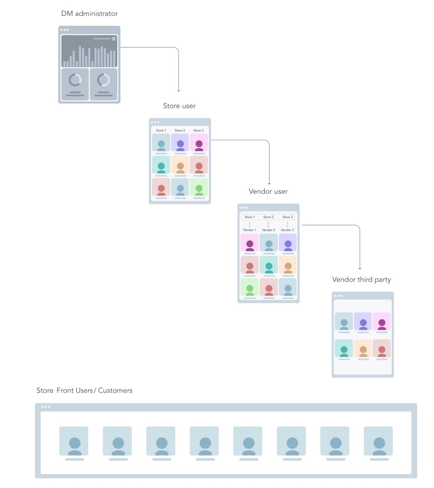
Fig. 2.3 DM User Levels
2.5. DigitMarket™ Administrator
DigitMarket™ Administrators- These are the highest level of users and are responsible for creating and monitoring the stores.
DigitMarket™ Administrators (DM Administrators) are the super-user of DigitMarket™. Multiple users can have the privilege of being DM Administrators. The primary DM Administrators are added from the back end. Peer DM Administrators are added from the DigitMarket™ UI by the primary DM Administrators. Click here to see how it works in DigitMarket™.
A DigitMarket™ Administrator can:
- Create and monitor Stores.
- Activate/deactivate Stores and Store Admins.
- Create and manage Store Admins.
- Associate Store Admins to Store and vice versa.
- Move a Store based on request.
- Share a Store.
- Chat with other DigitMarket™ users.
Note
This user is responsible for creating/monitoring the store and creating/associating other store users to the store. During store creation, they can define store specific attributes like currency type and define store-specific order/product life cycles. He can optionally create other DM users and assign them to required user groups and name their roles. Any DM user can move/share stores with other DM employees based on the acceptance by the other party.
2.5.1. Store Administrator
Store Users are linked to a specific store. With the multi-tenant platform feature of DigitMarket™, a store user can be linked to multiple stores. The store users will also get single-point access to the required stores with an option to switch between stores. Store users are responsible for the creation and monitoring of vendor users.
This user is responsible for creating/monitoring the vendor and creating/associating the vendor users to that vendor. He can optionally define vendor-specific order/product life cycles. These are the only group of users who can create store-specific categories for the stores they are part of. Click here to see how it works in DigitMarket™.
- They can create products.
- They can optionally create other store Employees and assign them to required user groups and name their role.
Any Store Employee can move/share vendors with other Store employees based on the acceptance by the other party.
- Manage Publishers.
- Create a generic product template that could be used by the publishers.
- Create and manage Categories.
- Create, manage and monitor vendors users.
- Activate/deactivate vendors users.
- Associate vendor with the store.
- Create and instantiate Products/Services.
- Manage created Products/Services.
- Chat and handle queries with other DigitMarket™ users.
- Store level dashboard.
- Role-based access control for the user onboarding.
- Generate customized reports.
Note
2.5.2. Vendor Administrator
Vendor Users- They are linked to a specific vendor or multiple vendors. Once logged into DigitMarket™, they will have a single point of access to all needed stores. Vendor users are responsible for creating and monitoring vendor third-party users. The Vendor third-party management is critical because your business has a lot of moving parts for all successful businesses. Be an expert at the core business and partner with other experts who can keep those plates spinning will help in the success. Hence outsourcing services through experienced third-party vendors is the best option that DigitMarket™ offers. Vendor users are associated with Vendor accounts. Vendor Users are onboarded by store users. Click here to see how it works in DigitMarket™.
A vendor user can:
- Create another Vendor Users within the limit of their limits of his role and responsibilities and assign them to required user groups and name their role.
- Assign Vendor Users to various Categories.
- Activate/deactivate Vendor Users.
- Create and manage Products/Services.
- Edit/clone published Products/Services.
- Product editions with the ability to create variants in terms of features.
- Define price plans - Fixed, free and Recurring all 3 types supported.
- Handle customer orders.
- Chat with other DigitMarket™ users.
- Respond to queries or requests from Store Users for their Vendor.
- Creating/monitoring vendor’s third-party.
- Creating/associating vendors’ third-party users.
- Creation of vendor-specific products and optionally publish products: During product creation, he can define product-specific life cycles.
- Any Vendor Employee can move/share vendor’s assets (For example Store User inquiry/order) he owns with other vendor employees based on the acceptance by the other party.
2.5.2.1. Vendor Rating
Vendor ratings are an ongoing activity by companies and are a process for measuring the capabilities and performance of a vendor. These ratings are part of the company’s vendor management program. Vendor ratings are calculated from weighted variables, the most common being:
- The quality of the service: This would cover such factors as customer service, billing accuracy, quality of the service or products provided.
- Prices and cost of using the service: All companies require competitive pricing that remains stable so that they can forecast their future costs.
- Adherence to delivery schedules: This includes promptness, quantity, lead time, packaging, and the ability to provide ad hoc deliveries.
- The capability of the business: This includes problem resolution, technical support and overall service provided.
2.5.2.2. Vendor third-party
DigitMarket™ is not just opening an opportunity to create stores and onboard vendors, but it is extended to onboard vendor’s third parties. It is the best add-on feature for vendors to partly offload their order journey to the third parties.
Another good thing is that since the vendor is a DigitMarket™ user, once onboarded they can use all the features of DigitMarket™ modules and defining journey. The feature access of the third party is granted by the corresponding vendor and he will be at vendor service.
- This user can handle orders that are moved by the vendor arena to the third-party arena.
- He creates other Vendors’ Third-Party Employee and assigns them to required user groups, also names their role.
Any Vendors’ Third-Party Employee can move/share vendors’ third-party assets (For example Store User order passed to the third party via a vendor) he owns with other vendors’ third-party employees based on the acceptance by the other party.
All actions performed by the third party are transparent to his vendor. This feature allows you to:
- Improve the quality of your services.
- Increase operational or financial efficiencies.
- Reduce your costs.
- Expand the availability of your services.
- Accelerate service delivery.
- Focus on your core business functions.
2.5.2.3. StoreFront users or Customers
StoreFront users are the visitors/end-customers to the DigitMarket™ storefront, who buy the products/services advertised by vendors. Store Users can also make inquiries or register grievances regarding a product/service via the storefront. They are also in the DigitMarket™ platform but do not come under DigitMarket™ user levels. These users have the following features:
- Search.
- Product listing.
- Product description page, store owner and publishers can easily customize the product description page.
- Category and attribute-based facets and filters.
Note
Store Users are customers who visit the storefront, and hence have no access to the DigitMarket™ portal.
2.5.2.4. Onboarding
Onboarding of vendor and vendor third party is customizable and easily pluggable to any module. Create user forms and generate invites or by providing link messages while creating invites to the user. Once the invite is filled each store user can have a customizable journey for onboarding, order, store, vendor. Click here to see how it works in DigitMarket™.
Here is a quick view of the onboarding journey.
Fill the application and submit.
Verification process
- If verification is successful, await Final Approval.
- Else reject application.
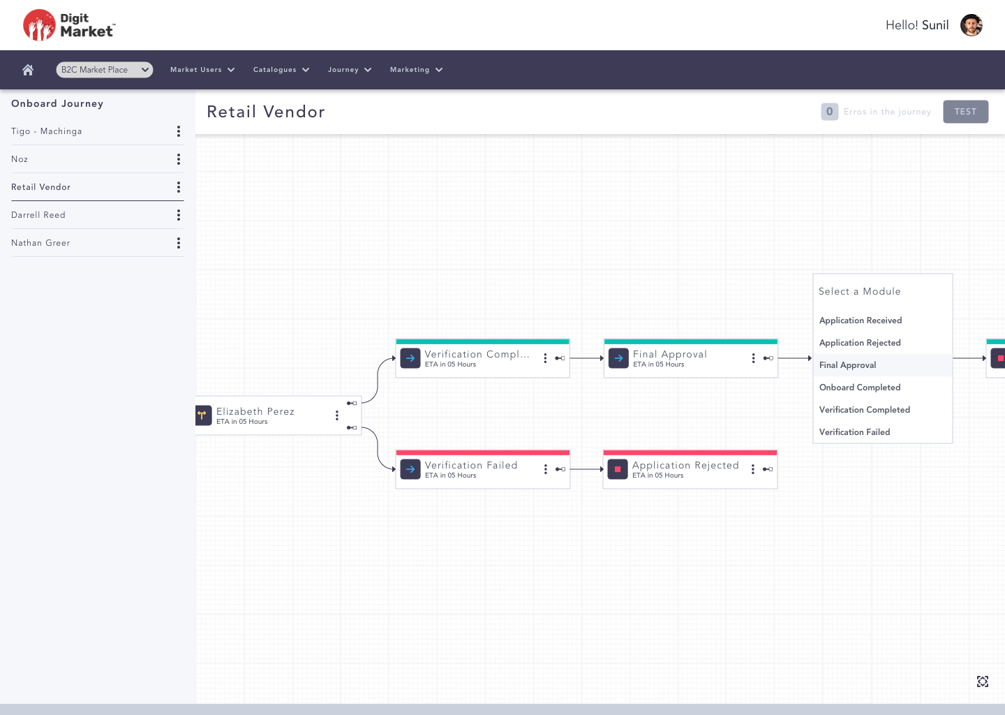
Fig. 2.4 Onboarding Journey
2.5.2.5. Invites
An invite is a way to broadcast specific information or query to a whole user type.
For example, DM users at any DM user level can be on-boarded to the DM platform via manual process or via invites. Click here to see how it works in DigitMarket™.
When a user wishes to use DigitMarket™, an invite will be sent with a welcome message. When the user clicks on the tab “FILL MY DIGIT MARKET PROFILE” from the message, a page appears. On this page the user must fill a form with basic information and to validate the user, he must link his profile with a passport or PAN and attach a photo and ID proof.
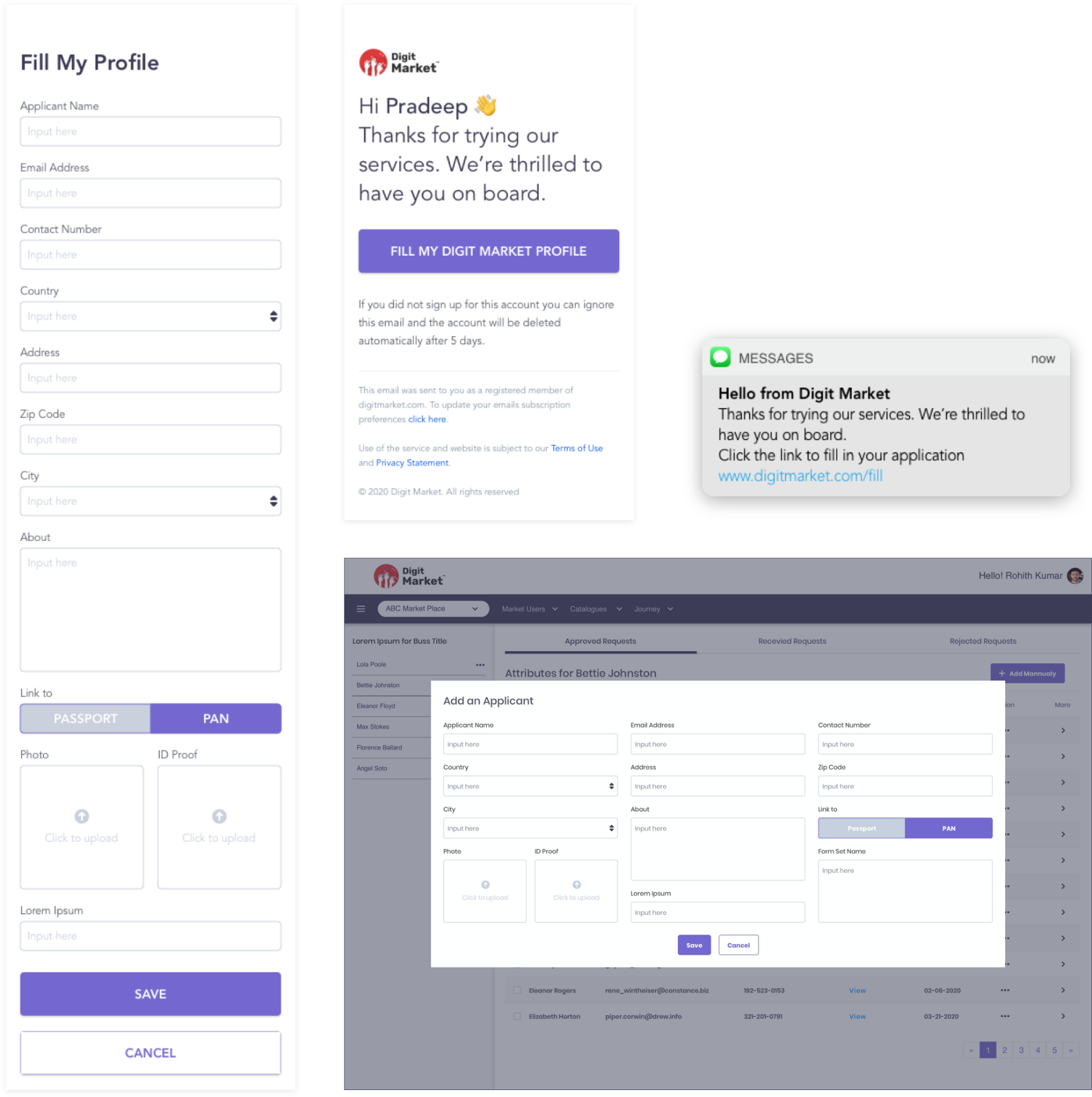
Fig. 2.5 Invites
2.5.3. Customer Management
DigitMarket™ helps to easily manage customer conflicts, preferences, orders and best actions with our built-in customer management systems. It helps to group the customer into different clusters to configure group-based storefront customization.
Customer management is made easier with DigitMarket™’s intuitive platform.
- Customer response from the time of placing an order to purchase disputes can be tracked, and they can be addressed on time.
- Vendors can address customer issues and ensure that the allocated user under the vendor portal takes care of the customer issue effectively.
2.5.3.1. Customer onboarding
Customer Onboarding is an umbrella term that is used to describe the entire process that users go through when they start their journey as a customer of your product or service.
2.5.3.2. Rating and Review
Customers can rate and review the services offered in the DigitMarket™. Ratings are giving feedback through numbers and Reviews are the feedback giving through writing their own opinion in the form of a text by the customer.
2.5.3.3. Enquiries
Any level of user can use this feature for resolving doubt or solving a problem.
2.5.3.4. DigitMarket™ Chat
DigitMarket™ provides its users (at all levels) the DM chat facility to help communicate with their peers and next level users. Click on Chat to see how it works in DigitMarket™.
2.5.3.5. Store
The store has store administrators and users. They are responsible for creating/monitoring vendor and creating/associating the vendor users to that vendor. He can optionally define vendor-specific order/product life cycles. These are the only group of users who can create store-specific categories for the stores they are part of DigitMarket™. Click here to see how it works in DigitMarket™.
2.5.3.6. Manage stores
- Manage and monitor stores.
- Associate stores users to store.
- Create store attributes.
- Share/move stores.
- Address store/vendor user queries and grievances.
2.5.3.7. Store and Category
- Create, intialize and view.
- Create/organize/maintain product and billing categories in a hierarchy.
- Manage category attributes and data.
2.5.3.8. Vendor
Vendor users are associated with vendor accounts, and they are onboarded by store users. Once the vendor is onboarded, they can use all the features of DigitMarket™ modules and define the journey. Click here to see how it is in DigitMarket™.
Multi-vendor platform:
It comes with three different interfaces:
- Admin Interface for platform owners
- Manages partners, catalogues, products, campaigns, orders, events and more.
- Onboard vendors.
- Provides deep analytics and actionable insights.
- Oversees several storefronts from a single place.
- Partner Portal
- Partners define and manage their products, leads, dashboards, reports, etc.
- Gives the option to create multiple stores with separate products, categories and product classes.
- Storefront
- Displays products and their features.
- Provides all the components needed to create a branded storefront including APIs, layouts, widgets, content management systems, etc.
2.5.4. Product Management
- Instantiate products.
- Edit/Clone the published products.
- Manage product attributes and data.
- Address customers queries and grievances.
2.5.5. Order Management
Order management and refers to the complete life cycle of the process, which begins when an order is placed and ends when the customer receives their package. The major phases included receiving the order, tracking, and fulfilling customer orders. Click here to see how it works in DigitMarket™.
2.5.6. Enquiry Management
It is a solution designed and developed to overcome the complications that the marketplace faces in keeping track of the enquiries or leads that they receive. It gives the solution to how to handle and manage these enquiries in real-time. Click on Enquiry to see it in DigitMarket™.
2.5.6.1. Vendor third-party
It is the best add-on feature for vendors to partly offload their order journey to the third parties. Another good thing is that since the vendor third-party is a DigitMarket™ user, they are on-boarded by vendor users. The vendor third-party access control is granted by the corresponding vendor and he will be at his service.
2.5.6.2. Order handling
The vendor can transfer the responsibilities of order handling to the Vendor third-party with the Move option. In that case, order handling will be done by the vendor third-party. All actions performed by the third party are transparent to his vendor as the vendor third-party is also in the DigitMarket™ platform.
2.5.6.3. Forms and Form-set
DM promises a dynamic way to create real-life and customizable user forms. Users can define each attribute at the needed level of granularity (that is each attribute’s basic type, UI type, sensitivity, etc.) and related N such attributes to create a single form. The forms that are created in DM need to be grouped under one of the below types during the form creation stage.
- Product Application - Used for application type of products. For example, a credit card request application or home loan application, etc.
- Store Creation (with/without user linking) - Used to decide the attributes needed during the creation of stores.
- Vendor Creation (with/without user linking) - Used to decide the attributes needed during the creation of vendors.
- Vendors’ Third-party creation (with/without user linking) - Used to decide the attributes needed during the creation of vendors’ third party.
- Store user creation - Used to decide the attributes needed during the creation of store users.
- Vendor user creation - Used to decide the attributes needed during the creation of vendor users.
- Vendors’ Third-party user creation - Used to decide the attributes needed during the creation of vendors’ third-party users.
- DM Administrator creation - Used to decide the attributes needed during the creation of DM employees.
Form sets are DM way to link N number of related forms (from the same form group) as one and be used during assignment to DM assets.
Forms are mainly provided to get the information by filling the corresponding fields in it. DigitMarket™ allows users at any level to create a customizable form by adding attributes according to their requirements. Click here to see how it works in DigitMarket™.
Formset is a collection of different types of forms. Click here to see how it works in DigitMarket™.
2.6. Multi-Tenancy
DigitMarket™ promises a multi-tenant platform. Hence it allows multiple stores to exist on the platform with clear boundaries on their tenancy privacy. The multitenant platform allows users to manage and provide services in multiple stores, multiple sites, and multiple brands from a single administrative panel. This flexible model allows catalogs, categories, rules, and other attributes to be shared across multiple stores or applied to a single store. With this feature, productivity is ensured.
2.6.1. Headless Architecture and API
DM exposes secure restful service as pointed out below:
- Storefront APIs- The set of performance APIs are exposed to approve aspirants and help them to build their storefront.
- Integration APIs- The set of APIs that help in integration with DigitMarket™.
- Internal APIs- To build DigitMarket™ functionality.
Click here to see the detailed DigitMarket™ API Documentation.
2.6.1.1. Integration with third party Access control
Integrating and collaborating with trusted third-party access control with individuals and partner organizations is a strategic need that many organizations have. However, every time an organization grants external party access to their marketplace, they are creating another potential attack vector. DigitMarket™ makes it possible to grant fine-grained access to specific sections based on user identity and business needs, balancing business productivity with security. DigitMarket™ promises precise visibility and control over third-party access to your marketplace.
2.6.1.2. Payment handling and pay-outs
DigitMarket™ payment integration for payment handling and payouts method creates a positive user experience, making it easy for a consumer to interact with your marketplace. The method, we offer for your platforms allow you to have a frictionless checkout experience, streamline the onboarding process which helps to manage your business with ease.
2.6.1.3. Pay-in
A pay-in occurs when someone who is wishing to buy something within a marketplace pays for that service.
2.6.1.4. Payout
A payout occurs when the facilitator or administrator of the marketplace disburses payments to those selling within their marketplace.
2.6.1.5. Invoice split up
Splitting an invoice lets a customer spread out payments for a single invoice across multiple invoices. You can split an original draft invoice into multiple invoices, allocating all original charges across the new invoices on a percentage basis of your choosing. This capability is useful if you have a large original invoice that you agree to let a customers pay in several installments.
2.6.1.6. Variety Build-In
The marketplace supports B2B, B2C, B2B2X ecosystems and allows users to customize their workflows according to their needs. Here the user can offer any type of service like sales, leasing, physical assets, buyable product, bookable products, etc. This makes DigitMarket™ a special product from other products in the market.
2.6.1.7. Personalization
User can add logos, themes, and customize their domain to mark their stamp on the platform and ensure everything remains branded for a better user experience. The role name or designation assigned in each level is customizable.
2.6.1.8. On-Go Management
Users can manage, monitor, and customize their market when they want, where they want and offers ultimate mobility.
2.6.1.9. Safe and secure payments
DigitMarket™ is integrated with security and compliance to ensure a safe payment gateway for the users.
2.6.1.10. Simple Shipping
The creation of an account and Shipping Management System is driven with an API and it can support multiple methods and even integrate with third-party logistics companies. Users can configure to accommodate several bookings and trace vendor availability and vendor actions.
2.6.1.11. Efficient Taxonomy
Users can tag the products and services with attributes and house them under relevant categories to maintain order. The tags are provided with multimode filter options, layout customization and pagination that enable easy tracking of items.
2.6.1.12. Safety First
Access Management and User authentication provide the user with the option to unlock custom authentication and single sign-on with social media logins like Facebook, Google, etc.
2.6.1.13. Track Success
With out-of-the-box integration with Google Analytics, users can easily get information like how many people visited your storefront, customer behavior insights, bounce rate, etc. With custom dashboards, users can see KPIs for everything from sales volume and transactions to users and product performance.
DigitMarket™ suffices to Business-to-Customer (B2C), Customer-to-Customer (C2C), Business-to-Business (B2B), Individual-to-Individual (I2I) and Business to Individual (B2I) needs.
2.7. Promises of DigitMarket™
Get Quicker into Market.
The template and tools of DigitMarket™ are designed in a way that users can offer any type of services like sales, leasing, digital, physical assets, buyable product, bookable products. Users can configure it and launch it quickly.
Suitable for any Size.
DigitMarket™ is driven by APIs in all the platforms; hence it helps to scale up in progressive business.
It spans from business model consulting > business model > technology architecture > billing systems > integration.
Customer / Partner Journey at a Quick Glance
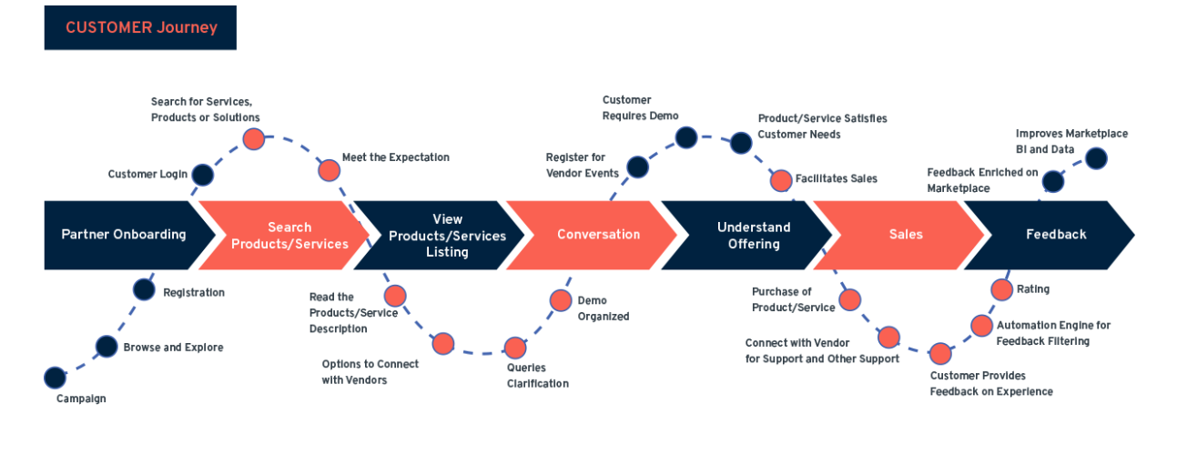
Fig. 2.6 Customer Journey
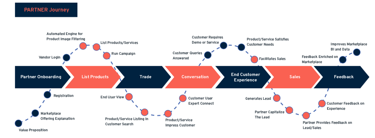
Fig. 2.7 Partner Journey
2.8. Overarching Concepts of DigitMarket™
2.8.1. Dashboard
A dashboard will provide all the information at-a-glance with a visual display. This comprehensive snapshot is the analytical info of the performance of DigitMarket™ features. It uses data from the past to identify trends that can influence future decision-making.
Click here to see how it works in the DM Administrator.
Click here to see how it works in the store Administrator.
Click here to see how it works in the vendor Administrator.
2.8.2. Quick Action Shortcuts
Quick actions shortcuts, help users’ navigation and workflow smooth by giving convenient access to information. Quick actions shortcuts allow users to perform contextual actions when hovering on a specific component. These quick-action shortcuts are globally available throughout the website. These shortcuts are meant to make workflows more efficient, quicker, and easier.
Click on Quick Action Shortcuts in DM Administrator to see how it works in the DM Administrator.
Click on Quick Action Shortcuts in Store Administrator to see how it works in the Store Administrator .
Click on Quick Action Shortcuts in Vendor Administrator to see how it works in the Vendor Administrator .
2.8.3. User Types
User Types help to handle a set of people with the same guidelines. While generating the invite to onboard store/vendor/store users/vendor users, the respective administrator can simply select the pre-configured user type to generate the invite with no need to worry about the on-boarding form and message per Invite.
Steps to create User Type:
- Log-in to DigitMarket™ as DM Administrator for Store/Store Users, or as Store Administrator for Vendor/Vendor Users.
- Navigate to Forms > Add Form in DM Administrator/Store Administrator for Store/Store Users and Vendor/Vendor Users respectively and create a form with the required user type.
- Group the respective Forms into Formset.
- Create a User Type:
- From DM Administrator, navigate to Market Users> Add Store/Store Type. Add User Type by selecting Store Formset and User Formset.
- From Store Administrator, navigate to Market Users> Add Vendor/Vendor Type. Add User Type by selecting Store/Vendor Formset and User Formset.
- Create a Admins:
- From DM Administrator, navigate to Market Users > Store Admin . This user is responsible for creating/monitoring the vendor and creating/associating the vendor users to that vendor. He can optionally define vendor-specific order/product life cycles.
- From Store Administrator, navigate to Market Users> Vendor Admin . The Vendor users are responsible for creating and monitoring vendor third-party users
2.8.3.1. Journey
DM journeys help DM users to define the flows they need either for onboarding(Store/Vendor) or Order Management.
The beauty of the journey in the Digit Market is that Journey can be defined at the Store level, vendor level or product level. If all the vendors under a store are following the same journey then the journey can be defined at the store level. If Vendors want to customize the journey then they can define it at the vendor level. If all the vendors want their product with the same journey also can be defined at the vendor level else if any product wants a different journey then the journey can be defined at the product level.
UI Components:
Click the Journey button, will list already created modules. Select anyone will display as a node in the middle panel. Each node in the journey has:
General
The General components are as shown below:
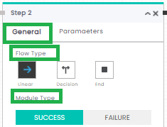
Fig. 2.8 General Components
Depending on the requirement users can use the below components for creating a journey.
- Flow Type
- Click the linear icon
to create linear flow.
- Click the decision icon
to create a decision flow.
- Click the end icon
to stop the flow.
- Module Type
- Click the
button if the node denotes success else click the
button.
Parameters
The Parameters components are as shown below:
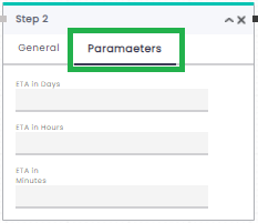
Fig. 2.9 Parameters Components
Here user can mention the Expected Time of Arrival in Days, Hours, or Minutes.
is Cancellable:
This option is available in store, vendor, and product journey. Once this is selected then the ordered item can be canceled in that module. Then the user can create a journey defining steps that need to follow if the order is canceled. Steps for defining cancel order journey are:
- Select the decision icon icon in the canceled module.
- Connect the true state
 to the journey to be followed if the order is not canceled.
 - Connect the false state
 to the journey if the user canceled the product as shown below:
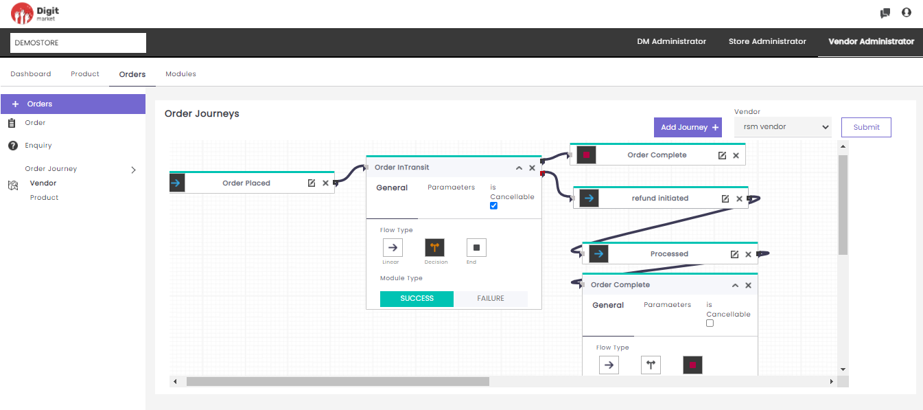
Fig. 2.10 Cancel Order
- Select the decision icon
Notification
Notification is an effective tool to engage with the customer and increase sales in the online store. A busy online store will be receiving a bucket load of orders by the hour, notifications regarding orders are another great way to add value for users. These notifications alert customers about the progress of their orders. They contain information like order confirmations, order status updates, Incomplete action or transaction and tracking information. Users can create notification template in the Store Administrator. Click on the Notification button as shown below:
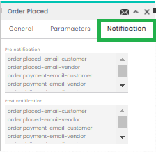
Fig. 2.11 Notification
Click the Notification button to display all the Pre notification and Post notification where users can select required notifications. Pre notification will be triggered once that module is initiated, and Post notification will be triggered once the selected module is done.
Note
Hold the control button to select multiple notification.
- Connection Nodes
- The Connection nodes for Linear flow are as shown below:
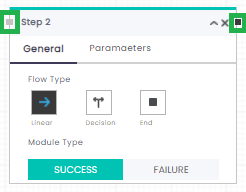
Fig. 2.12 Connection Node
- The Connection nodes for Decision flow are as shown below:
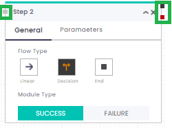
Fig. 2.13 Bilinear Connection Node
The Grey node denotes an incoming connection black denotes outgoing but in decision flow, black denotes true and red denotes the false connection
Steps to create the Onboarding Journey Store/Vendor:
Create Forms by navigating to Forms in DM Administrator/Store Administrator: Add Form in DM Administrator/Add Form in Store Administrator.
Group Forms into Formset.
Create a User Type:
- For Store/Store users: from DM Administrator, navigate to Market Users> Store Type. Add Store Type by selecting Store creation Formset and Store User creation Formset.
- For Vendor/ Vendor users: from Store Administrator, navigate to Market Users > Vendor Type. Add Vendor Type by selecting Vendor creation Formset and Vendor User creation Formset.
Add Module by navigating to Modules or use the default one.
Click here to see how it works in the DM administrator.
Click here to see how it works in the Store administrator.
Click here to see how it works in the Vendor administrator.
Create onboarding Journey:
- For Store onboard journey, navigate to Market Users> Store Onboard Journey by adding the required module/ Default one.
- For Vendor onboard journey, navigate to Market Users> Vendor Onboard Journey by adding the required module/Default one.
Steps to create Order Journey:
2.8.3.2. Onboard Requests
Steps to create Onboarding Requests:
- Log-in to DigitMarket™ as DM Administrator for Store/Store Users, or as Store Administrator for Vendor/Vendor Users.
- Create an Invite:
- For Store/Store users: from DM Administrator, navigate to Marketing>Generate Invite. Click here to see how it works in the DM administrator.
- For Vendor/ Vendor users: from Store Administrator, navigate to Marketing>Generate Invite. Click here to see how it works in the Store administrator.
- Users have to fill the application and submit it.
- The respective administrator can take corresponding actions on the onboard requests on Received Requests, Accepted Requests, Approved Requests, Rejected Requests. Click on Store Onboard Requests to see the onboard request in store administrator and click on Vendor Onboard Requests to see the onboard request in vendor administrator.
2.8.3.3. Catalogues
This allows store admins to create a store category and can be defined as a classification of the store’s products/services based on any shared characteristics. Store admin can also create customized categories for their products/services based on the fixed price plan and subscription plan. Categories are displayed as tree structure with Root as parent and child as product/service.
Click here to see how it works in the store Administrator
2.8.3.4. Products
Store Admins can add the products/services to the store and Vendor Admins can edit or clone the products/services to the store. These products/services will be displayed on the storefront for the customers.
Log-in to DigitMarket™ as Store admin to perform the below operation at the store/vendor level:
- Add Product.
- View Product List.
- Add Product Formsets.
- Add Product Forms.
- Add Related Products. Click here to see how it works in the store administrator.
Log-in to DigitMarket™ as Vendor to perform the below operation:
- Instantiate/ Manage product publications.
- View Product List.
- Add Product Formsets.
- Add Product Forms.
- Add Related Products. Click here to see how it works in the vendor administrator.
2.8.4. Orders
Order journeys are a DigitMarket™ way to orchestrate a logical flow by linking modules and mapping them to the next success or failure phase. By defining journeys, DM users can define the flows they would need. This module helps to define an Order journey at store level/vendor level/product level.
Log-in to DigitMarket™ as Store admin to perform the below operation at the store/vendor level:
- View Order journey.
- Add Store/Vendor Order Journey.
Steps to create Order Journey:
- Add Module by navigating to Modules or use the default one.
- Create order Journey by navigating to Orders> Order Journey (Store or Vendor).
Click here to see how it works in the store administrator.
Log-in to DigitMarket™ as Vendor admin to perform the below operation at Vendor user level:
- View Order journey.
- View/Add Enquiry
- Add Vendor/Product Journey.
Steps to create Order Journey:
- Add Module by navigating to Modules or use the default one.
- Create order Journey by navigating to Orders> Order Journey (Vendor or Product).
Click here to see how it works in the vendor administrator
2.8.5. Settings
DM Admins and Store Admins have Settings module which helps to have Menu-based access. It is a generic way to restrict users from accessing specific features. Menu-based access is granted by users to their subordinates. With this feature, you can restrict your subordinates from accessing functionalities that are not essential to their user role.
Note
Based on the Menu settings the Main Menu and Sub Menu will differ for each user.
Log-in to DigitMarket™ as DM admin to perform the below operation at store level:
- Add Menu.
- View Menu List.
- Add Menu Access/Menu MappingURL’s for automatic.
- View Menu Mapping.
- Region.
- Region Code.
- Rating Scale.
- Questions.
- Question Options. Click here to see how it works in the DM administrator.
Log-in to DigitMarket™ as Store admin to perform the below operation at vendor level:
- Add Menu.
- View Menu List.
- Add Menu Access/Menu MappingURL’s for automatic.
- View Menu Mapping.
- Region.
- Region Code.
- Notification Template.
- Rating Scale.
- Questions.
- Question Options. Click here to see how it works in the Store administrator.
2.8.6. Modules
DM Admins, Store Admins and Vendor Admin have a Module section in the main menu to orchestrate the flow in the journey by linking modules. Modules help to define the action (manual/external/automated) associated with each step of such flow. DM allows its users to create manual or dynamic modules and use them to create journeys.
Log-in to DigitMarket™ as DM admin to perform the below operation at store level:
- Add Module.
- View Module List.
- Add URL for automatic.
- Module URL Mapping.
- URL Operation Names. Click here to see how it works in the DM administrator.
Log-in to DigitMarket™ as Store admin to perform the below operation at vendor level:
- Add Module.
- View Module List.
- Add URL for automatic.
- Module URL Mapping.
- URL Operation Names. Click here to see how it works in the Store administrator.
Log-in to DigitMarket™ as Vendor admin to perform the below operation at Vendor user level:
- Add Module.
- View Module List.
- Add URL for automatic.
- Module URL Mapping.
- URL Operation Names. Click here to see how it works in the Vendor administrator.
2.8.7. Forms
Store Admins or Vendor Admins have Forms module which helps to create real-life forms by defining each attribute at the needed level of granularity and by relating N such attributes. Each form must be wrap into formset.
Log-in to DigitMarket™ as DM admin to perform the below operation at store level:
- Add Form
- View Form List.
- Add/View Formset List.
- UI Type.
- Regex For UI Type. List Click here to see how it works in the DM administrator.
Log-in to DigitMarket™ as Store admin to perform the below operation at vendor level:
- Add Form.
- View Form List.
- Add/View Formset List.
- UI Type.
- Regex For UI Type. Click here to see how it works in the Store administrator.
2.8.8. Marketing
DM Admins and Store Admins have Marketing module which helps to generate an invite or message. An invite is a way to broadcast specific information or query to a whole user type. DM users at any level can be on-boarded to the DM platform via manual process or via invites. DM also allows users to create/design messages at the user type level.
Log-in to DigitMarket™ as DM admin to perform the below operation at store level:
- Generate an Invite.
- View Invite.
- View/Compose Message.
- Coupons
- Coupon Rules.
- Coupon Offers. Click here to see how it works in the DM administrator.
Log-in to DigitMarket™ as Store admin to perform the below operation at vendor level:
- Generate an Invite.
- View Invite.
- View/Compose Message.
- Coupons
- Coupon Rules.
- Coupon Offers. Click here to see how it works in the Store administrator.
2.8.9. Service Providers
2.9. DigitMarket™ User interface
2.9.1. Getting Started
To access DigitMarket™, use any standard web browser client (such as Google Chrome, Firefox, or any other browser). You can access the DigitMarket™ portal either by signing in as a registered user or without signing in (as a Guest User). Access permissions and privileges vary based on the user role of the user signed in.
To buy DigitMarket™ platform/Store/Vendor hit the DigitMarket™ URL the landing page is as shown below:
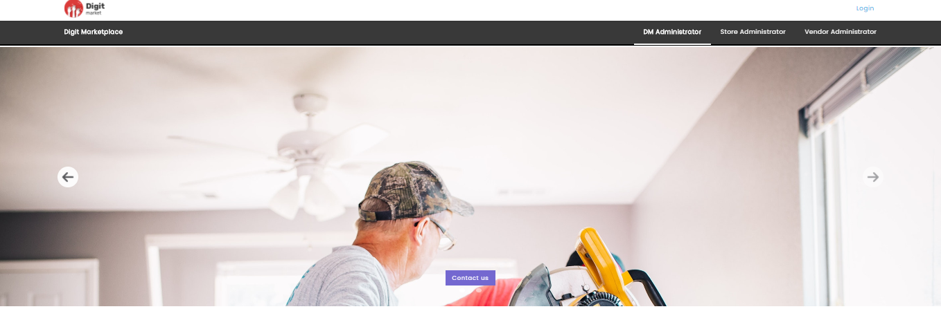
Fig. 2.14 Carousel
Click the Contact Us button, Try Us dialog will be displayed as shown below:
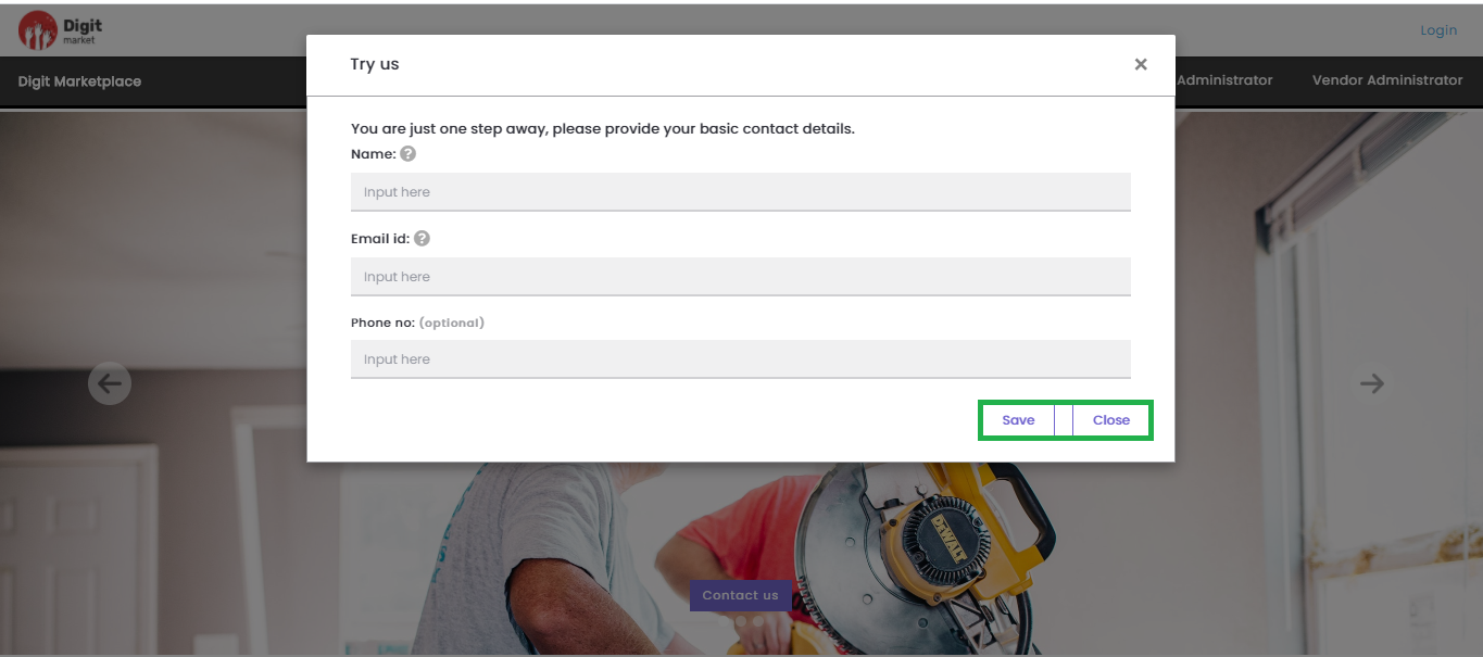
Fig. 2.15 Try Us
On the above dialog populate all the fields and click the Save button to save the data and Close to exit. Once the user submits the information concerned team will get in touch to serve the requirements.
Log in to DigitMarket™:
Access the DigitMarket™ using the URL provided to you. The DigitMarket™ Login page will be displayed as shown below:
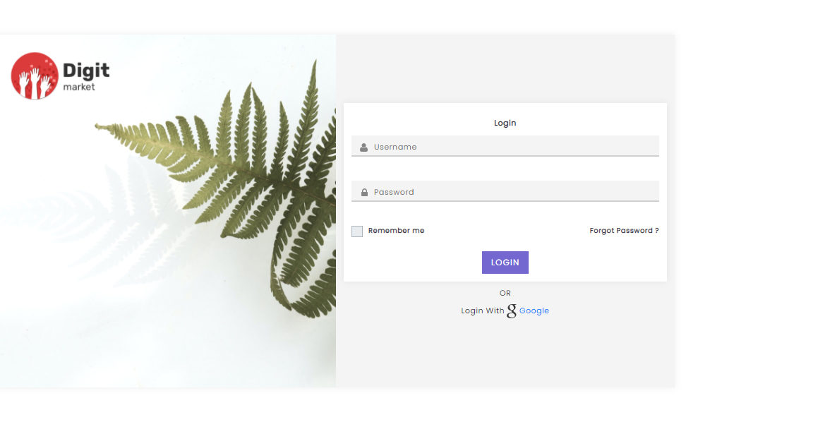
Fig. 2.16 Log-In Page
On the Login page, populate the Username and Password box, with respective credentials.
Click Login to navigate into the portal. Click on Google to log-in using Google credentials.
Click Forgot Password to retrieve the password. A link is sent in an email to your registered email address using which you can change the password.
Click Remember Me to automatically login to DigitMarket™ without re-entering your username and password every time you log in.
To log in as a first-time user:
Users logging into the DigitMarket™ portal for the first time need to change their account password. After changing the password, use the changed password at the next login.
On the Login page, populate the Username and Password box, with respective credentials.
Click Login. You will be redirected to the Change Password page where you need to change your login password. Ensure that your password fulfills the criteria that are displayed on the Change Password page.
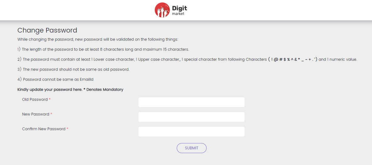
Fig. 2.17 Change Password
In the Old Password box, enter the old password.
In the New Password box, enter the new password.
Re-enter the new password in the Confirm New Password box.
Click Submit. You will be redirected to the DigitMarket™ Login page. You must use your new password to login into your account.
Log out of DigitMarket™:
- At the top-right corner of the DigitMarket™ page, click the user menu icon
 to display the user menu.
 - Click the Logout button to log out from the portal.
Note
DigitMarket™ automatically ends a browser session and signs the user out after a period of inactivity.
2.10. DM Administrators
These are the higher level of users that are responsible for creating and monitoring the stores. In DigitMarket™, DM Admins can create Stores and assign Store users to the Store. As DM Administrators, when you Sign-in to DigitMarket™ application the landing page will be the DM Administrators Dashboard page.
2.10.1. Dashboard
DM Administrator’s Dashboard page will display the total count of Onboarded Stores and Store Users as shown below:
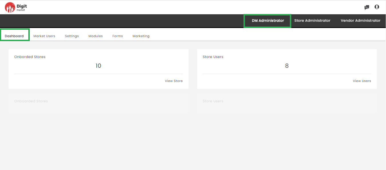
Fig. 2.18 DM Administrator Dashboard
Click the View Stores tab to display the Store List page and click the View Users to display the Store Admin page.
Quick Action Shortcuts
The Quick Action Shortcuts in DM Administrator are Chat via chat icon  and Switch Role and Logout via user icon .
DigitMarket™ Chat
DM chat helps the interactions between the DM users. The DM chat initiator can search and select the intended recipient and initiate a chat request. However, the chat can intiated based on few conditions:
- If the superuser wants to chat with the lower-level user, they can chat directly without accepting the chat request by the lower-level user.
- If the lower-level user wants to chat with the super user, then the superuser permission is needed (they should accept it). Once the superuser accepts the chat will be enabled and they can interact using this feature or else it will be disabled mode.
To Chat in DigitMarket™:
At the top-right corner of the DigitMarket™ page, click the chat icon to display the chat history.
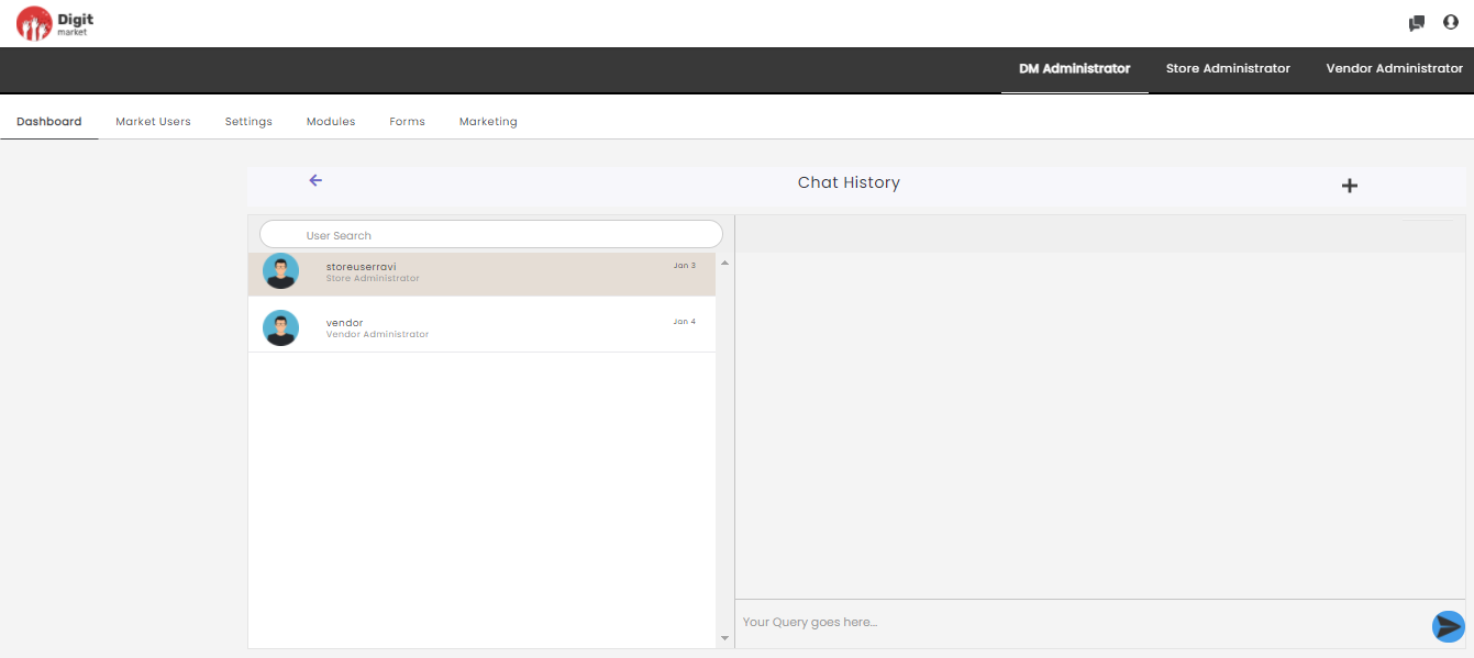
Fig. 2.19 Chat History
User Search: This field helps to search for other users.
The left panel will display all the users who have initiated the chat request. Once the chat request has been sent they have to wait until the other user accepts it as shown below:
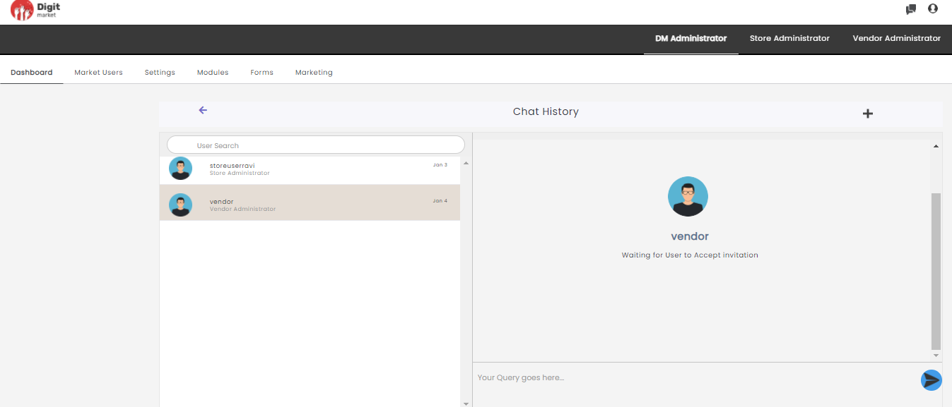
Fig. 2.20 New Chat
If the chat request has been accepted then they can type in the queries on the right side as shown below:
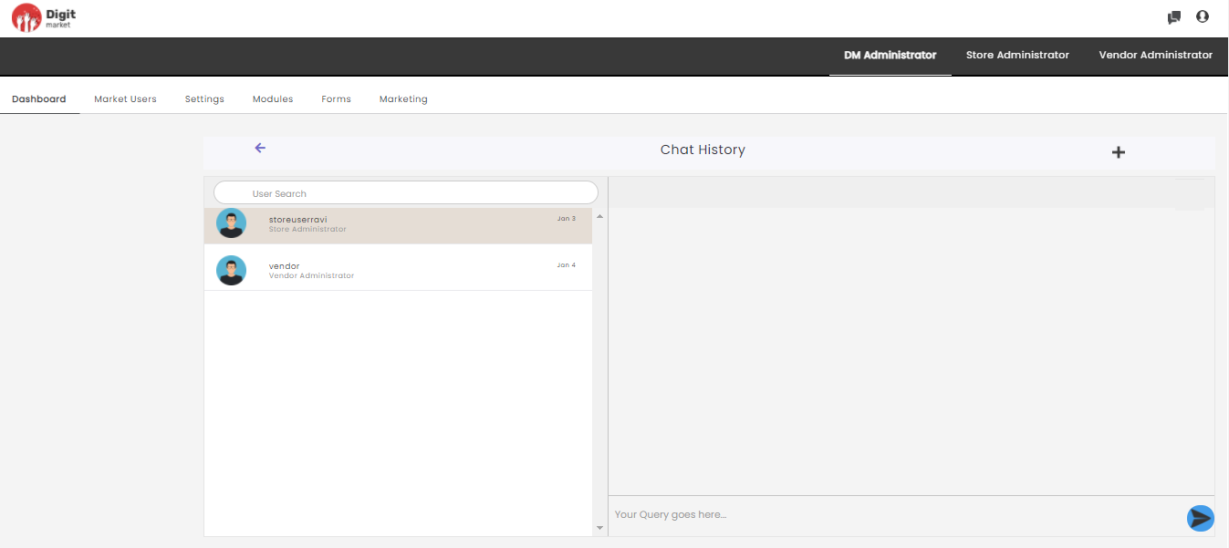
Fig. 2.21 Chat Initiated
Click the plus icon  to display a new chat page as shown below:
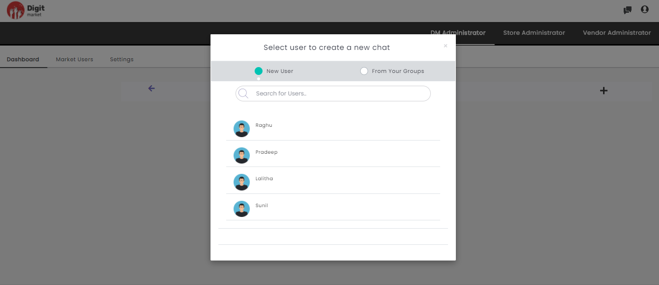
Fig. 2.22 Create New Chat
Here Users can select the below options for a new chat:
- New User: Here the user can select anyuser and send chat request once they accept user can start chatting with them.
- From Your Groups: This will display the others users associated with the logged user.
- Select for Users: Users can search the people from here and send chat request.
Switch Roles
- At the top-right corner of the DigitMarket™ page, click the user icon to display the user menu.
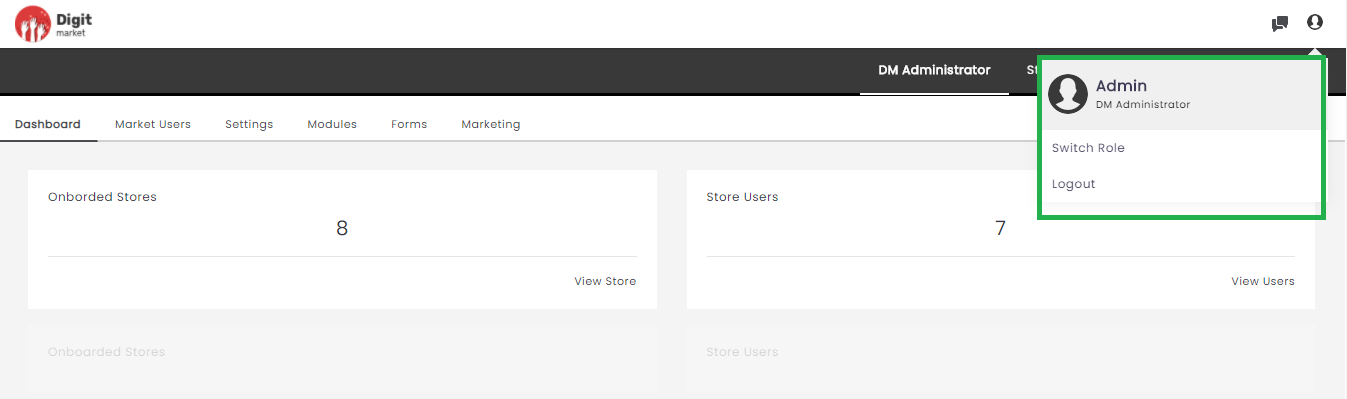
Fig. 2.23 User Menu
Click the Switch Role to display the Switch Role window.
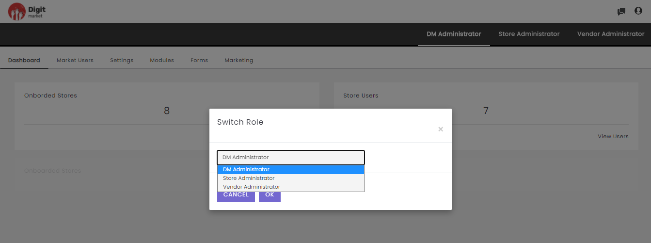
Fig. 2.24 Switch Roles
From the drop-down, select the required user role and click OK or click Cancel to exit.
Logout
Click the user menu icon to display the user menu and click the Logout button to log out from the portal.
2.10.2. Market Users
Once you log-in as the DM Administrator, click the Market Users tab from the main menu the Store List page will be displayed. Stores are online marketplaces where vendors can advertise their products/services and visitors to the stores can purchase those products/services. DigitMarket™ creates organized and user-friendly storefronts for the convenience of the vendors and their customers. The Store List will display all the stores along with details such as Store Name, Store Id, Store Admins, Action Store Status and StoreFront as shown below:
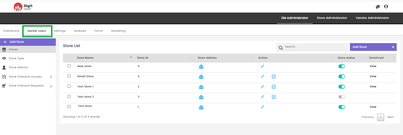
Fig. 2.25 Store List
On the Store List page users have the following options:
Add Store: Click the Add Store tab, displays the Create Store dialog as shown below:
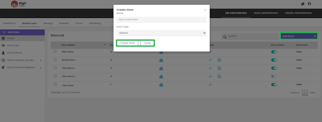
Fig. 2.26 Create Store
In the Create Store dialog, provide the Name and Store Type for the new Store. Click the Create Store button to create a new store and Close to exit.
- Search: Allows users to search the store by giving a phrase or a key value. It is recommended to populate this field with relevant information so that locating through search will be quicker.
- Stores: Click the Stores tab, the Store List page will be displayed. This page displays all the stores along with the details such as Store Name, Store ID, Store Admins, Action, Store Status and StoreFront for each Store. Based on pagination, records will be displayed on one page. Use Previous or Next to switch between the pages.
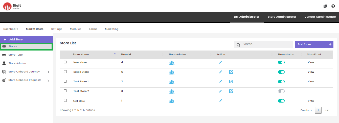
Fig. 2.27 Store List
Note
Use the arrow icon  in the Store Name to list ascending order or descending order.
Store Name: Name of the store.
Store Id: Id of the store.
Store Admins: Here users can assign Store Admins. Click the user icon
 corresponding to the store, the Assign user to stores
dialog will be displayed as shown below:
corresponding to the store, the Assign user to stores
dialog will be displayed as shown below: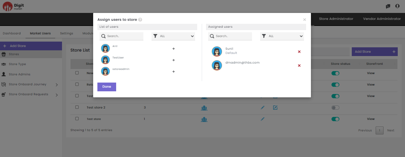
Fig. 2.28 Store Admin Actions
The Assign user to stores dialog has a List of Users and Assigned
Users. The List of users will display all the available users and
Assigned users will display the users which is already assigned.
Click the plus icon  to add users for the selected store and
the Users will be added to the Assigned Users list and removed from
the List of Users. Click the cross icon
to add users for the selected store and
the Users will be added to the Assigned Users list and removed from
the List of Users. Click the cross icon  to delete the user
from the store and will be removed from the Assigned users and added
in the List of users. Users can search by typing in the key-value in
the text box or filtering by clicking the filter icon
to delete the user
from the store and will be removed from the Assigned users and added
in the List of users. Users can search by typing in the key-value in
the text box or filtering by clicking the filter icon  . Click Done to save the changes and exit or click
  to exit.
Note
Only assigned store admin users can access the respective stores.
- Action:
Click the edit icon
the Update Store dialog will be displayed as shown below:
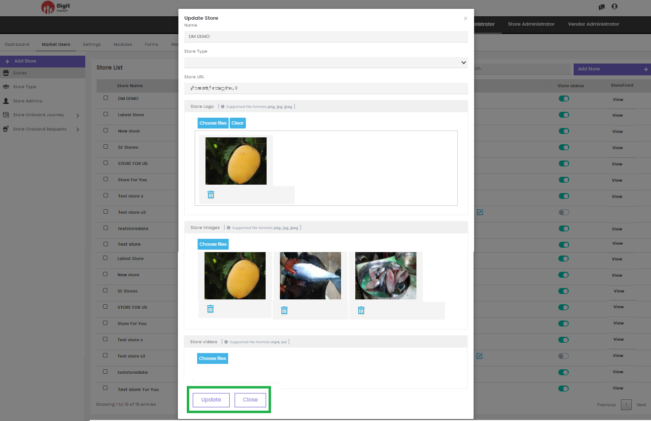
Fig. 2.29 Actions Store Admins
In the Update Store dialog users can edit all the info and click the Update button to add or click
/Cancel to exit.
Click the advanced edit icon
to view the Formsets associated with the store will be displayed as shown below:
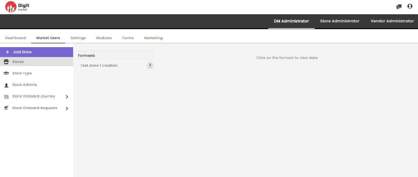
Fig. 2.30 Advanced Edit Option of Store
Click the Formset Name to view the formsets as shown below:
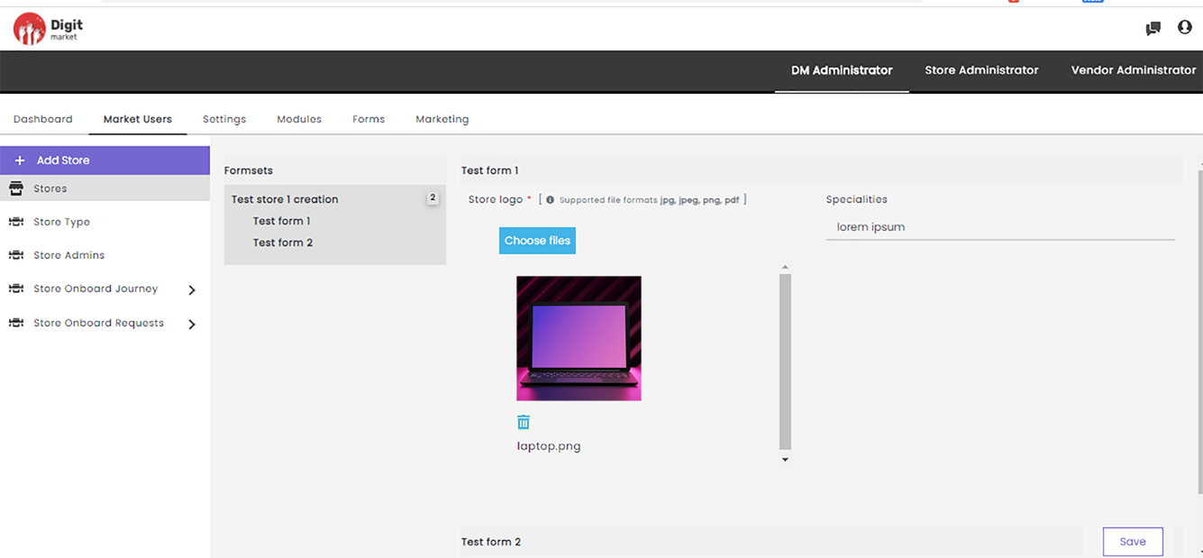
Fig. 2.31 Formset Details
Users can modify the details and click the Save button a successful message will be displayed as shown below:
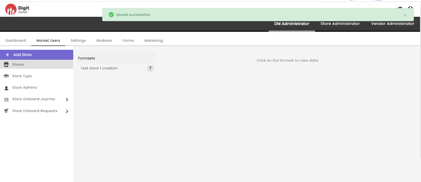
Fig. 2.32 Formset Saved Succesfully
Store Status: Store Status is a toggle button that allows you to Activate/Deactivate selected Stores. The green button shows active clicking on it a warning message will pop-up as shown below:
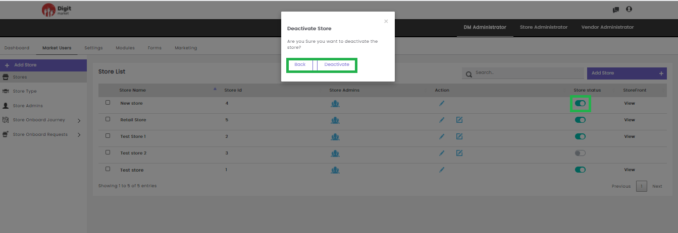
Fig. 2.33 Warning Message for Deactivating the Store
Click the Deactivate button to deactivate or Back to exit.
Users can also click the checkbox to the corresponding Store to Activate or Deactivate the Store or click Cancel to exit.
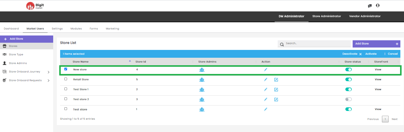
Fig. 2.34 Activate/Deactivate Store
Click the Activate button on the Store List page the Activate Store dialog will be displayed. Click the Activate button to activate the store or Back/
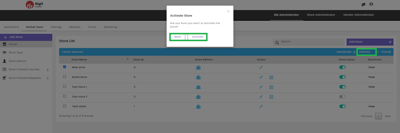
Fig. 2.35 Activate Store
Click the Deactivate button on the Store List page the Activate Store dialog will be displayed. Click the Deactivate button to deactivate the store or Back/
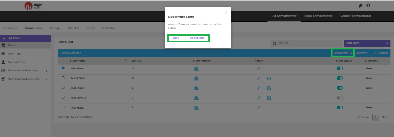
Fig. 2.36 Deactivate Store
- StoreFront: Click the View button corresponding to the store will display the respective store front.
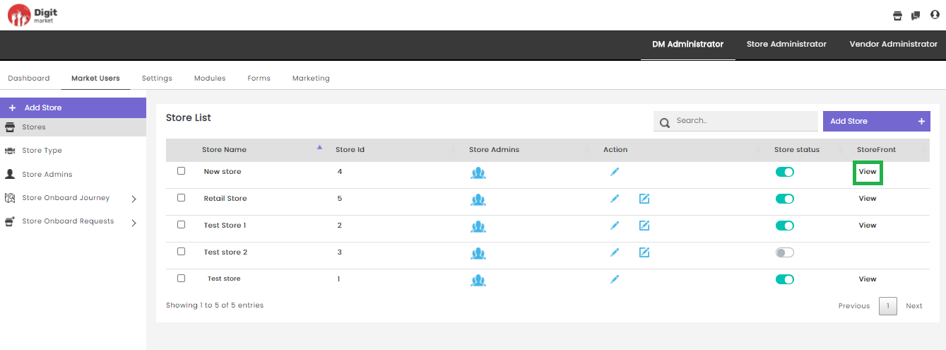
Fig. 2.37 Store Front
Users can also perform:
- Search: Allows users to search Store by giving a phrase or a key value. It is recommended to populate this field with relevant information so that locating through search will be quicker.
- Add Store: Click the Add Store tab, the Create Store dialog will be displayed as shown below:
Fig. 2.38 Create Store
In the Create Store dialog, provide all the details like: Name, Store Type. Click the Create Store button to create and close to exit.
- Store Type : Click the Store Type tab, StoreType List page will be displayed with all the store types in the store along with details such as Name, CreatedDate, Action.
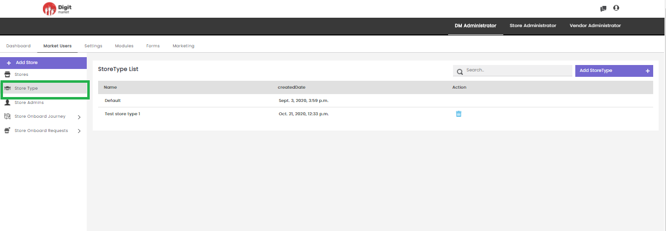
Fig. 2.39 Store Type List Page
Users can also perform:
- Search: Allows users to search Store Type by giving a phrase or a key value. It is recommended to populate this field with relevant information so that locating through search will be quicker.
- Add StoreType: Click the Add StoreType tab, the Create StoreType dialog will be displayed as shown below:
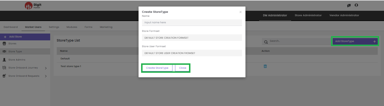
Fig. 2.40 Create StoreType
In the Create StoreType dialog, provide all the details like: Name, Store Formset, Store User Formset. Click the Create storeType button to create and close to exit.
Store Admin: Click the Store Admin tab, the Store Admins page will be displayed. This page will display all Store Admins in the store along with details such as Username, Email ID, Contact, Role Name, Group, Stores Action and Status. Use Previous or Next to switch between the pages.
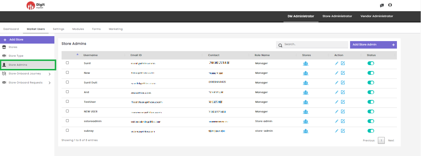
Fig. 2.41 Store Admins
Username: The username of the store admins.
Email-Id: The email id provided at the time of store admin creation.
Contact: The contact number of the store admin which is given at the time of the creation.
Role name: The role that is assigned to that admin at the time of the creation.
Stores: Here users can assign stores. Click the user icon
corresponding to the admin, the Assign User to Stores
dialog will be displayed as shown below: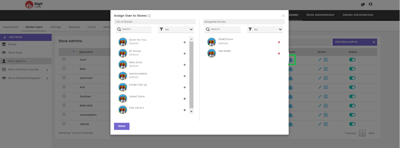
Fig. 2.42 Stores in StoreAdmins
The Assign User to Stores dialog has a List of Stores and Assigned
Stores. The List of Stores will display all the available stores and
Assigned Stores will display the stores which is already assigned.
Click the plus icon to add stores for the selected user and
the Stores will be added to the Assigned Stores list and removed from
the List of Stores. Click the delete icon to delete the
store for the user and will be removed from the Assigned Stores and
added in the List of Stores. Users can search by typing in the
key-value in the text box or filtering by clicking the filter icon . Click Done to save the changes and exit or click to exit.
Actions: Click the edit icon
the Update Store dialog
will be displayed as shown below: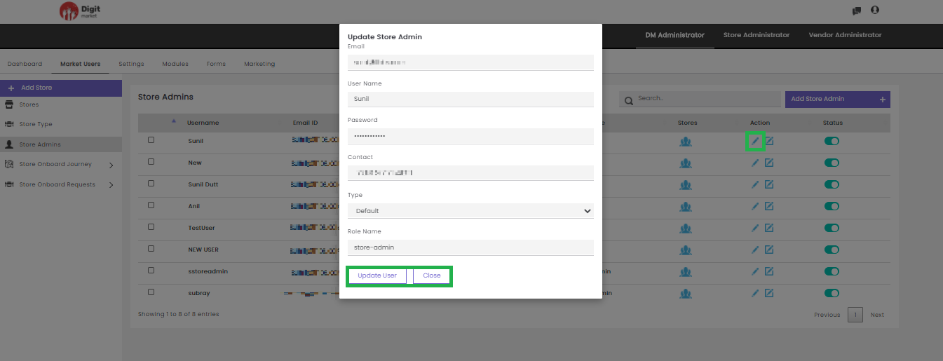
Fig. 2.43 Update Store Admin
In the Update Store Admin dialog, users can edit all the info and
Click Update User to modify or click Cancel to exit.
Click the advanced edit icon to display the Formsets name and number
of Formsets associated with the Store. Click the Formset to see
further details.
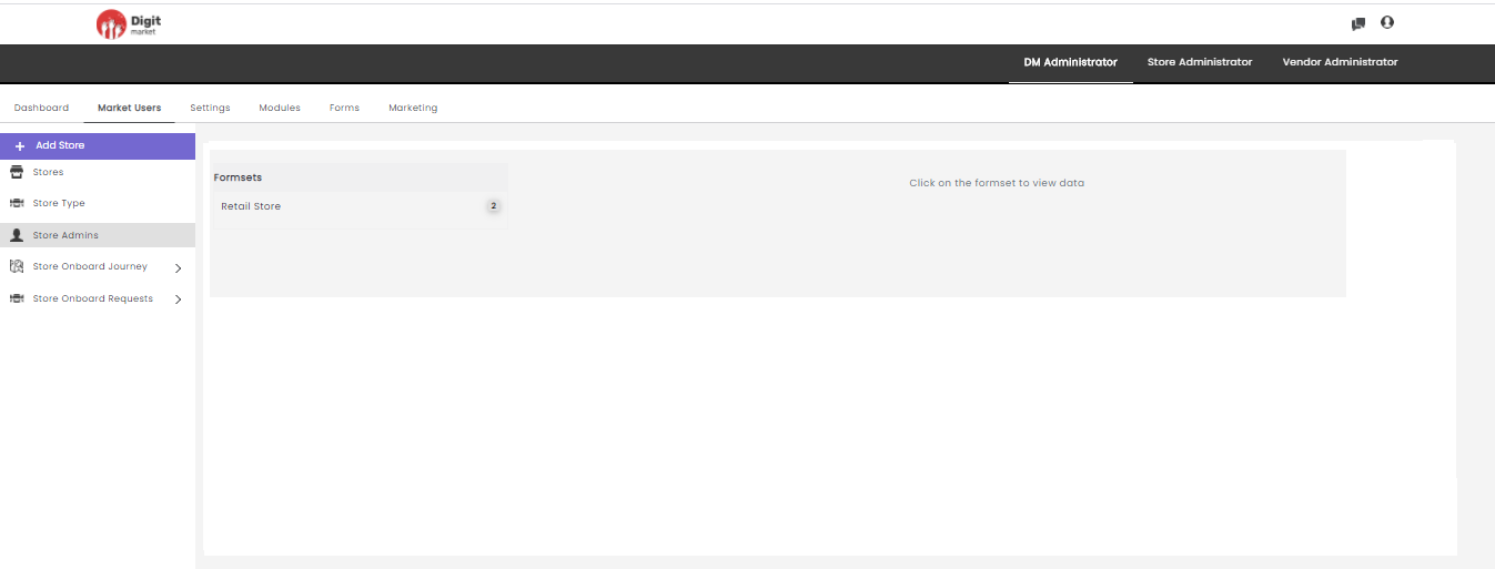
Fig. 2.44 Advanced Edit Option of Store Admin
- Status: It is a toggle button that allows you to Activate/Deactivate selected Store Users. The green button shows active clicking on it a warning message will pop-up as shown below:
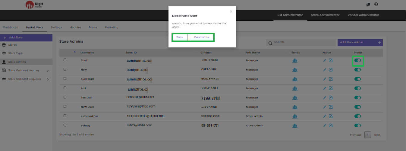
Fig. 2.45 Warning Message for Deactivating the Store User
Click the Deactivate to deactivate the user or Back/
Users can also click the checkbox to the corresponding Store Admin to Activate or Deactivate the Store Admin or click Cancel to exit.
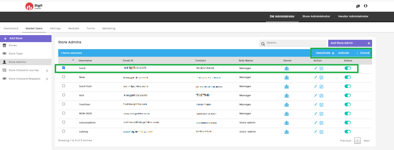
Fig. 2.46 Activate/Deactivate Store Admin
Click the Activate button in the Store Admins the Activate user dialog will be displayed. Click the Activate to activate the user or Back/
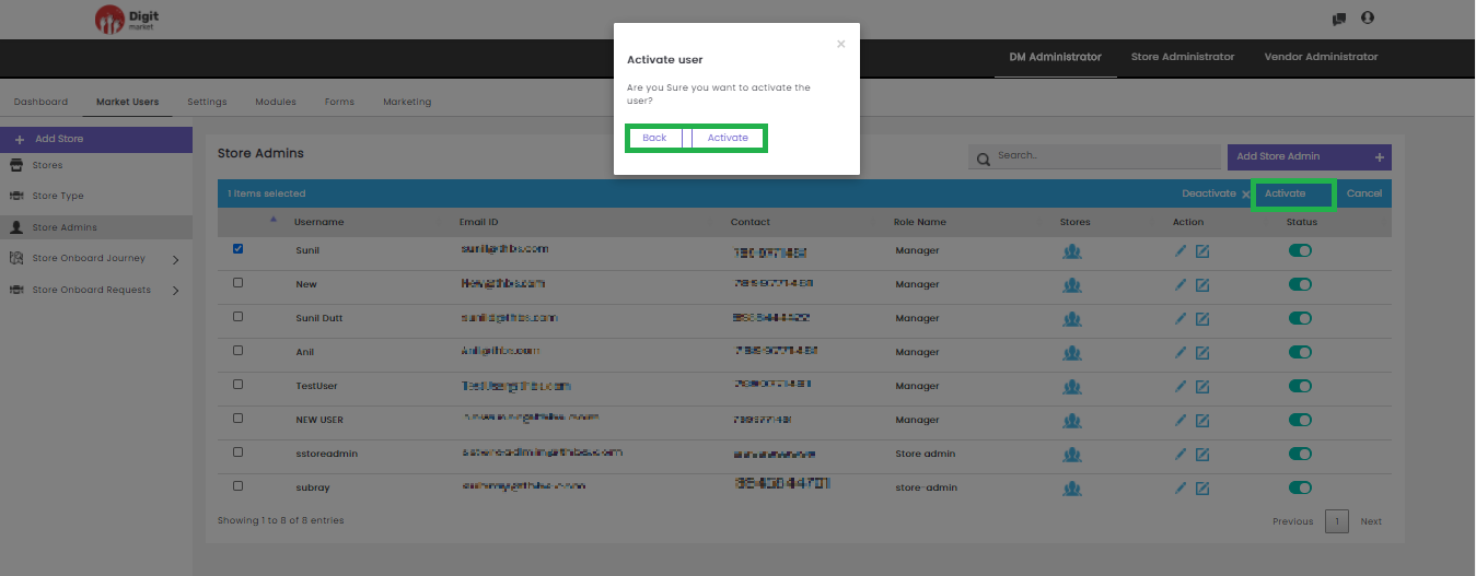
Fig. 2.47 Activate User
Click the Deactivate button in the Store Admins the Activate user dialog will be displayed. Click on the Deactivate to deactivate the user or Back/
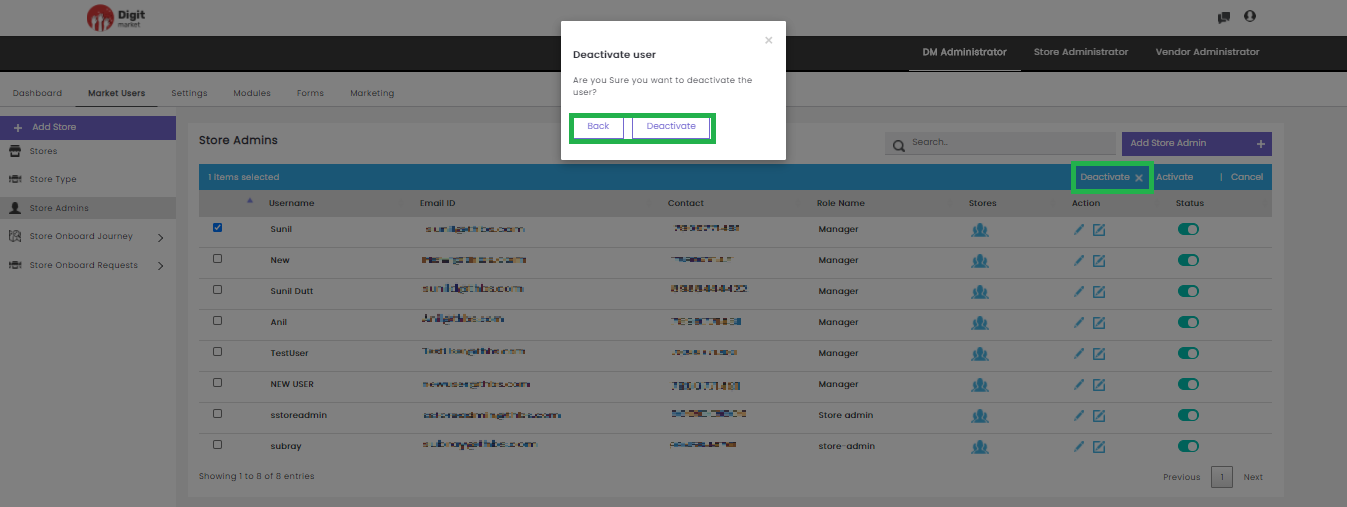
Fig. 2.48 Deactivate User
Note
Once the user is deactivated, he cannot login to the application.
Users can also perform:
- Search: Allows users to search Store Admin by giving a phrase or a key value. It is recommended to populate this field with relevant information so that locating through search will be quicker.
- Add Store Admins: Click the Add Store Admins tab, the Create Store Admin dialog will be displayed as shown below:
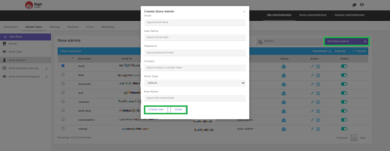
Fig. 2.49 Create Store Admin
In the Create Store Admin dialog, provide the Email, User Name, Password, Contact, Store Name and Role Name for the new Store Admin. Click the Create User to create a new user and Close to exit.
- Store Onboard Journey: Click the Store Onboard Journey tab, in the left panel it has two options:
Default: Click the Default tab, Default Journey will be displayed in the middle panel as shown below:
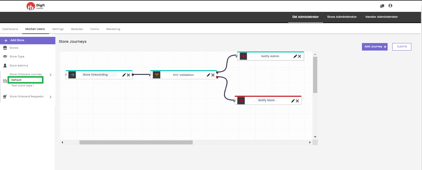
Fig. 2.50 Default Store Journey
Here users can perform the following actions:
- Add Journey: Click Add Journey displays all the already created modules in the drop-down. Select any one displays the node in the canvas as shown below:
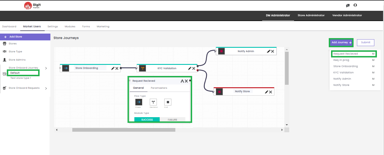
Fig. 2.51 Store Journey
In Add Journey, users can create a journey by selecting a module and providing other information like: Flow Type, Module Type and Parameters and click
to minimize and add or
. Click the edit icon
- Submit: Click the Submit button to save and submit the flow a success message will be displayed as shown below:
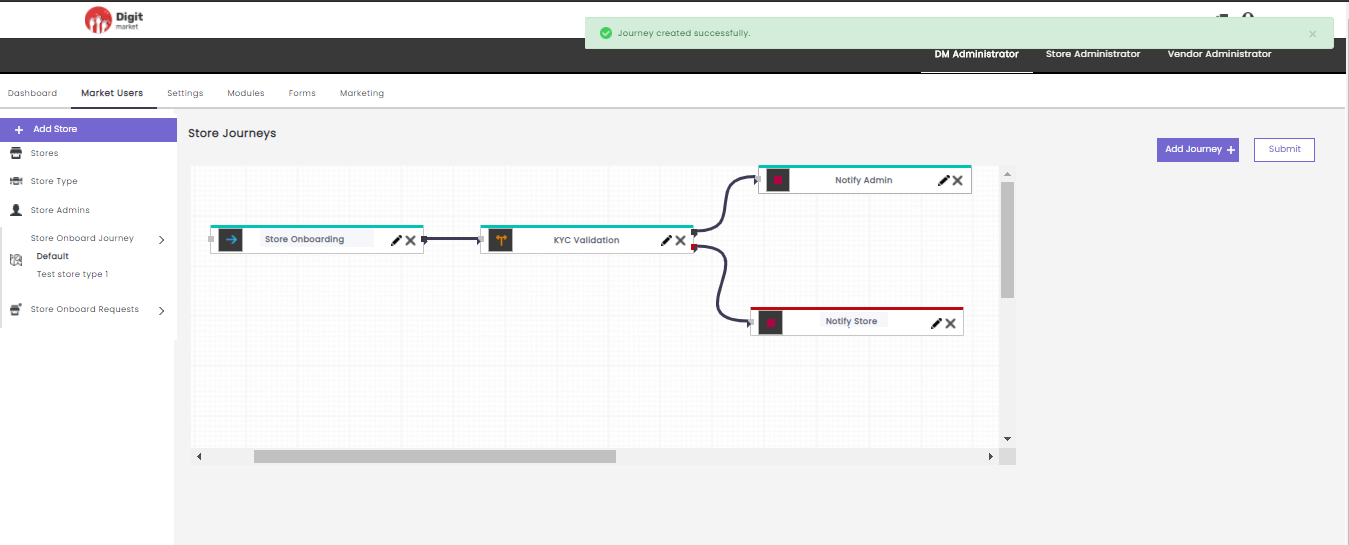
Fig. 2.52 Submit Store Journey
Other Stores: Click the Other Stores (Test store type 1) tab in the left panel will display all the stores. Click on any store type to display the corresponding store journey as shown below:
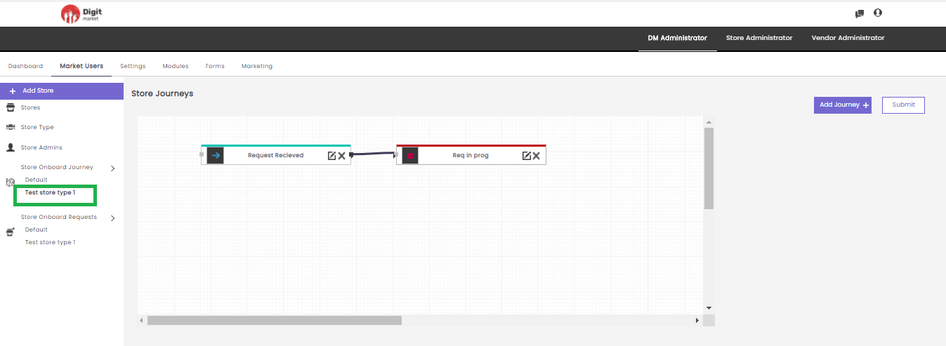
Fig. 2.53 Other StoreType Journey
All the actions in the Test storeType! journey as same as the Default journey.
Store Onboard Requests: Click the Store Onboard Requests tab, in the left panel it is a collapsible window that displays Default Requests, and the Store Requests select any. The functionality is the same.
Once the Store Onboard invite has been filled and submitted the invite initiator can view the data that was submitted and also get it through an approval life cycle and the final action can be performed. Store Onboard Request can be a default or a customized(the name given by the user) one. In any of the cases(default or customized) the approval life cycle will be :
- Received Requests
- Accepted Requests
- Approved Requests
- Rejected Requests
- Default: Click the Default tab, Default request will be displayed if any, else ‘There is no request data’ will be displayed as shown below:
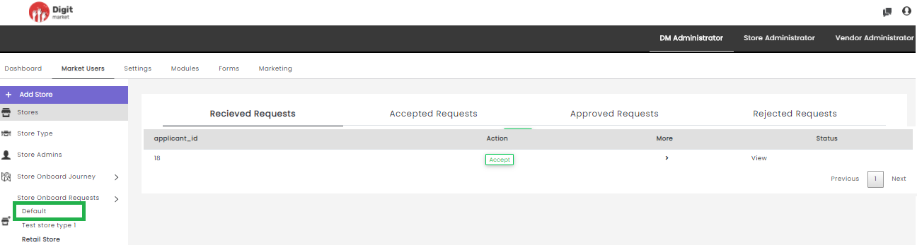
Fig. 2.54 Default Store Requests
- Other Store Onboard Requests: Click the Store Onboard Requests tab, from the left panel and select any stores.
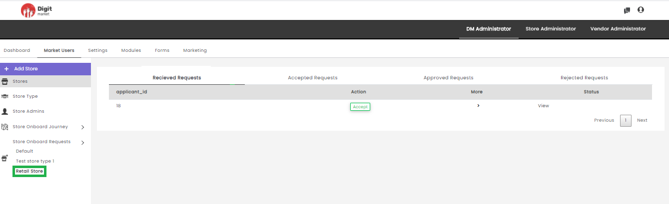
Fig. 2.55 Retail Store
Received Requests: Click the Received Requests tab, displays accepted requests as shown below:
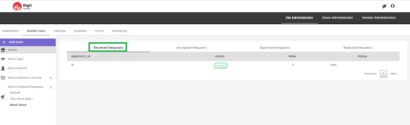
Fig. 2.56 Received Request DM
application_id: Id of the received requests.
Action: Action to be taken for the received requests like ‘Accept’ as shown on the above figure.
More: Click the
 icon to see more details if any.
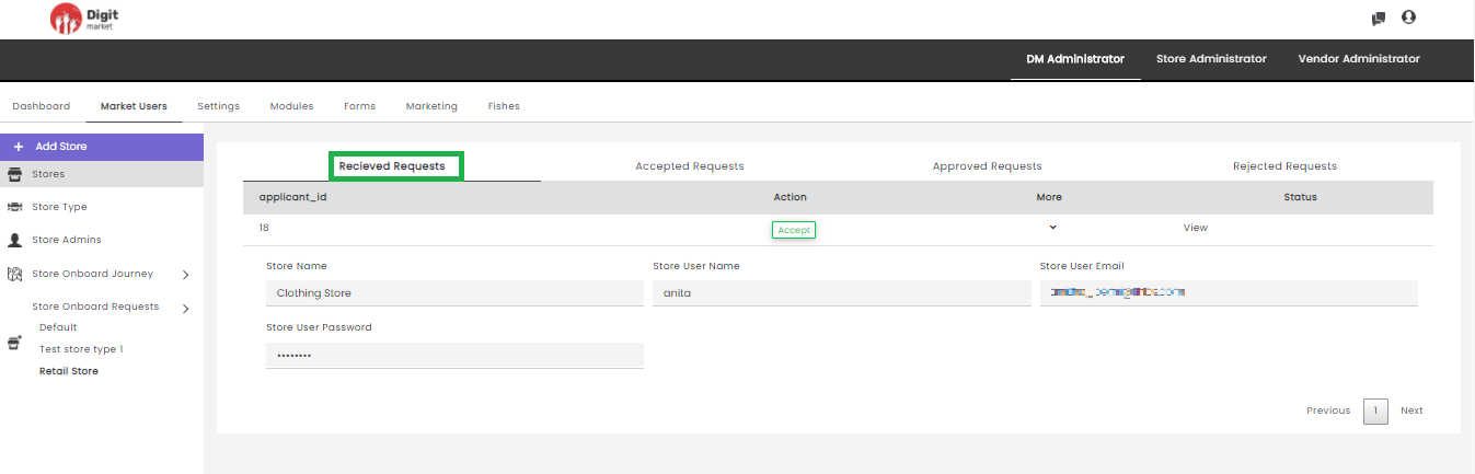
Fig. 2.57 More Details
Status: Click the View button to display the status of the received request as shown below:
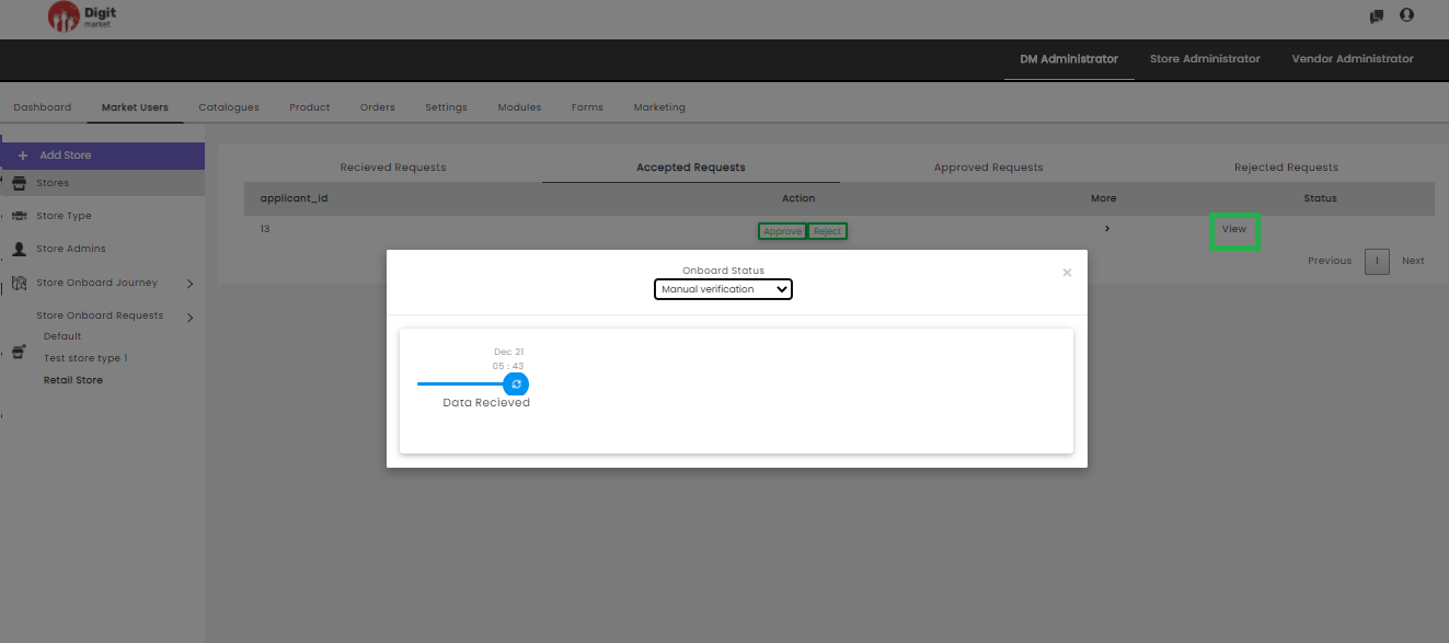
Fig. 2.58 Status of the Recieved Requests
Note
Status is only visible if a journey is associated with the selected store.
- Accepted Requests: Click the Accepted Requests tab, displays accepted requests as shown below:
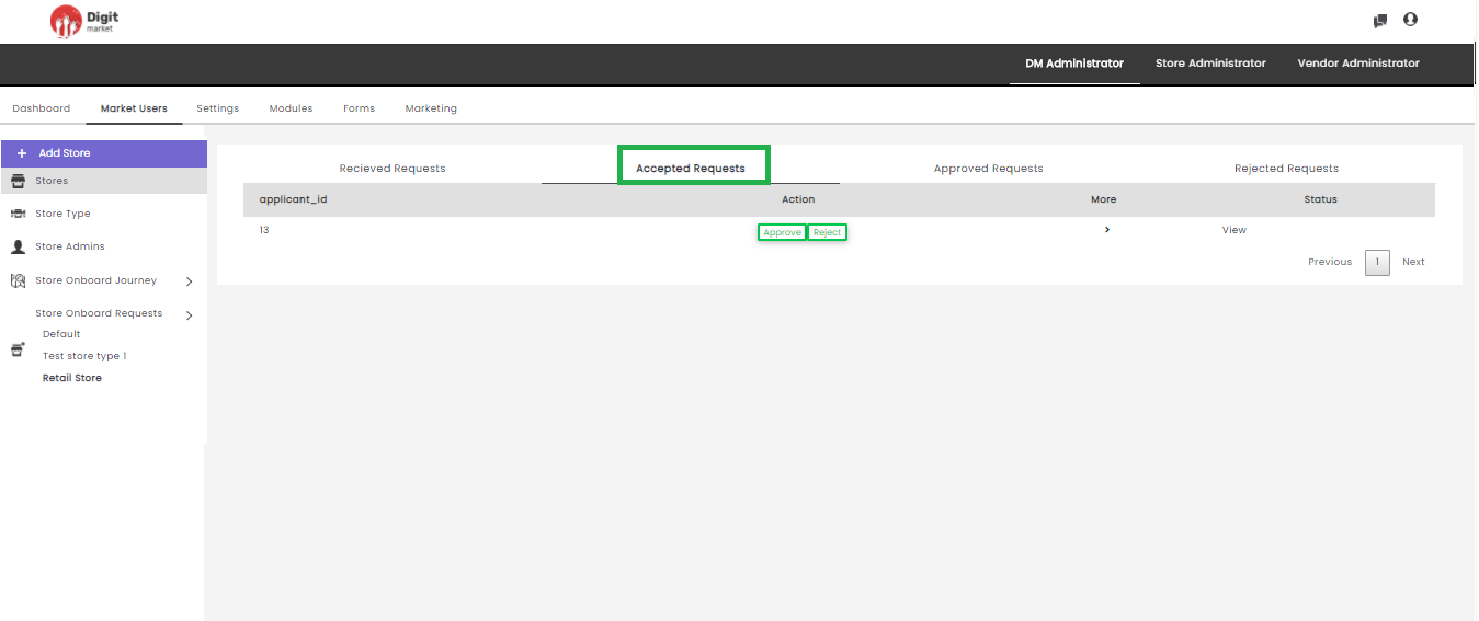
Fig. 2.59 Accepted Requests
It displays information like:
application_id: Id of the accepted requests.
Action: Action to be taken for the accepted requests like ‘Approve or Reject’. If the request is approved it will move to the next state (Approved Requests) and the state will change to Onboard. If the request is Rejected it will displays as Rejected Requests.
More: Click the
icon to see more details if any.Status: Click the View button to display the status of the accepted request. The current state will be in blue and the previous will be in green color. Each state will display with date and time as shown below:
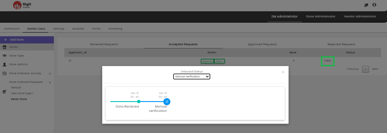
Fig. 2.60 Status of the Accepted Requests
Click the drop-down list in the dialog to see the states. Users can switch to any state a warning message will be displayed as shown below:
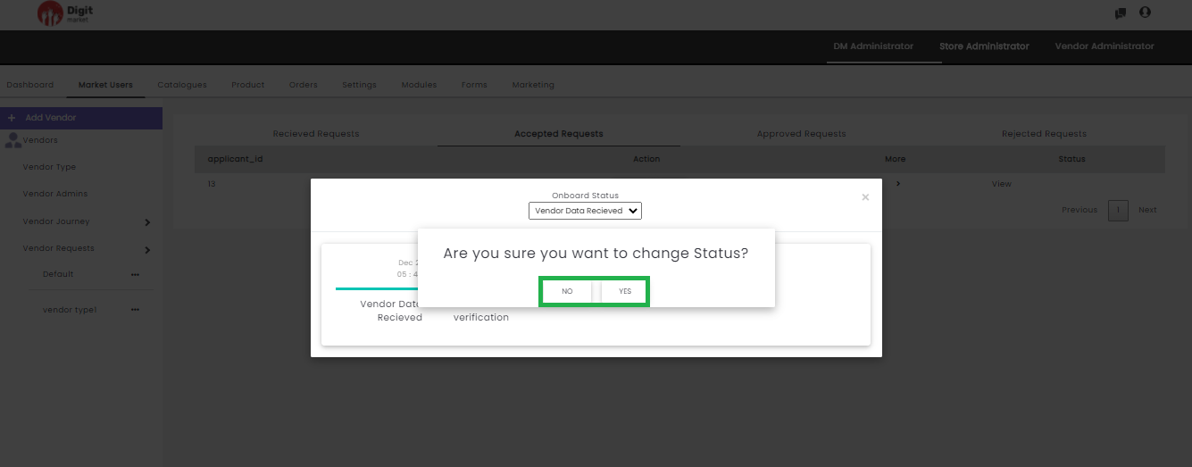
Fig. 2.61 Warning Message for State Change in Accepted Request
Click Yes to change the state or No to exit.
- Approved Requests: Click the Approved Requests tab, displays the approved requests as shown below:
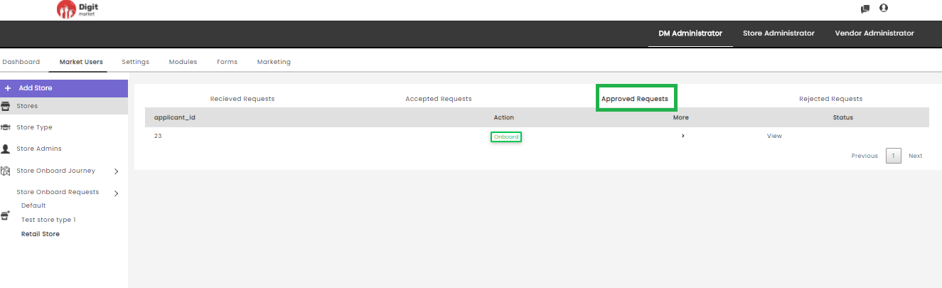
Fig. 2.62 Approved Requests
It displays information like:
- application_id: Id of the approved requests.
- Action: Action to be taken for the approved requests like ‘Onboard’.
- More: Click the icon to see more details as shown
below:
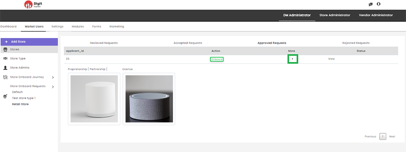
Fig. 2.63 More Details in Approved requests
- Status: Click the View button to display the status of the approved request. The current state will be in blue and the previous will be in green color. Each state will display with date and time as shown below:
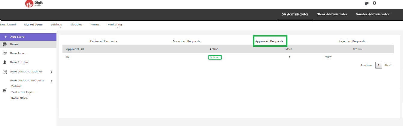
Fig. 2.64 Approved Request
Click the drop-down list in the dialog to see the states. Users can switch to any state a warning message will be displayed as shown below:
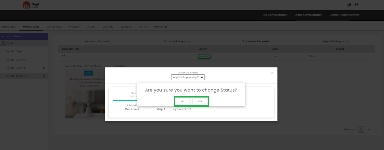
Fig. 2.65 Warning Message for State Change in Approved Request
- Rejected Requests: Click the Rejected Requests tab, displays the rejected requests as shown below:
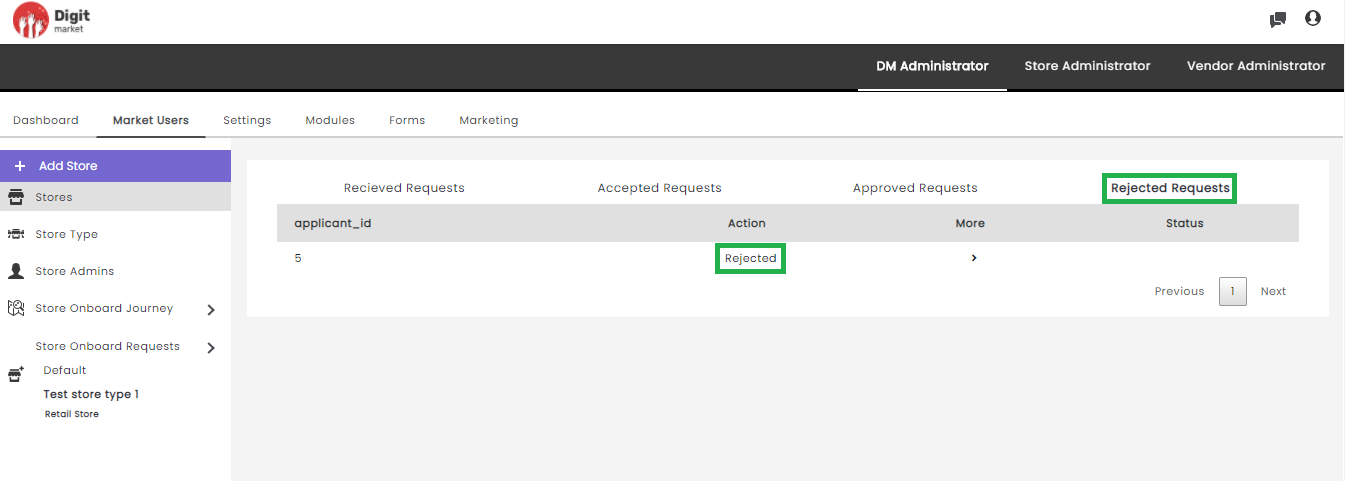
Fig. 2.66 Rejected Request
- application_id: Id of the rejected requests.
- Action: Action will display the state as ‘Rejected’.
- More: Click the icon to see more details if any.
- Status: Click the View button to display the status of the rejected request.
2.10.3. Settings
Once you log-in as the DM Administrator, click the Settings tab from the main menu the Menu List page will be displayed as shown below:
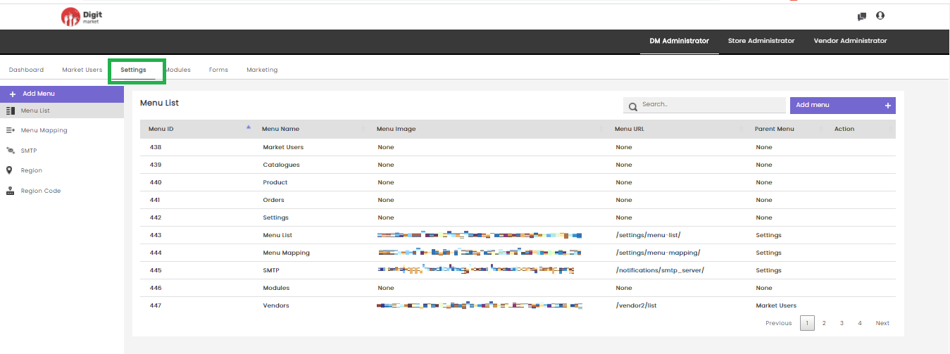
Fig. 2.67 Menu List
Note
Use icon in any field to list ascending or descending order.
Settings module which helps to have Menu-based access.
Menu-based Access
is a generic way to restrict users from accessing specific features. Menu-based access is granted by users to their subordinates. With this feature, you can restrict your subordinates from accessing functionalities that are not essential to their user role.
Note
For example, Vendor Admins and Vendor Users are the Store Admin’s subordinates. As a Store Admin, you will be able to provide menu-based access for Vendor Admins and Vendor Users. If you don’t want Vendor Admins to access a specific menu, you can disable that menu for Vendor Admins.
On the Menu List page users have the following options:
: Click the Add Menu tab, displays the Create Menu dialog as shown below:
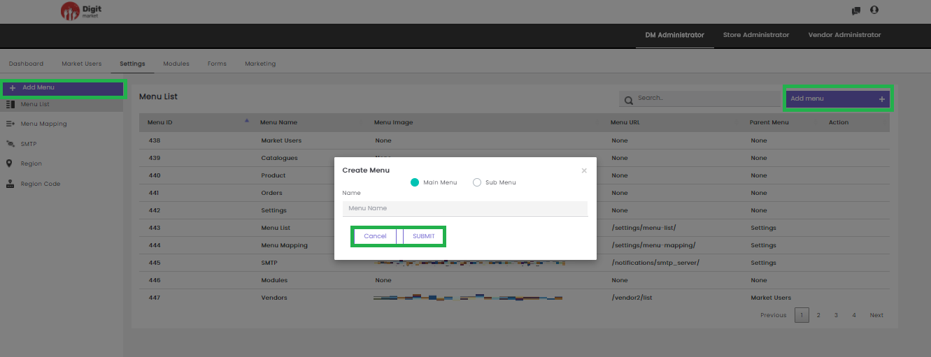
Fig. 2.68 Create Menu
The Create Menu dialog has two options: Main Menu and Sub Menu. Select the appropriate one and provide the name. Click the Submit button to create the menu and Cancel to exit.
Search: Allows users to search the menu by giving a phrase or a key value. It is recommended to populate this field with relevant information so that locating through search will be quicker.
Menu List: Click the Menu List tab, the Menu List page will be displayed. This page displays the details such as Menu ID, Menu Name, Menu Image, Menu URL, Parent Menu and Action for each Menu. It will display ten menus on one page. Use Previous or Next to switch between the pages.
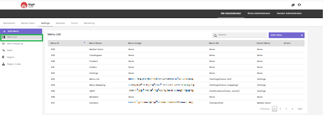
Fig. 2.69 Menu List
Users can also perform:
- Search: Allows users to search the menu by giving a phrase or a key value. It is recommended to populate this field with relevant information so that locating through search will be quicker.
- Add menu: Add menu has the same functionality as above click the Add Menu for more details.
Menu Mapping: Click the Menu Mapping tab to map the menus that are created to a user role. Menu mapping is done to allow users to access only those functionalities that are permitted for their user roles. The Menu Mapping page displays the details such as Menu Name and Role Name. Use Previous or Next to switch between the pages.
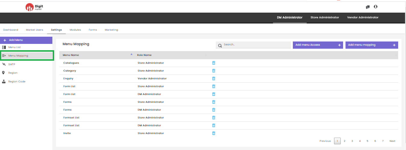
Fig. 2.70 Menu Mapping
Click the delete icon  to delete the menu mapping a warning message will display as shown below:
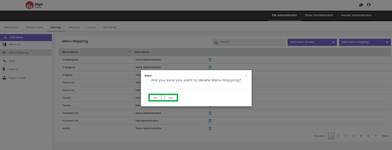
Fig. 2.71 Warning Message for Deleting the Menu Mapping
Click Yes to delete the menu mapping and No to exit.
Users can also perform:
- Search: Allows users to search menu mapping by giving a phrase or a key value. It is recommended to populate this field with relevant information so that locating through search will be quicker.
- Add menu Access: This allows the user to provide menu access to a role. Users must select a Menu and Roles for menu mapping. Click the Submit button to create the menu and Cancel to exit. The Menu Mapping dialog as shown below:
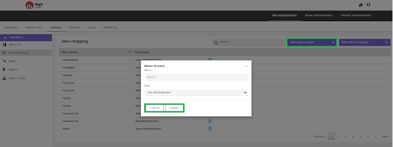
Fig. 2.72 Menu Mapping List
- Add menu Mapping: Click the Add Menu Mapping, displays the Menu Mapping dialog. Select a Menu and Role to which the mapping to be done. Users can select one menu or all. Click the Submit button to create the menu and Cancel to exit.
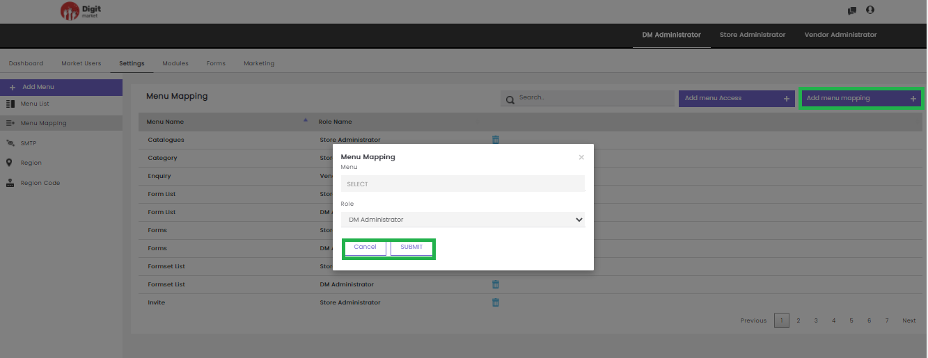
Fig. 2.73 Add Menu Mapping
Click Select All to select all the menus created or click Deselect All to remove the selection.
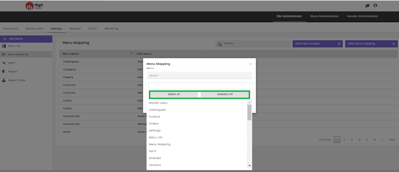
Fig. 2.74 Select or Deselect Menu Mapping
SMTP: It is used for mail configuration. Click the SMTP tab, displays a page with the details such as Smtp Name, Smtp Host, Smtp Port, Smtp User, Update, Delete. Use Previous or Next to switch between the pages.
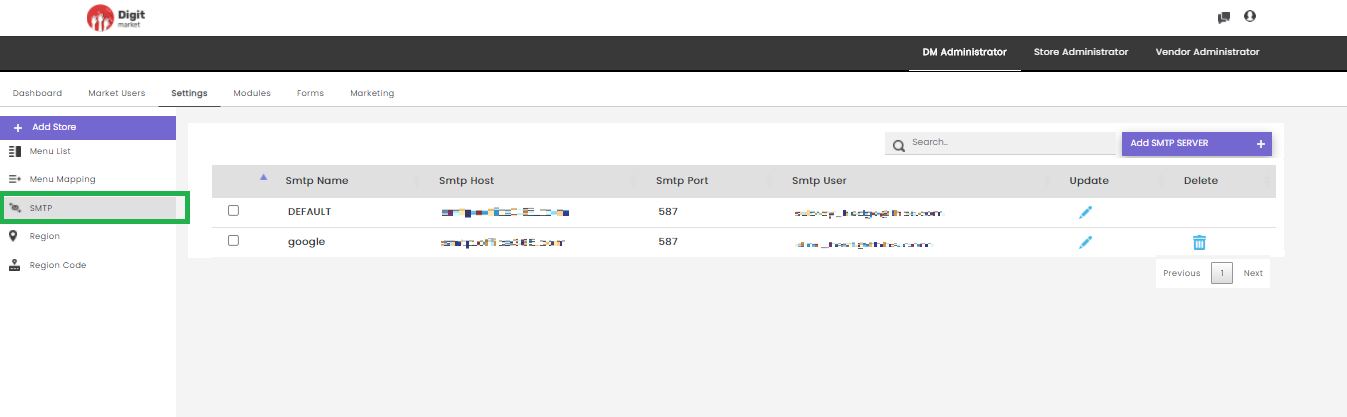
Fig. 2.75 SMTP
Click the edit icon
to update the SMTP server configuration details as shown below:
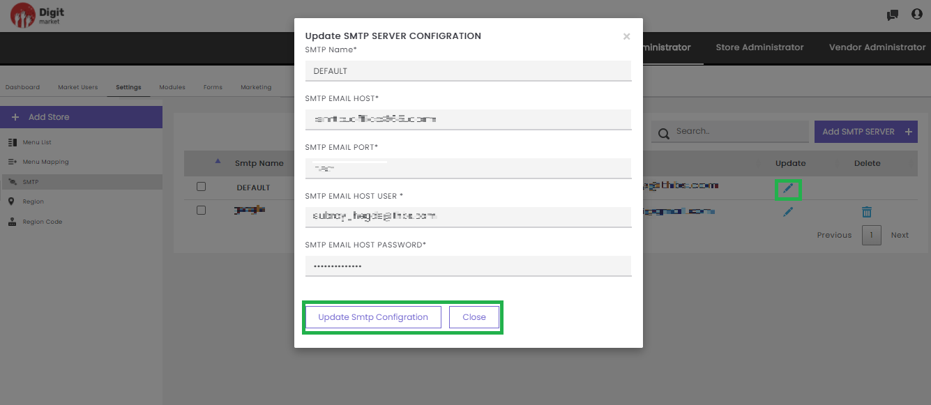
Fig. 2.76 Update SMTP Server Configuration Details
Edit the required details and click the Update Smtp Configuration to update the details or Close to exit.
Click the delete icon
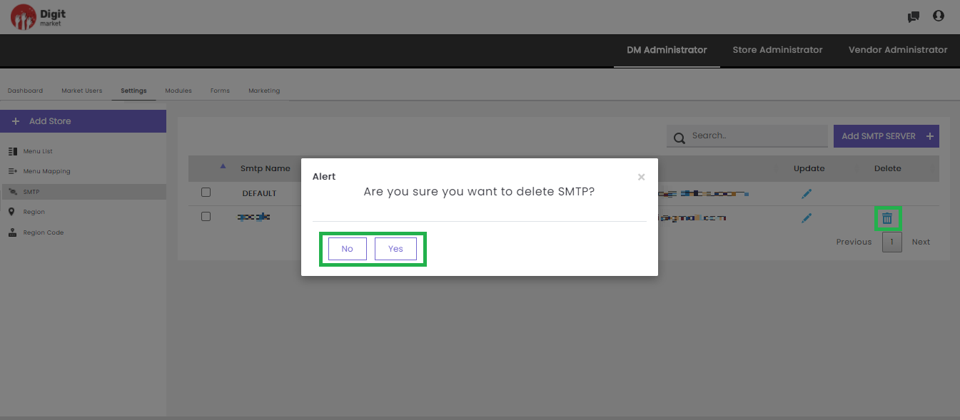
Fig. 2.77 Delete SMTP
Click Yes to delete and No to exit.
Users can also perform:
- Search: Allows users to search SMTP server configuration details by giving a phrase or a key value. It is recommended to populate this field with relevant information so that locating through search will be quicker.
- Add SMTP Server: Allows the user to add SMTP server configuration by providing the details in the Create SMTP SERVER CONFIGURATION dialog as shown below:
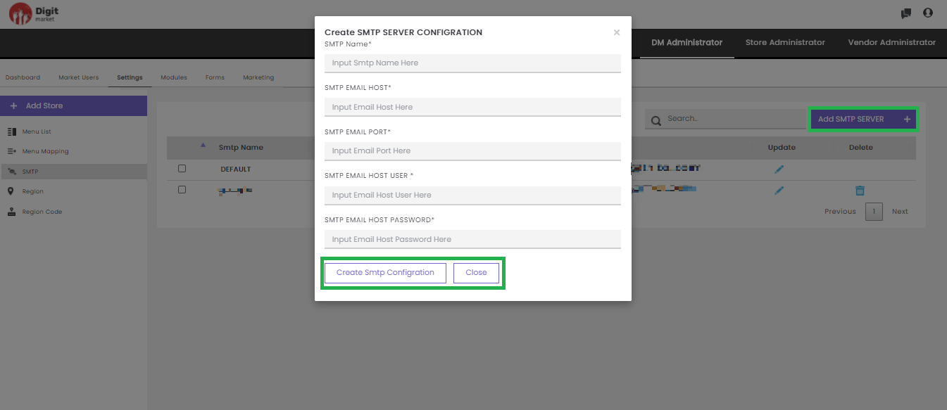
Fig. 2.78 Create SMTP Server Configuration Details
In the SMTP SERVER CONFIGURATION dialog provide the details such as:
- SMTP Name
- SMTP EMAIL HOST
- SMTP EMAIL PORT
- SMTP EMAIL HOST USER
- SMTP EMAIL HOST PASSWORD
Click Create Smtp Configuration to create and Close to exit.
Region: This is used for restricting the activity based on region-wise. Click the Region tab, displays a page with the details such as Region Name, Region Scope, Region Created_by, Region Store, Region Vendor, Update, Delete. Use Previous or Next to switch between the pages.
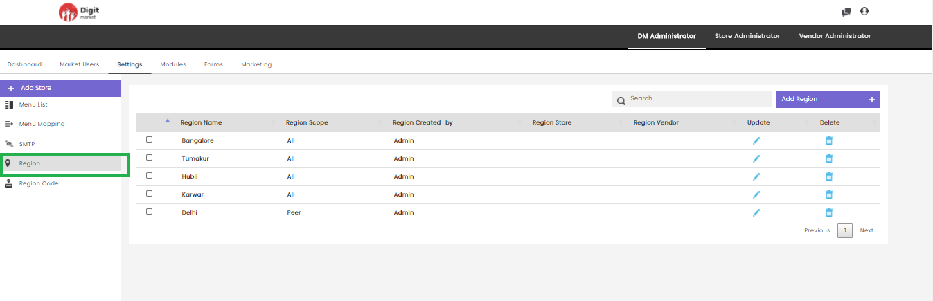
Fig. 2.79 Region
Click the edit icon
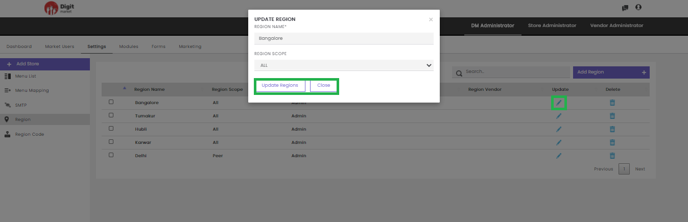
Fig. 2.80 Edit Region
Edit the required details and click the Update Regions to update the details or Close to exit.
Click the delete icon
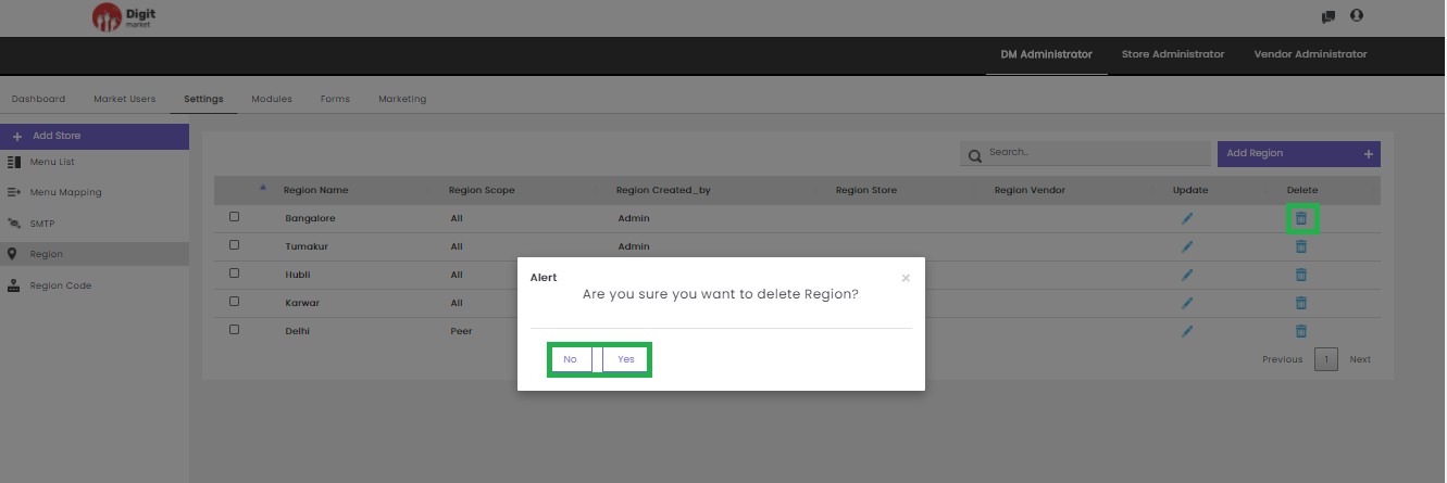
Fig. 2.81 Delete Region
Click Yes to delete and No to exit.
Users can also perform:
- Search: Allows users to search Region details by giving a phrase or a key value. It is recommended to populate this field with relevant information so that locating through search will be quicker.
- Add Regions: Allows the user to add Regions by providing the details in the CREATE REGION dialog as shown below:
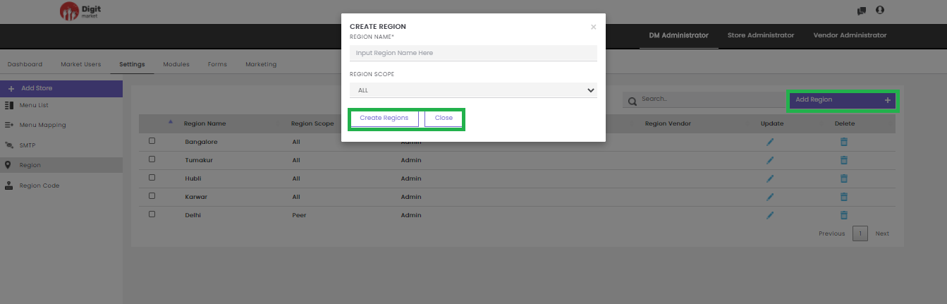
Fig. 2.82 Create Region
In the CREATE REGION dialog provide the details such as:
- REGION NAME: The name of the region.
- REGION SCOPE: Scope can set to ALL or Peers.
- ALL: Subordinates and below level user will inherit the region and region code.
- Peers: Only user subordinates will inherit the region and region code.
Click Create Regions to create and Close to exit.
Region Code: This is used for restricting the activity based on region-code. Click the Region Code tab, displays a page with the details such as Region Code, Region, Region Code Store, Region Code Vendor, Update, Delete. Use Previous or Next to switch between the pages.
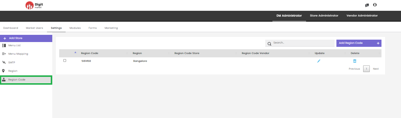
Fig. 2.83 Region Code
Click the edit icon
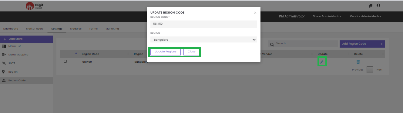
Fig. 2.84 Edit Region Code
Edit the required details and click the Update Regions to update the details or Close to exit.
Click the delete icon
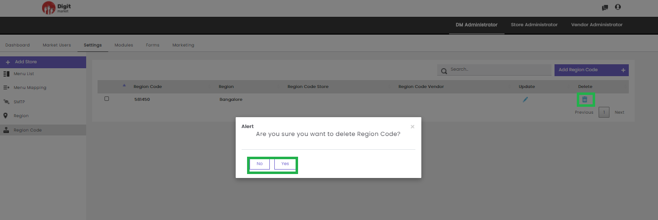
Fig. 2.85 Delete Region Code
Click Yes to delete and No to exit.
Users can also perform:
- Search: Allows users to search Region details by giving a phrase or a key value. It is recommended to populate this field with relevant information so that locating through search will be quicker.
- Add Region Code: Allows the user to add Region Code by providing the details in the CREATE REGION CODE dialog as shown below:
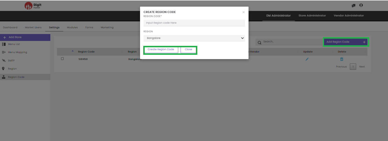
Fig. 2.86 Create Region Code
In the CREATE REGION dialog provide the details such as:
- REGION CODE
- REGION
Click Create Regions to create and Close to exit.
- Rating Scale: A rating scale is a set of categories designed to elicit information about a quantitative or a qualitative attribute. Rating scales allow participants to weigh, or assign numerical values as answers via a simple star rating graphical interface system. Rating scales are a crucial element in the surveys and it is important to understand how to use them appropriately.
In the DM Administrator, the user can define the rating scale for Store. Click the Rating scale tab from the left panel, the Rating Scale List page will be displayed as shown below: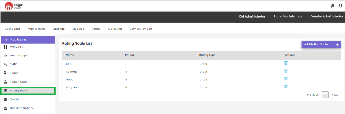
Fig. 2.87 Rating Scale List Page
Rating Scale List page will display all the ratings along with the details:
- Name: Name of the rating.
- Rating: Rating scales show the strength of feeling or agreement.
- RatingType: Displays the rating.
- Actions: Click the delete icon
Users can also perform:
Add Rating Scale: Click the Add Rating Scale tab, displays the Add Rating Scale dialog as shown below:
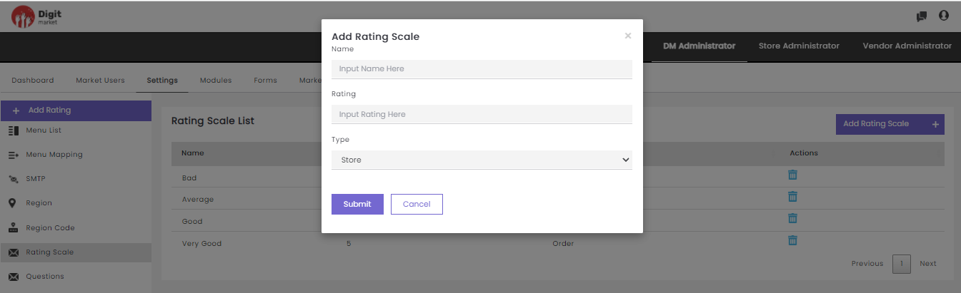
Fig. 2.88 Add Rating Scale
In the Add Rating Scale dialog, provide the
- Name: Name for the rating.
- Rating: Users can select a numeric number to define the rating scale.
- Type: Users can select the rating type as store as in DM Administrator log-in user can set the rating only for store.
Click the Submit to create or Cancel to exit.
Questions: Rating questions can be used to evaluate a variety of topics or stimuli including statements or options. Rating questions help to understand how the customer feels about a particular product, the preference of the customer and compare the results. Here users can provide the questions from a range of options — which are scaled between two extremes — like Excellent to Terrible and responders can choose from a range of options or provide the textual information according to the type of question. Questions posed in the surveys tend to take a range of different forms like:
- Descriptive: Respondents are provided with text-area where they can provide textual information.
- SingleSelectOption Respondents are presented with several answer options to choose one from it.
- MultiSelectOption: Respondents are presented with several answer options and to choose from.
In the DM Administrator, the user can define the question for a group(store) or for ratings . Click the Questions tab from the left panel, the Questions for Rating page will be displayed as shown below:
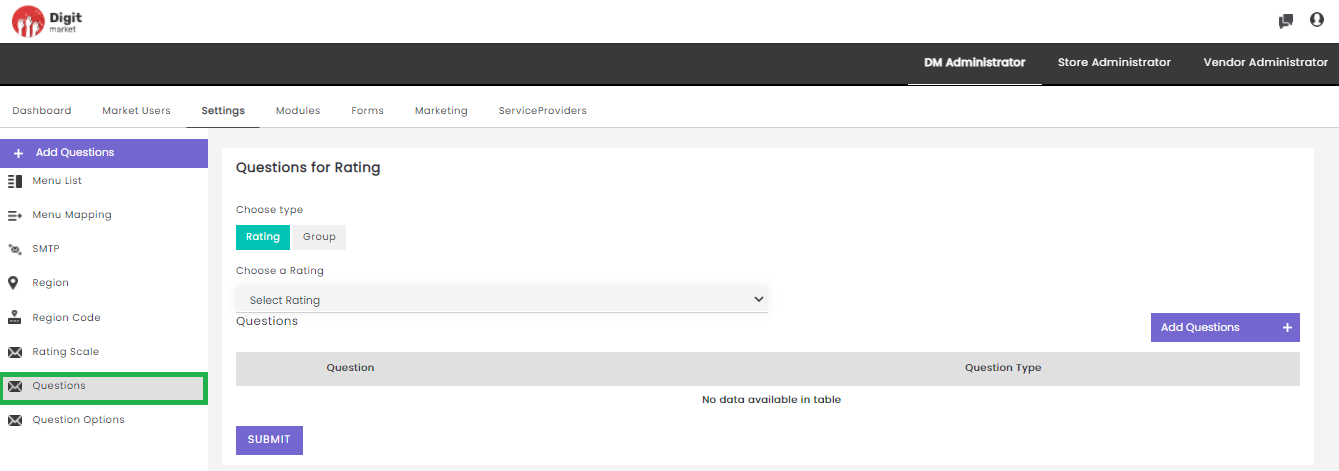
Fig. 2.89 Questions for Rating
The steps to define the question for rating and group are as follows:
- Choose type: Select Rating for defining the questions for rating scale and for Group by defining the questions at store level.
- Choose Rating: Click the drop-down to display the available rating scale.
- Add Question: Click Add Questions button to add the question for the selected Rating type in the above step. Enter the required question and select the required Question Type as shown below:
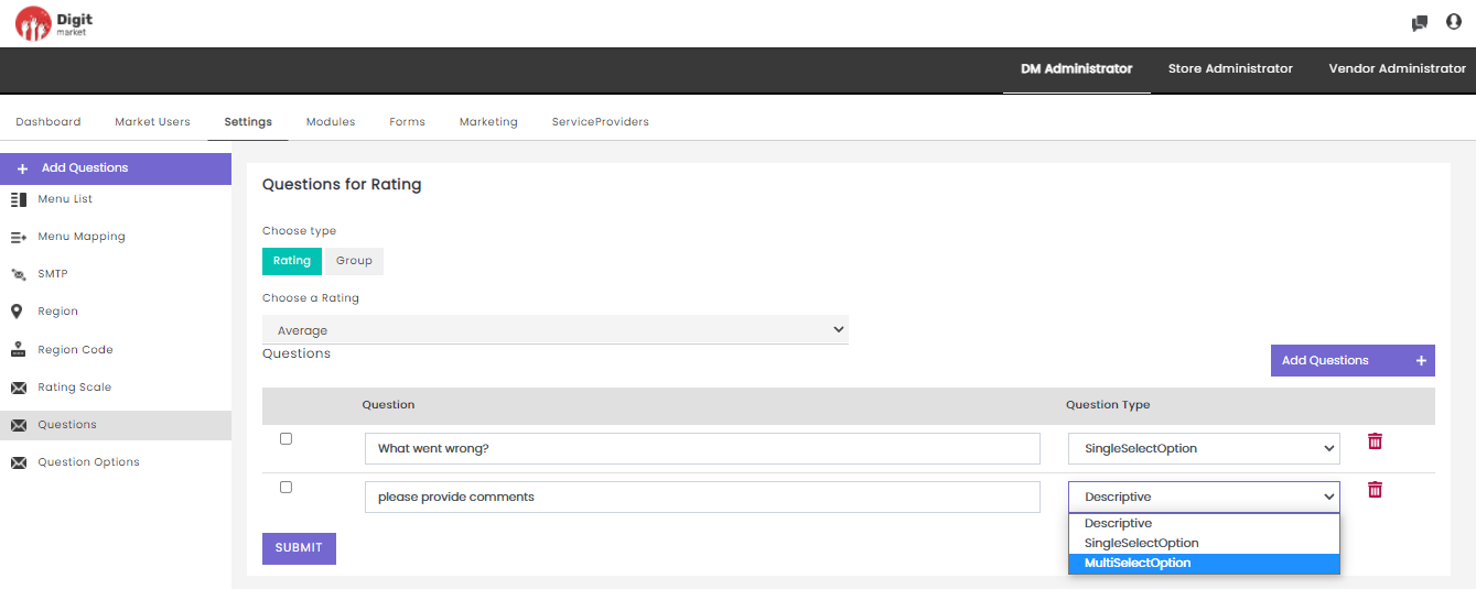
Fig. 2.90 Add a Question
Click the SUBMIT button to save the changes
Click the delete icon
to delete the question and a success message will be displayed.
Note
For the customer, the question defined in the group along with selected ratings will be displayed.
- Question Options: As every customer experience professional knows, surveys represent an invaluable tool for improving the customer experience, by understanding the strong and weak points about the business, and ultimately boosting revenues.
In the DM Administrator, the user can define the option for selected questions. Click the Questions Options tab from the left panel, the Options for Questions page will be displayed as shown below: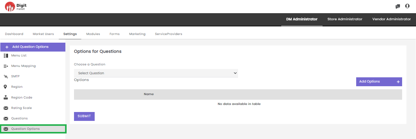
Fig. 2.91 Options for Questions
The steps to define the options for question for the selected question are as follows:
- Choose a question: Select a question for defining the options.
- Add Options: Click Add Options button to add the option for the selected question in the above step. Enter the required option as shown below:
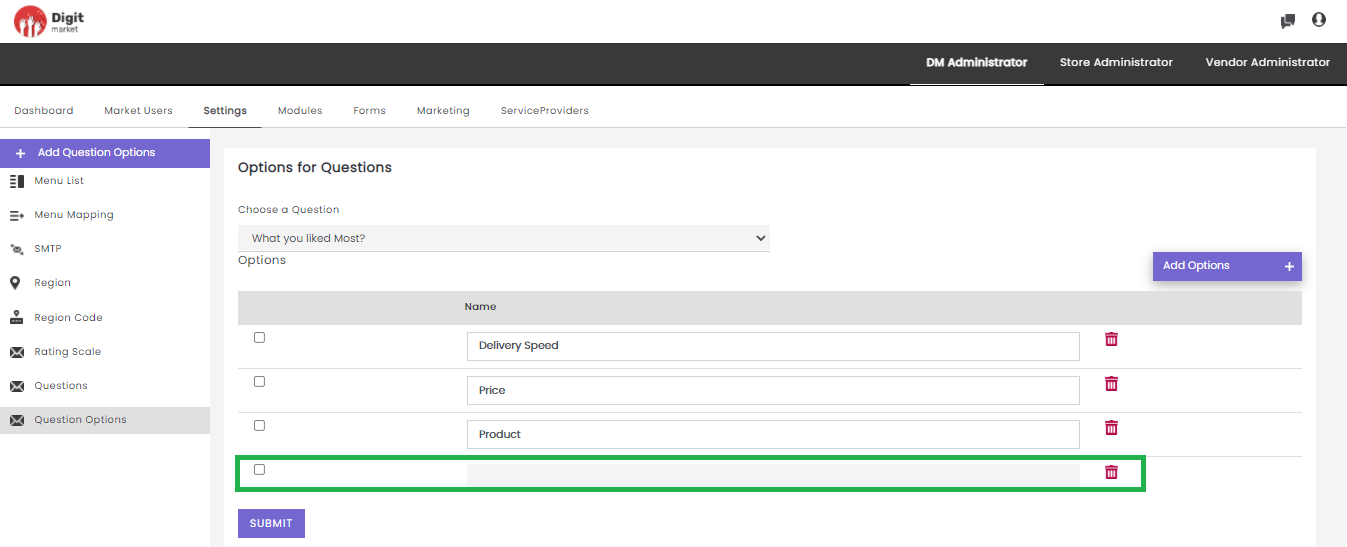
Fig. 2.92 Add Options
Click the SUBMIT button to save the changes
Click the delete icon
2.10.4. Modules
Once you log-in as the DM Administrator, click the Modules tab from the main menu the Module List page will be displayed. The Module List will display all the Modules along with details such as Module Name, Journey Type, Type and Action as shown below:
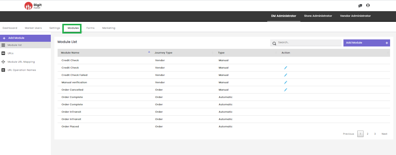
Fig. 2.93 Modules List
On the Module List page users have the following options:
Add Module: Click the Add Module tab, the Create Module dialog will be displayed as shown below:
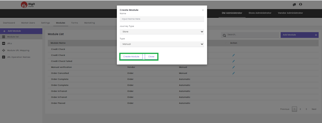
Fig. 2.94 Create Module
In the Create Module dialog, provide the following informations:
Name: Name for the module.
Journey Type: Click the dropdown list to select any one of the options: Store/Vendor/Order/Set to Third Party/Set to Vendor based on the requirement.
Type: Click the dropdown list to select any one of the options: Manual/Automatic.
Manual: This process requires a DM user to push it through every step by approving or rejecting that part of the flow. Automatic: Here Modules are pre-linked with an API for creating the journey by setting the URL, Module URL Mapping and URL Operation Names. This will auto-assign to the succeeding modules. It helps to reduce the manual effort, minimize costs, increase efficiency, and streamline processes
Click the Create Module button to create a new module and Close to exit.
- Search: Allows users to search by giving a phrase or a key value. It is recommended to populate this field with relevant information so that locating through search will be quicker.
- Module list: Click the Module list tab from the left panel, the Module List page will be displayed as shown below:
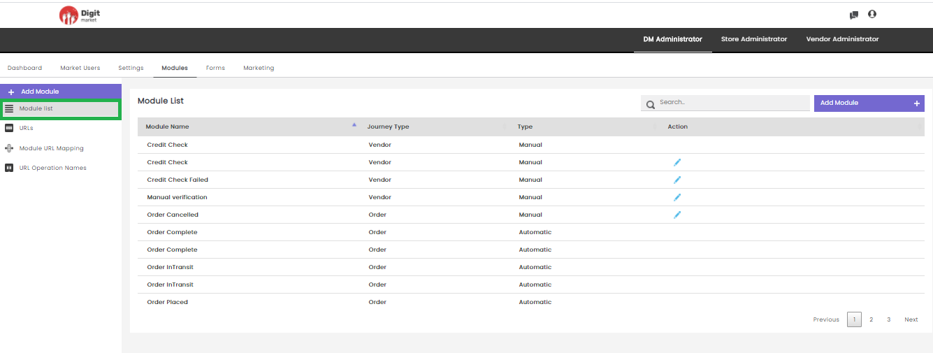
Fig. 2.95 Module List Page
Module List page will display all the modules along with the details:
- Module Name: Name for the module.
- Journey Type: Type of journey chosen at the time of creation.
- Type: Display Manual or Automatic. Manual for manual transmission of steps by approving or rejecting that part of the flow. Automatic is pre-linking with an API.
- Actions: Click the edit icon
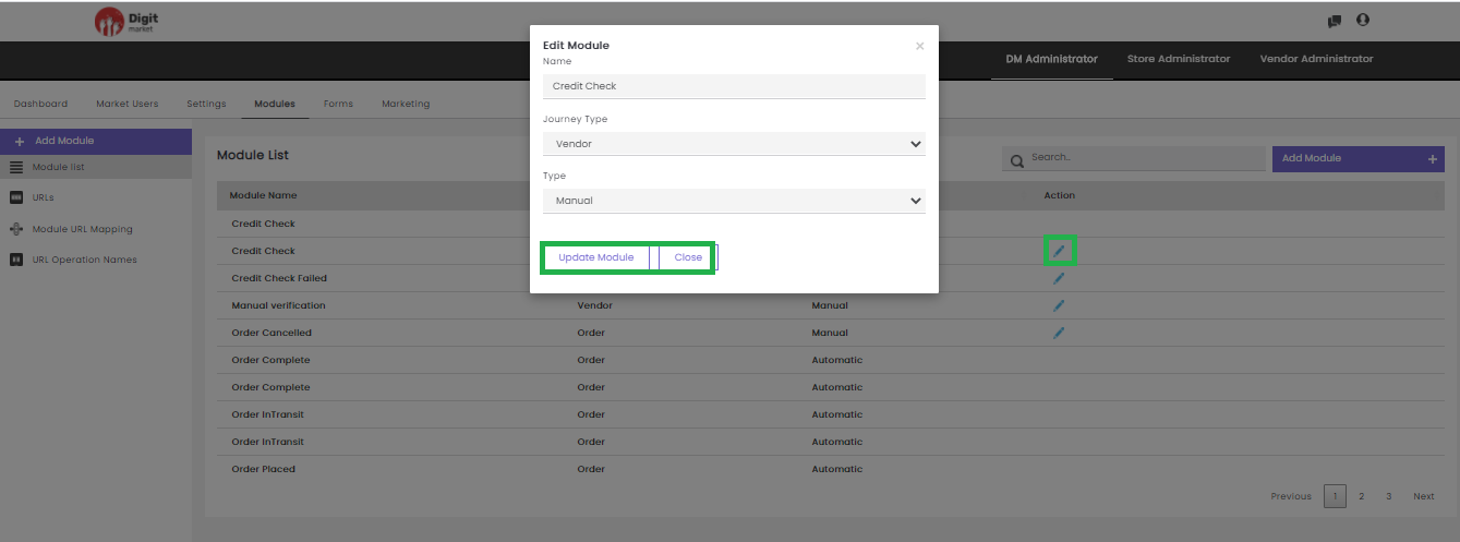
Fig. 2.96 Edit a Module
In the Edit Module dialog, users can edit all the info and click the Update Module to update the details or click
URLs: Click the URLs tab, the Module URL List page will be displayed. This page displays all the URL along with the details like URL, URL Type, Request Type, Journey Type, Client Id, Client Secret, Actions. Use Previous or Next to switch between the pages.
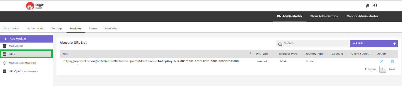
Fig. 2.97 Module URL List Page
Users can edit the URL by clicking the edit icon
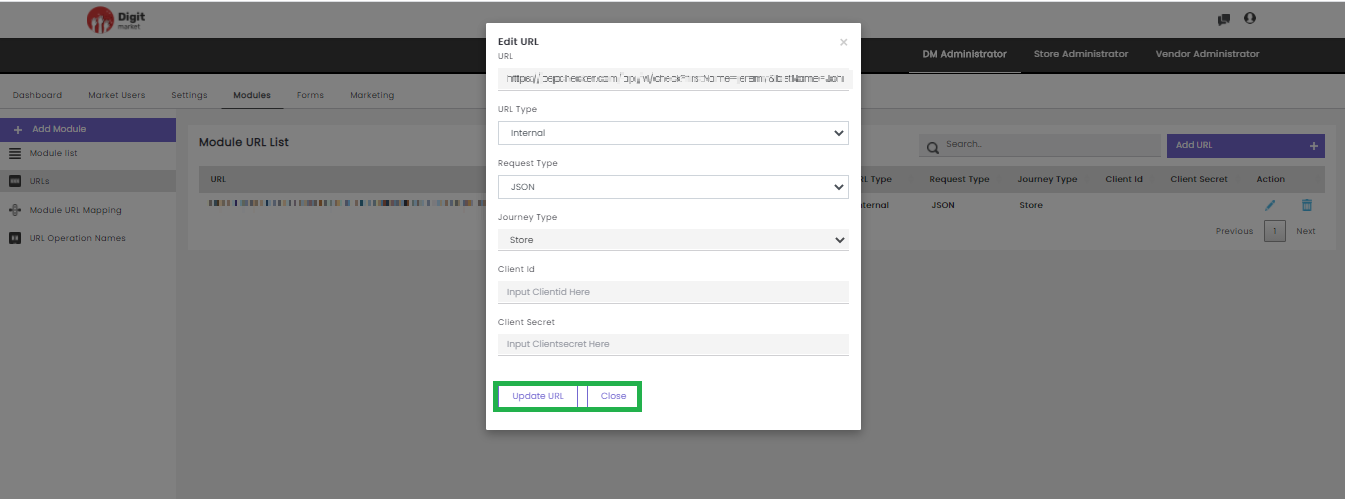
Fig. 2.98 Update URL
Users can delete an URL by clicking the delete icon
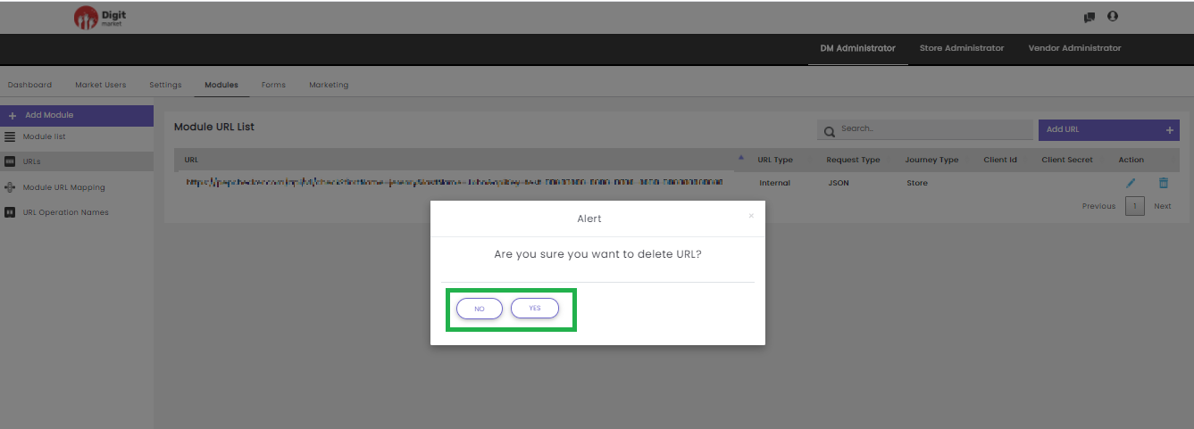
Fig. 2.99 Warning Message for URL Deletion
Click Yes to delete and No to exit.
Users can also perform:
- Search: Allows users to search by giving a phrase or a key value. It is recommended to populate this field with relevant information so that locating through search will be quicker.
- Add URL: Click the Add URL tab, the Create URL dialog will be displayed as shown below:
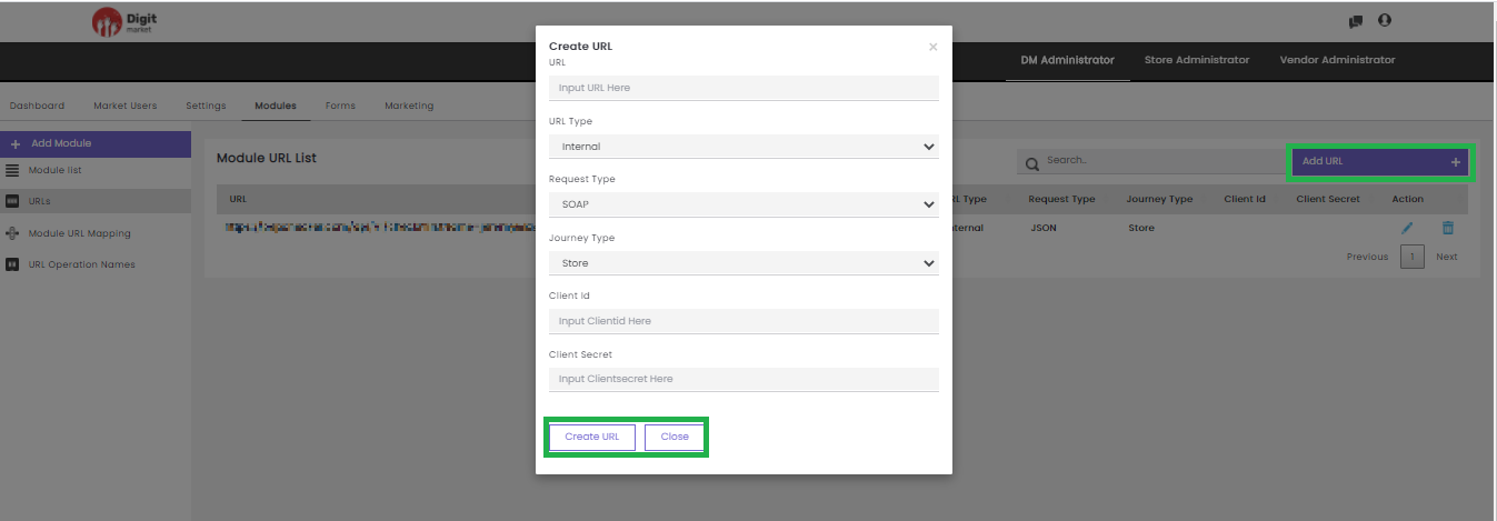
Fig. 2.100 Add URL
In the Create URL dialog, provide the URL, URL Type, Request Type, Journey Type, Client Id and Client Secret to create a new URL. Click the Create URL to create or Close to exit.
Module URL Mapping: This allows users to map the module with the URL. Click the Module URL Mapping tab, the Module URL Mapping page will be displayed as shown below:
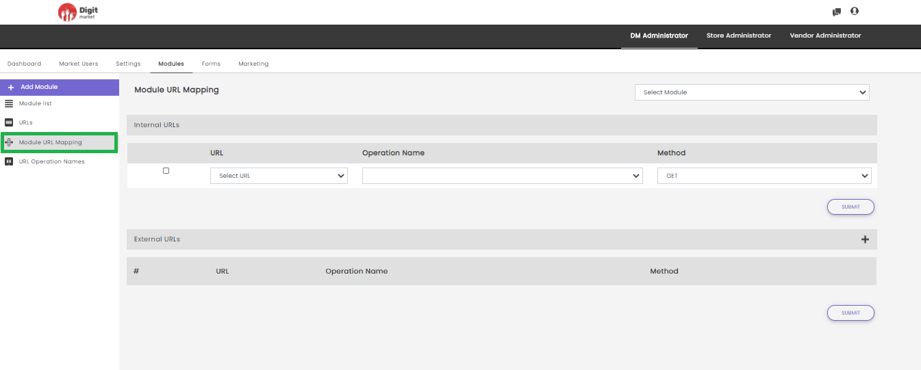
Fig. 2.101 Module URL Mapping page
To map URL with Module:
Step 1: Select a module from the Select Module drop-down field for which the URL needs to be mapped.
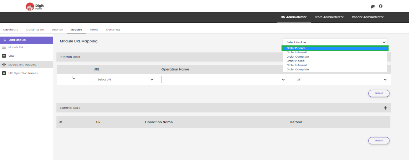
Fig. 2.102 Select Module
Step 2: Users can provide Internal URLs and External URLs.
Internal URL
- Select the corresponding checkbox.
- It will display all the URL added with the ADD URL tab and URL Type as Internal as drop-down select any.
- Select the Operation Name.
- Select a Method from the drop-down.
- Click the Submit button.
External URL
- Click the plus icon
- Select the corresponding checkbox.
- It will display all the URL added with the ADD URL tab and URL Type as Internal as drop-down select any.
- Select the Operation Name.
- Select a Method from the drop-down.
- Click the Submit button.
URL Operation Names: In the URLs tab while adding an url using the ADD URL button, if the URL is SOAP/Notification request type, then user should provide the operation name, then select the request type: SOAP/Notification and select url from Choose a URL, then users have to provide the URL operation names. Click the URL Operation Names tab, the URL Operation Names page will be displayed as shown below:
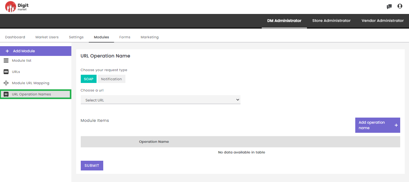
Fig. 2.103 URL Operation Names
On the above page users have to:
- Select Soap or Notification.
- Click the Select Method to get URL drop-down field and select any.
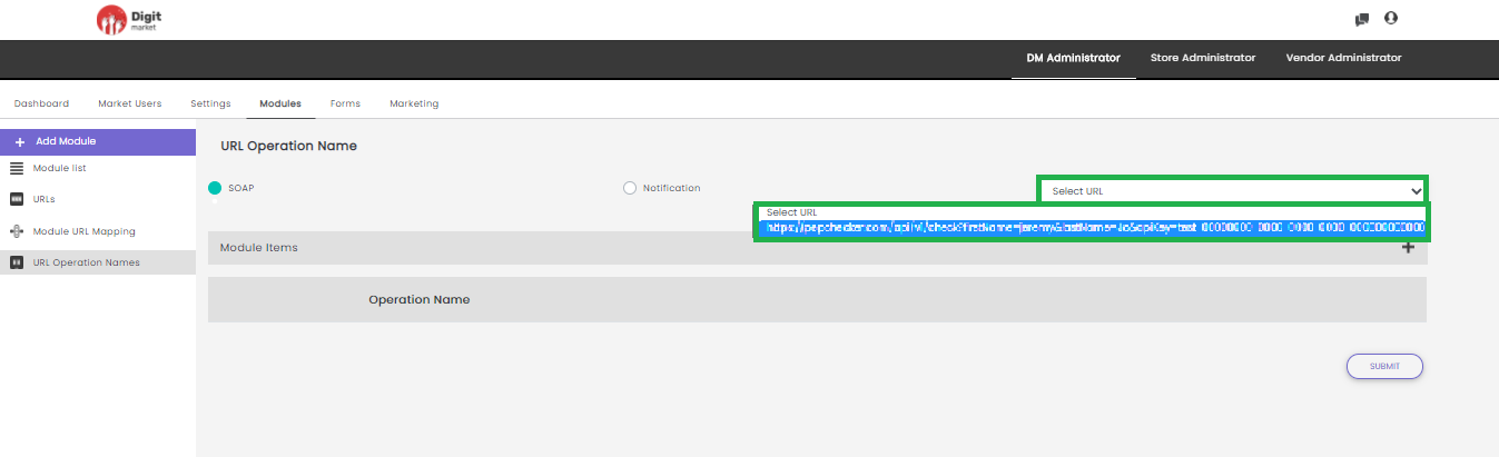
Fig. 2.104 Select Soap and Select URL
- Click the plus icon
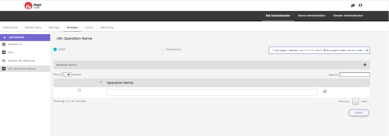
Fig. 2.105 Operation Name
2.10.5. Forms
Once you log-in as the DM Administrator, Click the Forms tab from the main menu the Form List page will be displayed. The Form List will display all the Forms along with details such as Form Name, Status, Progress, Form Type and Action as shown below:
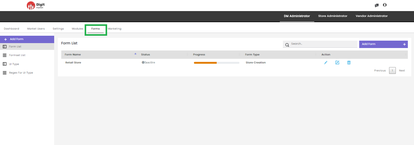
Fig. 2.106 Store Form List
On the Form List page users have the following options:
Add Form: Click the Add Form tab, displays the Create a new Form dialog as shown below:
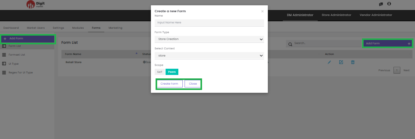
Fig. 2.107 Create New Form
Provide all the details in the Create a new Form dialog:
- Name: Name for the form.
- Form Type: Select from the drop list as per the requirement. The available options are:
- Store Creation
- Store User Creation
- Select Context: Select from the drop list. The values will depend on Form Type selection.
- Scope: Select either self or peers.
Click the Create From button to create or Close to exit. Once the form is created a successful message will be displayed and will be added to the Form List as shown below:
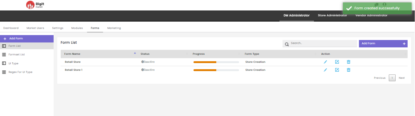
Fig. 2.108 Form Created Successfully
Search: Allows users to search by giving a phrase or a key value. It is recommended to populate this field with relevant information so that locating through search will be quicker.
Form List: Click the Form List tab, the Form List page will be displayed. Form List page displays all the forms along with the details such as:
- Form Name: Name given for the form at the time of creation.
- Status: Displays active or inactive.
- Progress: State of the form.
- Form Type: Displays the type of the form given at the time of creation.
- Action:
- Click the edit icon to display the Edit Form dialog
where the user can edit the details: Name, Form Type, Select
Context, Scope as shown below:
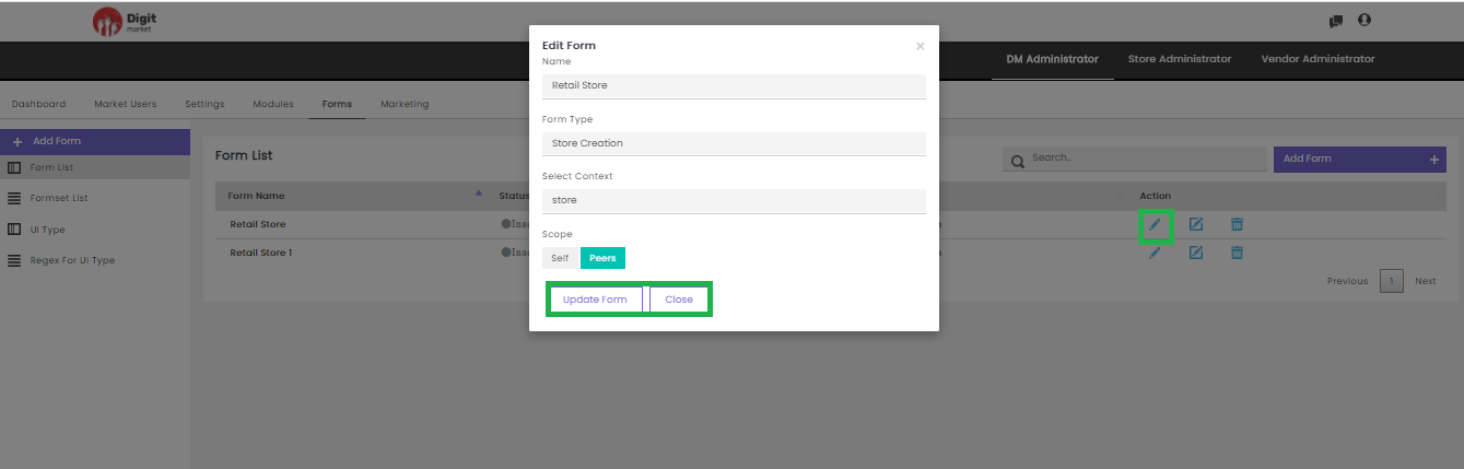
Fig. 2.109 Edit Forms In DM Administrator
Click the Update Form button to update the details or Close to exit.
- Click the advanced edit icon
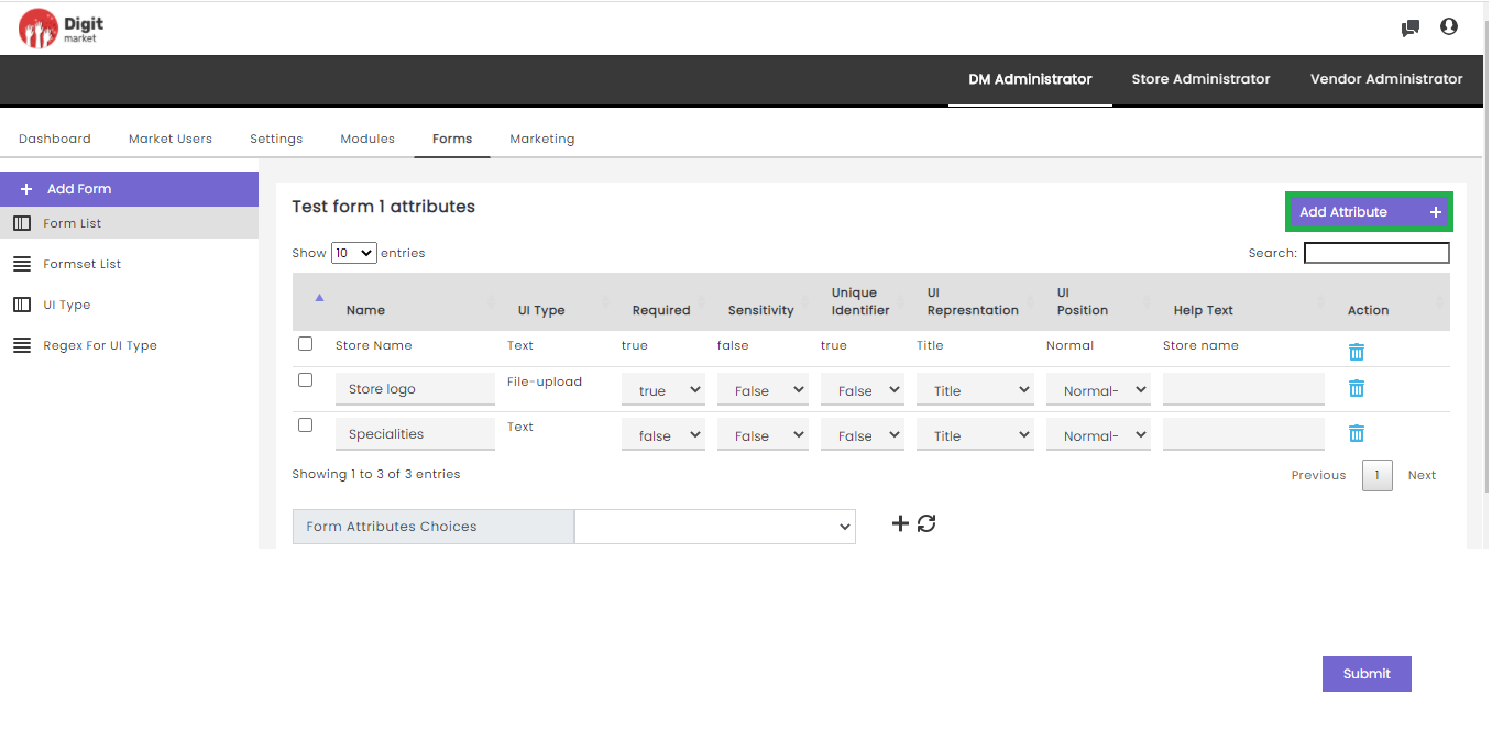
Fig. 2.110 Advanced Edit Options of Forms in DM Administrator
Note
Atleast one user defined attribute should be added for the user registration form is displayed.
Click the Add Attribute button to add attributes for the selected form by providing the following details:
- Name: Name of the attribute.
- UI Type: Click the dropdown list to select from the options: Email, Phone-number, text, etc.
- Required: Click the dropdown list to select any one of the two options: True/False. True for mandatory fields and False for non-mandatory fields.
- Sensitivity: Click the dropdown list to select any one of the two options: True/False. True for sensitive fields and False for non- sensitive fields.
- Unique Identifier: Click the dropdown list to select any one of the two options: True/False. True for unique fields and False for non- unique fields.
- UI Representation: Click the dropdown list to select from the options: Title, Short Description, Description, Profile-Logo, Display-Logo,etc.
- UI Position: Click the dropdown list to select from the options: Normal-Left, Normal, Normal-Right, Tab-Left, Tab-Right.
- Help Text: Metainformation about the form, aids to help the users.
- Action: Click the delete icon
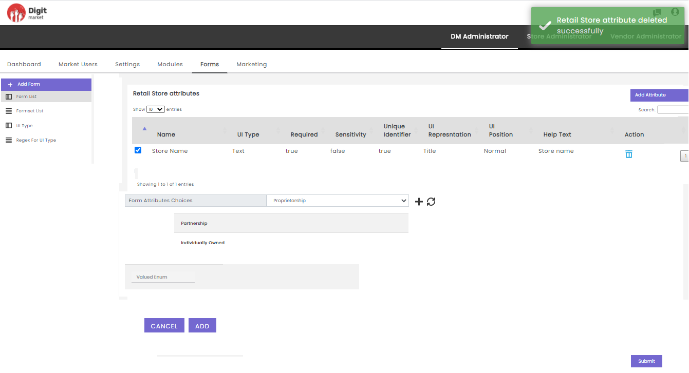
Fig. 2.111 Attribute Delete Successfully in DM Administrator
Note
Default attributes cannot be deleted.
- Form Attributes Choices displays all the attributes in the form. Click the plus icon
to clear the entered values.
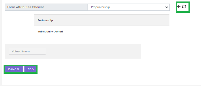
Fig. 2.112 Form Attributes Choices
If the user wants to define form attributes having a fixed set of values, then the user must select UI Type as ‘drop down’, then data values for those enums are set here.
The Add button allows you to add multiple values and the Cancel button to exit.
- Click Submit. The saved data is visible for the created categories.
- Click the delete icon
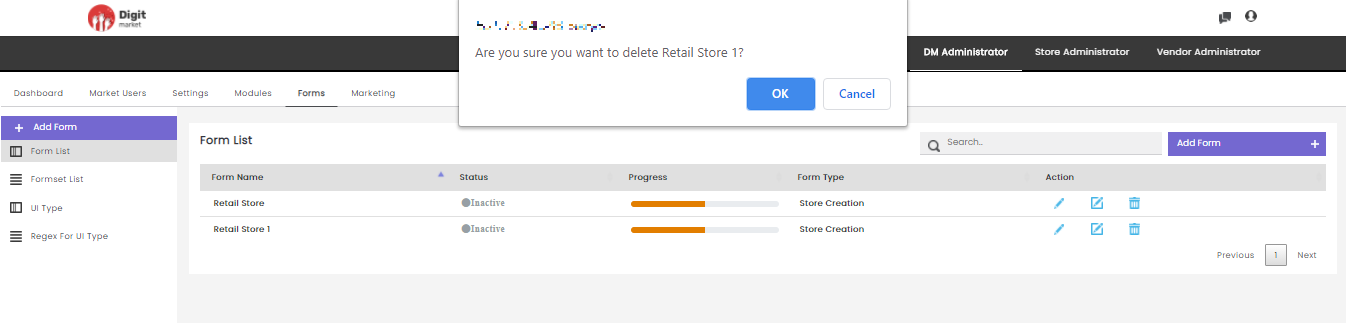
Fig. 2.113 Warning Message for Deleting the Form List in DM Administrator
Click OK to delete or Cancel to exit.
Users can also perform:
- Search: Allows users to search form attributes by giving a phrase or a key value. It is recommended to populate this field with relevant information so that locating through search will be quicker.
- Add Form: Click on Add Form to see how to create.
Formset List: Click the Formset List tab from the left panel, the Formsets List page will be displayed as shown below:
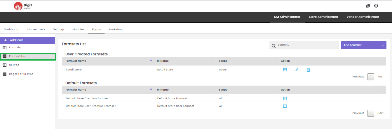
Fig. 2.114 Formset List
The Formsets List page displays all the forms in two sections User Created Formsets and Default Formsets along with the details such as:
- FormSet Name: Name for the formsets given at the time of creation.
- UI Name: Displays the name.
- Scope: Display the scope either Peers or Self, chosen at the time of creation.
- Action:
- Click the preview icon
to display the preview.
- Click the edit icon
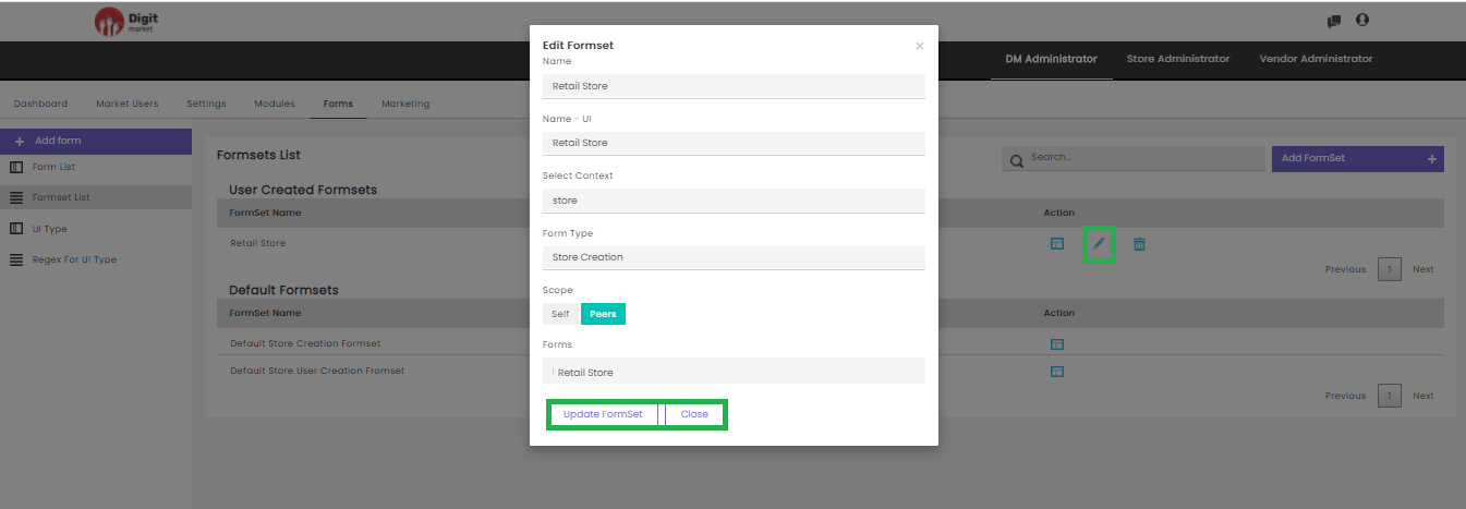
Fig. 2.115 Edit Formsets
On the above form, users can modify all the details and select forms. The form is a drop-down list where users can group different forms to make a formset. Already selected Forms will have
mark. Users can select more forms by clicking on the respective form name or deselect by clicking on the already selected form name.
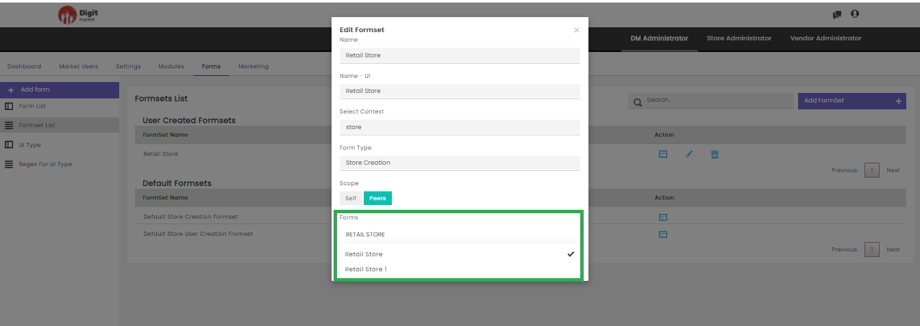
Fig. 2.116 Form Selection
Click the Update Formset to update the Formset or Close to exit.
- Action: Click the delete icon
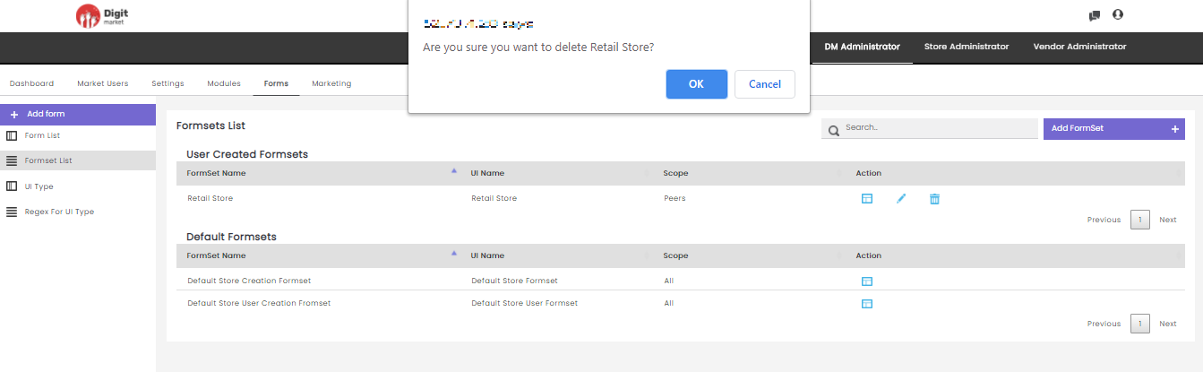
Fig. 2.117 Warning Message for Formset Deletion
Users can also perform:
- Search: Allows users to search the form attributes by giving a phrase or a key value. It is recommended to populate this field with relevant information so that locating through search will be quicker.
- Add Formset: Click Add Formset to create formset by providing the following details:
- Name: Name of the formsets.
- Name-UI: Name to be displayed in UI.
- Formset Type: Click the dropdown list to select from the options: Store Creation, Store User Creation.
- Select Context: Click the dropdown list to select.
- Scope: Set access by selecting either one among self or Peers.
- Forms: Click the drop-down list and select the forms where users can group different forms to make a formset. Already selected Forms will have
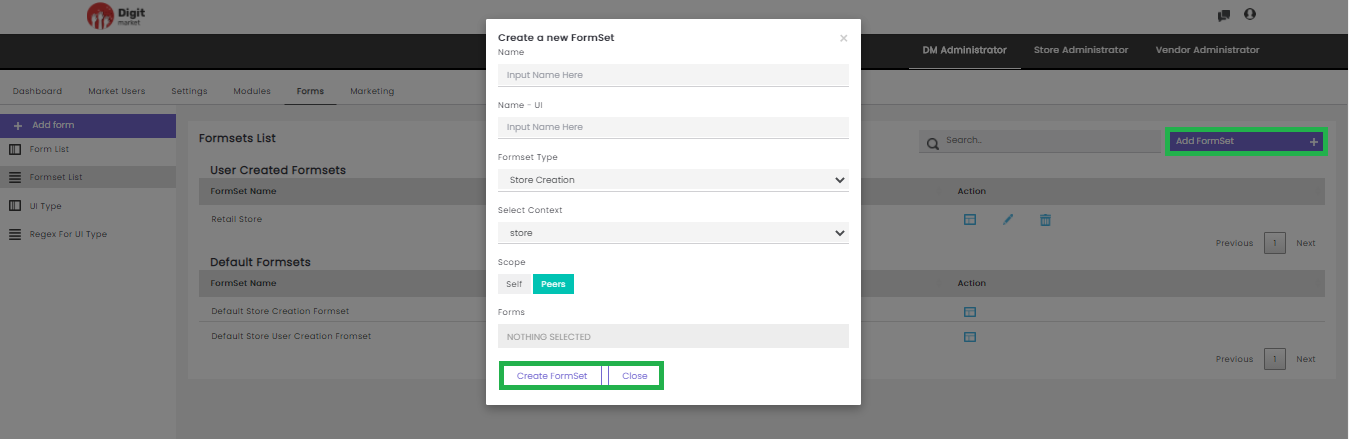
Fig. 2.118 Create Formsets
UI Type: Click the UI Type tab from the left panel, the UI Type List page will be displayed as shown below. Use Previous or Next to switch between the pages.
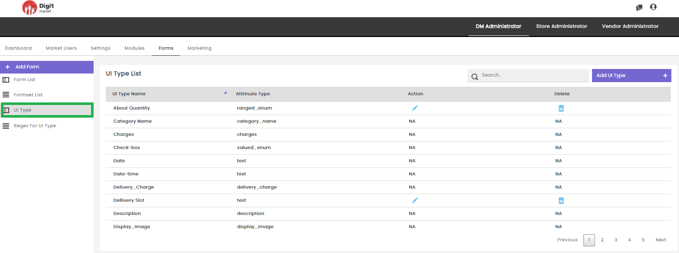
Fig. 2.119 UI Type
The UI Type List page displays all the UI type created along with the details such as:
- UI Type Name
- Attribute Type
- Action: Click the edit icon
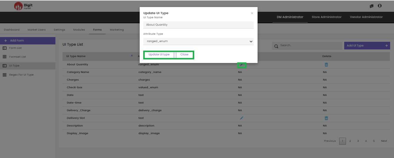
Fig. 2.120 Update UI Type
Edit the required field and click the Update UI Type button to update the details or Close to exit.
- Delete: Click the delete icon
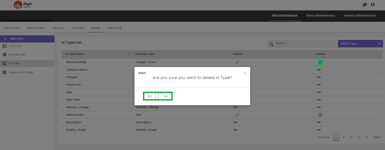
Fig. 2.121 Delete UI Type
Click the Yes to delete or No to exit.
Note
Users cannot edit or delete the default UI Type Name.
Users can also perform:
- Search: Allows users to search by giving a phrase or a key value. It is recommended to populate this field with relevant information so that locating through search will be quicker.
- Add UI Type: Click the Add UI Type tab, the Create a new UI Type dialog will be displayed as shown below:

Fig. 2.122 Add UI Type
In the Create a new UI Type dialog, provide the UI Type Name. Click the Create UI Type to create or Close to exit.
Regex For UI Type: Click the Regex For UI Type tab from the left panel, the Regex List page will be displayed. Use Previous or Next to switch between the pages.
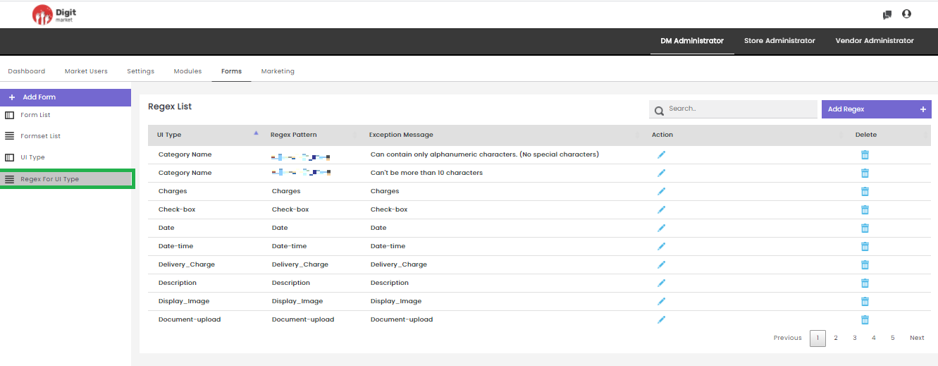
Fig. 2.123 Regex for UI Type
- UI Type
- Regex Pattern
- Exception Message
- Action: Click the edit icon
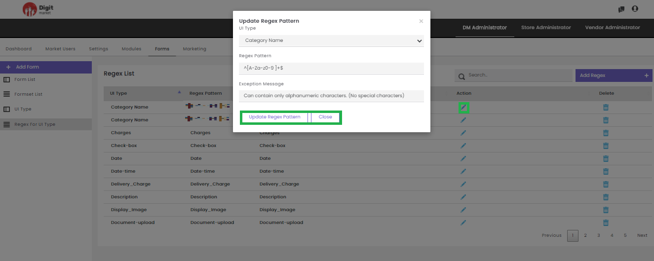
Fig. 2.124 Update Regex Pattern
- Delete: Users can delete a regex by clicking the delete icon
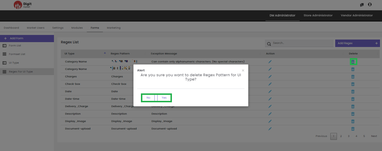
Fig. 2.125 Delete a Regex
Click the Yes to delete or No to exit.Users can also perform:
- Search: Allows users to search by giving a phrase or a key value. It is recommended to populate this field with relevant information so that locating through search will be quicker.
- Add Regex: Click the Add Regex tab, the Create a new Regex dialog will be displayed as shown below:
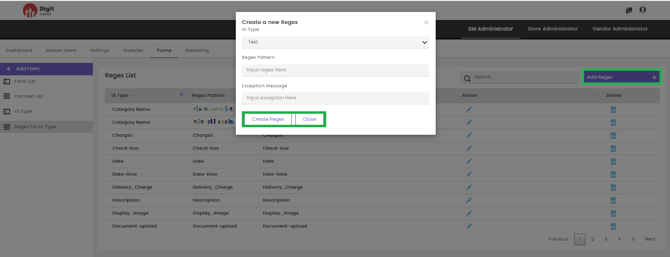
Fig. 2.126 Add Regex
In the Create a new Regex dialog, provide the UI Type, Regex Pattern, Exception Message. Click the Create Regex to create or Close to exit.
2.10.6. Marketing
The Marketing module is used for sending an invite via E-mail or SMS. The invite has to send to Store Users who wish to be part of the Digit Market™ platform.
Steps for sending an Invite Store users:
- Compose the message. Click on Compose Message to see how it works in Digit Market™.
- Generate the Invite. Click on Generate Invite to see how it works in Digit Market™.
- Send the Invite. Click on Send Invite to see how it works in Digit Market™.
- Fill the form and wait for apporval.
Once you log-in as the DM Administrator, click the Marketing tab, the Invite List page will be displayed. Use Previous or Next to switch between the pages.
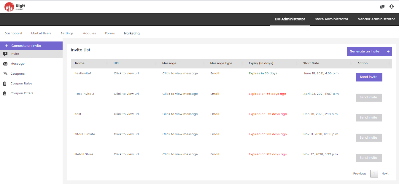
Fig. 2.127 Invite List
On the Invite List page users have the following options:
Generate Invite: Click the Generate Invite tab, displays the Generate an Invite dialog as shown below:
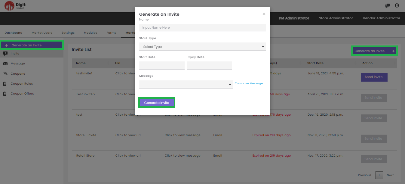
Fig. 2.128 Generate an Invite
On the Generate an Invite dialog, provides all the information like Name, Store Type, Start Date, Expiry Date, Message, Compose Message.
Here users can select the preconfigured message or compose the customized message as shown below:
- Click the Message will display all the messages as drop-down and select any as shown below:
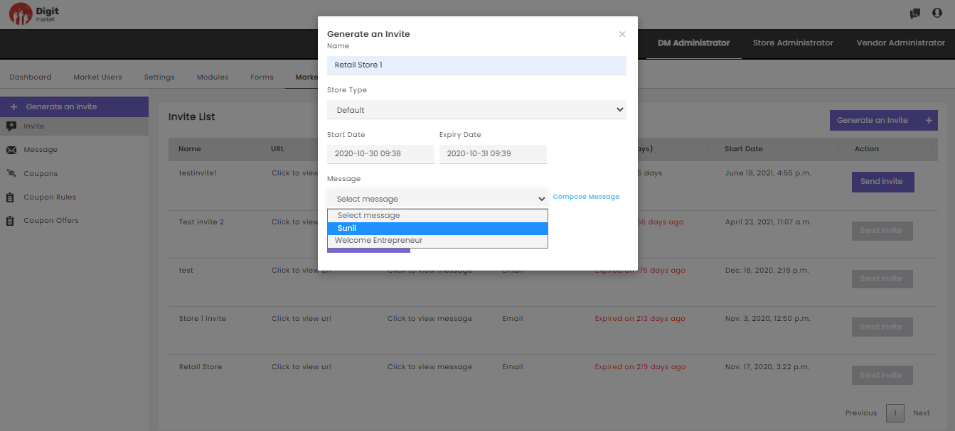
Fig. 2.129 Default Message in DM
- Click the Compose Message to compose a customized message by providing Name, Store Type, Message type as shown below:
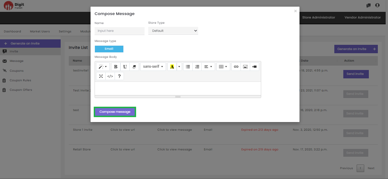
Fig. 2.130 Compose Message
Click the Compose message button to compose the message or click
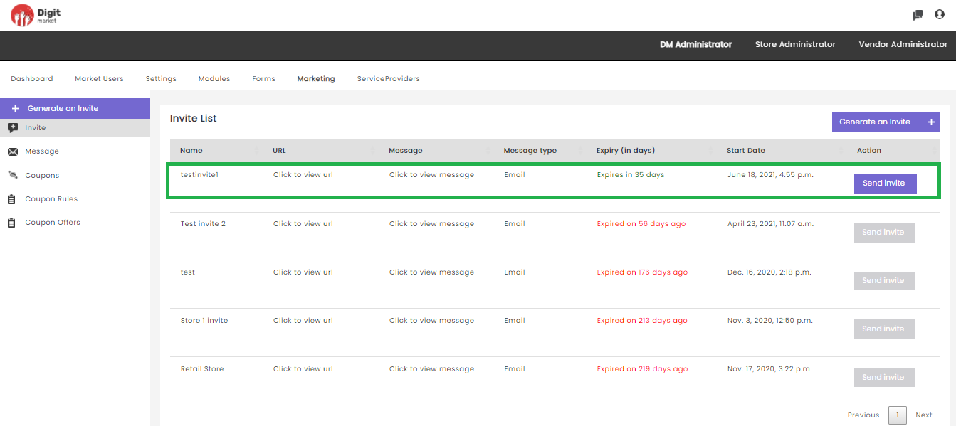
Fig. 2.131 Send Invite in DM
On clicking the Send Invite button the Send Invite dialog will be displayed as shown below:
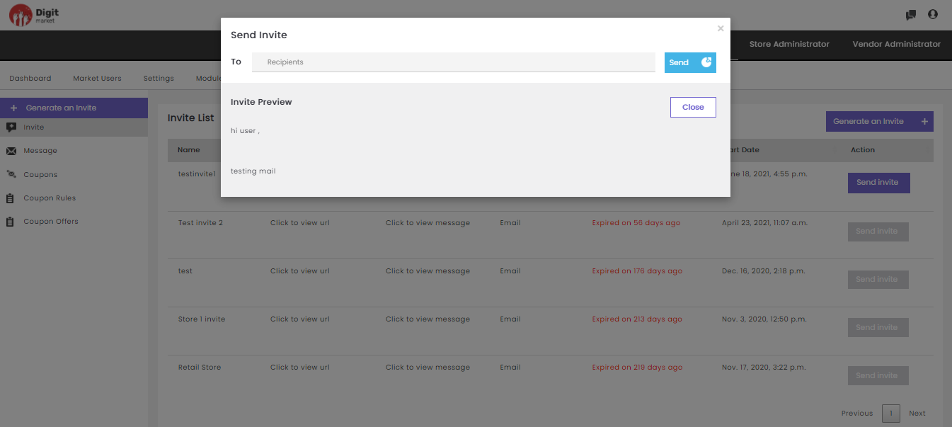
Fig. 2.132 Send Invite Dialog in DM
On the Send Invite dialog provide ‘To’ address and click the Send button to send or click the Close
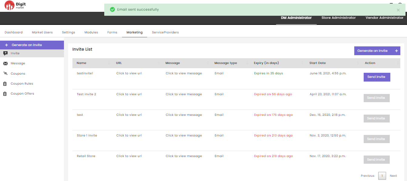
Fig. 2.133 Email send
Once the invite has recieved by the user, he has to fill the form and submit it. The DM Administrator can take the corresponding action on the Store Onboard Requests tab.
Invite: Same functionality as above.
Message: Click the Message tab, displays the Message List page. This page displays all the messages along with the details like Name, Type, Message type, Message, Action. Use Previous or Next to switch between the pages.
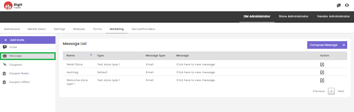
Fig. 2.134 Message List Page
Click the edit icon
the Update Message dialog will be displayed as shown below:
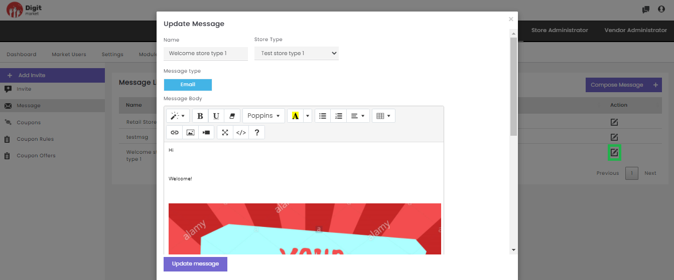
Fig. 2.135 Update Message
In the Update Message page, the user can edit all the required details and click on the Update message button to update or click the close icon
Click the Compose Message to create a new message. The functionality is as same as above click on Message to see the details.
Coupons: Coupons allows the admins to define a new coupon, coupon rule and associate an existing discount code to a coupon offer name. User must follow the below steps in order:
- Coupon Rule: Allows the user to create coupon rules at granular levels. It allows to associate with a predicate for evaluating criteria before applying the discount on the bill amount.
- Coupon Offers: Allows the user to create coupon offer, define the discount amount, and select a rule created on above step. Users can also create a compound rule using AND and OR logic if necessary, upon which coupon can be applied.
- Coupon: Allows the user to associate the created coupon offers with a coupon ticket and define the range of dates the coupon is applicable.
- Coupons: Click the Coupons tab, displays all the created coupons along with the details like Coupon Ticket, Coupon Offer, Coupon Expire, Update and Delete. Use Previous or Next to switch between the pages.
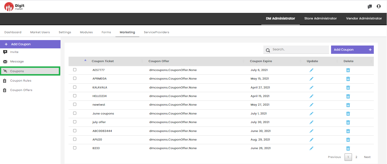
Fig. 2.136 Coupons
- Update: Click the edit icon the Update Coupon dialog
will be displayed as shown below:
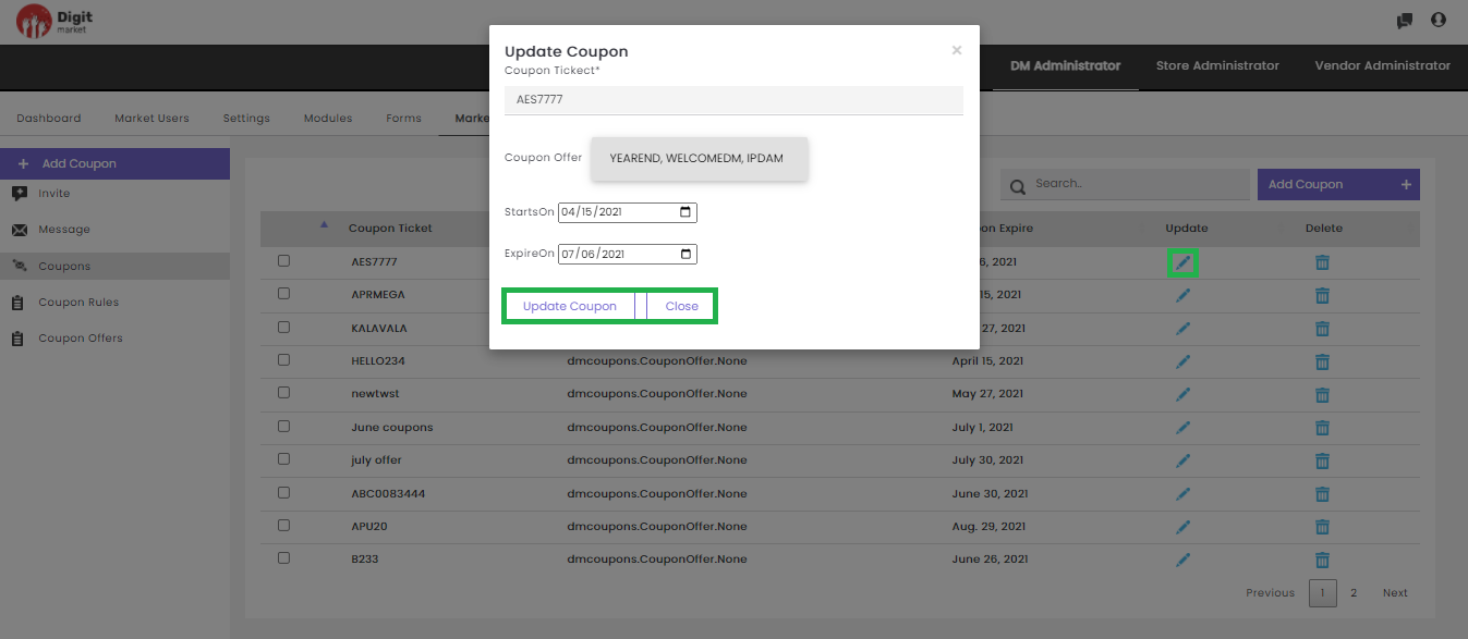
Fig. 2.137 Update Coupon
On the Update Coupon page, the user can edit all the required details in the Update Coupom dialog and click on the Update Coupon button to update the coupon details or click the Close button or cross icon
- Delete: Users can delete a coupon by clicking the delete icon
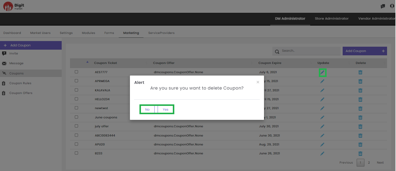
Fig. 2.138 Delete a Coupon
Click the Yes to delete or No to exit.
Users can also perform:
- Search: Allows users to search by giving a phrase or a key value. It is recommended to populate this field with relevant information so that locating through search will be quicker.
- Add Coupon: Click the Add Coupon tab, the Create Coupon dialog will be displayed as shown below:
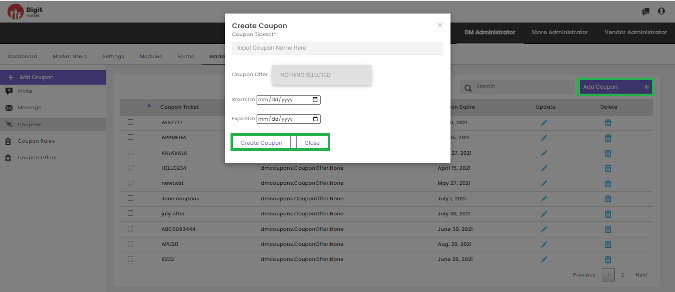
Fig. 2.139 Add Coupon
In the Create Coupon dialog, provide the details like:
- Coupon Ticket: Provide a name for coupon ticket
- Coupon Offer: Select already coupon offer’s from the from the drop-down
- StartsOn: The offer start date
- ExpiresOn: The offer start date
Click the Create Coupon button to create or Close to exit.
- Coupon Rules: This feature allows a discount code to associate with a predicate for evaluating the criteria before applying the discount on the bill amount and a discount percentage. Click the Coupon Rules tab from the left panel to display a page as shown below:
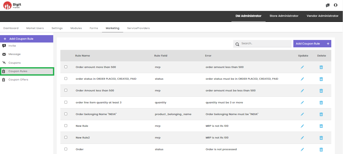
Fig. 2.140 Coupon Rules
The above page will display all the details like:
- Rule Name: The name given for the rule
- Rule Field: The field name for which the condition is applied
- Error: The error message to be displayed if the rule is not satisfying
- Update: Click the edit icon
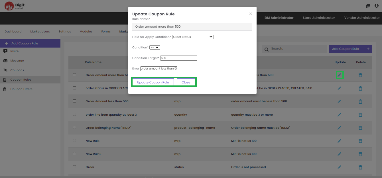
Fig. 2.141 Update Coupon Rule
Users can edit the required field and click the Update Coupon Rule button to update the details or Close to exit.
- Delete: Click the delete icon to delete the respective
row a warning message will be displayed shown below:
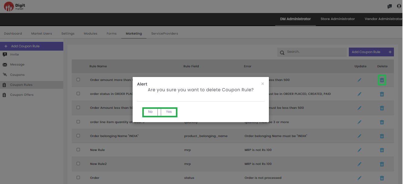
Fig. 2.142 Delete Coupon Rule
Users can also perform:
- Search: Allows users to search by giving a phrase or a key value. It is recommended populating this field with relevant information so that locating through search will be quicker.
- Add Coupon Rule: Click the Add Coupon Rule tab, the Create Coupon Rule dialog will be displayed as shown below:
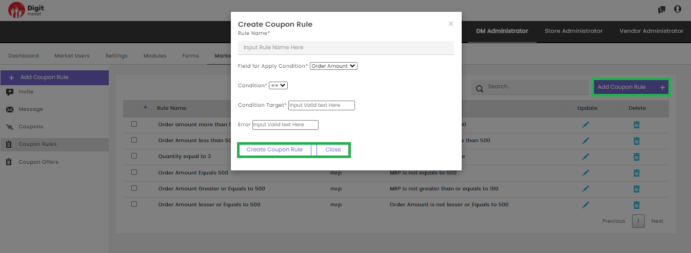
Fig. 2.143 Add Coupon Rule
In the Add Coupon Rule dialog provide the details like:
Rule Name: The name for the rule created.
Field for Apply Condition: The user must select a field for which rule needs to be created. The available options are:
Order Amount: The Coupon rule created based on the order amount.
Order Number: Once the store admin creates a coupon rule, the order number helps to validate the coupon code against the order number for a particular customer based on the logical operator selected.
For example if the :
- Order Number is ‘3’ and Condition is ‘==’: Then the coupon code can be applied only on the third order.
- Order Number is ‘3’ and Condition is ‘<=’: Then coupon can be applied either on first or second or third order.
- Order Number is ‘3’ and Condition is ‘<=’: But if the customer already placed three orders and this is the fourth order, then it becomes an invalid coupon.
Note
Coupon code can applied only once.
- Quantity: The Coupon rule created based on the quantity.
- Condition: Select any conditional operator from the drop-down.
- Condition Target: User must type in the target field name.
- Error: Type-in the error message that needs to be displayed if the condition fails.
Click the Create Coupon Rule to create or Close to exit.
- Coupon Offers: Click the Coupon Offers tab from the left panel to display the offer details as shown below:
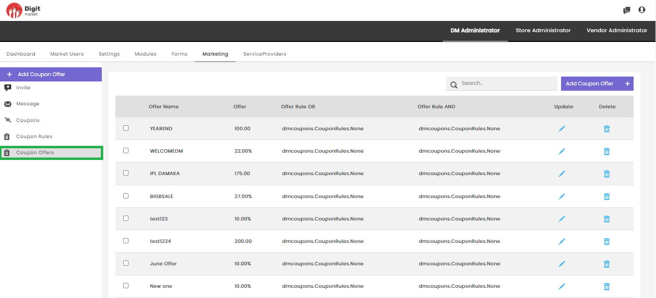
Fig. 2.144 Coupon Offers
The above page will display details like:
- Offer Name: The name given for the offer.
- Offer: The offer value either in amount or in percentage.
- Offer Rule OR: The list of rules to apply OR operations.
- Offer Rule AND: The list of rules to apply AND operations.
- Update: Click the edit icon
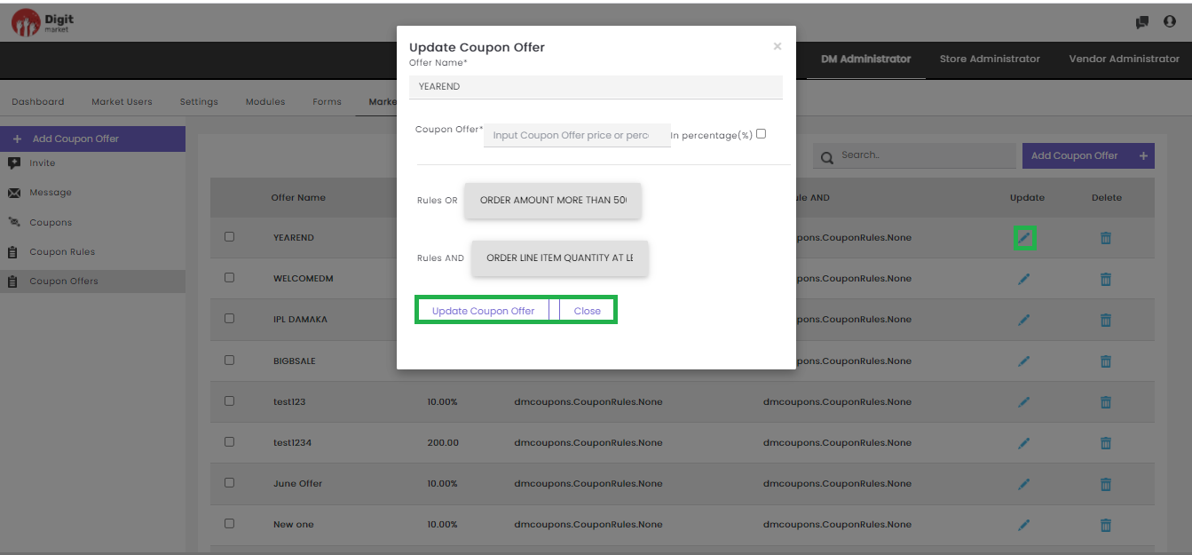
Fig. 2.145 Update Coupon Offer
- Delete: Users can delete a coupon offer by clicking the delete
icon a warning message will be displayed as shown below:
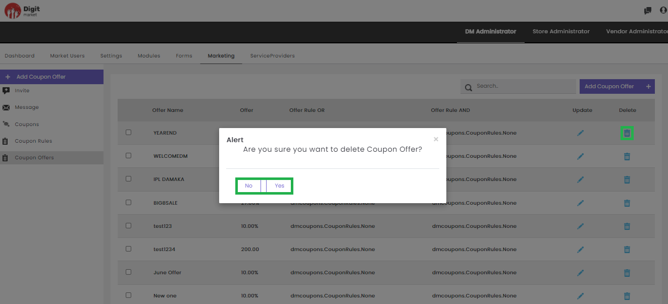
Fig. 2.146 Delete Coupon Offer
Click the Yes to delete or No to exit.
Users can also perform:
- Search: Allows users to search by giving a phrase or a key value. It is recommended to populate this field with relevant information so that locating through search will be quicker.
- Add Coupon Offer: Click the AddCouponOffer tab, the Create Coupon Offer dialog will be displayed as shown below:
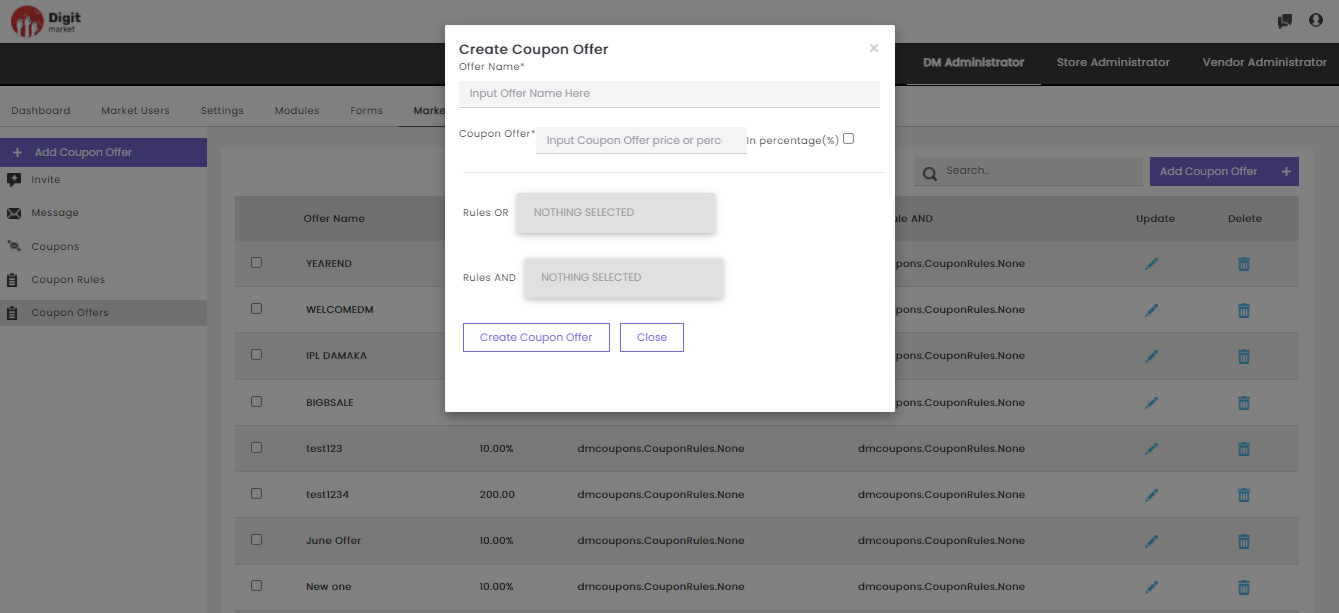
Fig. 2.147 Add Coupon Offer
In the Create Coupon Offer dialog provide the details like:
- Offer Name: Provide a name for the offer.
- Coupon Offer: Enter an offer amount as amount or check the checkbox if you wish to discount in percentage.
- Rule OR: Select the rule that should apply OR logic from the drop-down.
- Rule AND: Select the rule that should apply AND logic from the drop-down.
Click the Create Coupon Offer to create or Close to exit.
2.11. Store Administrator
Stores are online marketplaces where vendors can advertise their products/services and visitors to the stores can purchase those products/services. DigitMarket™ creates organized and user-friendly storefronts for the convenience of the vendors and their customers.
These users are linked to a specific store. With the multi-tenant platform feature of DigitMarket™, a store user can be linked to multiple stores. The store users will also get single-point access to the required stores with an option to switch between stores. Store users are responsible for the creation and monitoring the vendor users.
This user is responsible for creating/monitoring the vendor and creating/associating the vendor users to that vendor. He can optionally define vendor-specific order/product life cycles. These are the only group of users who can create store-specific categories for the store.
- They can create products.
- They can optionally create other store Employees and assign them to required user groups and name their role.
2.11.1. Dashboard
As Store Administrator, when you Sign-in to DigitMarket™ application the landing page will be the Store Administrators Dashboard page. This page will show total onboarded vendors, vendor admins, and customers as shown below:
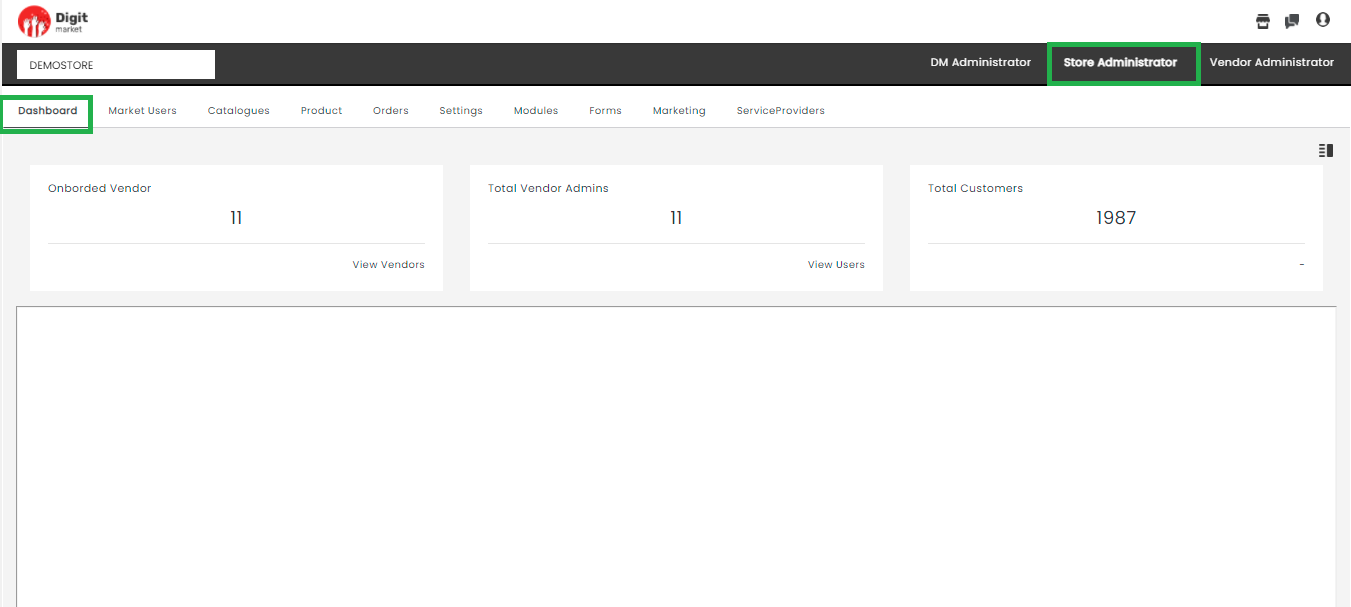
Fig. 2.148 Store Admin Dashboard
Click the View Vendors tab to display the Vendor List page and click the View Users to display the Vendor Admin page.
Quick Action Shortcuts
The Quick Action Shortcuts in Store Administrator are Chat via chat icon and Switch Role and Logout via user icon .
Click the StoreFront icon  to display the storefront of the respective user. The Storefront will display the products and its categories in the storefront.
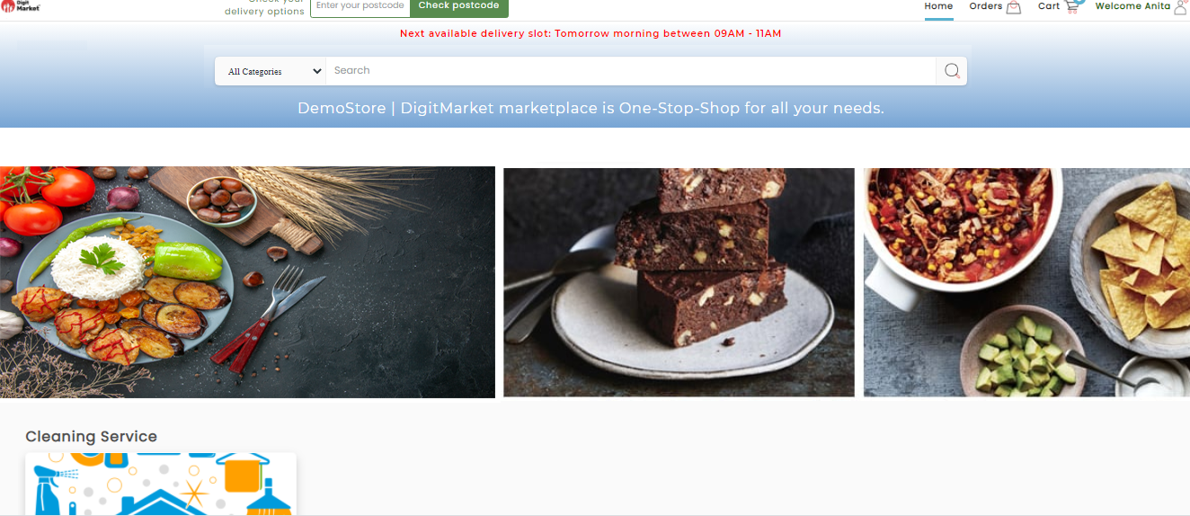
Fig. 2.149 Store Front
Click the chat icon to display the chat history as shown below. DM chat helps the interactions between the DM users. The DM chat initiator can search and select the intended recipient and initiate a chat request.
However, the chat can intiated based on few conditions:
If the superuser wants to chat with the lower-level user, they can chat directly without accepting the chat request by the lower-level user.
If the lower-level user wants to chat with the superuser, then the superuser permission is needed (they should accept it). Once the superuser accepts, the chat feature will be enabled and they can interact using this feature or else it will be in disabled mode.
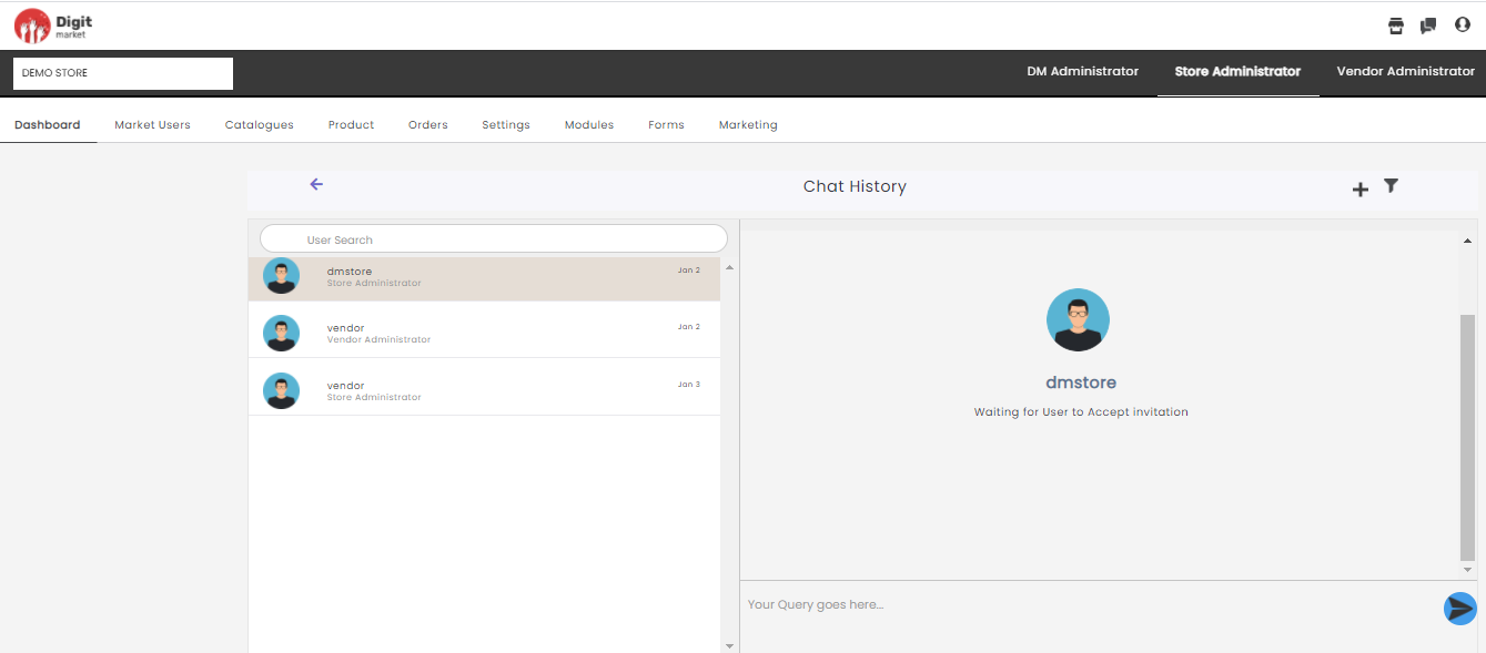
Fig. 2.150 Chat History
User Search: This field helps to search for other users.
The left panel will display all the users who have initiated the chat request. Once the chat request has been sent they have to wait until the other user accepts it as shown below:
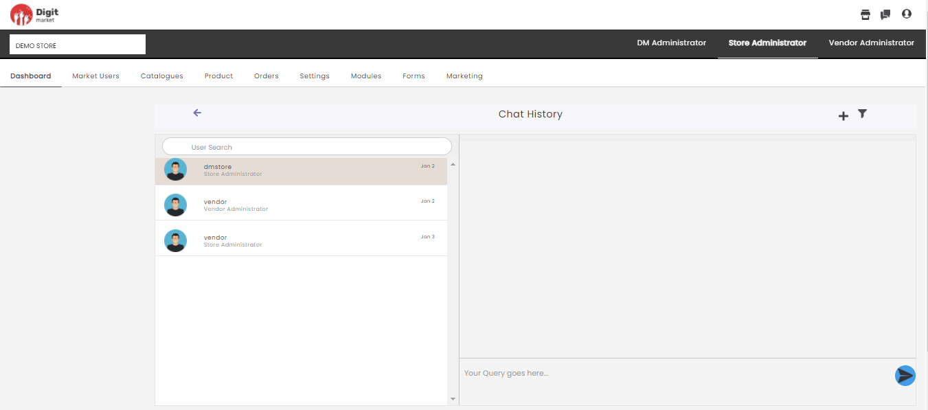
Fig. 2.151 New Chat
If the chat request has been accepted then users can type-in the queries on the right side as shown below:
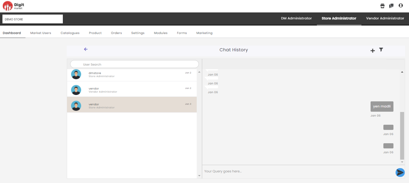
Fig. 2.152 Chat Initiated
Click the plus icon to display a new chat page as shown below:
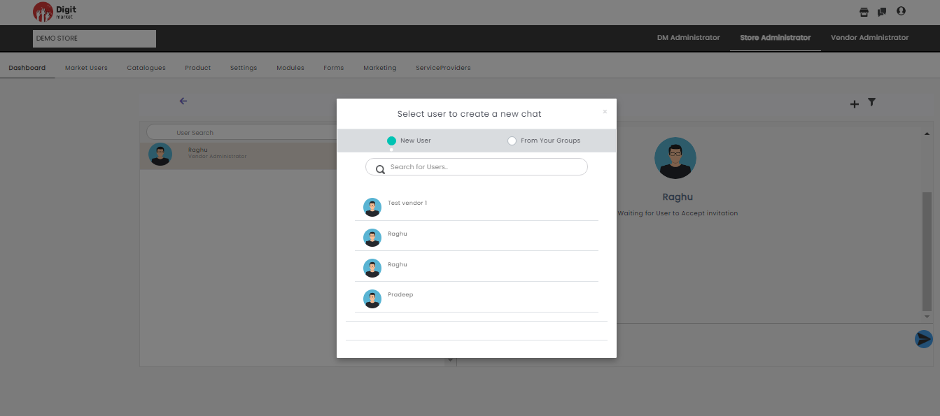
Fig. 2.153 Create New Chat
Here users can select the below options for a new chat:
- New User: Here the user can select any user, and send chat request once they accept user can start chatting with them.
- From Your Groups: This will display the other users associated with the logged-in user.
- Select for Users: Users can search the people from here and send chat request.
Click the filter icon  to filter the chats at different levels. Users can select store level/vendor level on the pop up.
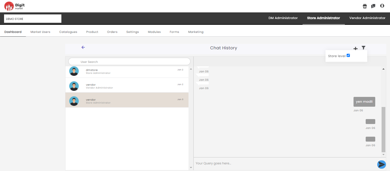
Fig. 2.154 Filter
Switch Roles
- At the top-right corner of the DigitMarket™ page, click the user icon to display the user menu.
Fig. 2.155 User Menu
Click the Switch Role to display the Switch Role window.
Fig. 2.156 Switch Roles
From the drop-down, select the required user role and click OK or click Cancel to exit.
Logout
Click the user menu icon to display the user menu and click the Logout button to log out from the portal.
2.11.2. Market Users
Market Users display the vendors corresponding to the selected Marketplace.
Once the user log-in as the Store Administrator, click the Market Users tab from the main menu the Vendor List page will be displayed. The Vendor List will display all the vendors along with details such as Vendor Name, Vendor Id, Vendor Admins, Action, and Vendor Status as shown below:
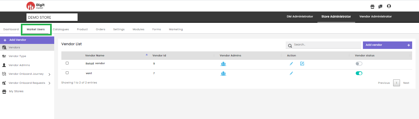
Fig. 2.157 Vendor List
On the Vendor List page users have the following options:
Add Vendor: Click the Add Vendor tab, displays the Create Vendor dialog as shown below:
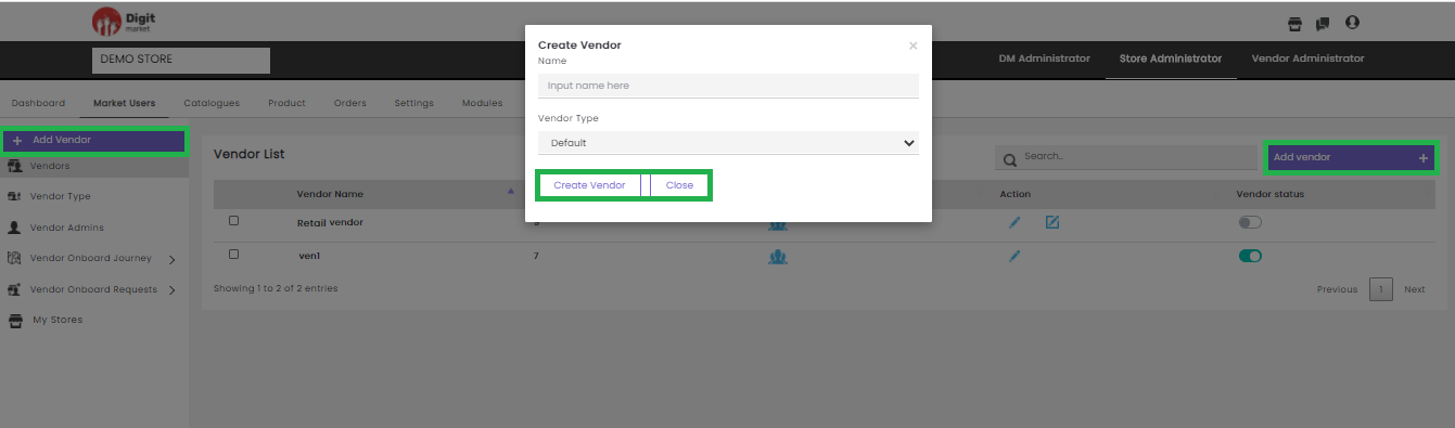
Fig. 2.158 Create Vendor
In the Create vendor dialog, provide the Name and Vendor Type for the new vendor. Click the Create Vendor button to create a new vendor and Close to exit.
- Search: Allows users to search vendors by giving a phrase or a key value. It is recommended to populate this field with relevant information so that locating through search will be quicker.
- Vendors: Click the Vendors tab, the Vendor List page will be displayed. Vendor List page displays all the vendors along with details such as Vendor Name, Vendor Id, Vendor Admins, Action, and Vendor Status as shown below:
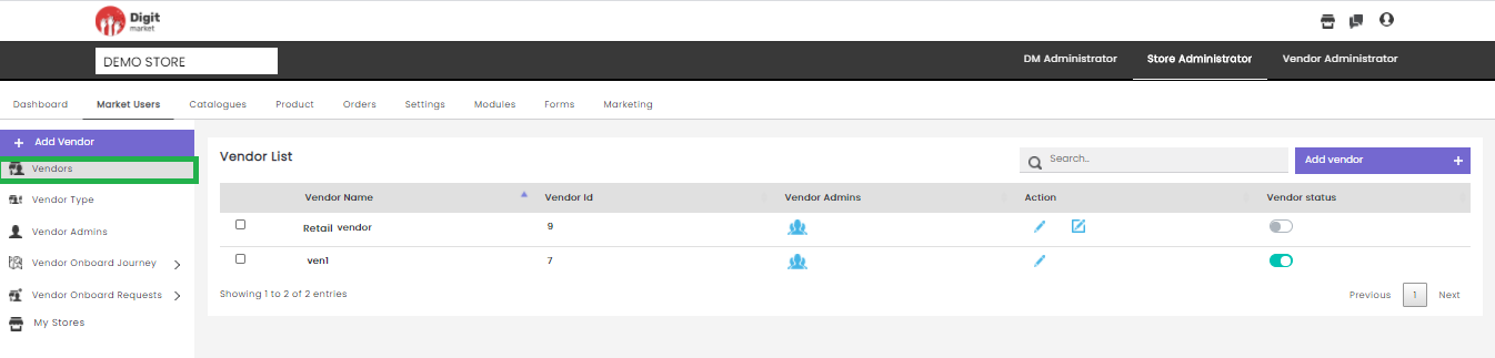
Fig. 2.159 Vendor List
- Vendor Name: Name of the vendor.
- Vendor Id: Id of the vendor.
- Vendor Admins: Here users can assign Vendor Admins. Click the user icon
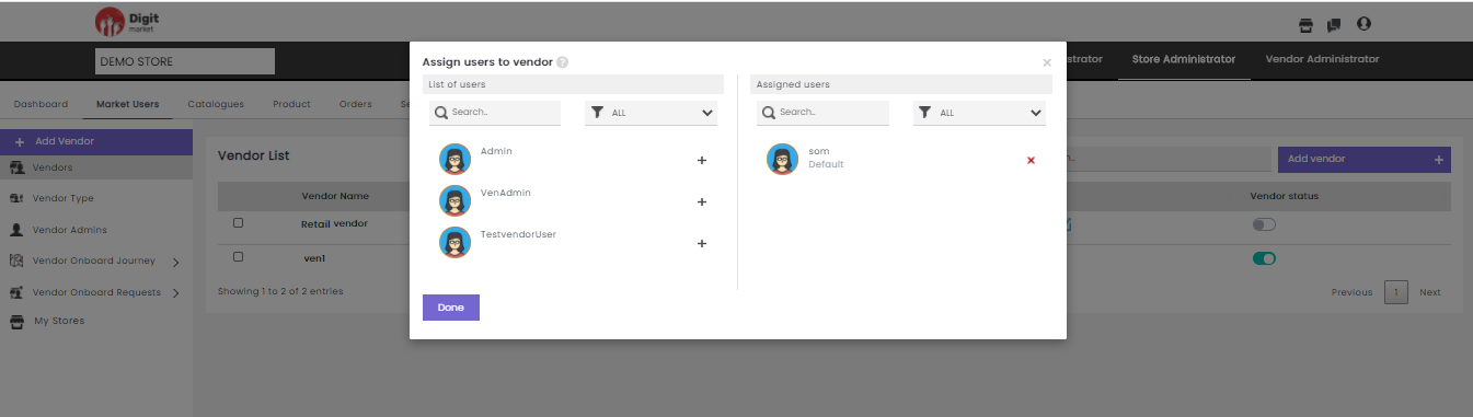
Fig. 2.160 Vendor Admin Actions
The Assign users to vendor dialog has a List of users and Assigned users. The List of users will display all the available vendor users and Assigned users will display the vendor users which is already assigned. Click the plus icon
Note
Only assigned vendor admin users can access the respective vendor.
- Action: Click the edit icon
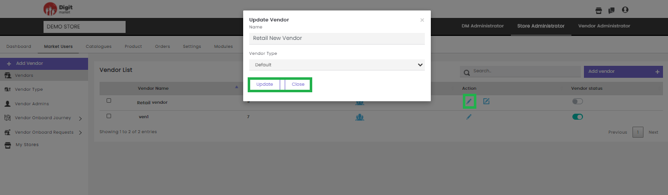
Fig. 2.161 Actions Vendor Admins
In the Update Vendor dialog, users can edit all the Name and Vendor Type and Click Update to add or click
Click the advanced edit icon
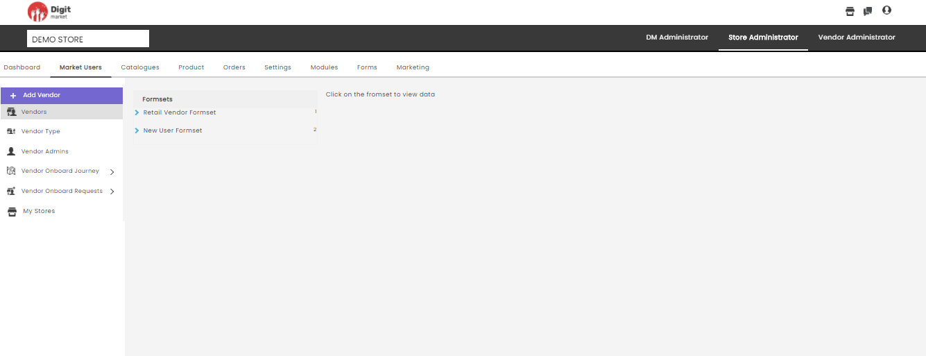
Fig. 2.162 Advanced Edit of Vendor
Vendor Status is a toggle button that allows you to Activate/Deactivate selected Vendors. The green button shows active clicking on it a warning message will pop-up as shown below:
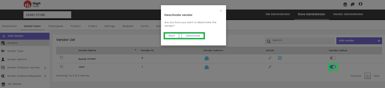
Fig. 2.163 Warning Message for Deactivating the Vendor
Click the Deactivate button to deactivate or Back to exit.
Users can also click the checkbox, to the corresponding Vendor to Activate or Deactivate the Vendor or click Cancel to exit.
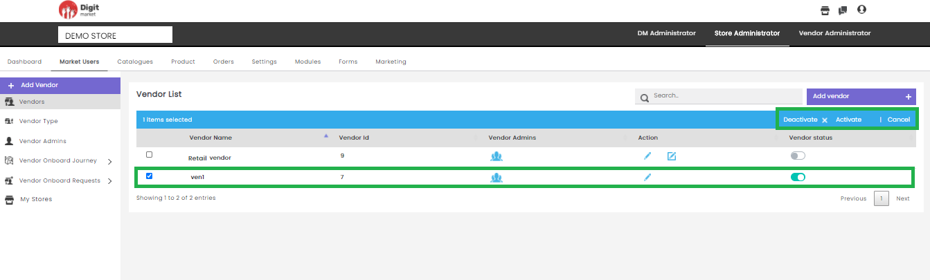
Fig. 2.164 Activate/Deactivate Vendor User
Click the Activate button on the Vendor List page the Activate vendor dialog will be displayed. Click the Activate button to activate the user or Back/
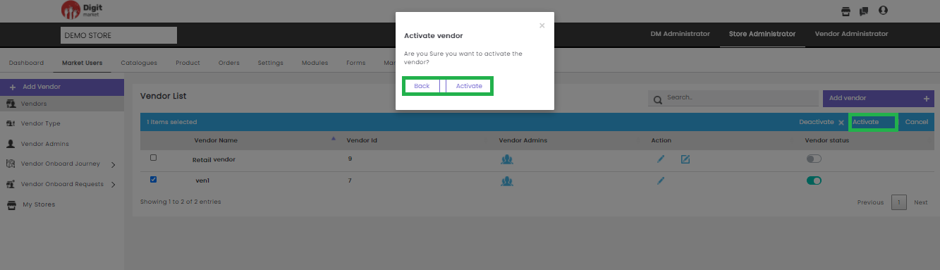
Fig. 2.165 Activate Vendor
Click the Deactivate button on the Vendor List page the Deactivate vendor dialog will be displayed. Click on the Deactivate to deactivate the user or Back/
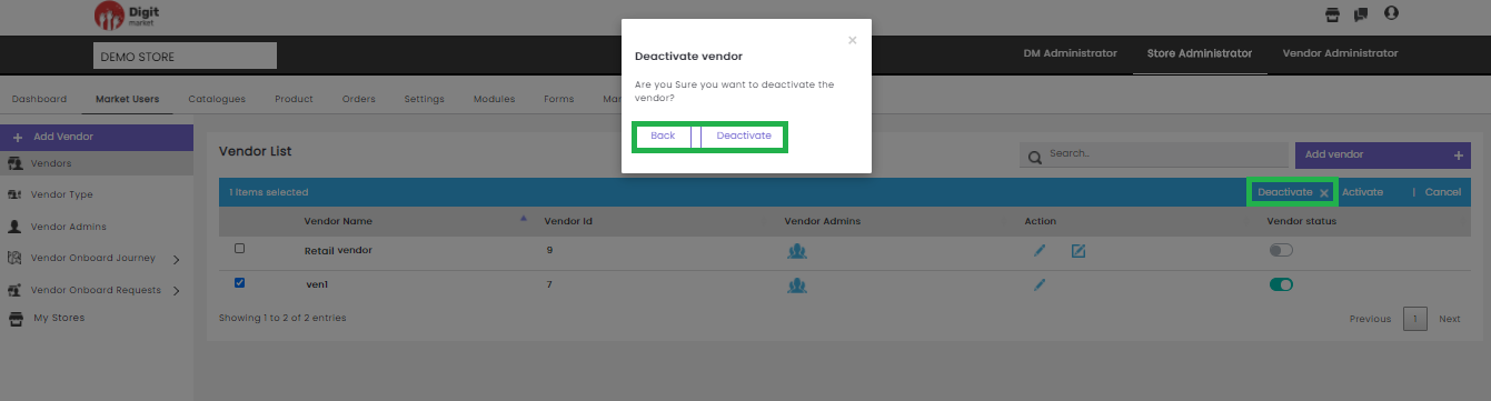
Fig. 2.166 Deactivate Vendor
Note
Once the vendor is deactivated, he cannot login to the application.
Users can also perform:
- Search: Allows users to search Vendor by giving a phrase or a key value. It is recommended to populate this field with relevant information so that locating through search will be quicker.
- Add Vendor: Click the Add Vendor tab, the Create Vendor dialog will be displayed as shown below:
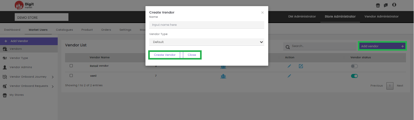
Fig. 2.167 Add Vendor
In the Create Vendor dialog, provide the Name and Vendor Type for the new Vendor. Click the Create Vendor button to create a new vendor and Close to exit.
Vendor Type: Click the Vendor Type tab, VendorType List page will be displayed with all the vendor types in the store along with details such as Name, CreatedDate, Action.
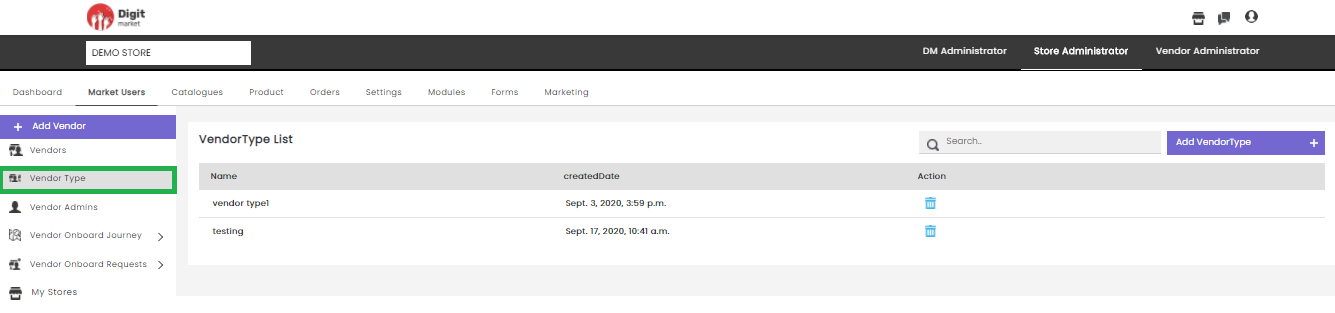
Fig. 2.168 Vendor Type List Page
Users can also perform:
- Search: Allows users to search Vendor Type by giving a phrase or a key value. It is recommended to populate this field with relevant information so that locating through search will be quicker.
- Add VendorType: Click the Add VendorType tab, the Create VendorType dialog will be displayed as shown below:
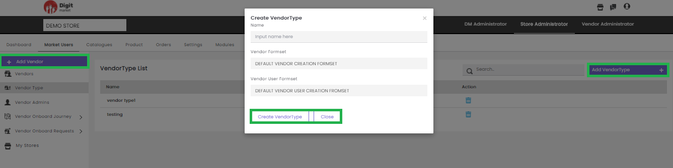
Fig. 2.169 Create VendorType
In the Create VendorType dialog, provide all the details like:
- Name: Name of the vendor type.
- Vendor Formset: Select any from the drop-down list. Click the Formset List to see the Vendor Formset creation.
- Vendor User Formset: Select any from the drop-down list. Click the Formset List to see the Vendor User Formset creation.
Click the Create VendorType button to create the Vendor Type and close to exit.
Vendor Admin: Click the Vendor Admin tab, Vendor Admins page will be displayed. This page displays all Vendor Admins along with details such as Username, Email ID, Contact, Role Name, Vendors, Action and Status. Use Previous or Next to switch between the pages.
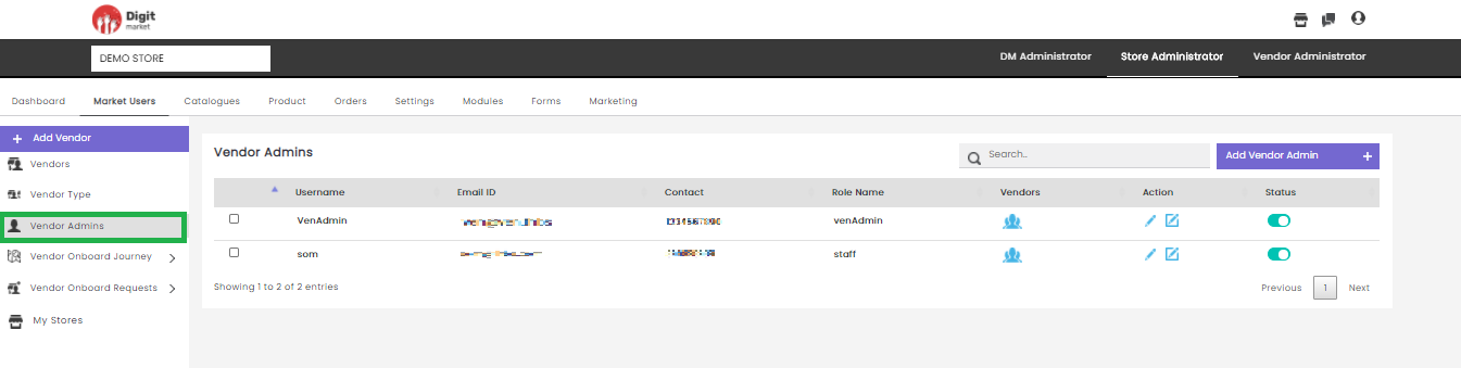
Fig. 2.170 Vendor Admins
- Username: The username of the vendor admins.
- Email-Id: The email id provided at the time of vendor admin creation.
- Contact: The contact number of the vendor admin which is given at the time of the creation.
- Role name: The role that is assigned to that admin at the time of the creation.
- Vendors: Here users can assign Vendor Users. Click the user icon
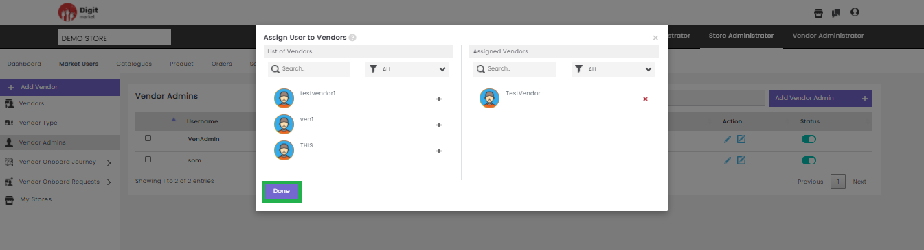
Fig. 2.171 Vendor Admin Action
The Assign User to vendors dialog has a List of vendors and Assigned vendors. The List of vendors will display all the available vendor users and Assigned vendors will display the vendor users which is already assigned. Click the plus icon
- Actions: Click the edit icon
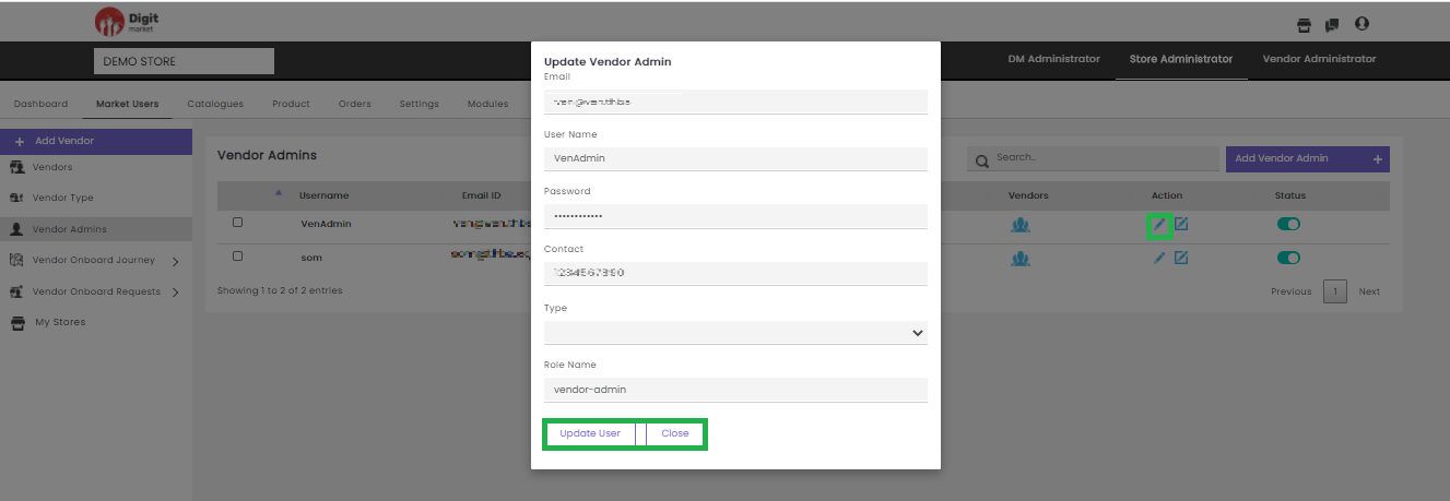
Fig. 2.172 Update Vendor Admin
In the Update Vendor dialog, users can edit all the info and Click Update User to update the details or click Cancel to exit.
Click the advanced edit icon
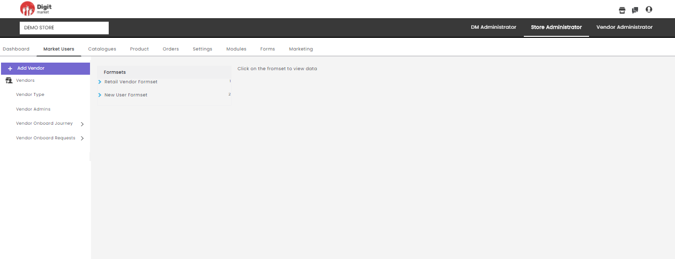
Fig. 2.173 Advanced Edit of Vendor
- Status: It is a toggle button that allows you to Activate/Deactivate selected Vendor Users.
The green button shows active, clicking on it a warning message will pop-up as shown below:
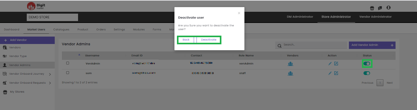
Fig. 2.174 Warning Message for Deactivating the Vendor Admin User
Click the Deactivate button to deactivate the user or Back/
Users can also click the checkbox to the corresponding Vendor to Activate or Deactivate single or multiple vendor Admin together or click Cancel to exit.
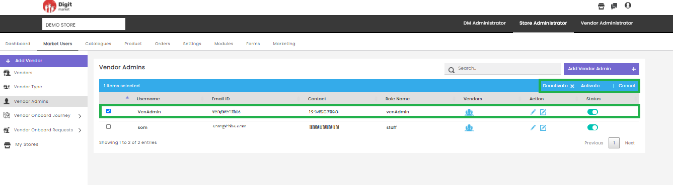
Fig. 2.175 Activate/Deactivate Vendor Admin
Click the Activate button on the Vendor Admins page the Activate user dialog will be displayed. Click the Activate button to activate the user or Back/
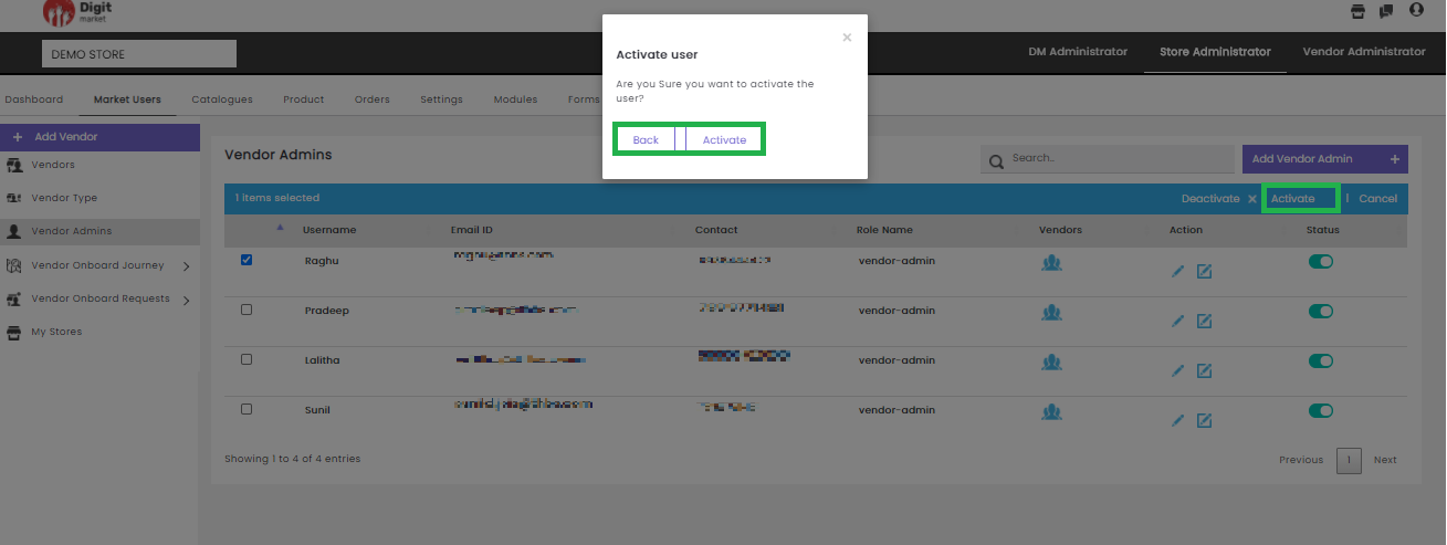
Fig. 2.176 Activate Vendor Admin
Click the Deactivate button on the Vendor Admins page the Activate user dialog will be displayed. Click the Deactivate button to deactivate the user or Back/
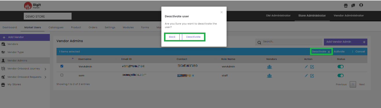
Fig. 2.177 Deactivate Vendor User
Users can also perform:
- Search: Allows users to search vendor admin by giving a phrase or a key value. It is recommended to populate this field with relevant information so that locating through search will be quicker.
- Add Vendor Admins: Click the Add Vendor Admins tab, displays the Create Vendor Admin dialog as shown below:
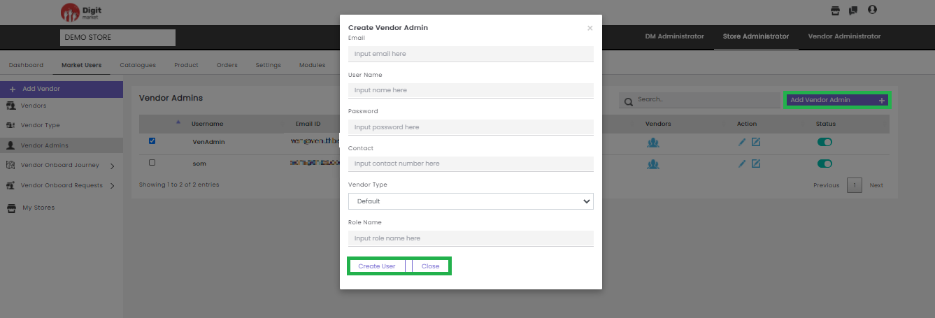
Fig. 2.178 Create Vendor Admin
In the Create Vendor Admin dialog, provide the Email, User Name, Password, Contact and Role Name for the new Vendor Admin. Click the Create User to create a new user and Close to exit.
- Vendor Onboard Journey: Click the Vendor Onboard Journey tab, in the left panel it has two options:
- Default: Click the Default tab from the left panel, Default Journey will be displayed in the middle panel as shown below:
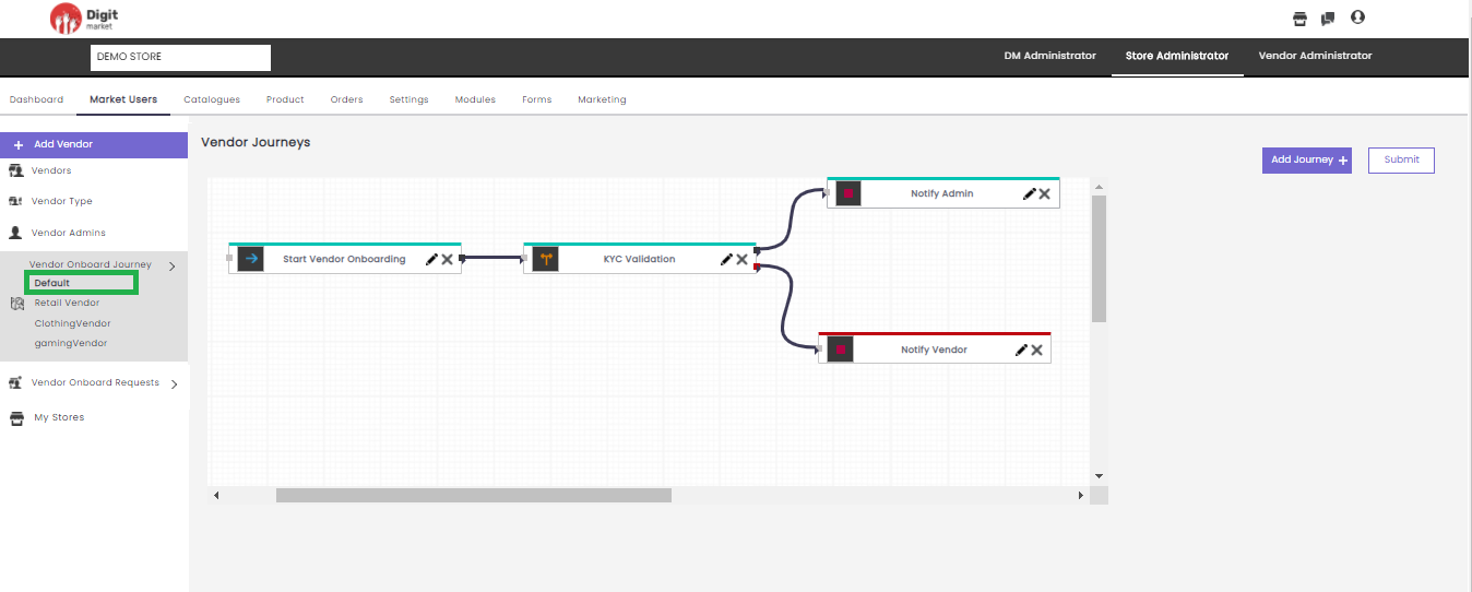
Fig. 2.179 Default Vendor Journey
Here users can perform the following actions:
- Add Journey: Click Add Journey displays all the already created modules in the drop-down. Select any one displays the node in the canvas as shown below:
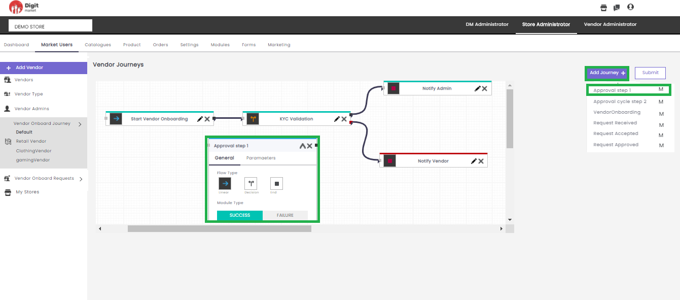
Fig. 2.180 Vendor Journey
In Add Journey, users can create a journey by selecting a module and providing other information like: Flow Type, Module Type and Parameters and click
- Submit: Click the Submit button to save and submit the flow a success message will be displayed as shown below:
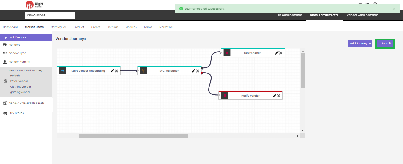
Fig. 2.181 Submit a Journey
- VendorType Onboard Journey: Click the Vendor Onboard Journey tab on the left panel, it will display all the vendor type in that store. Click on any vendor type will display the corresponding vendor journey as shown below:
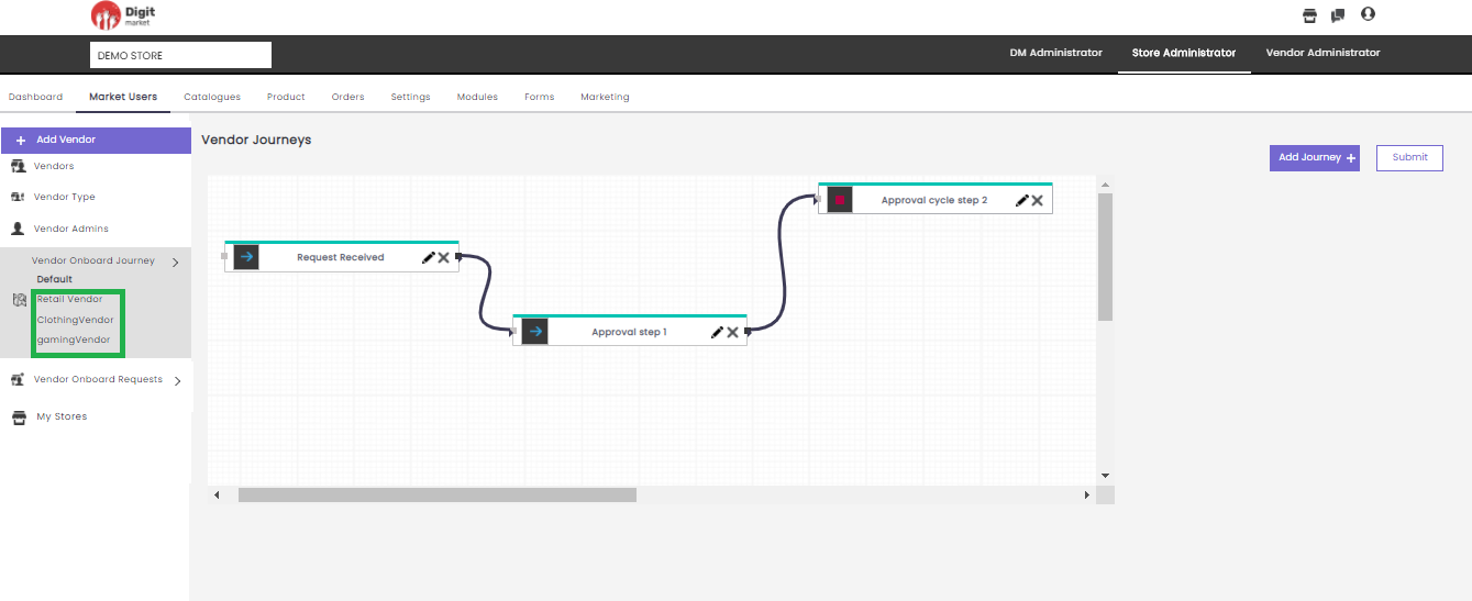
Fig. 2.182 Vendor Type Journey
Vendor Onboard Requests: Click the Vendor Onboard Requests tab from the left panel it is a collapsible window that displays Default Requests and all the Vendor Requests.
Once the Vendor Onboard invite has been filled and submitted, the invite initiator can view the data that was submitted and also get it through an approval life cycle and the final action can be performed. Vendor Onboard Request can be a default or a customized(the name given by the user) one. In any of the cases(default or customized) the approval life cycle will be :
- Received Requests
- Accepted Requests
- Approved Requests
- Rejected Requests
- Default: Click the Default tab, Default request will be displayed if any, else ‘There is no request data’ will be displayed as shown below:
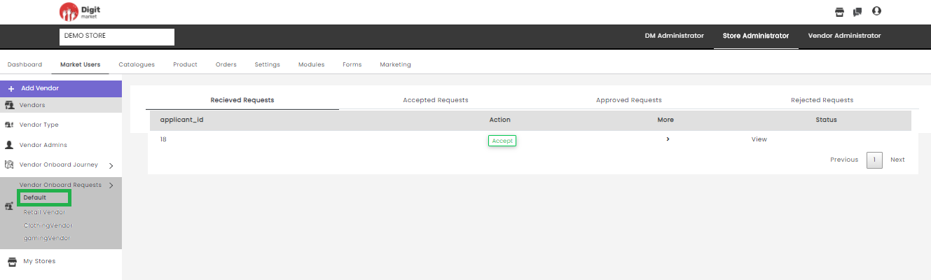
Fig. 2.183 Default Vendor Requests
- Other Vendor onboard Requests: Click the Vendor onboard Requests tab, the corresponding vendor request will be displayed.
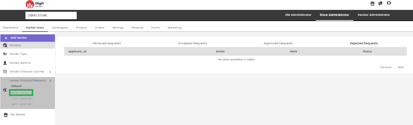
Fig. 2.184 Vendor Requests
- Received Requests:
- application_id: Id of the received requests.
- Action: Action to be taken for the received requests like ‘Accept’.
- More: Click the
- Status: Click the View button to display the status of the received request as shown below:
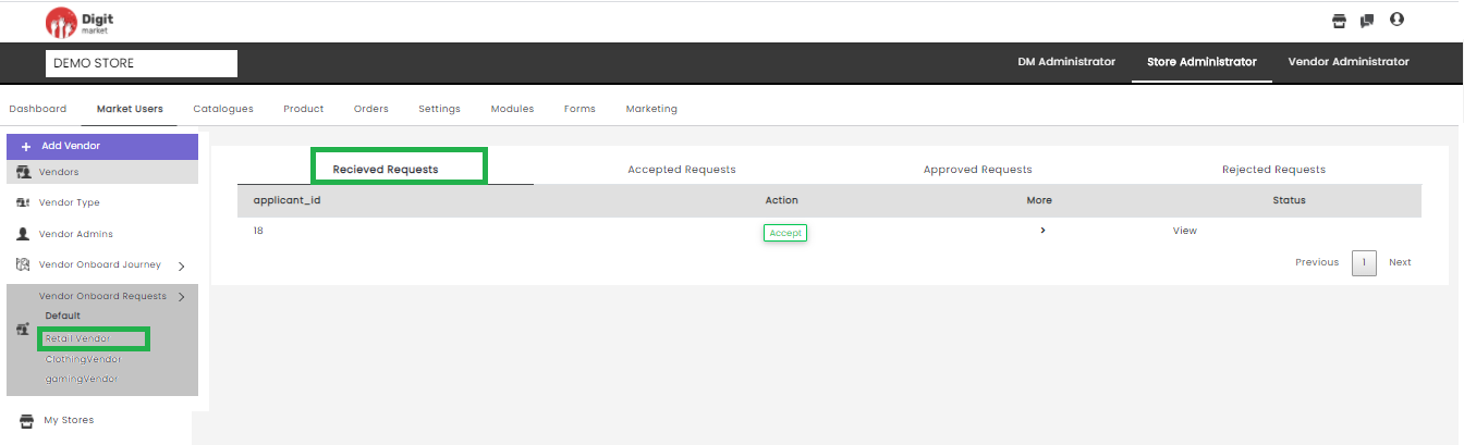
Fig. 2.185 Received Request
- Accepted Requests: Click the Accepted Requests tab, displays accepted requests as shown below:
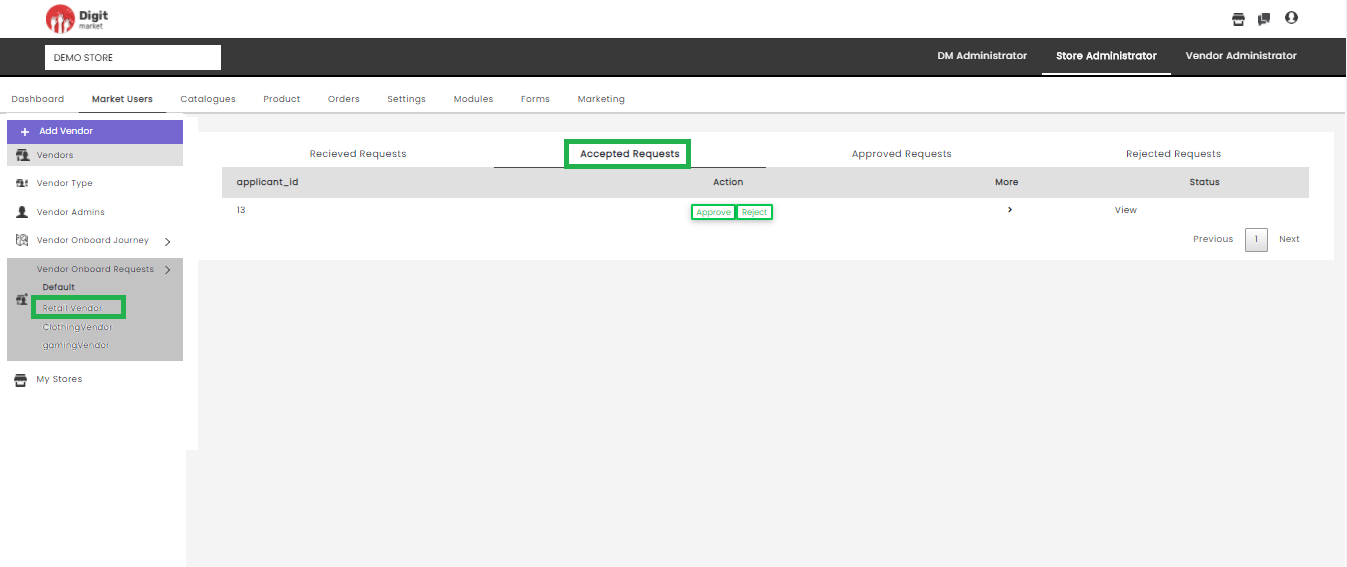
Fig. 2.186 Accepted Requests
It displays information like:
- application_id: Id of the accepted requests.
- Action: Action to be taken for the accepted requests like ‘Approve or Reject’. If the request is approved it will move to the next state (Approved Request) and the state will change to Onboard. If the request is Rejected it will displays as Rejected Request.
- More: Click the
- Status: Click the View button to display the status of the accepted request. The current state will be in blue and the previous will be in green color. Each state will display with date and time as shown below:
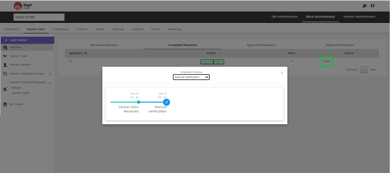
Fig. 2.187 Status of the Accepted Requests
Click the drop-down list in the Status dialog to see the states. Users can switch to any state, a warning message will be displayed as shown below:
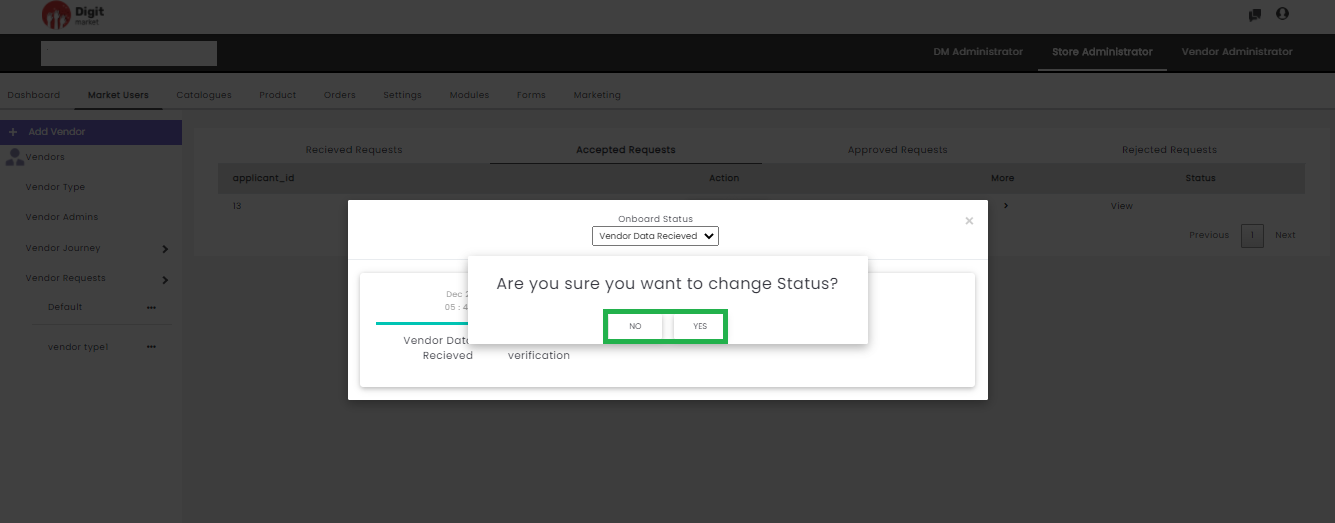
Fig. 2.188 Warning Message for State Change in Accepted Request
Click Yes to change the state or No to exit.
- Approved Requests: Click the Approved Requests tab, displays the approved requests as shown below:
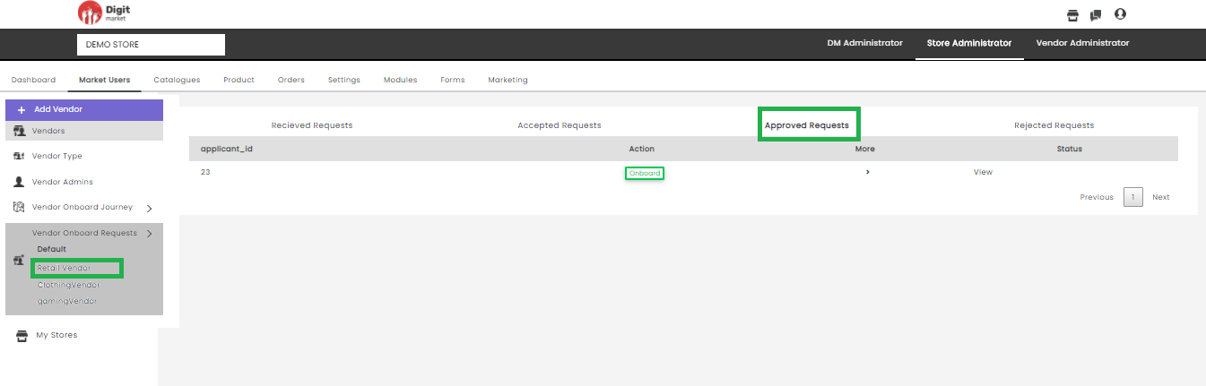
Fig. 2.189 Approved Request
It displays information like:
- application_id: Id of the approved requests.
- Action: Action to be taken for the approved requests like ‘Onboard’ as shown in the above figure.
- More: Click the
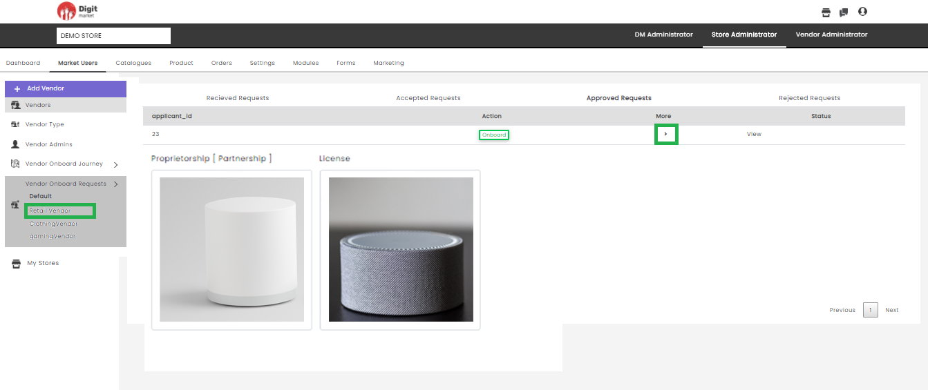
Fig. 2.190 More Details in Approved requests
- Status: Click the View button to display the status of the approved request. The current state will be in blue and the previous will be in green color. Each state will display with date and time as shown below:
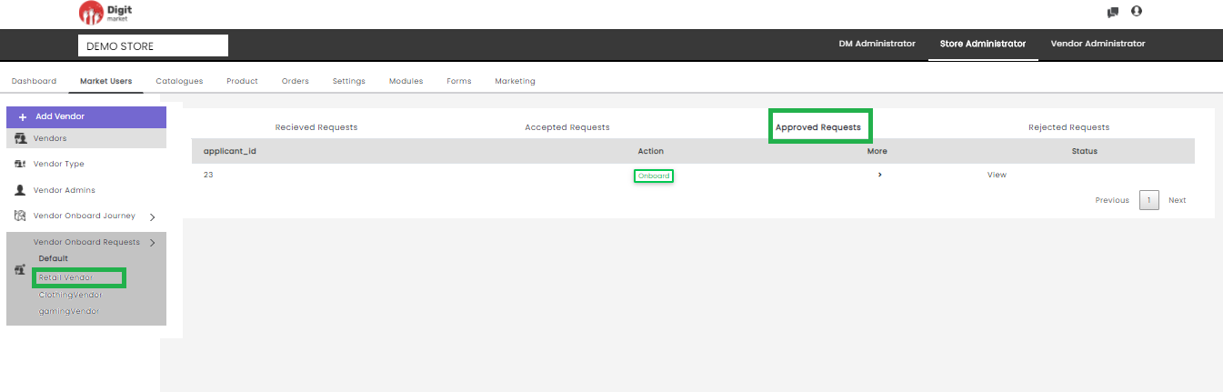
Fig. 2.191 Approved Request
Click the drop-down list in the Status dialog to see the states. Users can switch to any state a warning message will be displayed as shown below:
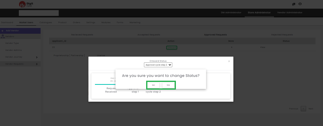
Fig. 2.192 Warning Message for State Change in Approved Request
- Rejected Requests: Click the Rejected Requests tab, displays the rejected requests as shown below:
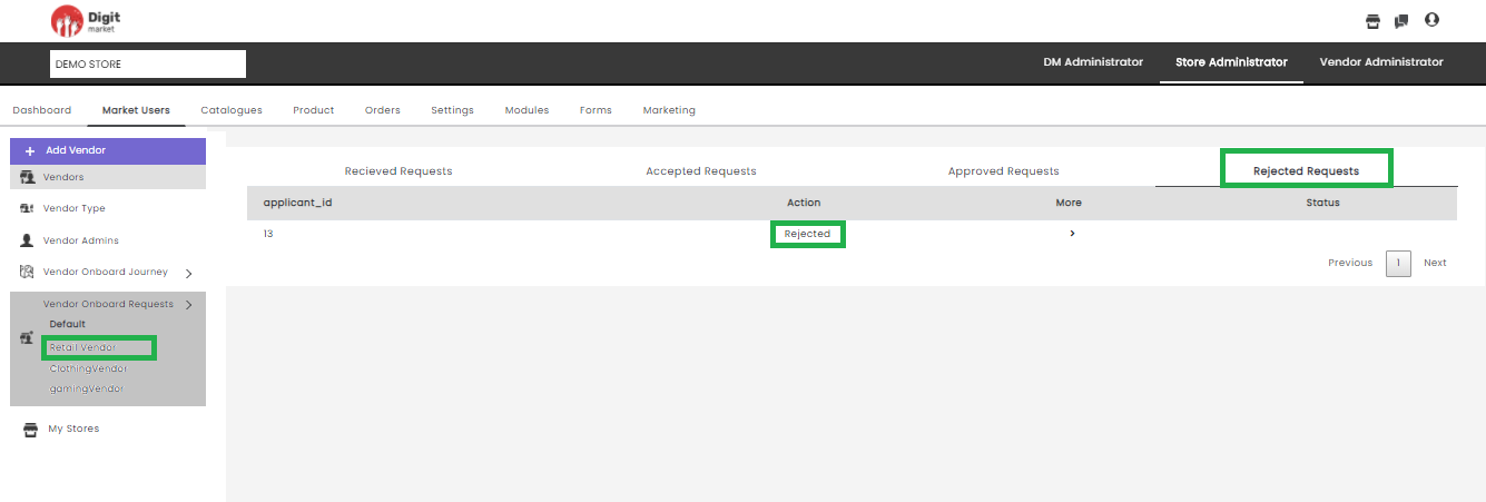
Fig. 2.193 Rejected Request
- application_id: Id of the rejected requests.
- Action: Action will display the state as ‘Rejected’.
- More: Click the
- Status: Click the View button to display the status of the rejected request.
My Stores: Click the My Stores tab from the left panel the Store List page will be displayed as shown below. This page displays all the stores corresponding to logged-in users along with the details such as Store Name, Store ID, Customer Auth, Action, Store Status and StoreFront for each Store. Based on pagination, records will be displayed on one page. Use Previous or Next to switch between the pages
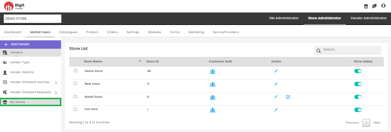
Fig. 2.194 My Stores
Store Name: Name of the store.
Store Id: Id of the store.
- Customer Auth: It will list the authentication type and users can
assign the authentication type. Click the user icon
corresponding to the store, the Assign Customer
Auth type to store dialog will be displayed as shown below:
Fig. 2.195 Customer Auth Actions
The Assign Customer Auth type to store dialog has a List of
Authentication type and Assigned Authentication type. The List of
Authentication type will display all the available authentication like
Phone Number and Email and the Assigned Authentication type will display
the assigned authentication type. Click the plus icon to add
authentication type for the selected store and the Users will be added
to the Assigned Authentication type list and removed from the List of
Authentication type. Click the cross icon to delete the
authentication from the store and will be removed from the Assigned
Authentication type and added in the Assigned Authentication type. Click
Done to save the changes and exit or click to exit.
- Action: Click on the Actions to see the details.
- Store Status: Click on the Store Status to see the details.
Users can also perform:
Search: Allows users to search by giving a phrase or a key value. It is recommended to populate this field with relevant information so that locating through search will be quicker.
2.11.3. Catalogues
Once you log-in as the Store Administrator, click the Catalogues tab from the main menu the Category Creation page will be displayed.
A store category can be defined as a classification of the store’s products/services based on any shared characteristics. Clothing, electronics, cleaning services and repairs are some examples of store categories. Store Admins pre-define the store categories for the vendors. However, vendors can request Store Admins to create customized categories for their products/services based on the price plan subscribed by them.
Note
Categories for a Store can only be created by the Store Admin.
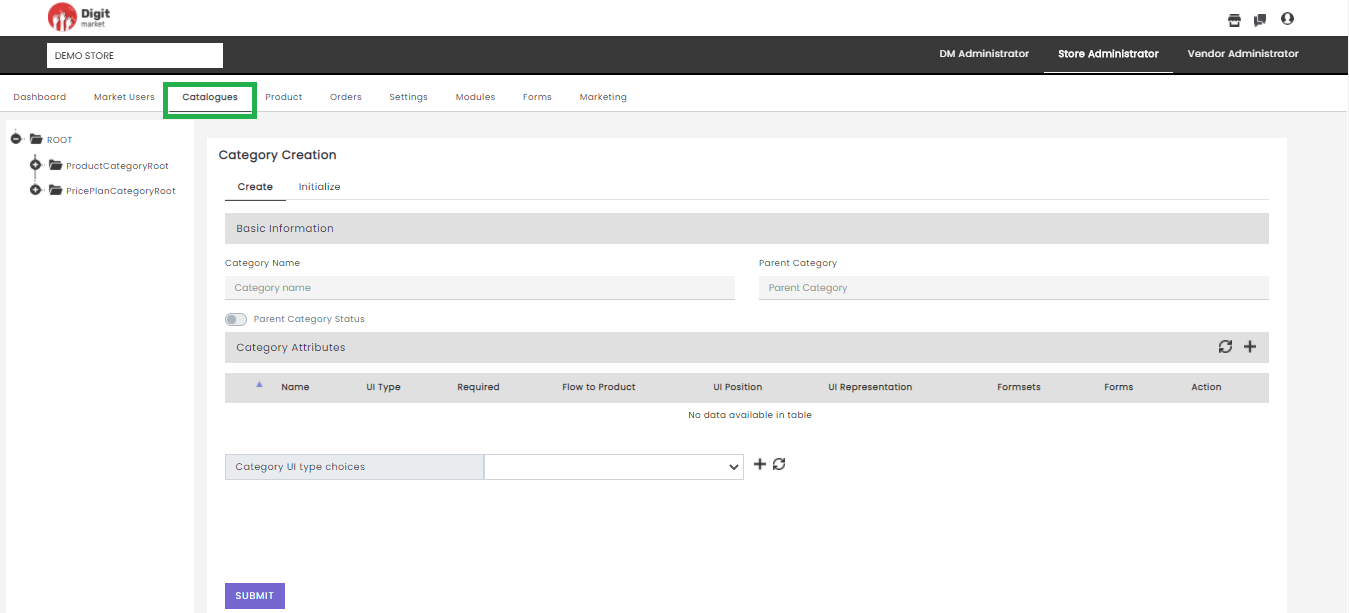
Fig. 2.196 Category Creation
Note
Menu names are customizable based on access rights. For more details refer Menu-based access section.
Category creation is a two-step process that involves creating a category and initializing the category.
Create a Category:
Sign-in to DigitMarket™ as a Store Admin.
Select the Store beneath which you desire to create categories.
On the Category Creation page, you can see a hierarchy of the categories displayed in a tree structure on the left. ROOT is the main category under which sub-categories called Product Category Root and Price Plan Category Root are pre-defined. Users can create products under each category.
In Category Creation page have the following sections:
Basic Information:
Under the Basic Information row, populate the data for:
- Category Name- Name of the category.
- Parent Category- ROOT is auto-populated as it is the main category. You must specify the sub-categories under which you want to create your category. The available subcategories are ProductCategoryRoot and PricePlanCategoryRoot. Select ProductCategoryRoot to add product-related categories; for example— Electronics. Select PricePlanCategoryRoot to add price plan related categories; for example—Subscription Plan.
Note
Category Attributes
Click the plus icon
 to display the Category
Attributes row. Click the refresh icon to display the
existing/inherited categories under the pre-defined
parent/sub-categories.
to display the Category
Attributes row. Click the refresh icon to display the
existing/inherited categories under the pre-defined
parent/sub-categories.
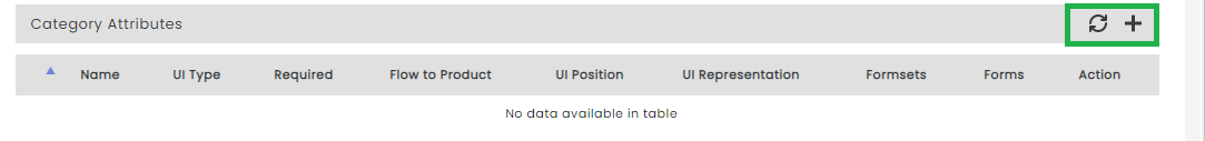
Fig. 2.197 Category Attributes
Note
Unwanted/Extra attributes row can be deleted by clicking on the delete icon .
Under the Category Attributes row, populate the following:
- Name: Name of the attribute. For example, electronics, clothing etc.
- UI Type: It defines the display type of the attribute and helps to link the attribute with their regex, validators etc. Click the dropdown list to select any one of the UI Type: Text, Rich-Text, etc.
- Required: Indicates if the attribute is required for category initialization. Click the dropdown list to select any one of the two options: True/False. Select True, if the user wants to assign values for the category attributes in the Initialize tab.
- Flow to Product: The value indicates if an attribute should be passed to products that would be created below this category or its child category. Click the dropdown list to select any one of the two options: True/False. Select True, then the Category Attributes will be visible on the product creation page and will be a mandatory field on the product publishing page. If selected False, then the Category Attributes will not be visible in the product creation page and product publishing page.
- UI Position: This is specifically to indicate if the attribute should be displayed on the Normal section or the TAB of the DM storefront. This list has to be curtailed and be made available only for the needed fields. Click the dropdown list to select any one of the UI position options: Normal, Normal-LEFT, Normal-RIGHT, etc.
- UI Representation: This helps to define the way the attribute should be represented on the UI. However, this list is to be shortened or to be removed. Click the dropdown list to select any one of the UI Representation options: Title, Title-Level 1, etc.
- Formsets: This is the nomenclature of the product formset which exists for defining the tab name. This formset is unlike the one used for grouping the forms into one formset. Click the dropdown list to select any one of the Formsets for the selected category.
- Forms: Click the dropdown list to select any one of the Forms for the selected category.
- Actions: Click the delete icon to delete the corresponding attribute.
- Category UI type choices
If users want to define category attributes having a fixed set ofvalues, then you must choose the UI Type as drop-down. Then data values for those
attributes are set in Category UI type choices.
Select the required Category Attribute type from the drop-down and click
the plus icon  to add enum attributes or click the refresh
icon to clear the entered values. The Add button allows
you to add multiple values.
to add enum attributes or click the refresh
icon to clear the entered values. The Add button allows
you to add multiple values.
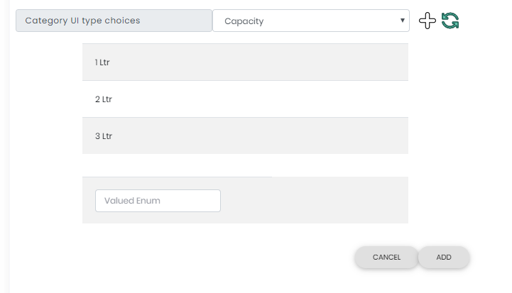
Fig. 2.198 Category UI type choices
The attributes can have ‘ranged enum’or‘valued enum’.
Ranged Enum
Ranged enum attribute type allows you to define a fixed range of values. For example, retail e-commerce segregates their clothing department according to age groups like 0-2 years, 2-4 years etc. In such cases, the age range is defined in the backend for shoppers to select clothes based on age. A category enum attribute helps to set a range like 0-2 years for the age category to be displayed in the store. Here 0-2 years is an example of ranged enum attribute type.
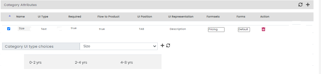
Fig. 2.199 Ranged Enum
Valued Enum
Valued enum attribute type allows you to define a set of values for an attribute. For example, you can define multiple variations of your product’s feature using valued enum attribute type, such as when a plastic dealer wants to sell bottles with a capacity of 1 Ltr, 2 Ltr and 3 Ltr. Here, for Attribute-Capacity, the valued enums are 1 Ltr, 2 Ltr and 3 Ltr.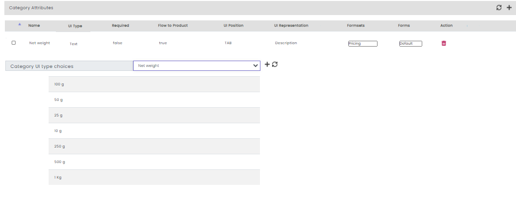
Fig. 2.200 Valued Enum
Note
Values for attribute types—valued_enum and ranged_enum always appear as dropdowns in the UI.
- Click Submit. The saved data is visible for the created categories.
Next, navigate to the Initialize tab.
Initialize a Category
Pre-determined values for category attributes are set during category initialization. Setting category attributes is a one-time activity and their values remain fixed thereafter. Users will not be able to change its value during the product creation.
For example, let us say that for a brand, the warranty is standard across all its products. In such cases, the warranty attribute needs to be defined only once for the whole category. The value for the warranty attribute is mapped in the Initialize tab and will be inherited automatically across all its products. No other user will be able to change the value for the warranty attribute.
Note
To initialize a category attribute, it is mandatory to select ‘True’ in the Required field under Category Attribute. Attributes whose Required field value was selected ‘False’ will not be displayed under the Initialize tab.
- From the Categories drop-down list, select the required category.
- Select the appropriate image and click Submit. The categories’ attributes and their data are saved.
For example, if you select the Categories as ‘Fruits and Veggies’, in the Initialize tab, you will be asked to upload an image.
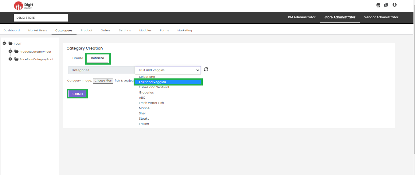
Fig. 2.201 Intialiaze Categories
Note
Categories for a Store can only be deactivated and NOT deleted.
2.11.4. Product
Store Admins can add the products/services to the store. These products/services will be displayed on the storefront for the customers.
Once you log-in as the Store Administrator, click the Product tab from the main menu the Product List page will be displayed along with details such as Name, Image, Product Type, Status. In the Product List page using the Show entires drop-down list, users can set the number of the product to be displayed on one page. Use Previous or Next to switch between the pages as shown below:
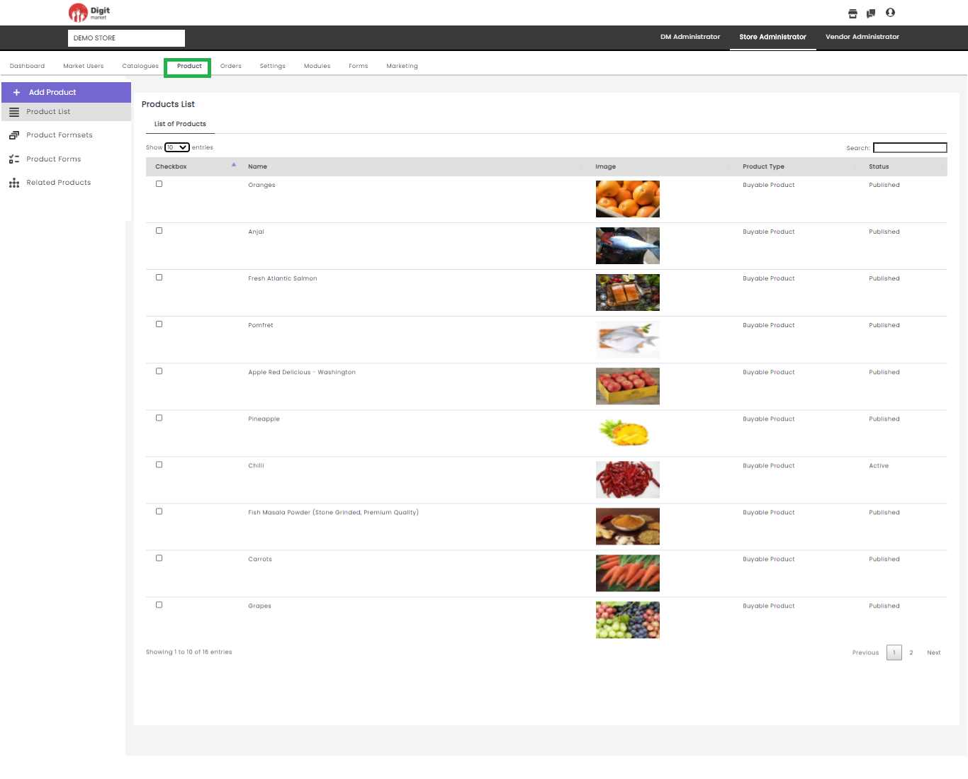
Fig. 2.202 Products List
Note
Products for a Store can only be created by Store Admins.
Search: Used for searching by giving some attributes.
Here users can perform the following actions:
- Add Product: Click the Add Product tab the Product Creation page will be displayed.
Note
To create a product user must add at least one category in each product and price place else a warning message will be displayed as shown below:
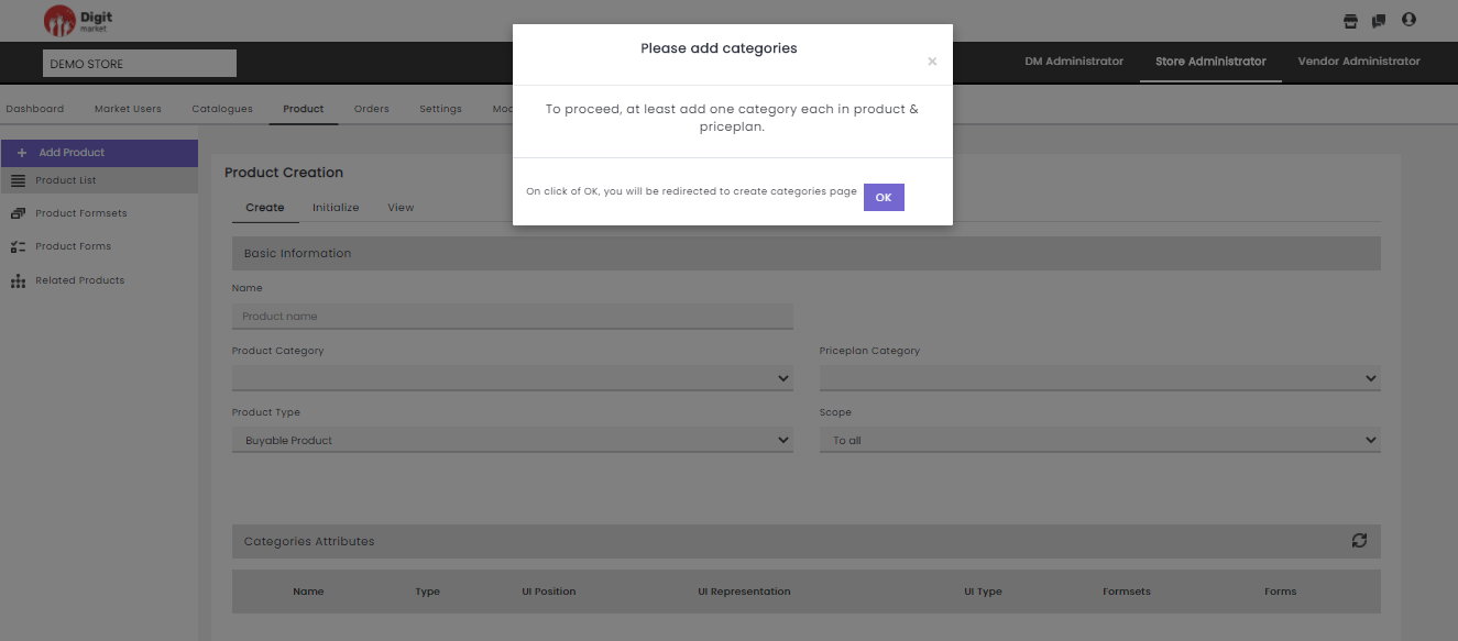
Fig. 2.203 Add product Warning Message
Click Ok navigates to Catalogues page or
The Product Creation page is as shown below:
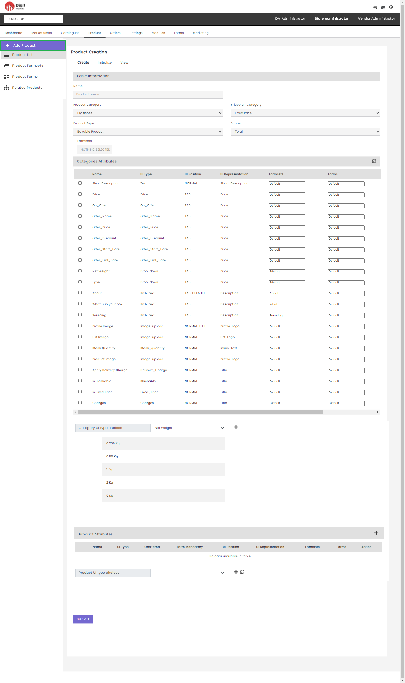
Fig. 2.204 Add Product
Step 1: Create
The Product creation form is categorized into:
Basic Information:
- Name: Text box to enter the product name.
- Product category: Dropdown to select the product category from the list. Based on the product category selection, the Category Attributes created at the time of product category creation will also display.
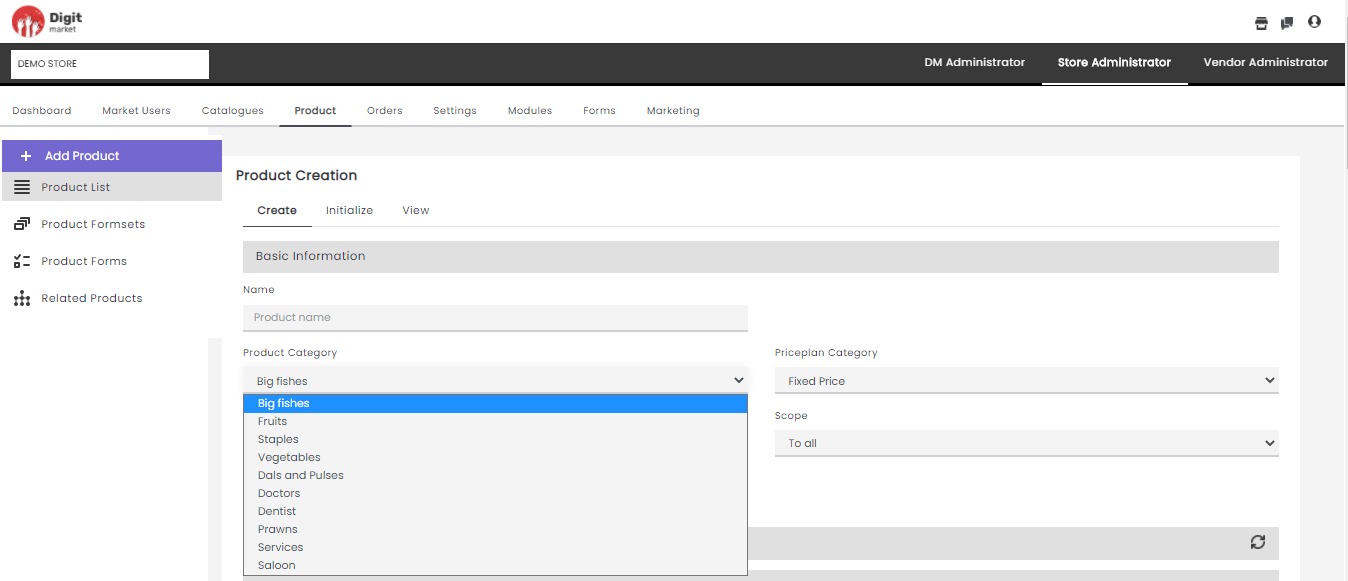
Fig. 2.205 Product category
- Priceplan Category: Select a plan from the available list of plans in PricePlan Category. Digit Market™ supports Fixed Price, Free, and Recurring types of plans. Based on the PricePlan selection, the Category Attributes created at the time of PricePlan category creation will also display.
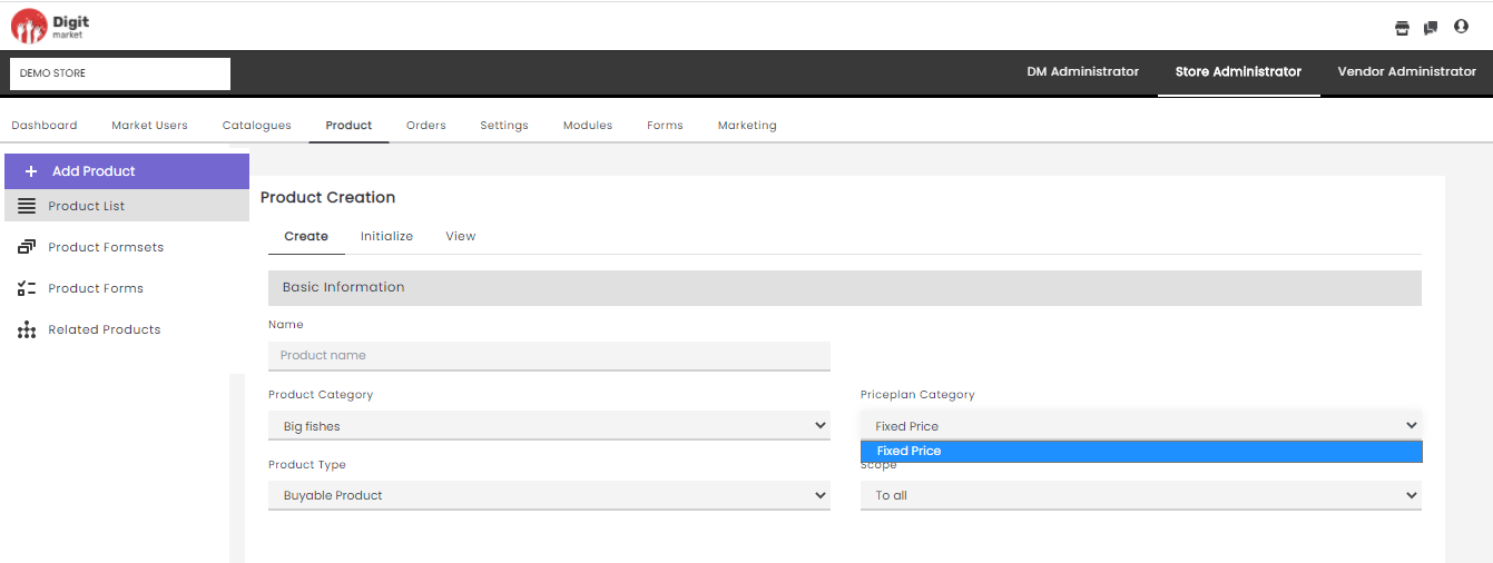
Fig. 2.206 price plans
- Product Type: Drop-down to select a product type. Based on the Product Type selection, the Category Attributes created at the time of Product Type creation will also display.
- Buyable Product: Used for the products which can be bought from the Store.
- Subscription Product: Used for the products where the customer agrees to pay the company for products or services throughout a specified period.
- Application Product: It is selected for services like apply and get eg: Credit card, debit card etc.
- Bookable Product: Used for booking eg: Doctor Appointment, Show seat booking.
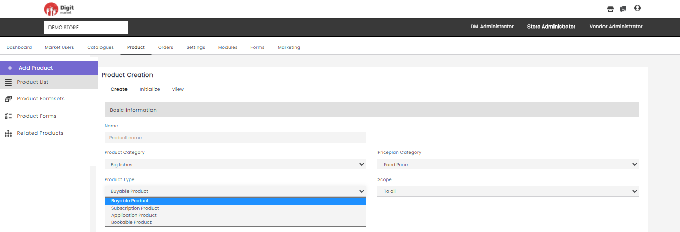
Fig. 2.207 Product Type
- Scope: Drop-down field to set the scope.
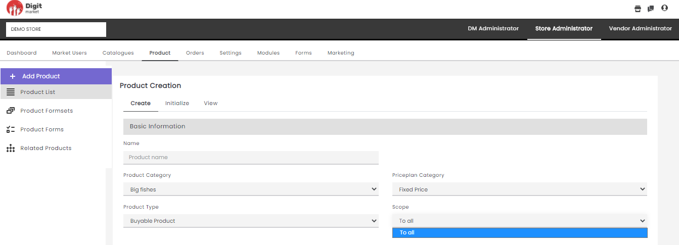
Fig. 2.208 Scope
- Formsets: Select a formset if the user wants to attach it along with the product. The formset will be displayed in the front end.
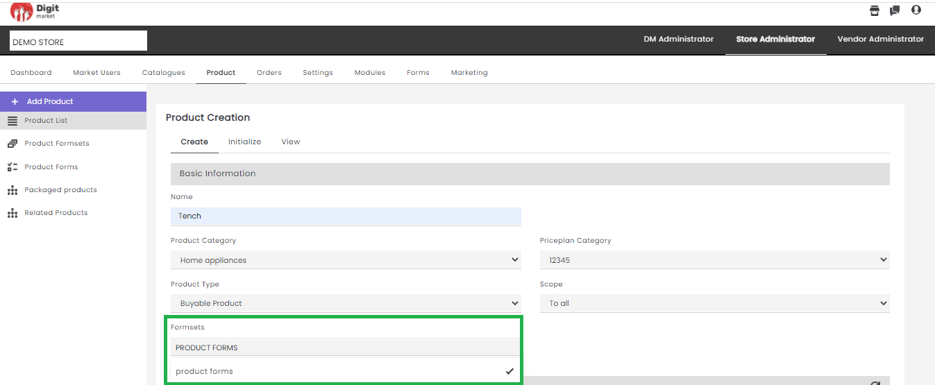
Fig. 2.209 Formset
The formset helps to gather more product specific information from the user while purchasing. An example is as shown below for purchasing a sim with formset attached:
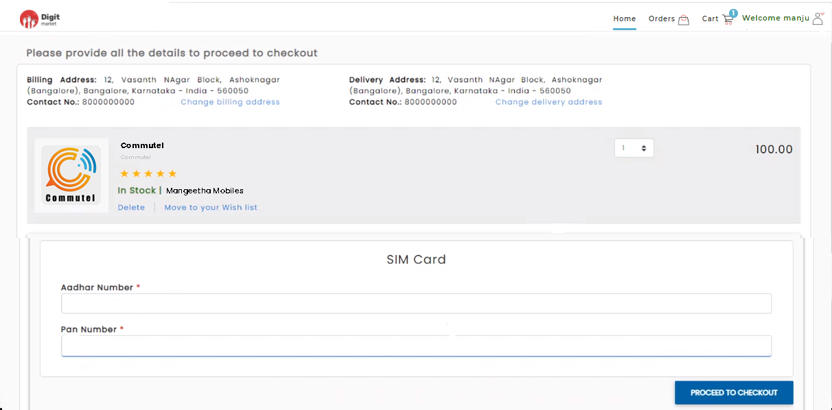
Fig. 2.210 Product Formset
- Categories Attributes: It will display the following categories attributes selected in Category creation details:
- Name: Name of the attributes.
- UI Type: Display the UI type.
- UI Position: Display the position of the attribute TAB-LEFT, TAB-RIGHT, TAB.
- UI Representation: Display the type of UI data.
- Formsets: Display the formset chosen for the attribute at the time of creation.
- Forms: Default value.
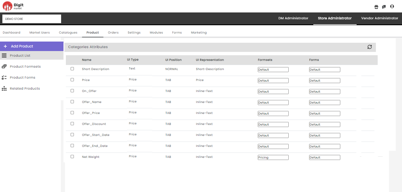
Fig. 2.211 Category Attributes
Click the refresh iconto refresh the data.
Note
The Category Attributes will be inherited to the new product based on the Product Category, Priceplan Category, Product Type selection.
- Category UI type choices: It will display the ui choices created in the Product Category. For eg: Here the Product Type is Big Fishes hence the values as shown below:
- Net Weight
- Type
- Price
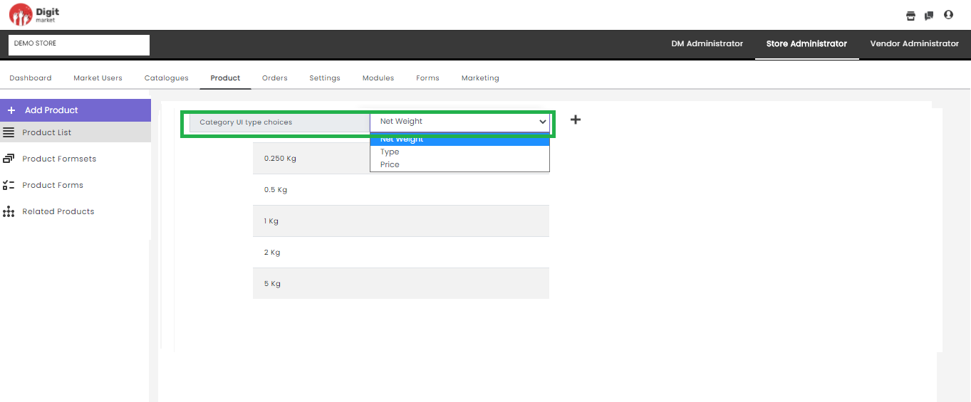
Fig. 2.212 Category UI type choices
Click the plus icon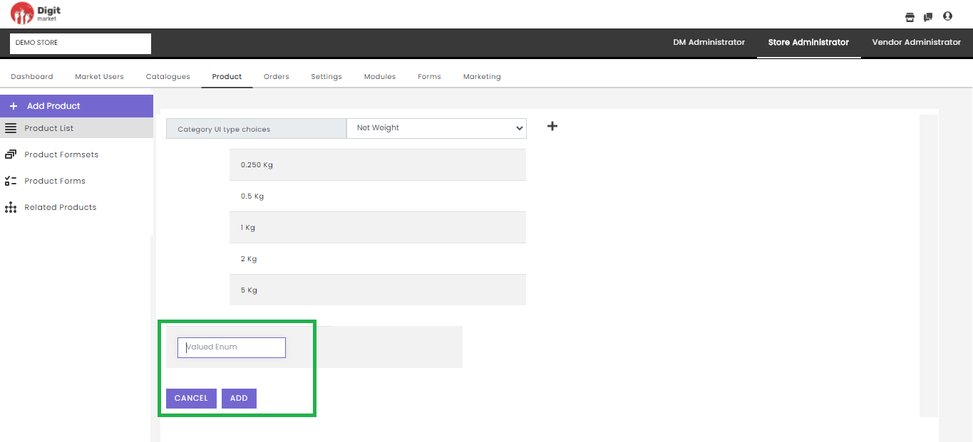
Fig. 2.213 Add Valued Enum
- Product Attributes: The Category Attributes will list the attributes based on the Product Category, Priceplan Category, Product Type selection. If the users want to add more attributes they can create new attributes here, by providing the following details:
- Name: Name of the attributes to be displayed.
- UI Type: Select any value from the drop-down list.
- One-time: Select any value True/False.
- Form Mandatory: Select any value True/False.
- UI Position: Select any value to position the attribute TAB-LEFT, TAB-RIGHT, TAB.
- UI Representation: Select any value from the drop-down list.
- Formsets: Users can select a formset from the dropdown or choose default.
- Forms: Default value.
- Actions: Click the delete icon
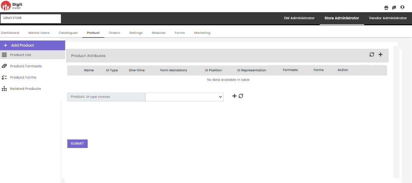
Fig. 2.214 Product Attributes
Click the refresh icon
- Product Enum Attributes
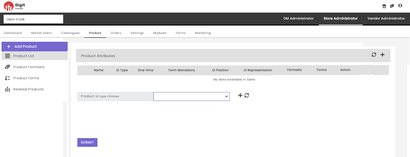
Fig. 2.215 Product Enum Attributes
Click the refresh icon
Click SUBMIT to create a product. A successful message will be displayed once we provide all the details as shown below:
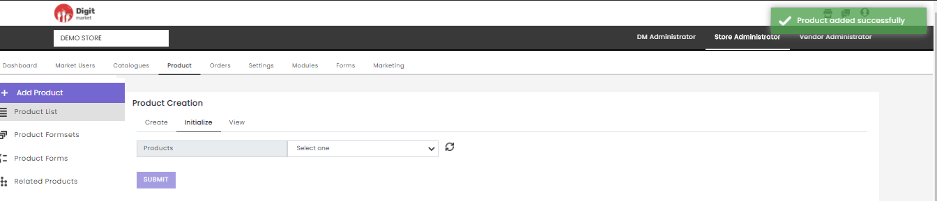
Fig. 2.216 Product Created Successfully
Step 2: Initialize
Once the product is created users need to initialize. Click the Initialize tab
- From the Products drop-down list, select the required product.
- Select the appropriate image and click Submit. The product and their attributes data are saved. Click the refresh icon
For example, if you select the Categories as ‘Vehicle Insurance’, upload an image and click Submit.
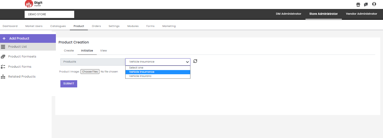
Fig. 2.217 Initialize Products
Step 3: View
- Click the View tab to view the attributes of the Product chosen from the drop-down. It will display attributes like Attribute Name, Attribute Type, One-time, Form Mandatory, UI Position, UI Representation, UI Type, Formsets, Forms as shown below:
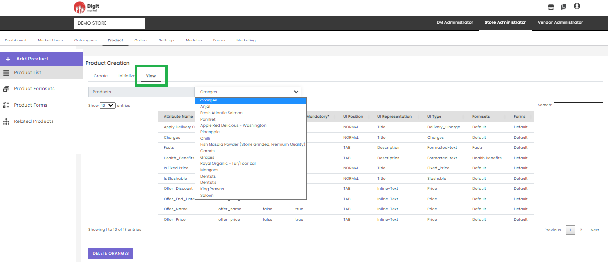
Fig. 2.218 Add Product View
- In the Product Creation page using the Show entries drop-down list, users can set the number of the product attributes to be displayed on one page. Use Previous or Next to switch between the pages.
- Search: Allows users to search by giving a phrase or a key value. It is recommended to populate this field with relevant information so that locating through search will be quicker.
- Delete: Click the Delete button to delete the product. The delete button name will update as Delete along with the product chosen in the Products field. A warning message will display as shown below:
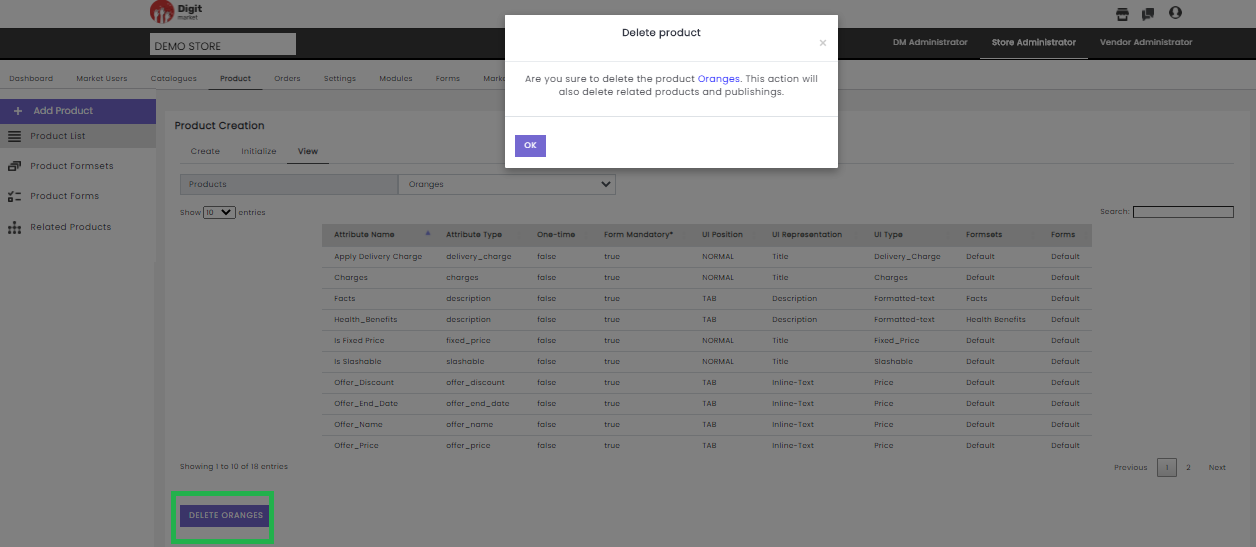
Fig. 2.219 Delete a Product in View Tab
Click Ok to delete, hence product along with the related product and publishings will be deleted. Click the cross
icon to exit.
Note
User can create/publish the product by initializing the sub-category the product is created in and it is not mandatory to initialize the Main/Parent category
Products List: Click the Products List tab from the left panel, the Product List page will be displayed. The Product List page displays all the products along with details such as Name, Image, Product Type, Status. On this page using the Show entries drop-down list, users can set the number product to be displayed on one page. Use Previous or Next to switch between the pages.
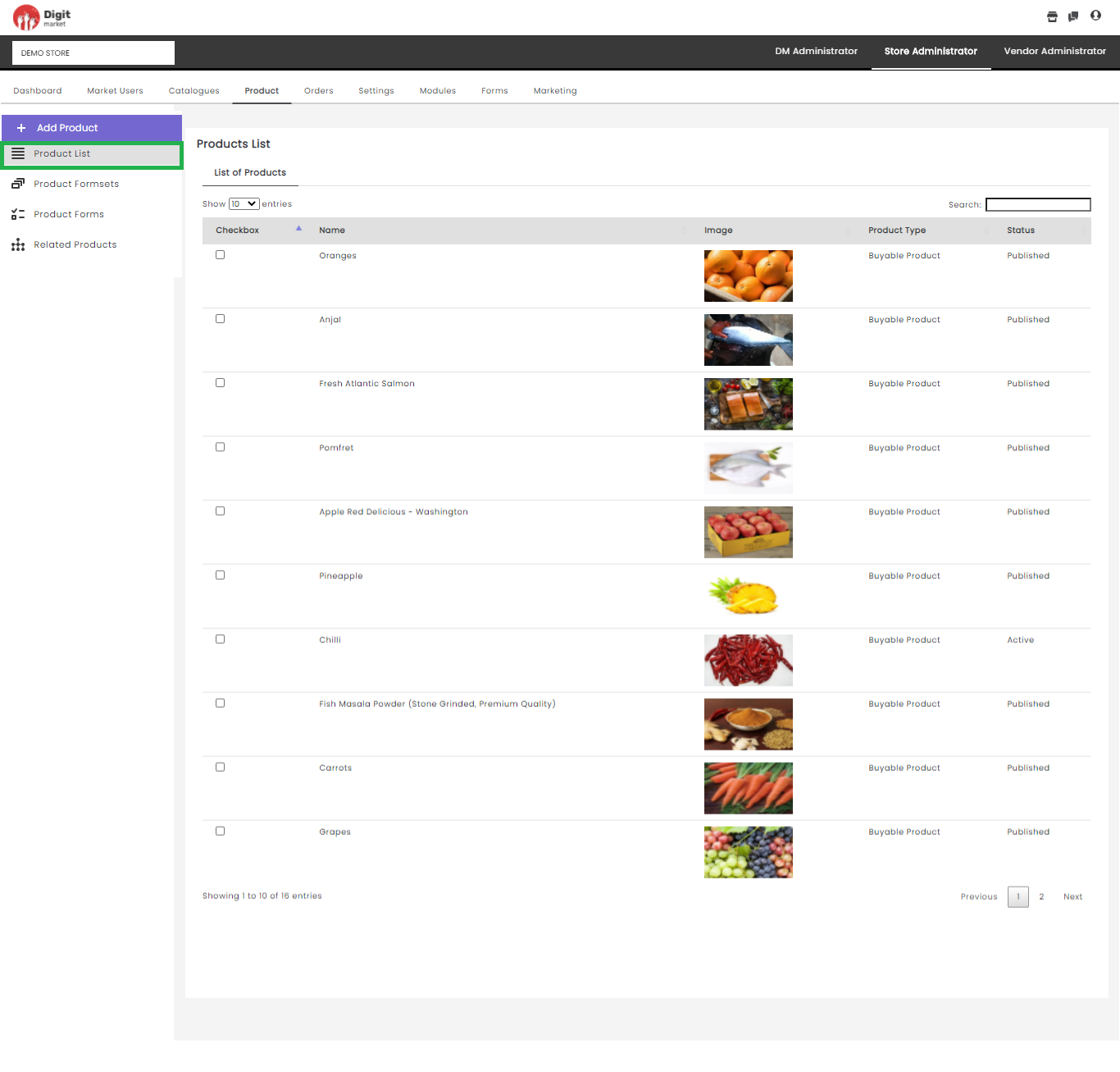
Fig. 2.220 Product List
Products Formsets: The Product Formsets allows users to wrap product specifications at a high level in the storefront. This can be used for the products and categories.
Click the Products Formsets from the left panel, the List of Forms page will be displayed along with details: Name, UI Position, UI Representation. On this page using the Show entries drop-down list, users can set the number formset to be displayed on one page. Use Previous or Next to switch between the pages.
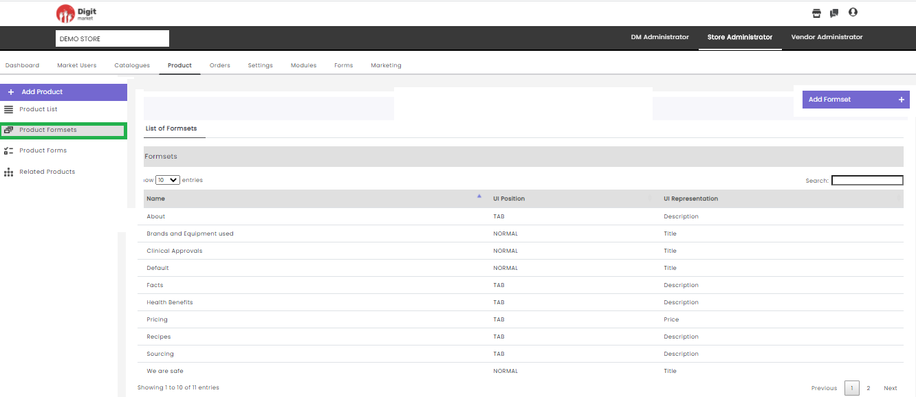
Fig. 2.221 Product Formsets
Users can also perform:
- Search: Allows users to search s by giving a phrase or a key value. It is recommended to populate this field with relevant information so that locating through search will be quicker.
- Add Formset: Click the Add Formset tab, the Create a new Formset dialog will be displayed as shown below:
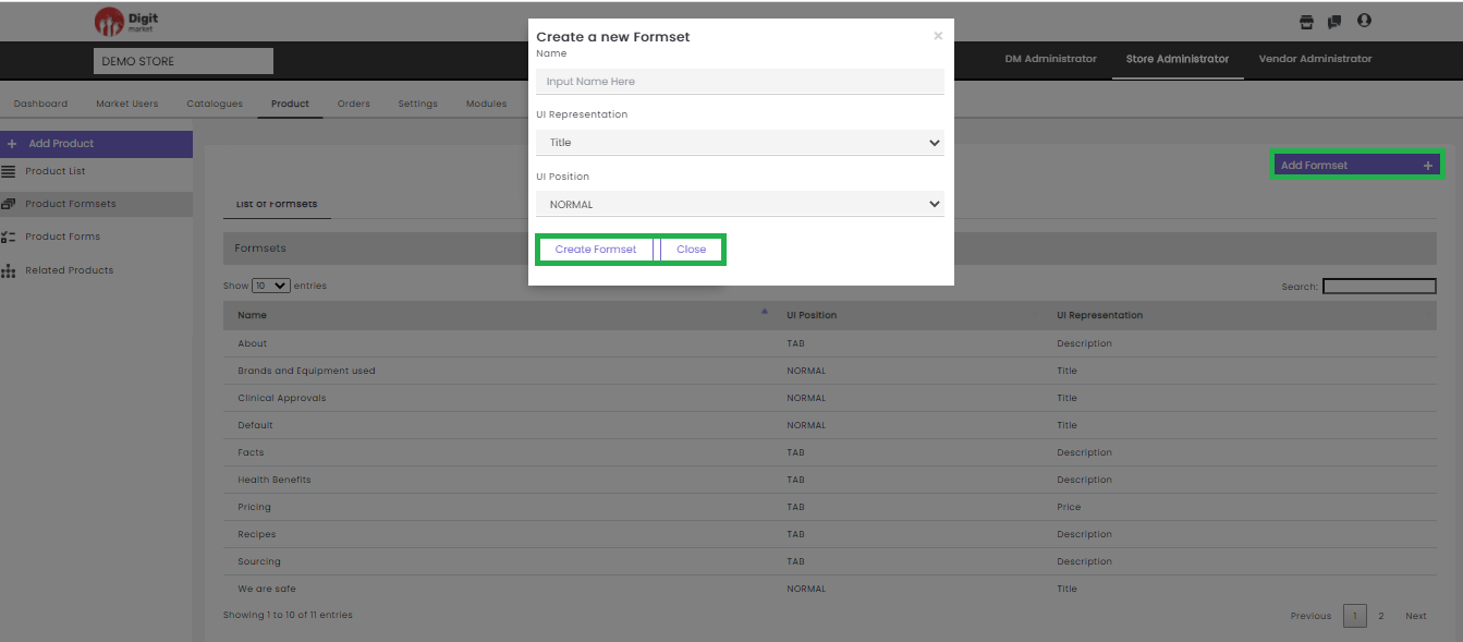
Fig. 2.222 Create a new Formset
In the Create a new Formset dialog, provide the Name, UI Position and UI Representation for the new Formset. Click the Create Formset button to create a new Formset and Close to exit.
- Products Forms: Click the Products Formsets tab from the left panel, the List of Forms page will be displayed along with details: Name, UI Position, UI Representation. On this page using the Show entries drop-down list, users can set the number forms to be displayed on one page. Use Previous or Next to switch between the pages.
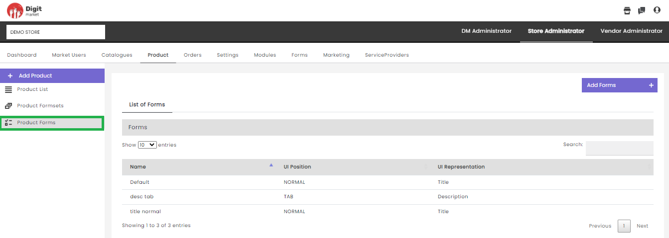
Fig. 2.223 Product Forms
Users can also perform:
- Search: Allows users to search forms by giving a phrase or a key value. It is recommended to populate this field with relevant information so that locating through search will be quicker.
- Add Forms: Click the Add Forms tab, displays the Create a new Forms dialog as shown below:
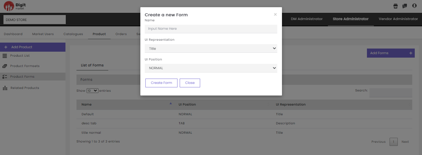
Fig. 2.224 Create New Forms
In the Create a new Forms dialog, provide the Name, UI Representation and UI Position for the new Forms. Click the Create Forms button to create a new Forms and Close to exit.
- Packaged Product: This page will display all the published products. Users can create a new variant by grouping the required product and offer a discount if needed. Click the Packaged Products tab from the left panel, the Product Packaging page will be displayed as shown below:
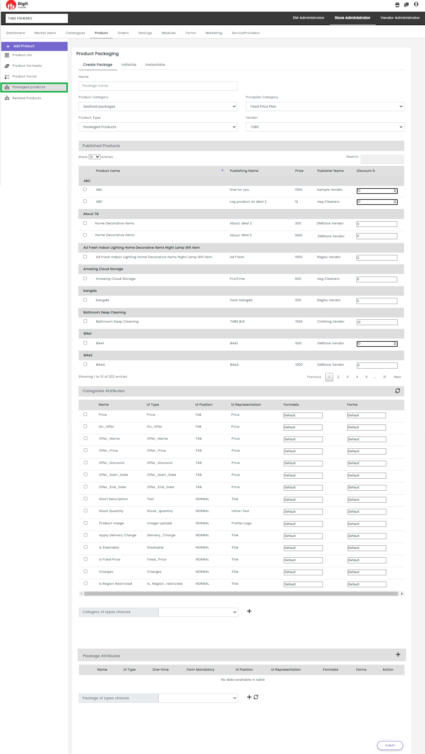
Fig. 2.225 Package Product
To create a package users have to perform in below steps:
- Create Package: Users can create a new package by providing:
- Name: A name for the new package, will be displayed as a variant in the storefront.
- Product Category: The user must select under which category this package needs to be displayed. It must be a package category.
- Priceplan Category: Here users can select the price plan category as Fixed Price Plan, Subscription plan.
- Product Type: It should be always Packaged products.
- Vendor: Based on the vendor selection the products published by the vendor will display.
Once the user provides all the above details they can select the required products to the group as a bundle and publish them as a new variant by optionally giving some discounts. Store Admin can add as many products as they want into this bundle. But the quantity of each product should be one and if any one of the products goes out of stock the packaged product goes out of stock.
For example, If a store admin has created a packaged product with ABC 500 grams and ABC2 300 grams. The available quantities of ABC and ABC2 are 1000 grams and 500 grams respectively. If a customer is trying to add one quantity of the package he can successfully. On another buy, the package will go out of stock as ABC2 doesn’t meet the package quantity mentioned. Since ABC2 doesn’t have enough quantity to meet the package requirements.
Note
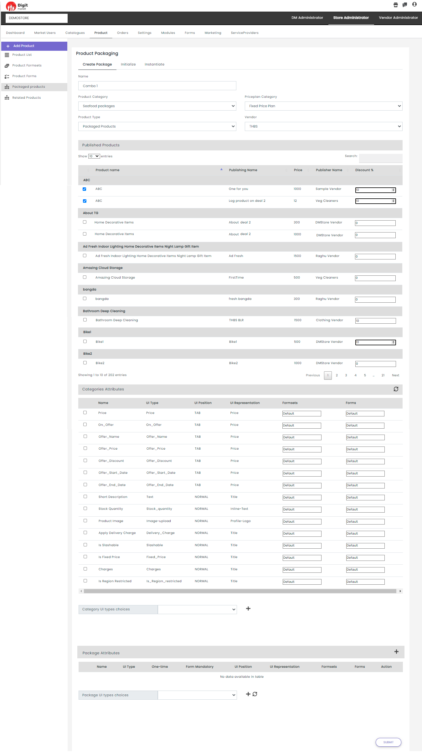
Fig. 2.226 New Package Product
Click the Submit button a confirmation dialog will be displayed users can verify and click the Submit button to create the new package.
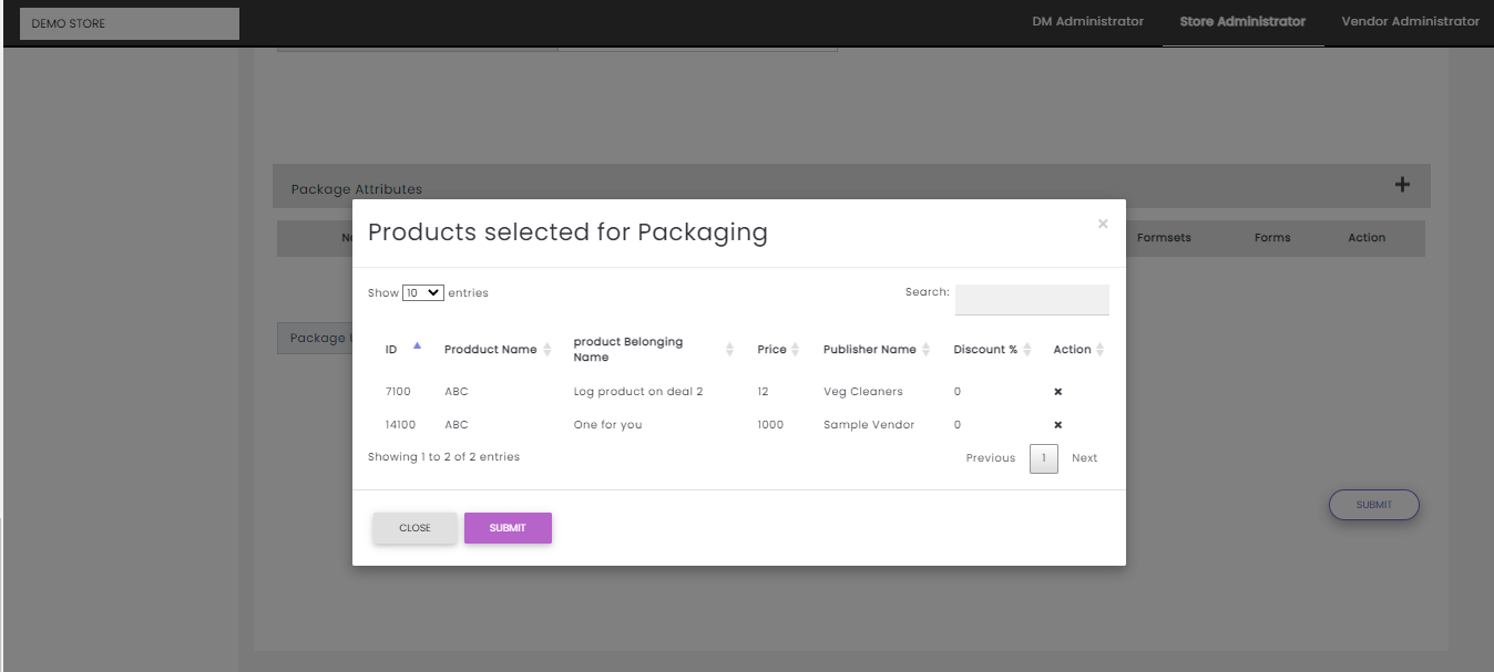
Fig. 2.227 Package Confirmation
- Initialize: Once the user successfully creates a new package. It will navigate to the Product Packaging Initialize tab where the user can select the new package created under the Products drop-down as shown below:
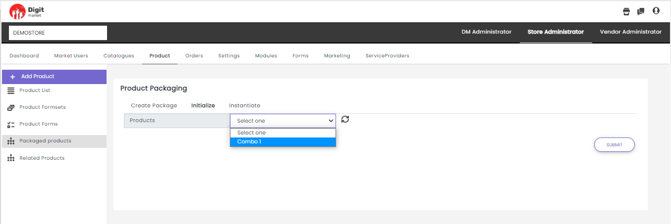
Fig. 2.228 Initialize the Product
Once the package is selected user has to upload an image and click the Submit button.
- Instantiate: From the Products drop-down list, select the required package product. It will display all the package products created as shown below:
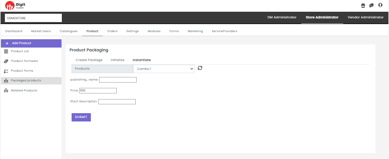
Fig. 2.229 Instatiate Package
Here user can provide details like:
- Publishing_name: A name for publishing the product.
- Price: This will display the amount to be paid after applying the percentage of discount in the original price if mentioned any. If the store admin wants to modify, he can mention the new price here too.
- Short Description: More details about the product.
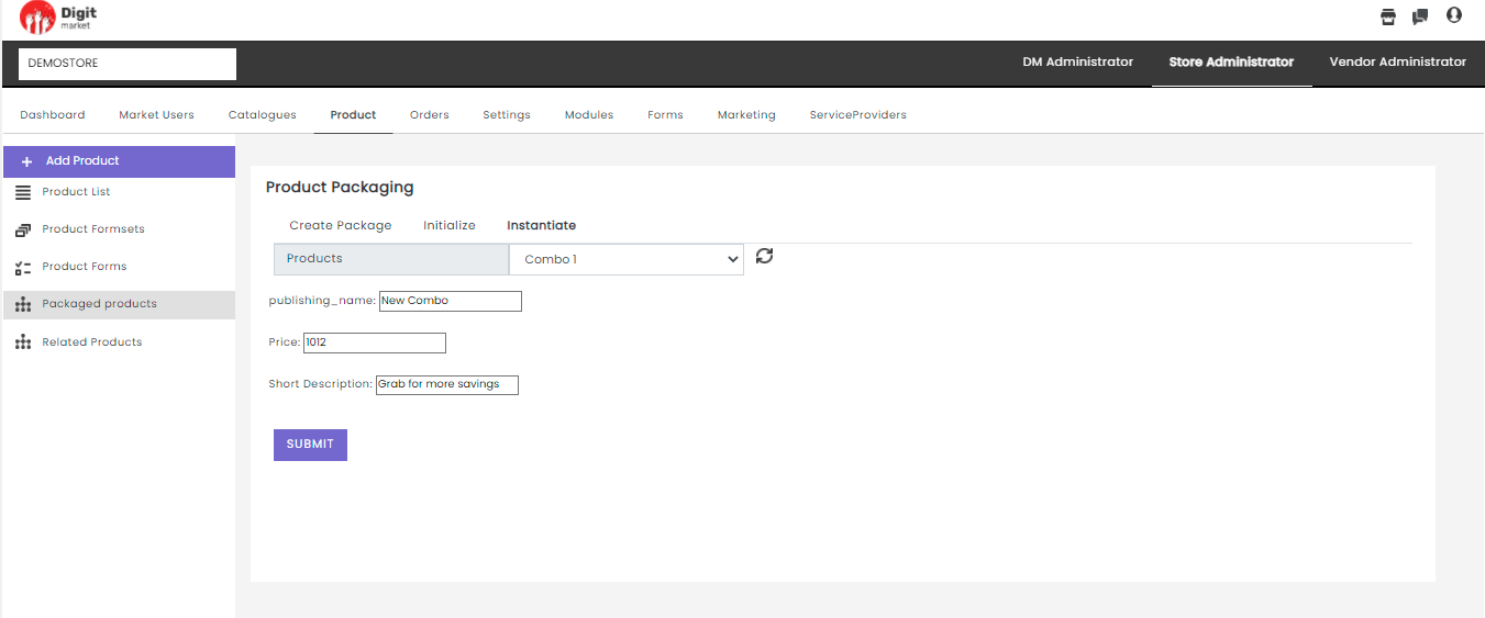
Fig. 2.230 Instantiate Package With Details
- Click the Submit button to publish the product and a success message will be displayed.
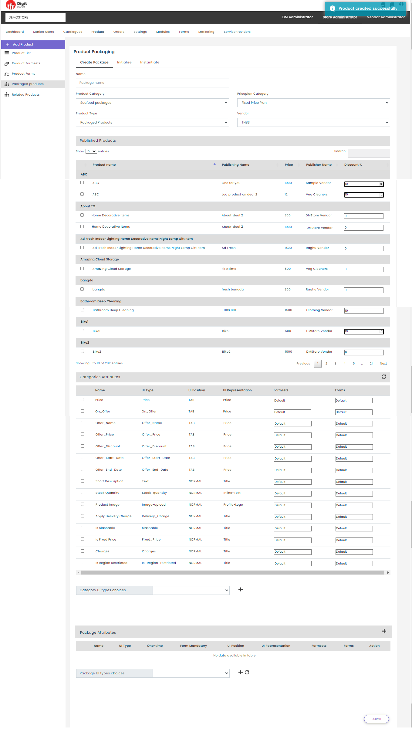
Fig. 2.231 Package Product
Once all the steps are completed the product will be displayed in the Store Front under Packaged Product as shown below:
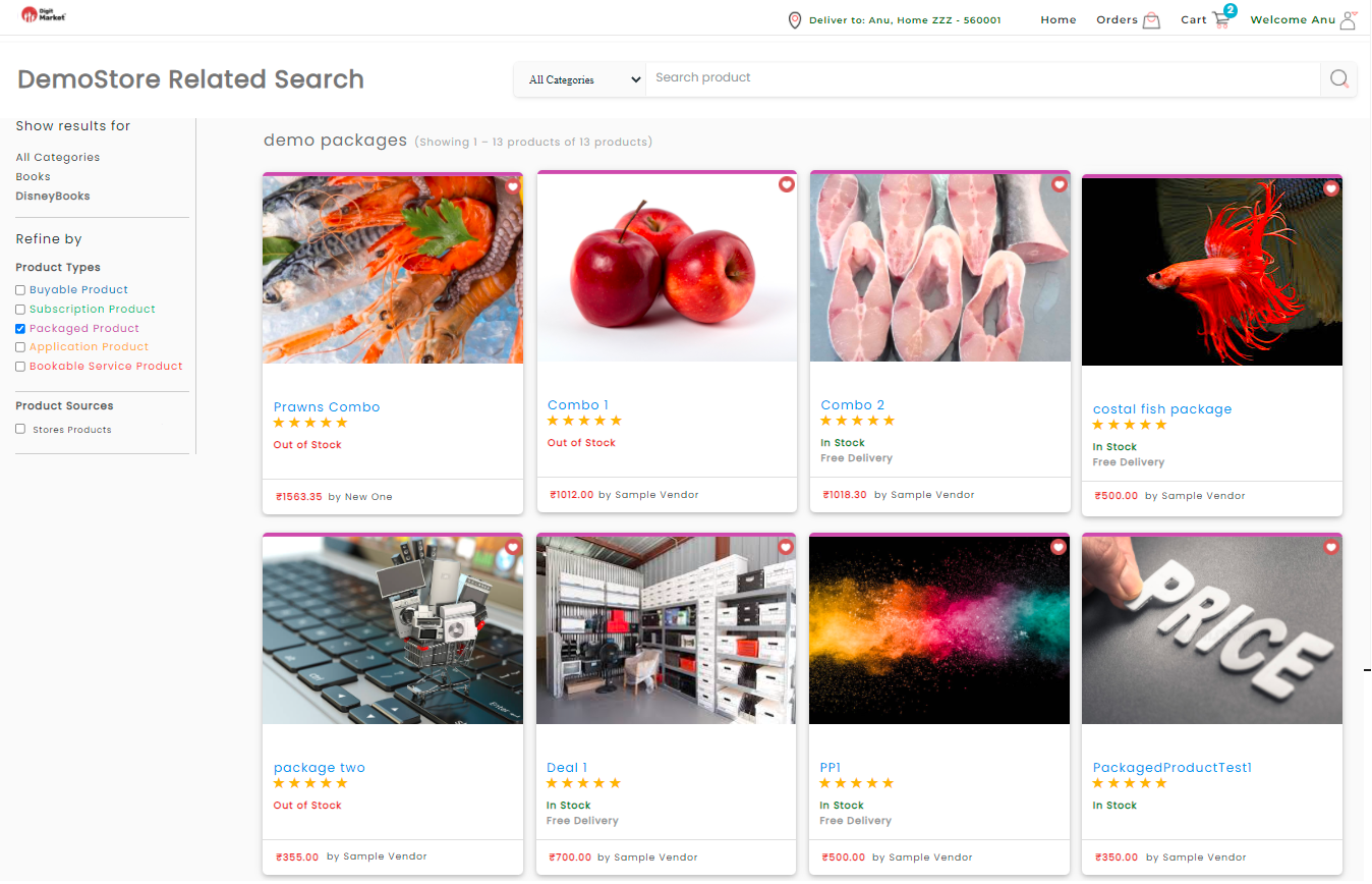
Fig. 2.232 Package Product in Store Front
The above page will display all the created package product. Click the respectective package product to see more details.
For example here, click on the Combo 1 to see the details as shown below:
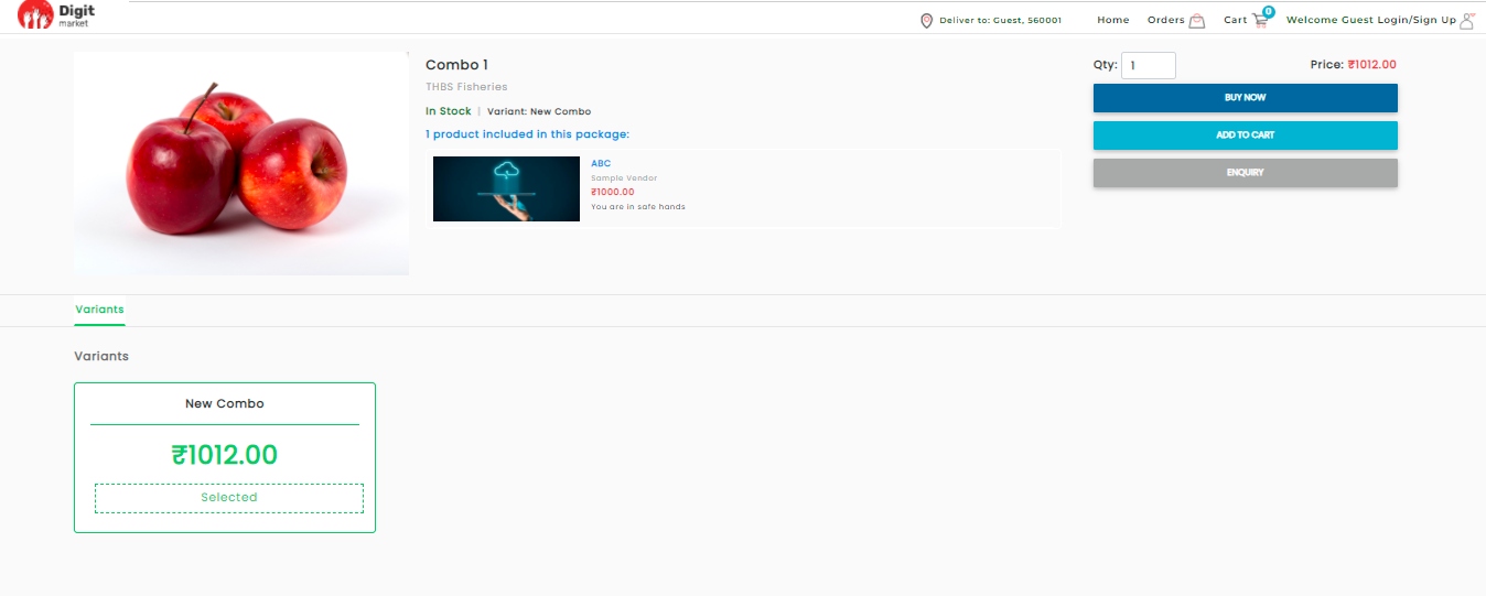
Fig. 2.233 Package Product in Store Front
- : Click the Related Products tab from the left panel, the Related Products page will be displayed as shown below. This page will also display all the Vendor and Pubished Products details like: Product Name, Publishing name, Price, Publisher Name, Selected.
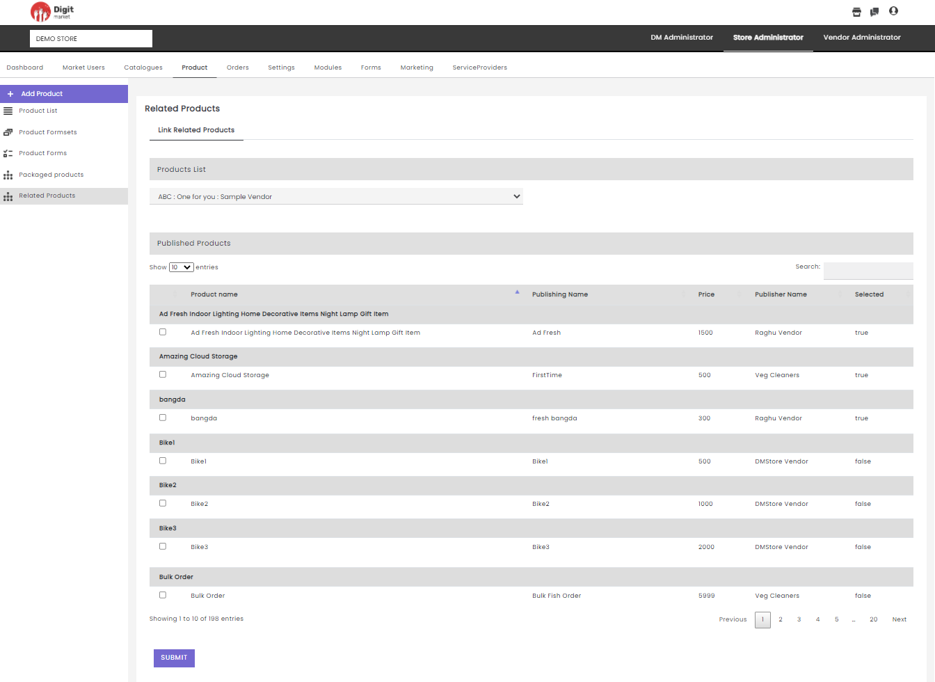
Fig. 2.234 Related Product
On this page using the Show entries drop-down list, users can set the number product to be displayed on one page. Use Previous or Next to switch between the pages.
The Related Products page allows user to link the products and the linked product will be displayed as suggestion to buy together. The steps for linking are:
- Select Vendor
- Check the checkboxes to the respective published products to link with the selected product in the Product List.
- Click the Submit button to link the products. The linked products will be displayed on the product description in the store product.
Note
The related products will be defined by store admin.
2.11.5. Orders
Once you log-in as the Store Administrator, click the Orders tab from the main menu, the Order List page will be displayed along with the details such as Product Deatils, Orderid, Order Item ID, Qty, Journey Status, More, Retry as shown below:
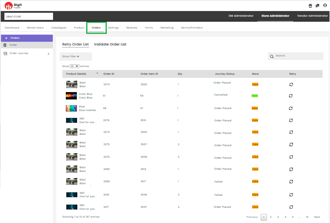
Fig. 2.235 Journey Page
- Orders: Click the Orders tab this page will display :
- Retry order List: This will list all the order line item that can retry to complete the journey.
- Validate Order List: This will list all the failed orders.
Retry order List
Click this tab to display all the order line items that are paused in some modules of their order journey. Store admin can retry to complete the journey. Once the journey is completed the View button is changed to green else it will be in orange as shown below:
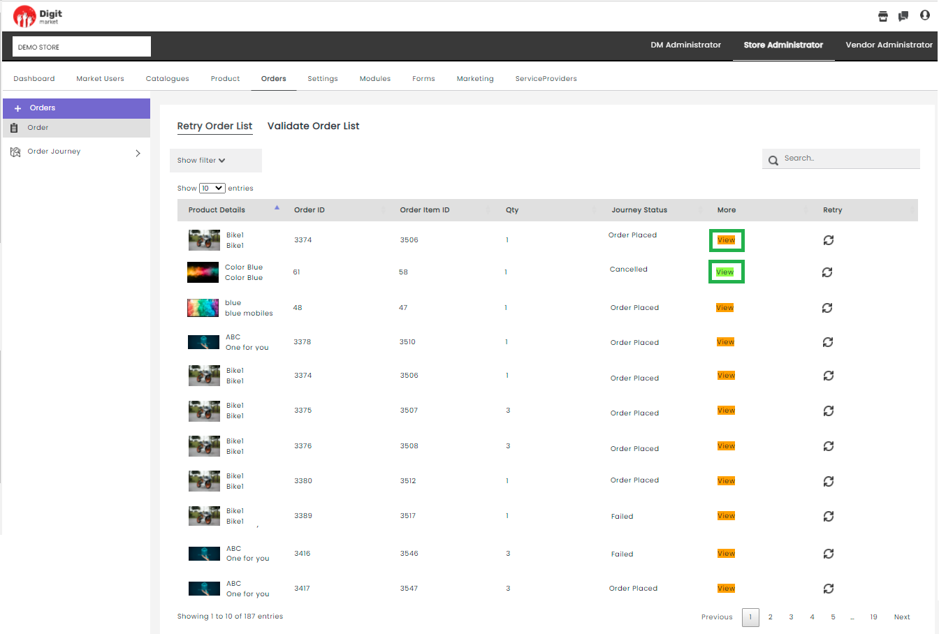
Fig. 2.236 Retry Order List
Click the View button to see the journey. Also, users can retry the journey by clicking the retry
icon.
Here users can refine the order list based on Journey Status, Date, Vendor, Failed/Completed available on Show Filter drop-down,
click the drown arrow  icon to see the fields. Use the up-down arrow
  icon to select the criteria from the drop-down as shown below:
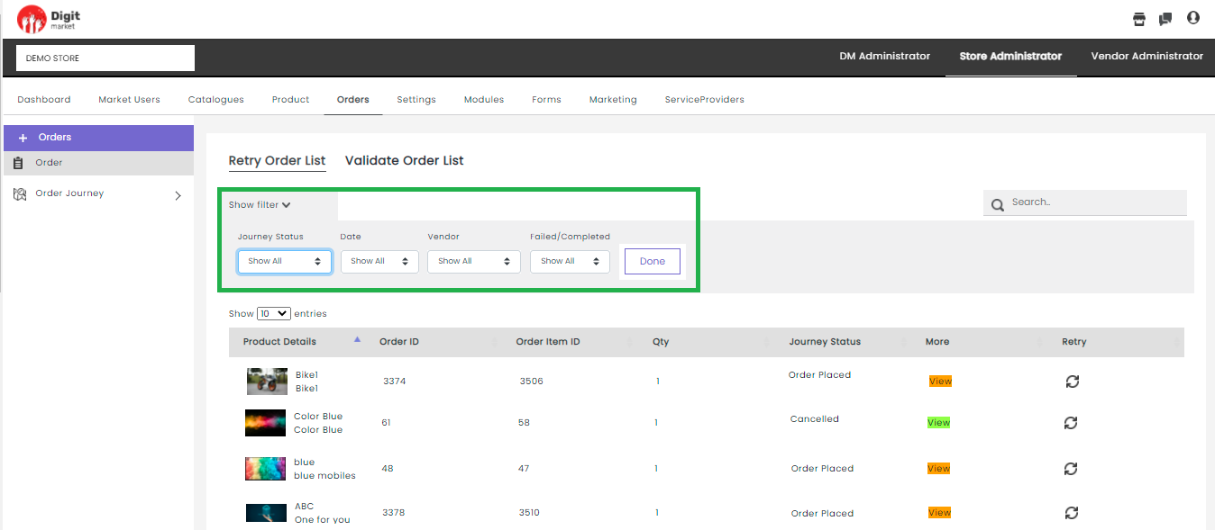
Fig. 2.237 Show Filter Order List
Users can select the required field and click the Done button to apply the filter and the result will be displayed on the order list page. For instance, if a user wants to filter based on ‘order placed’, select order placed from the Journey Status and click the Done button as shown below:
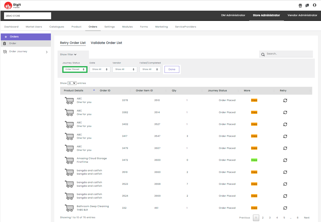
Fig. 2.238 Show Filter Order List
On this page using the Show entries drop-down list, users can set the number of the product to be displayed on one page. Use Previous or Next to switch between the pages.
Validate Order List: This page will display all the failed orders whose journey can not be started.
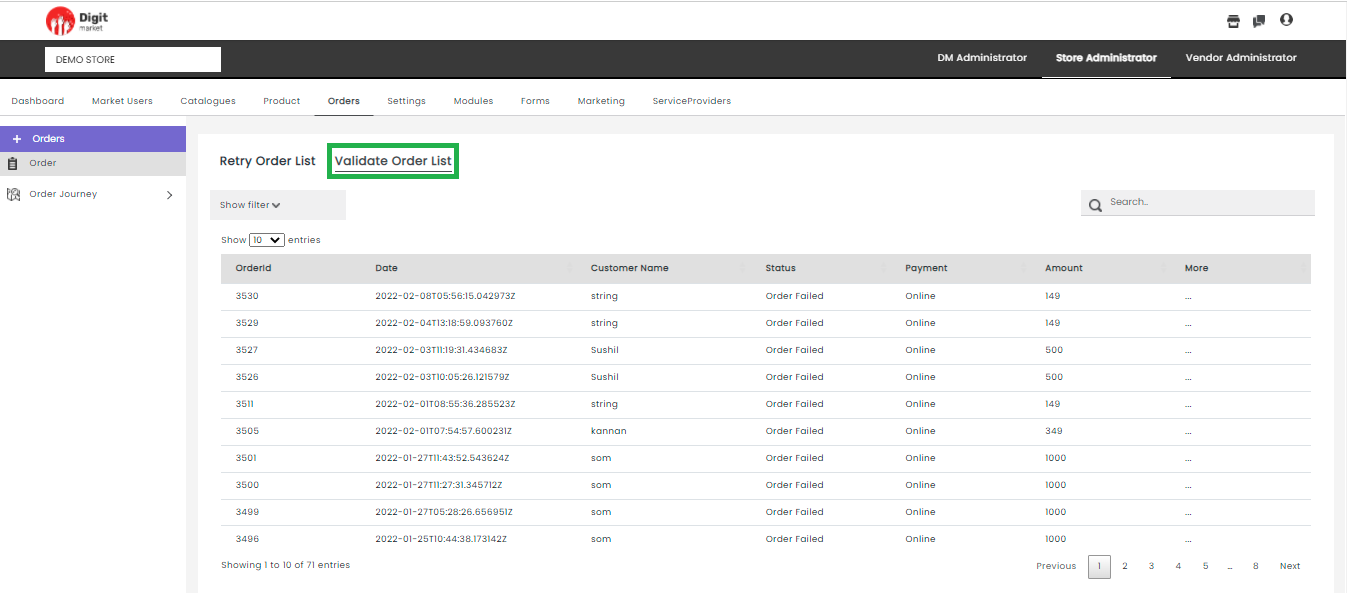
Fig. 2.239 Validate Order List
Note
Failed order whose mode of payment is online only will display in the Validate Order List.
The Searching and Filtering have the same functionality as in Retry Order List. In addition, users can view the below details:
- Orderid: Displays the id assigned for the order.
- Date: The date of the order placed.
- Customer Name: Displays the name of the customer who placed the order.
- Status: Displays the current status of the order. It will be always Order Failed.
- Payment: Displays the payment method. It will be always Online.
- Amount: The amount for the order.
- More: Click on the three-dot
icon under More field will display the detailed description about the order as shown below:
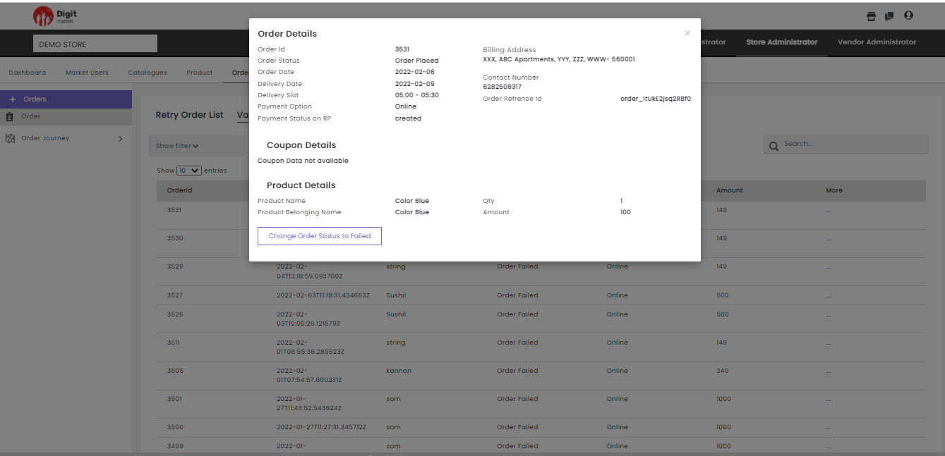
Fig. 2.240 More Order List
Here Store Admin can fail the order by clicking the Change Order Status to Failed if the payment is not successful within a particular amount of time. A notification will be triggered from the backend to notify the status of the customer. Once the order is failed the product will be reverted to the stock quantity. It also reverts the delivery slot and coupons.
In the Orders tab, users can create store/vendor journeys by selecting the respective store/vendor. Click here to see the UI components to create Journey.
- Store: Click the Store tab from the left panel, the Store order journey will be displayed as shown below:
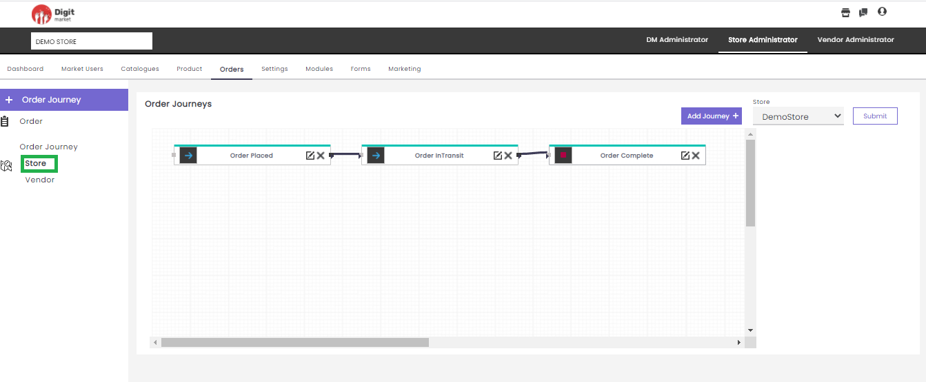
Fig. 2.241 Store Order Journey
Here users can perform the following actions:
Add Journey: Click the Add Journey button displays all the already created modules in the drop-down. Select any one displays the node in the canvas as shown below:
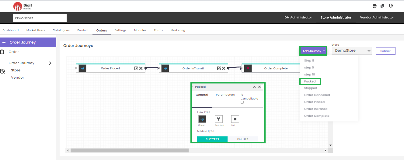
Fig. 2.242 Journey Node
In Add Journey, users can create a journey by selecting a module and providing other information like: Flow Type, Module Type and Parameters and is Cancellable. Click
to minimize and add or to exit. Once a node is
is added the icon will be changed to edit icon . Click the icon the node will expand and users can edit
General and
Parameters data. Click the
icon to provide the link from one node to another node. If users want to add
modules click here to see the
steps.Store: Click the dropdown field to display all the stores under the Store Admin. Select anyone to create the journey.
Click Submit to create Store Journey.
Vendor: Click the Vendor tab from the left panel, the Vendor order journey will be displayed as shown below:
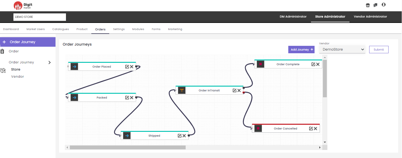
Fig. 2.243 Vendor Journey Page
All the actions in the vendor journey are the same as the store journey except that instead of Store selection users have to select to vendor.
Steps for Journey in a nutshell:
- Click the Add Journey to add nodes.
- Provide other information like : Flow Type, Module Type and Parameters.
- Click
- Select Store/Vendor.
- Click Submit to create the journey.
2.11.6. Settings
Once you log-in as the Store Administrator, click the Settings tab from the main menu to display the Menu List page the functionality of this page is as same as in DM Administrator.
On the Menu List page users have the Add Menu, Search, Menu List and Menu Mapping the functions are the same as in DM Administrator.
Notification
Notification is an effective tool to engage with the customer and increase sales in the online store. A busy online store will be receiving a bucket load of orders by the hour, notifications regarding orders are another great way to add value for users. These notifications alert customers about the progress of their orders. They contain information like order confirmations, order status updates, Incomplete action or transaction and tracking information.
Notification templates: Users can create a notification by selecting an appropriate placeholder on the required notification type. Users cannot create any template but they can edit accordingly.
Click the Notification templates tab, the Notification template page will be displayed. This page displays the details such as Feature Name, Notification type, Send to, Template and Actions for each feature. It will display ten features on one page. Use Previous or Next to switch between the pages.
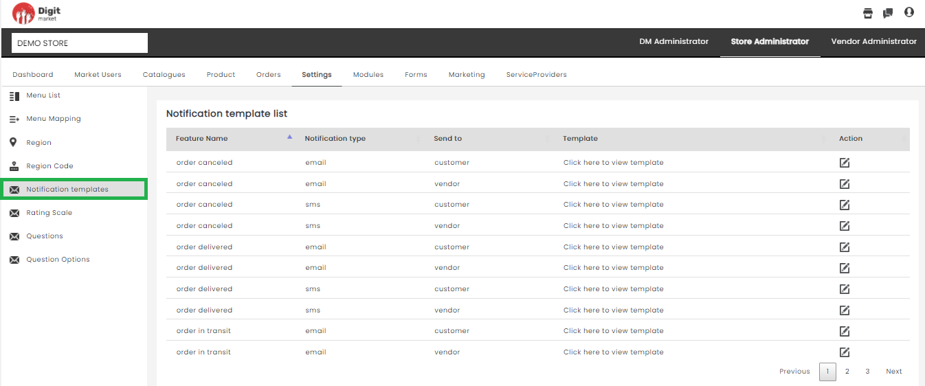
Fig. 2.244 Notification Template
Click the edit icon
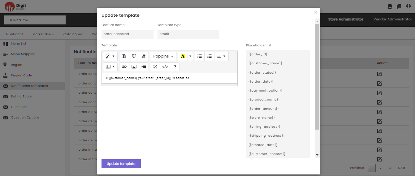
Fig. 2.245 Update Template
On the above dialog, users can edit the message and click the Update template button. The update template dialog will vary according to the Template Type(email/sms). If the template type is email, users can use typography to customize the message along with the required place-holder. If the template type is SMS users can just send a message with the required place-holder. Once the order comes in, the place-holder will replace it with the transactional data and send out the notification to the recipient.
Rating Scale: A rating scale is a set of categories designed to elicit information about a quantitative or a qualitative attribute. Rating scales allow participants to weigh, or assign numerical values as answers via a simple star rating graphical interface system. Rating scales are a crucial element in the surveys and it is important to understand how to use them appropriately.
In the Store Administrator, the user can define the rating scale for Vendor, Product, Order, Customer. Click the Rating scale tab from the left panel, the Rating Scale List page will be displayed as shown below:
Fig. 2.246 Rating Scale List Page
Rating Scale List page will display all the ratings along with the details:
- Name: Name of the rating.
- Rating: Rating scales show the strength of feeling or agreement.
- RatingType: Displays the rating is for Vendor, Product, Order, Customer.
- Actions: Click the delete icon
Users can also perform:
Add Rating Scale: Click the Add Rating Scale tab, displays the Add Rating Scale dialog as shown below:
Fig. 2.247 Add Rating Scale
In the Add Rating Scale dialog, provide the
- Name: Name for the rating.
- Rating: Users can select a numeric number to define the rating scale.
- Type: Users can select the rating is defined for Vendor/ Product/ Order/ Customer.
Click the Submit to create or Cancel to exit.Questions: Rating questions can be used to evaluate a variety of topics or stimuli including statements or options. Rating questions help to understand how the customer feels about a particular product, the preference of the customer and compare the results. Here users can provide the questions from a range of options — which are scaled between two extremes — like Excellent to Terrible and responders can choose from a range of options or provide the textual information according to the type of question. Questions posed in the surveys tend to take a range of different forms like:
- Descriptive: Respondents are provided with text-area where they can provide textual information.
- SingleSelectOption Respondents are presented with several answer options to choose one from it.
- MultiSelectOption: Respondents are presented with several answer options and to choose from.
In the Store Administrator, the user can define the question for a group or Vendor, Product, Order, Customer . Click the Questions tab from the left panel, the Questions for Rating page will be displayed as shown below:
Fig. 2.248 Questions for Rating
The steps to define the question for rating and group are as follows:
- Choose type: Select Rating for defining the questions for rating scale and Group for defining the questions at Vendor/Product/ Order/ Customer level.
- Choose Rating: Click the drop-down to display the available rating scale.
- Add Question: Click Add Questions button to add the question for the selected Rating type in the above step. Enter the required question and select the required Question Type as shown below:
Fig. 2.249 Add a Question
Click the SUBMIT button to save the changes
Click the delete icon
Note
For the customer, the question defined in the group along with selected ratings will be displayed.
Question Options: As every customer experience professional knows, surveys represent an invaluable tool for improving the customer experience, by understanding the strong and weak points about the business, and ultimately boosting revenues.
In the Store Administrator, the user can define the option for selected questions. Click the Questions Options tab from the left panel, the Options for Questions page will be displayed as shown below:
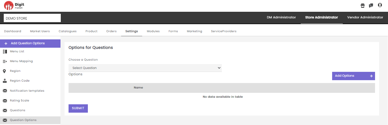
Fig. 2.250 Options for Questions
The steps to define the options for question for the selected question are as follows:
- Choose a question: Select a question for defining the options.
- Add Options: Click Add Options button to add the option for the selected question in the above step. Enter the required option as shown below:
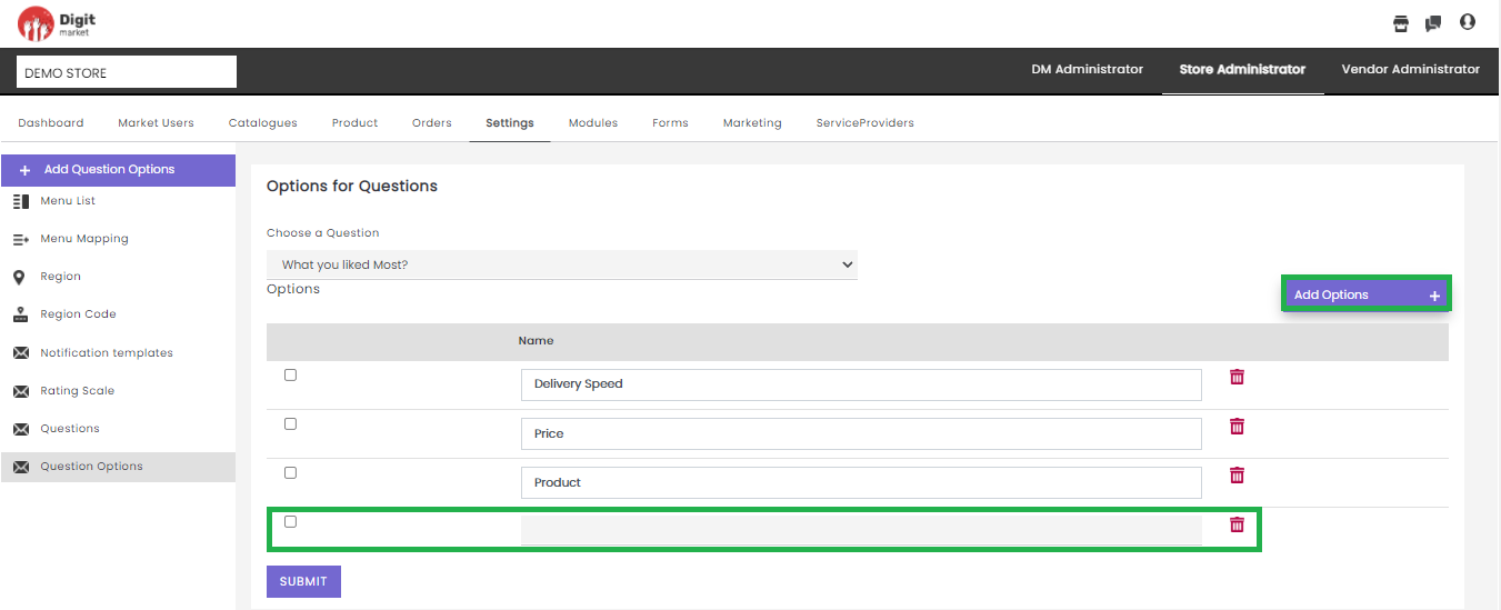
Fig. 2.251 Add Options
Click the SUBMIT button to save the changes
Click the delete icon
2.11.6.1. Modules
Once you log-in as the Store Administrator, click the Modules tab from the main menu the Module List page will be displayed. The Module List will display all the Modules along with details such as Module Name, Journey Type, Type and Action as shown below:
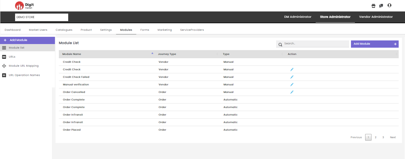
Fig. 2.252 Modules List
On the Module List page users have the following options:
- Add Module: Click the Add Module tab, the Create Module dialog will be displayed as shown below:
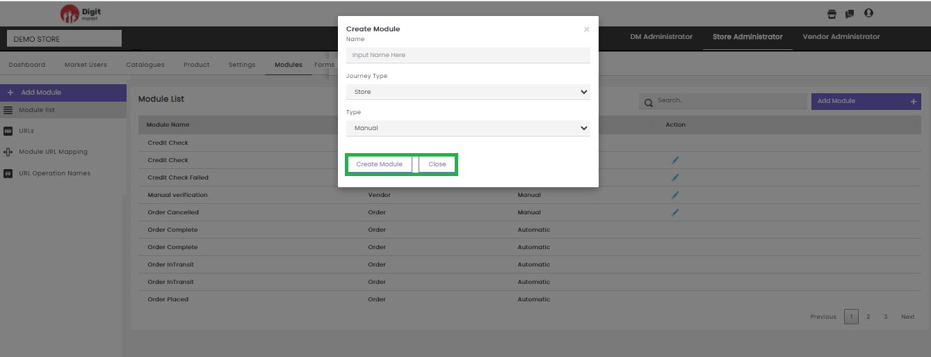
Fig. 2.253 Create Module
In the Create Module dialog, provide the
Name: Name for the module.
Journey Type: Click the dropdown list to select any one of the options: Store/Vendor/Order/Set to Third Party/Set to Vendor based on the requirement.
Type: Click the dropdown list to select any one of the options: Manual/Automatic.
Manual: This process requires a DM user to push it through every step by approving or rejecting that part of the flow. Automatic: Here Modules are pre-linked with an API for creating the journey by setting the URL, Module URL Mapping and URL Operation Names. This will auto-assign to the succeeding modules. It helps to reduce the manual effort, minimize costs, increase efficiency, and streamline processes
Click the Create Module button to create a new module and Close to exit.
- Search: Allows users to search the modules by giving a phrase or a key value. It is recommended to populate this field with relevant information so that locating through search will be quicker.
- Module list: Click the Module list tab from the left panel, the Module List page will be displayed as shown below:
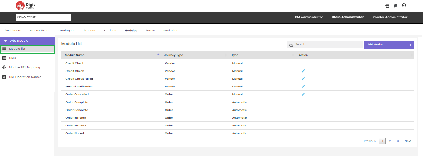
Fig. 2.254 Module List Page
Module List page will display all the modules along with the details:
- Module Name: Name for the module.
- Journey Type: Type of journey chosen at the time of creation.
- Type: Display internal or external. Internal for Manual and external for Automatic.
- Actions: Click the edit icon
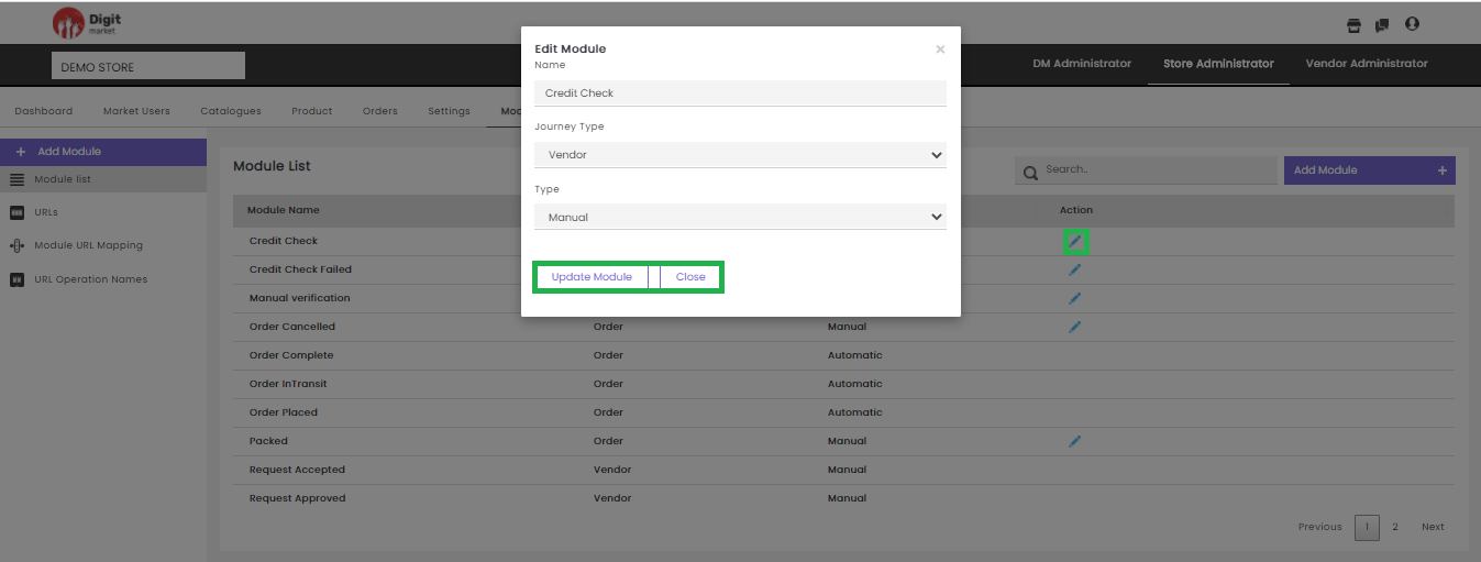
Fig. 2.255 Edit a Module
In the Edit Module dialog, users can edit all the info and click the Update Module to update the details or click
Users can also perform:
- Search: Allows users to search a module by giving a phrase or a key value. It is recommended to populate this field with relevant information so that locating through search will be quicker.
- Add Module: Click the Add Module to see the details.
URLs: Click the URLs tab, the Module URL List page will be displayed. This page displays all the URL along with the details like URL, URL Type, Request Type, Journey Type, Client Id, Client Secret, Action. Use Previous or Next to switch between the pages.
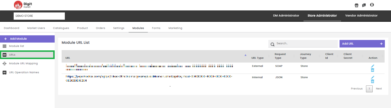
Fig. 2.256 Module URL List Page
Users can delete an URL by clicking the delete icon
a warning message will be displayed as shown below:
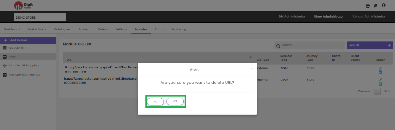
Fig. 2.257 Warning Message for URL Deletion
Click Yes to delete and No to exit.
Users can also perform:
- Search: Allows users to search by giving a phrase or a key value. It is recommended to populate this field with relevant information so that locating through search will be quicker.
- Add URL: Click the Add URL tab, displays the Create URL dialog as shown below:
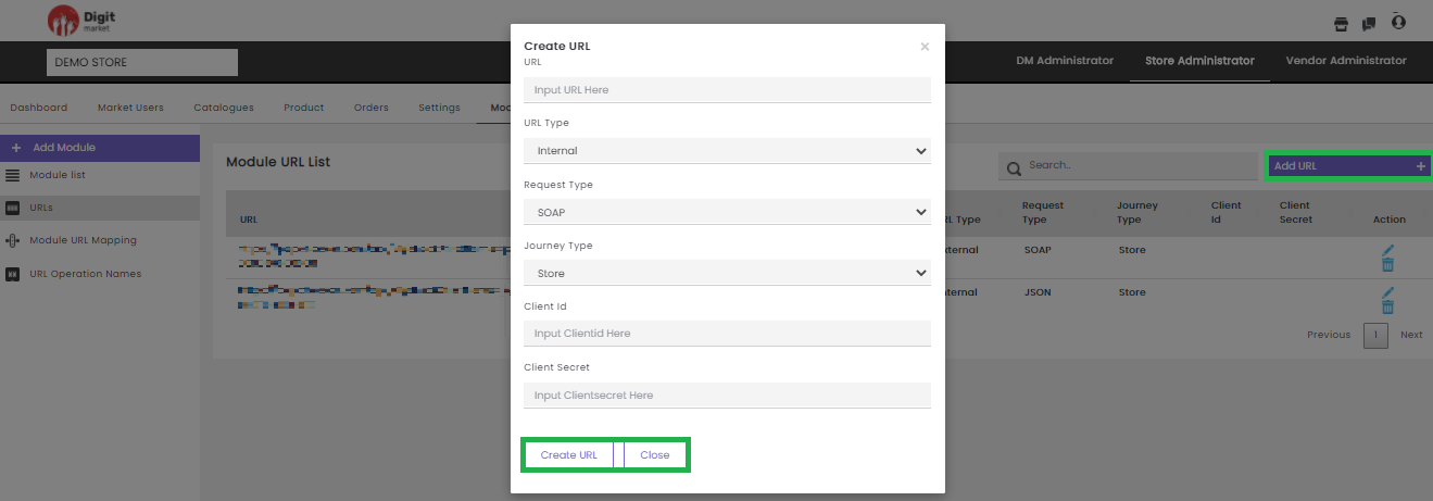
Fig. 2.258 Add URL
In the Create URL dialog, provide the URL, URL Type, Request Type, Journey Type, Client Id and Client Secret to create a new URL. Click the Create URL to create or Close to exit.
Module URL Mapping: Click the Module URL Mapping tab, the Module URL Mapping page will be displayed as shown below:
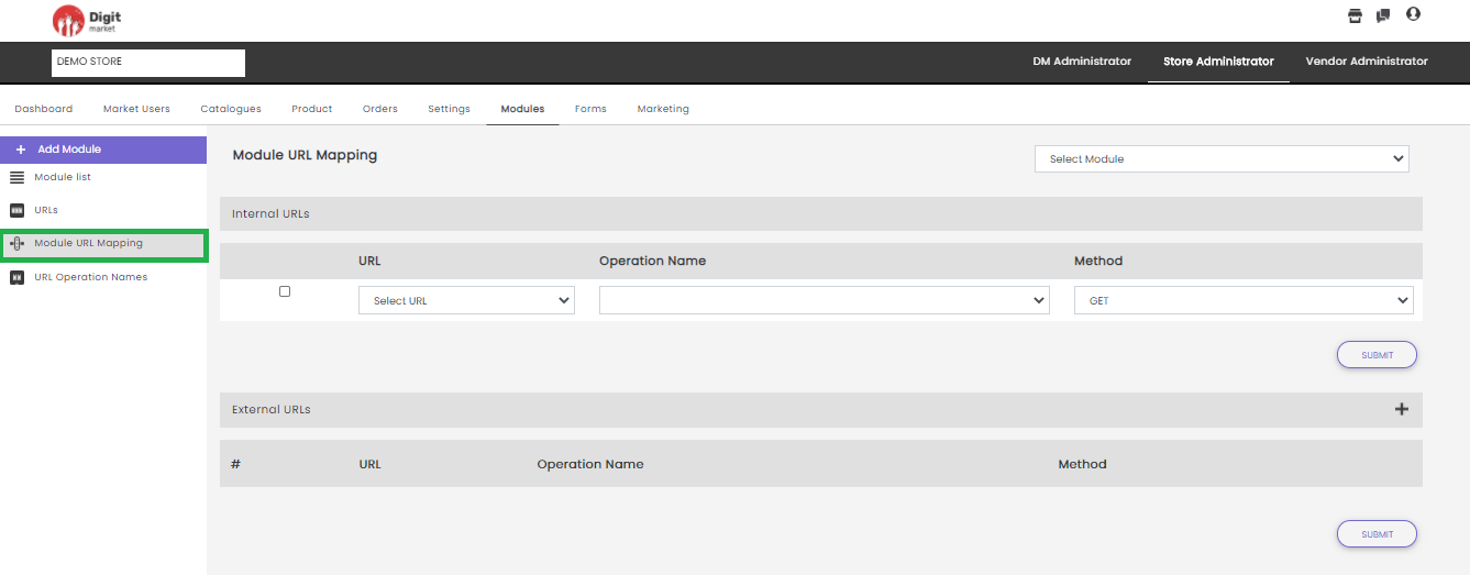
Fig. 2.259 Module URL Mapping page
Mapping URL with Module is a two step process:
Step 1: Select a module from the Select Module drop-down field for which the URL needs to be mapped.
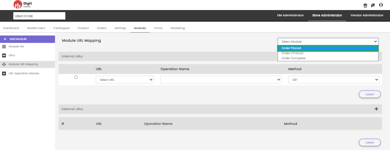
Fig. 2.260 Select Module SA
Step 2: Users can provide Internal URLs and External URLs.
Internal URL
- Select the corresponding checkbox.
- It will display all the URL added in the ADD URL tab and URL Type as Internal as drop-down select any.
- Select the Operation Name.
- Select a Method from the drop-down.
- Click the Submit button.
External URL
- Click the plus icon
- Select the corresponding checkbox.
- It will display all the URL added in the ADD URL tab and URL Type as Internal as drop-down select any.
- Select the Operation Name.
- Select a Method from the drop-down.
- Click the Submit button.
URL Operation Names: In the URLs tab while adding an url using the ADD URL button, if the URL is SOAP/Notification request type, then user should provide the operation name, then select the request type: SOAP/Notification and select url from Choose a URL, then users have to provide the URL operation names. Click the URL Operation Names tab, the URL Operation Names page will be displayed as shown below:
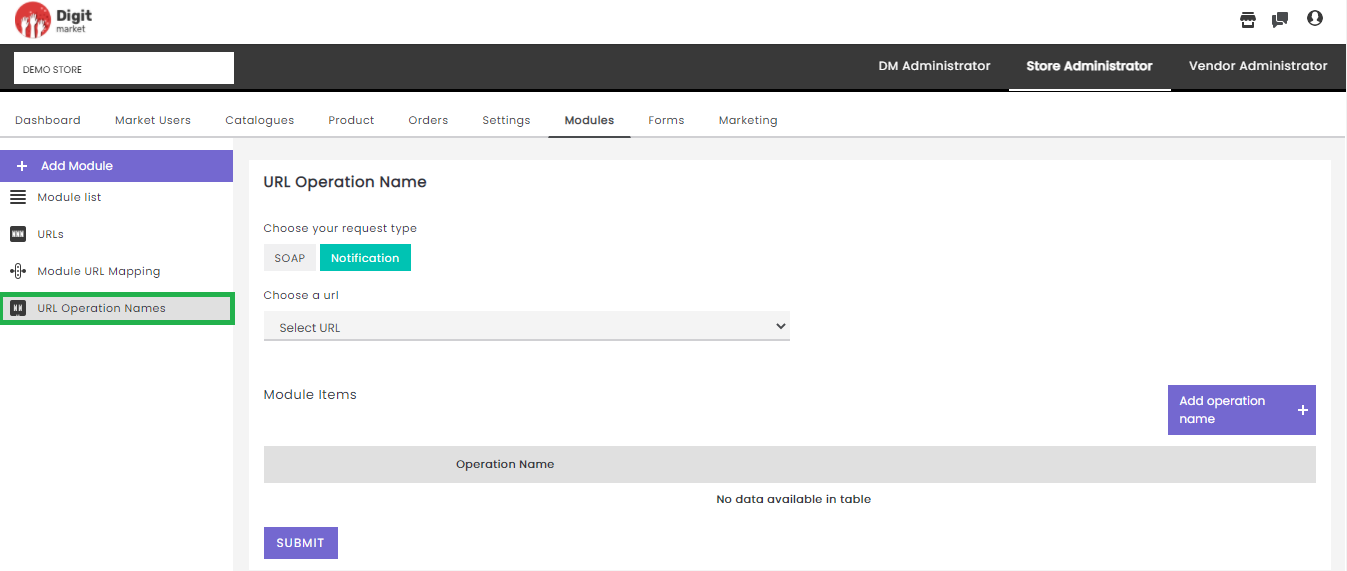
Fig. 2.261 URL Operation Names
On the above page users have to:
- Select Soap or Notification.
- Click the Select Method to get the URL drop-down field and select any.
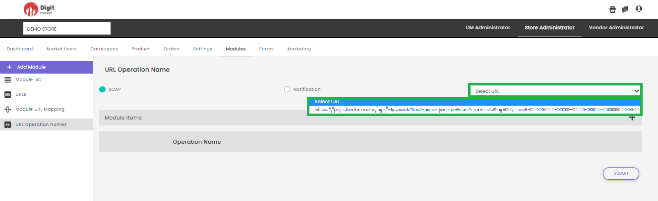
Fig. 2.262 Select Soap and Select URL
- Click the plus icon
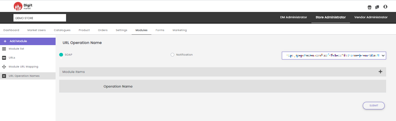
Fig. 2.263 Operation Name
2.11.7. Forms
Once you log-in as the Store Administrator, click the Forms tab from the main menu the Form List page will be displayed. The Form List will display all the Forms along with details such as Form Name, Status, Progress, Form Type and Action as shown below:
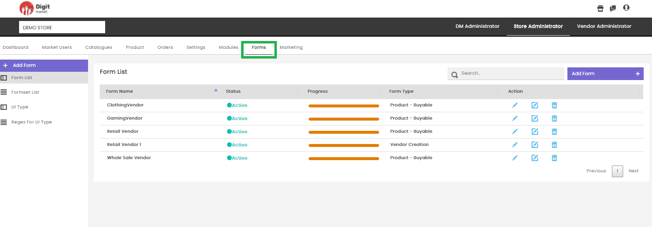
Fig. 2.264 Form List
On the Form List page users have the following options:
Add Form: Click the Add Form tab, displays the Create a new Form dialog as shown below:
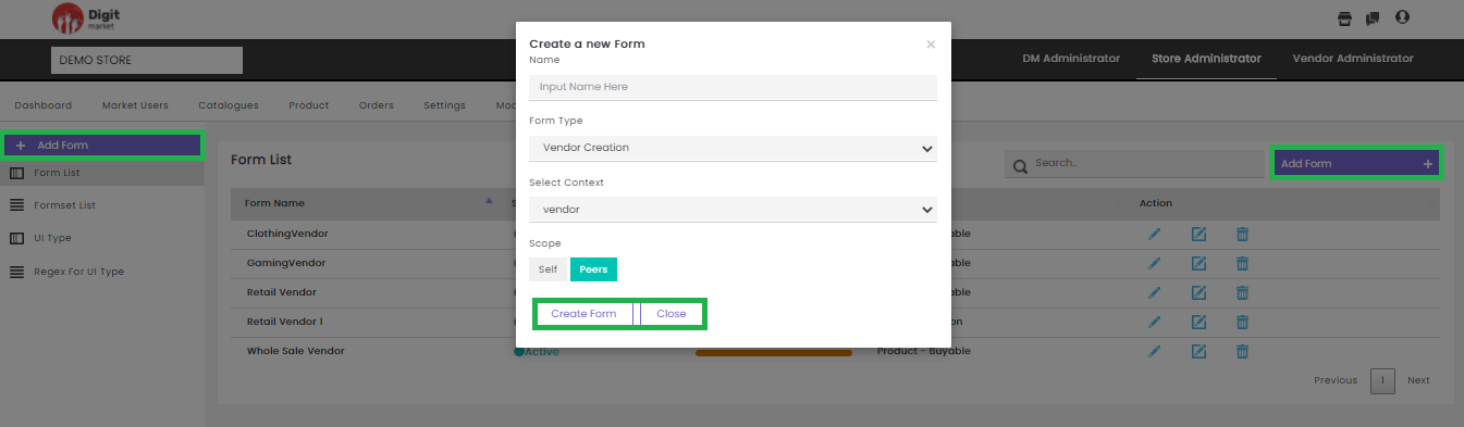
Fig. 2.265 Create New Form
Provide all the details in the Create a new Form dialog:
- Name: Name for the form.
- Form Type: Select from the drop list as per the requirement. The available options are:
- Vendor Creation
- Vendor User Creation
- Product-Buyable
- Product-Bookable
- Product-Subscription
- Product-Application
- Select Context: Select from the drop list. The values will depend on Form Type selection.
- Scope: Select either self or peers.
Click the Create From to create or Close to exit. Once the form is created a successful message will be displayed and will be added to the Form List as shown below:
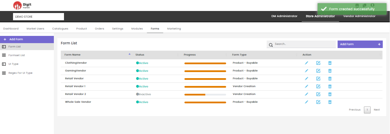
Fig. 2.266 Form Created Successfully
Search: Allows users to search by giving a phrase or a key value. It is recommended to populate this field with relevant information so that locating through search will be quicker.
Form List: Click the Form List tab, the Form List page will be displayed. Form List page displays all the forms along with the details such as:
- Form Name: Name given for the form at the time of creation.
- Status: Displays active or inactive.
- Progress: State of the form.
- Form Type: Displays the type of the form given at the time of creation.
- Action:
- Click the edit icon to display the Edit Form dialog
where the user can edit the details: Name, Form Type, Select
Context, Scope as shown below:
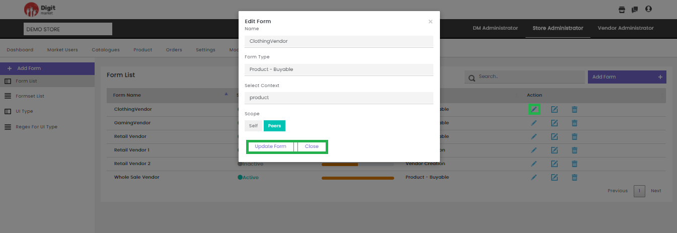
Fig. 2.267 Edit Forms
Click the Update Form button to update the details or Close to exit.
- Click the advanced edit icon
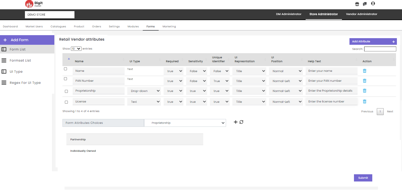
Fig. 2.268 Advanced Edit Options Store Administrator
Users can also perform:
- Search: Allows users to search attribute by giving a phrase or a key value. It is recommended to populate this field with relevant information so that locating through search will be quicker.
- Add Attribute: Click Add Attribute to add attributes for the selected form by providing the following details:
Note
Atleast one user defined attribute should be added for the user registration form is displayed.
- Name: Name of the attribute.
- UI Type: Click the dropdown list to select from the options: Email, Phone-number, text, etc.
- Required: Click the dropdown list to select any one of the two options: True/False. True for mandatory fields and False for non-mandatory fields.
- Sensitivity: Click the dropdown list to select any one of the two options: True/False. True for sensitive fields and False for non- sensitive fields.
- Unique Identifier: Click the dropdown list to select any one of the two options: True/False. True for unique fields and False for non- unique fields.
- UI Representation: Click the dropdown list to select from the options: Title, Short Description, Description, Profile-Logo, Display-Logo,etc.
- UI Position: Click the dropdown list to select from the options: Normal-Left, Normal, Normal-Right, Tab-Left, Tab-Right.
- Help Text: Metainformation about the form, aids to help the users.
- Action: Users can delete only the attributes added by him. Click the delete icon
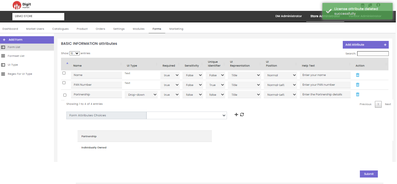
Fig. 2.269 Attribute Delete Successfully
Note
Default attributes cannot be deleted.
- Form Attributes Choices displays all the attributes in the form. Click the plus icon
Fig. 2.270 Form Attributes Choices
If the user wants to define form attributes having a fixed set of values, then the user must select UI Type as ‘drop down’, then data values for those enums are set here.
The Add button allows you to add multiple values and the Cancel button to exit.
- Click Submit. The saved data is visible for the created categories.
- Click the delete icon
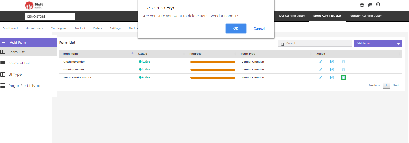
Fig. 2.271 Warning Message for Deleting the Form List
On this page, the users can restrict the number of attributes displays on one page. Use Previous or Next to switch between the pages.
Formset List: Click the Formset List tab from the left panel, the Formsets List page will be displayed. Formsets List page displays all the forms in two sections User Created Formsets and Default Formsets along with the details such as
FormSet Name: Name for the formsets given at the time of creation.
UI Name: Displays the name.
Scope: Display the scope either Peers or Self, given at the time of creation.
Action:
- Click the preview icon to preview the formset.
- Click the edit icon to display Edit Formset dialog
where the user can edit the details Name, Name-UI, Select
Context, Form Type, Scope and Forms as shown below:
- Click the preview icon
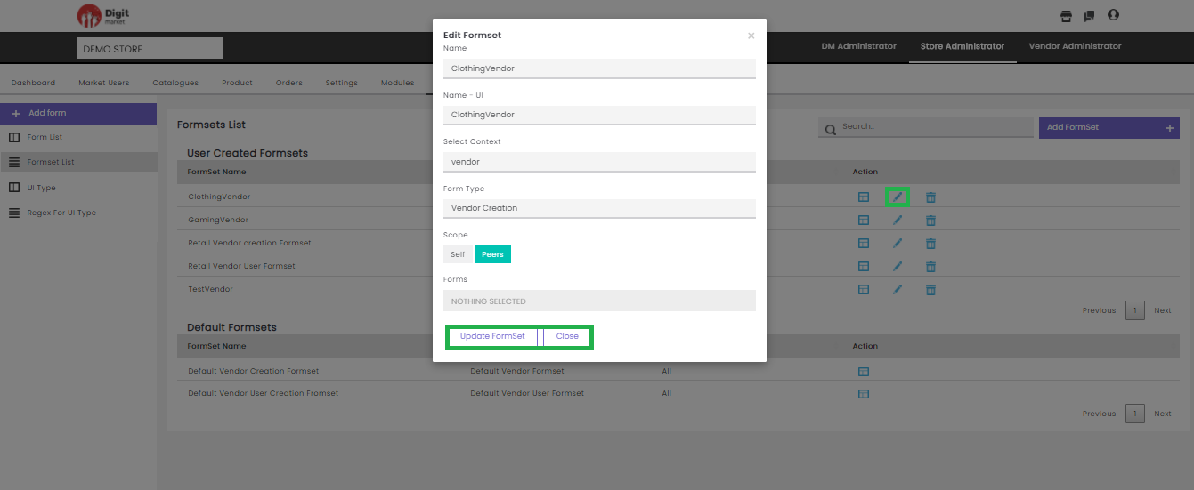
Fig. 2.272 Edit Formsets
- Forms is a drop-down list where users can group different forms to make a formset. Already selected Forms will have
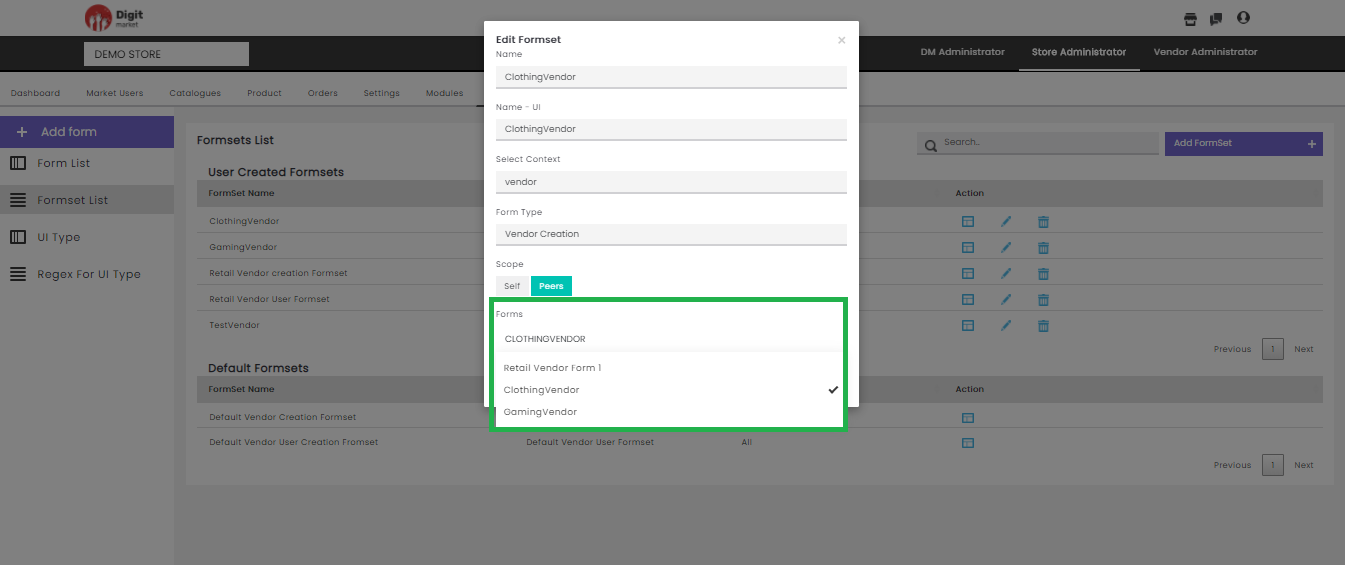
Fig. 2.273 Form Selection
Click the Update Formset to update the Formset or Close to exit.
- Delete: Click the delete icon
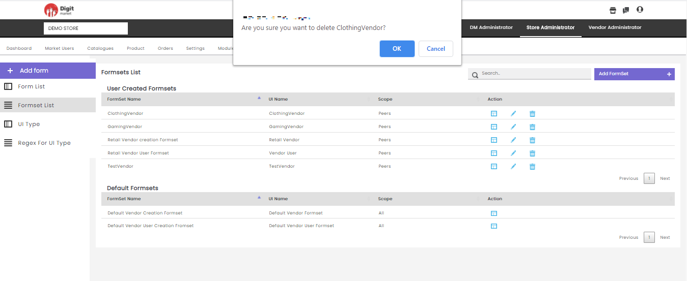
Fig. 2.274 Warning Message for Formset Deletion
Click the Ok to delete or Close to exit.
Users can also perform:
- Search: Allows users to search for the form attributes by giving a phrase or a key value. It is recommended to populate this field with relevant information so that locating through search will be quicker.
- Add Formset: Click Add Formset to create formset by providing the following details:
- Name: Name of the formsets.
- Name- UI: Name to be appeared in UI.
- Formset Type: Click the dropdown list to select from the options: Vendor Creation, Vendor User Creation, Product-Buyable, Product-Bookable, Product-subscription, Product-Application.
- Select Context: Click the dropdown list to select.
- Scope: Set access by selecting either one among self or Peers.
- Forms: Click the drop-down list where users can group different forms to make a formset. Already selected Forms will have
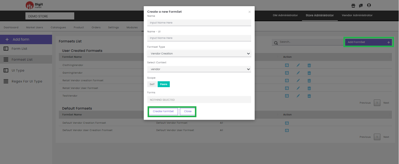
Fig. 2.275 Create Formsets
UI Type: Click the UI Type tab from the left panel, the UI Type List page will be displayed as shown below. Use Previous or Next to switch between the pages.
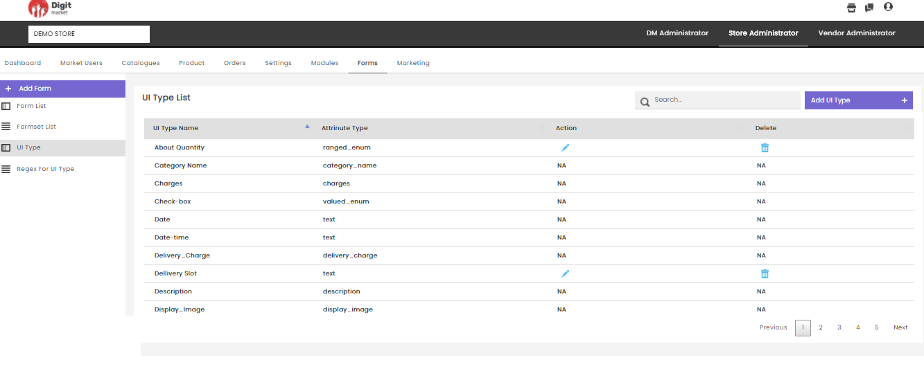
Fig. 2.276 UI Type
The UI Type List page displays all the UI type created along with the details such as:
- UI Type Name
- Attribute Type
- Action: Click the edit icon
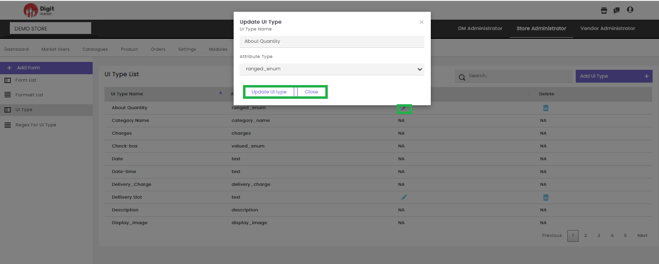
Fig. 2.277 Update UI Type
Click the Update UI Type button to update the details or Close to exit.
- Delete: Click the delete icon
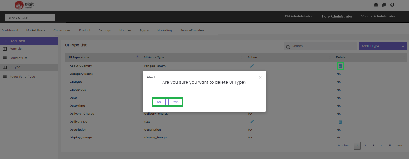
Fig. 2.278 Delete UI Type
Click the Yes to delete or No to exit.
Note
Users cannot edit or delete the default UI Type Name.
Users can also perform:
- Search: Allows users to search by giving a phrase or a key value. It is recommended to populate this field with relevant information so that locating through search will be quicker.
- Add UI Type: Click the Add UI Type button, the Create a new UI Type dialog will be displayed as shown below:
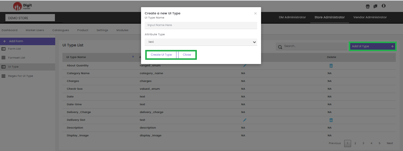
Fig. 2.279 Add UI Type
In the Create a new UI Type dialog, provide the UI Type Name and Attribute Type. Click the Create UI Type to create or Close to exit.
- Regex For UI Type: Click the Regex For UI Type tab from the left panel, the Regex List page will be displayed. Use Previous or Next to switch between the pages.
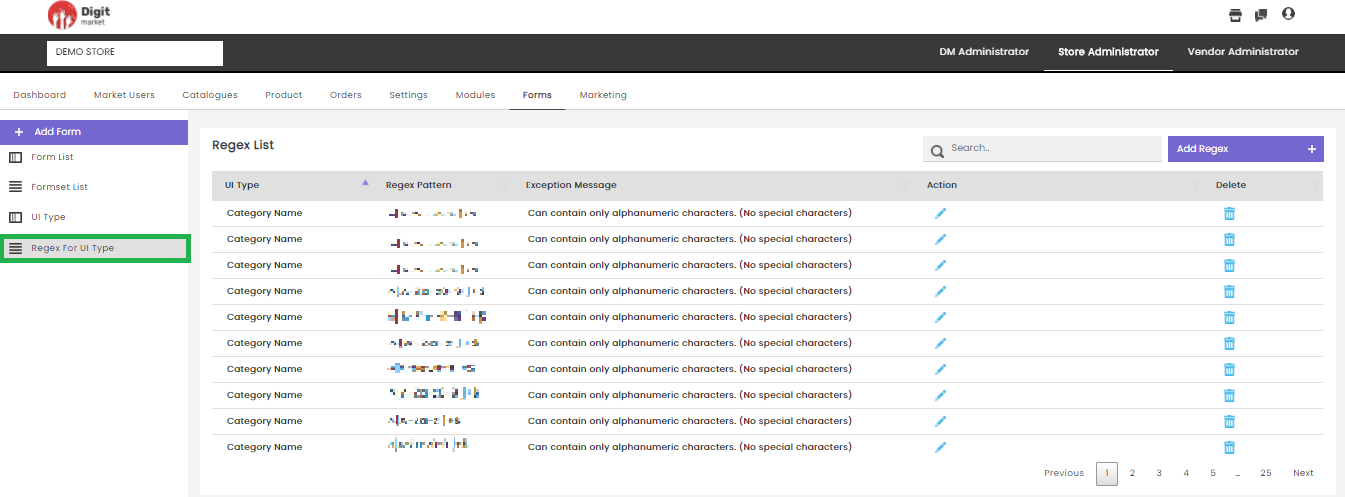
Fig. 2.280 Regex for UI Type
This page will display the details like:
- UI Type
- Regex Pattern
- Exception Message
- Action: Click the edit icon
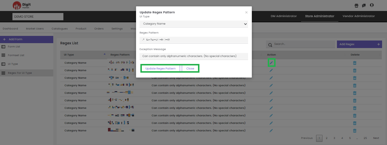
Fig. 2.281 Update Regex Pattern
- Delete: Users can delete a regex by clicking the delete icon
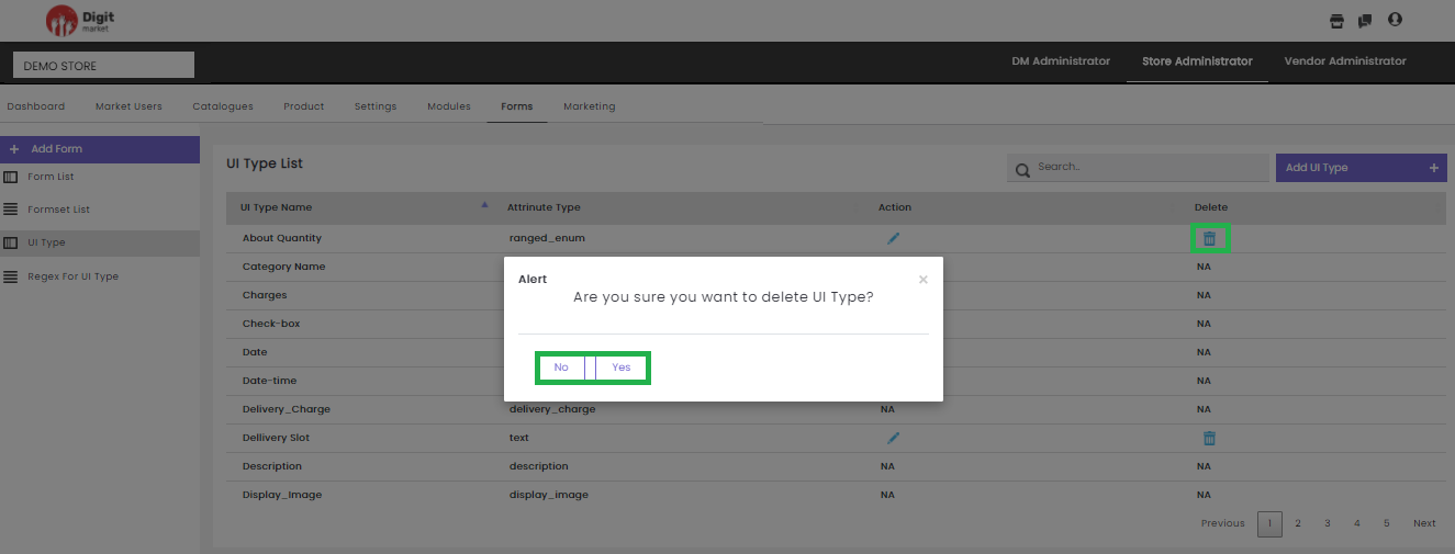
Fig. 2.282 Delete a Regex
Click the Yes to delete or No to exit.Users can also perform:
- Search: Allows users to search by giving a phrase or a key value. It is recommended to populate this field with relevant information so that locating through search will be quicker.
- Add Regex: Click the Add Regex tab, the Create a new Regex dialog will be displayed as shown below:
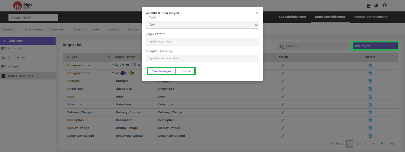
Fig. 2.283 Add Regex
In the Create a new Regex dialog, provide the UI Type, Regex Pattern, Exception Message. Click the Create Regex to create or Close to exit.
2.11.8. Marketing
Once you log-in as the Store Administrator, click the Marketing tab from the main menu the, the Invite List page will be displayed. Use Previous or Next to switch between the pages.
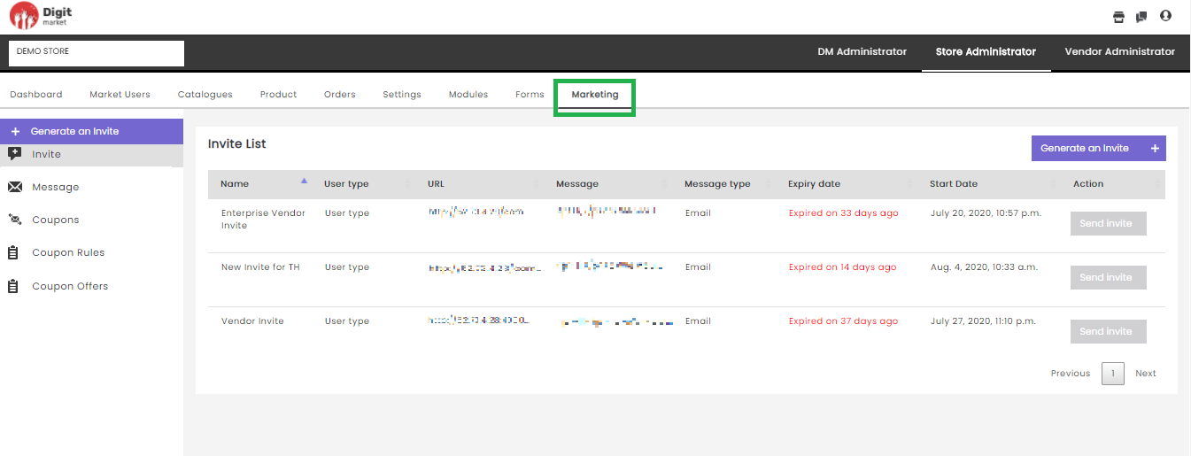
Fig. 2.284 Invite List Page
The invite has to send to Vendor Users who wish to be part of the Digit Market™ platform.
Steps for sending an Invite Vendor users:
- Compose the message. Click on Compose Messages to see how it works in Digit Market™.
- Generate the Invite. Click on Generate Invites to see how it works in Digit Market™.
- Send the Invite. Click on Send Invites to see how it works in Digit Market™.
- Fill the form and wait for apporval.
On the Invite List page users have the following options:
- Generate Invite: Click the Generate Invite tab, displays the Generate an Invite dialog as shown below:
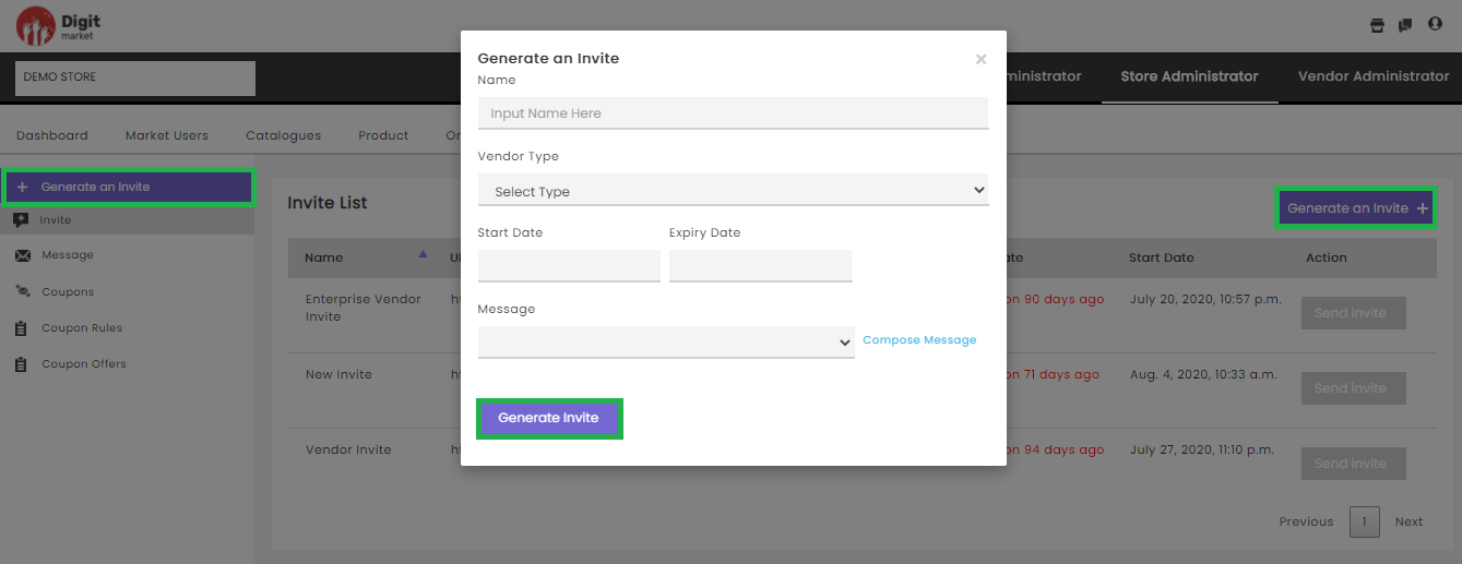
Fig. 2.285 Generate Invites
On the Generate an Invite dialog provides all the information like Name, Vendor type, Start Date, and Expiry Date, Message, Compose Message.
On the above dialog users have an option to select the preconfigured message or compose the customized message as shown below:
- Click the Message field to display all the preconfigured message as shown below:

Fig. 2.286 Default Message
- Click the Compose Message to compose a customized message by
providing
- Name: The name of the invite.
- Vendor type: Click this field will display all the vendor type in a drop-down select any.
- User type: Select either Email or SMS as shown below:
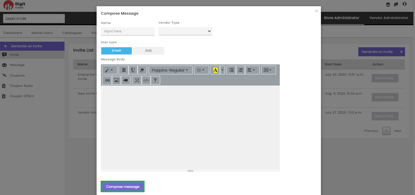
Fig. 2.287 Compose Messages
Click the Compose message button to compose the message or click
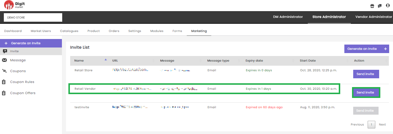
Fig. 2.288 Send Invites
On clicking the Send Invite button the Send Invite dialog will be displayed as shown below:
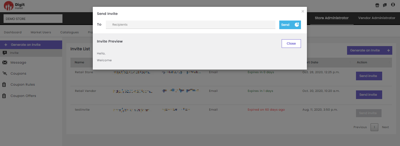
Fig. 2.289 Send Invite
On the Send Invite dialog provide ‘To’ address if Email is chosen or
Phone number if SMS is chosen and click the Send button to send or click
the Close to exit. On the dialog users also can see the
Invite Preview. Once the users click the send button a successful
message will be displayed as shown below:
Fig. 2.290 Email send
Once the Invite or Message has been sent, the receiver has to fill and submit it. The Store Administrator can take the corresponding action on the Vendor Onboard Requests tab.
- Invite: Same functionality as above.
- Message: Click the Message tab, the Message List page will be displayed. This page displays all the messages along with the details like Name, Type, Message type, Messages, Actions. Use Previous or Next to switch between the pages.
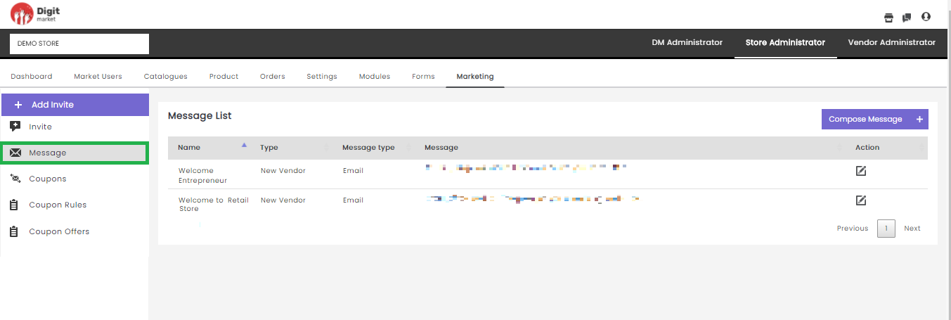
Fig. 2.291 Message List Page
Click the edit icon displays, the Update Message dialog as
shown below:
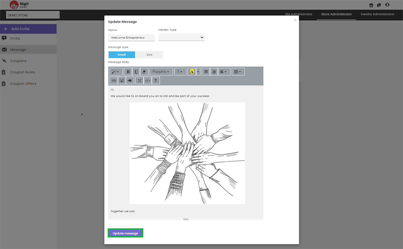
Fig. 2.292 Update Message
In the Update Message page, user can edit all the details and click on
the Update message button to update or click to exit.
Click the Compose Message to create a new message. The functionality is as same as above click the Compose Messages to see the details.
- Coupons: This allows the user to associate the created coupon offers with a coupon ticket and define the range of dates the coupon is applicable. The steps for creating coupons are as same as DM Administrator click on Coupons to see the steps.
- Coupon Rules: This allows the user to create coupon rules at granular levels. It allows to associate with a predicate for evaluating criteria before applying the discount on the bill amount and a discount percentage. The steps for creating coupons rules are as same as DM Administrator click on Coupon Rules to see the steps.
- Coupon Offers: This allows the user to create coupon rules at granular levels. It allows associating with a predicate for evaluating criteria before applying the discount on the bill amount and a discount percentage. The steps for creating coupons offers are as same as DM Administrator click on Coupon Offers to see the steps.
2.12. Vendor Administrator
They are linked to a specific vendor or multiple vendors. once logged into DigitMarket™, they will have a single point of access to all needed stores. Vendor administrators are responsible for the creation and monitoring of the vendor third-party users. Create another Vendor Users within the limit of their limits of his role and responsibilities and assign them to required user groups and name their role
- Assign Vendor Users to various Categories.
- Activate/deactivate Vendor Users.
- Create and manage Products/Services.
- Edit/clone published Products/Services.
- Product editions with the ability to create variants in terms of features.
- Define price plans - Fixed, free and Recurring all 3 types supported.
- Handle customer orders.
- Chat with other DigitMarket™ users.
- Respond to queries or requests from Store Users for their Vendor.
- Creating/monitoring vendor’s Third-party.
- Creating/associating vendors’ third-party users.
- Creation of vendor-specific products and optionally publish products: During product creation, he can define product-specific life cycles.
2.12.1. Dashboard
As Vendor Administrator, when you Sign-in to DigitMarket™ application the landing page will be the Vendor Administrators Dashboard page as shown below:
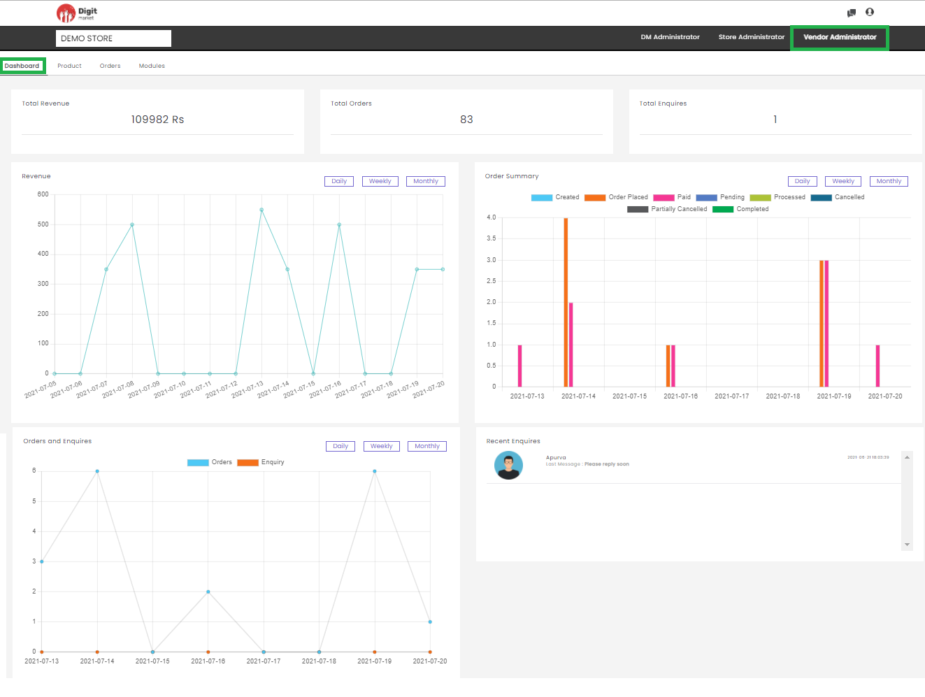
Fig. 2.293 Vendor Admin Dashboard
Here users can the following details:
- Total Revenue: It is the sum of the order amount on the Order List page.
- Total Orders: Total number of orders on the Order List page. Here users can click on the total orders to display the Order List page. Click on the total order to display the Order List page.
- Total Enquiries: Total number of enquiries. Click on the total enquiries to display the Chat List page.
- Revenue: The graphical representation of total order amount on a Daily, Weekly, and Monthly basis.
- Order summary: The graphical representation of order on a Daily, Weekly, and Monthly basis.
- Order and Enquiries: The graphical representation of the number of orders and Enquiries on a Daily, Weekly, and Monthly basis.
- Recent Enquiries: Displays the few recent enquiries. Click on any enquiries to display the Chat List page.
Quick Action Shortcuts
The Quick Action Shortcuts in Vendor Administrator are Chat via chat icon and Switch Role and Logout via user icon .
Click the chat icon to display the chat history as shown below. DM chat helps the interactions between the DM users. The DM chat initiator can search and select the intended recipient and initiate a chat request.
However, the chat can intiated based on few conditions:
If the superuser wants to chat with the lower-level user, they can chat directly without accepting the chat request by the lower-level user.
If the lower-level user wants to chat with the super user, then the superuser permission is needed (they should accept it). Once the superuser accepts the chat will be enabled and they can interact using this feature or else it will be disabled mode.
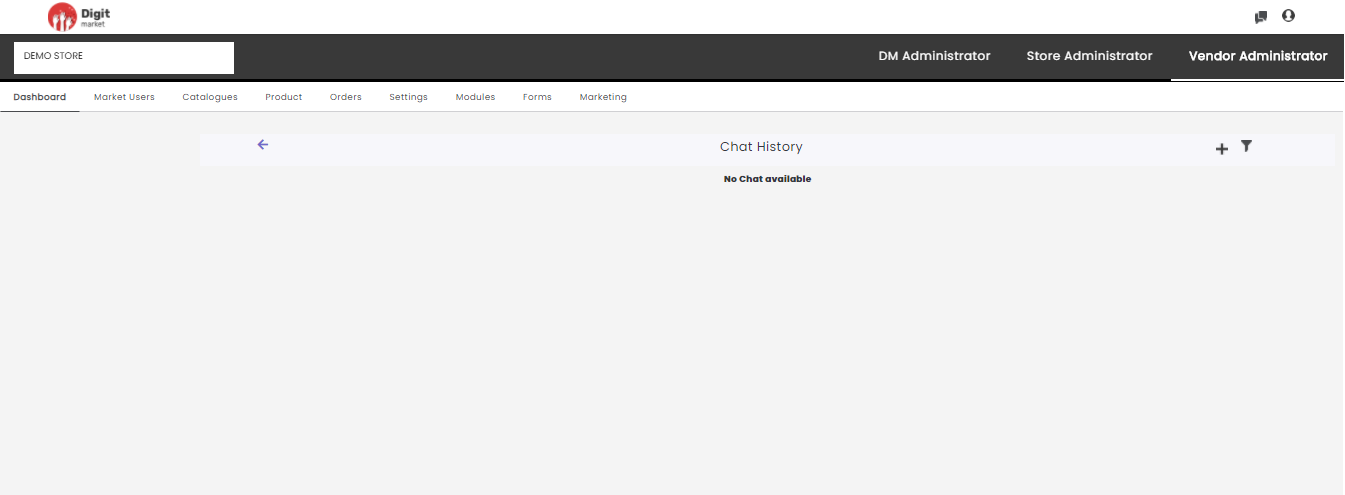
Fig. 2.294 Chat History
User Search: This field helps to search for other users.
The left panel will display all the users who have initiated the chat request. Once the chat request has been sent they have to wait until the other user accepts it as shown below:
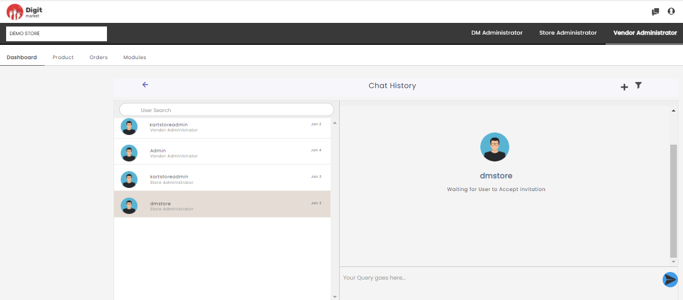
Fig. 2.295 New Chat
If the chat request has been accepted then they can type in the queries on the right side as shown below:
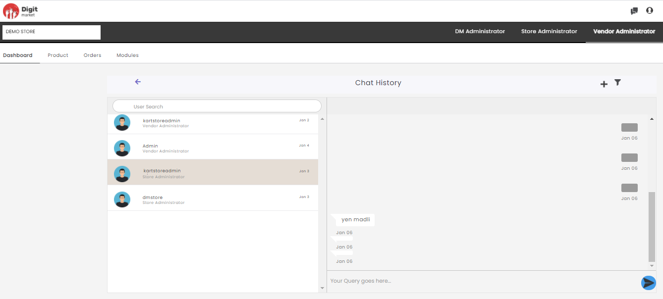
Fig. 2.296 Chat Initiated
Click the plus icon to display a new chat page as shown below:
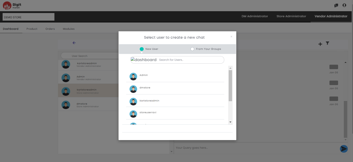
Fig. 2.297 Create New Chat
Here users can select the below options for a new chat:
- New User: Here the user can select anyuser and send chat request once they accept user can start chatting with them.
- From Your Groups: This will display the others users associated with the logged user.
- Select for Users: Users can search the people from here and send chat request.
Click the filter icon to filter the chats at different levels. Users can select store level/vendor level on the pop up.
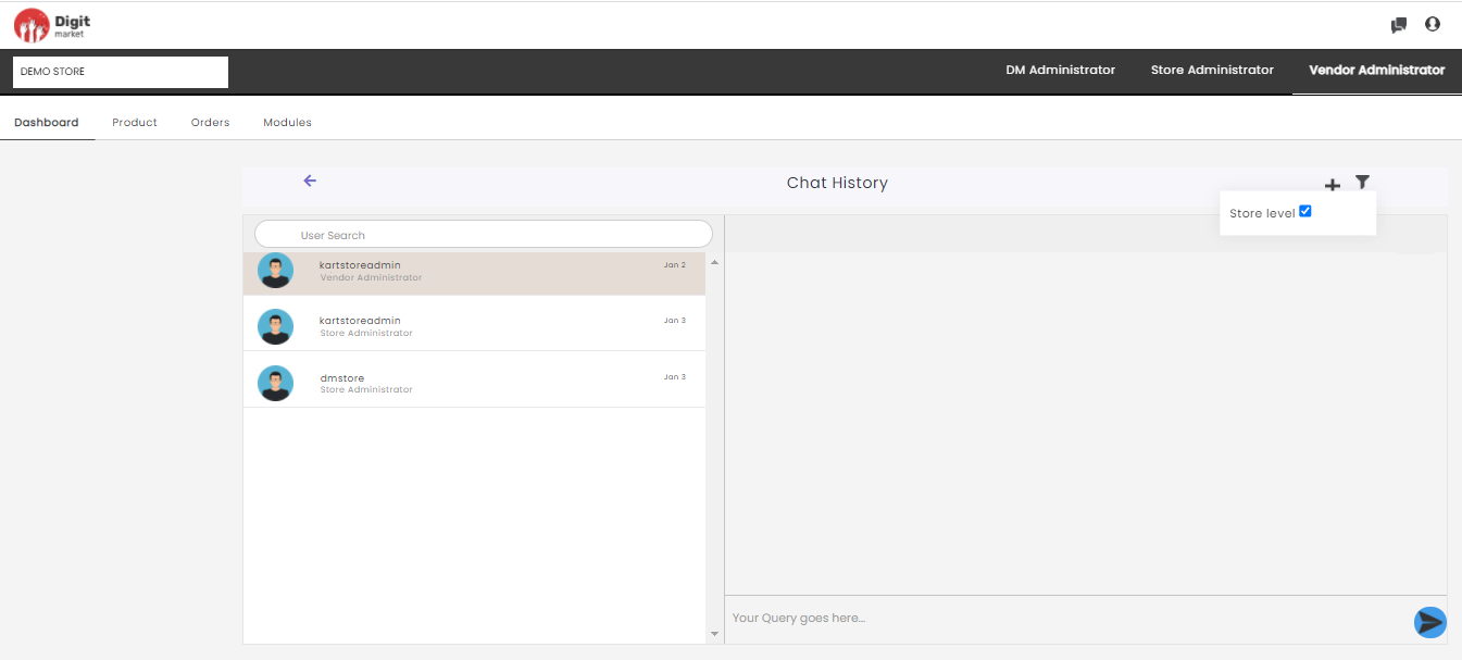
Fig. 2.298 Filter
Click the user menu icon to logout from the application.
2.12.2. Product
Vendor Admins can edit/clone the products/services to the store. These products/services will be displayed on the storefront for the customers.
Once you log-in as the Vendor Administrator, click the Product tab from the main menu the Product List page will be displayed along with details such as Name, Image, Product Type, Status. In the Product List page using the Show entries drop-down list, users can set the number of the product to be displayed on one page. Use Previous or Next to switch between the pages as shown below:
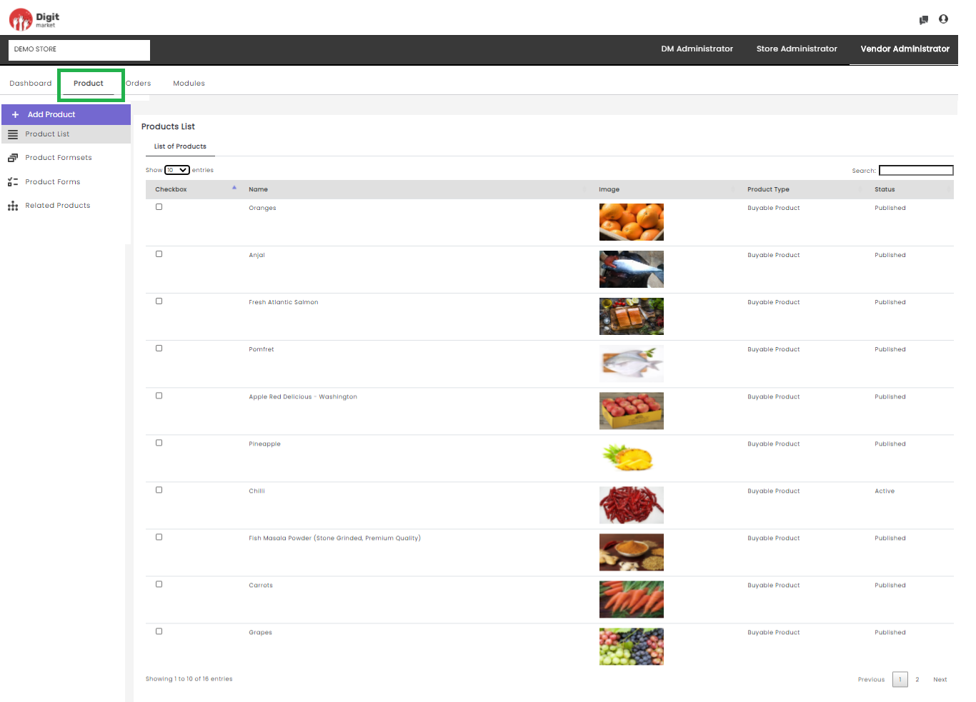
Fig. 2.299 Product List
Note
Products for a Store can only be created by Store Admins.
Here users can perform the following actions:
- Search: Used for searching by giving some attributes.
- Add Product: Click the Add Product tab the Product Publishing page will be displayed. Add Product helps to publish the product by the vendor.
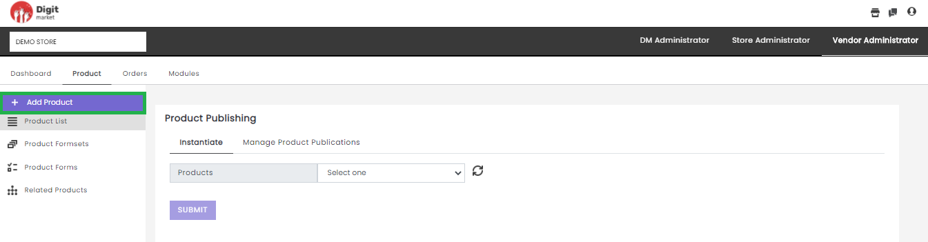
Fig. 2.300 Add Product
Here users have to perform in two steps:
Instantiate
From the Products drop-down list, select the required product. It will display all the products created in Categories under Catalogues along with its category attributes and product attributes created using Formset as shown below:
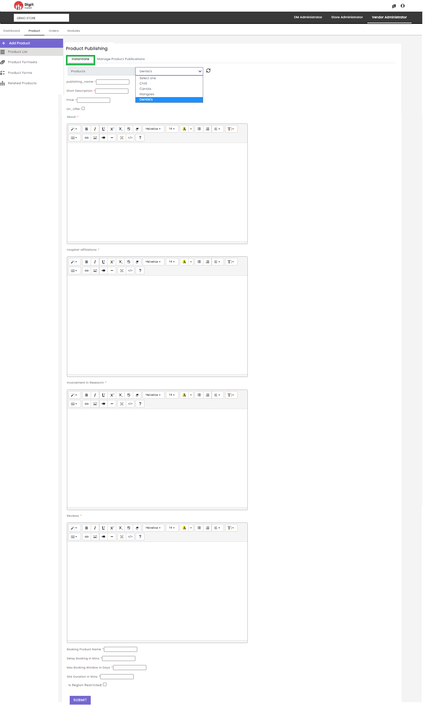
Fig. 2.301 Instantiate a Product
On the above figure, the vendor is publishing a Product ‘Dentist’s’ with its category attributes, product attributes and product enum attributes. To publish a product, the Vendor needs to provide the data for each attribute.
Category attributes are:
- Publishing_name
- Short Description
- Price
- On_Offer
Product attributes are:
- About
- Hospital-affiliations
- Reviews
Note
For Product attributes, vendors can type-in the more information about the product and can use typography and insert the link, video, codes etc by selecting appropriate icons to make attractive.
Product enum attributes are:
- Booking Product Name
- Delay Booking in Mints
- Max Booking Window in Days
- Slot Duration in Mints
Manage Product Publications
In Manage Product Publications in the Action field, vendors can edit/clone the instantiated product by selecting Published Products and Published Names from the drop-down list and click Submit to save the changes. Click the refresh icon
to refresh the data.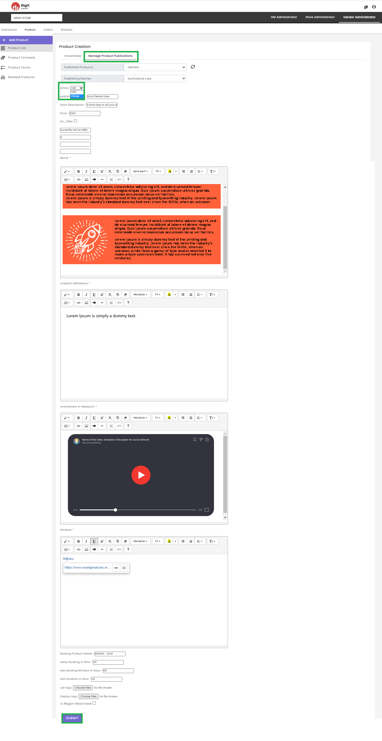
Fig. 2.302 Manage Product Publications
Note
The Product publishing page for Instantiating and Manage Product Publishing page will differ based on the type of the product like buyable, bookable, application and subscription. The above shown is for bookable.
- Products List: The functionality is the same as in Store Administrator. Click the Products List to see the details.
- Products Formsets: The functionality is the same as in Store Administrator. Click the Products Formsets to see the details.
- Products Forms: The functionality is the same as in Store Administrator. Click the Products Forms to see the details.
- Related Products: The functionality is the same as in Store Administrator. Click the Related Products to see the details.
2.12.3. Orders
Once you log-in as the Vendor Administrator, click the Orders tab from the main menu, the Order List page will be displayed along with the details such as Orderid, Date, Customer Name, Status, Payment, Amount, More as shown below:
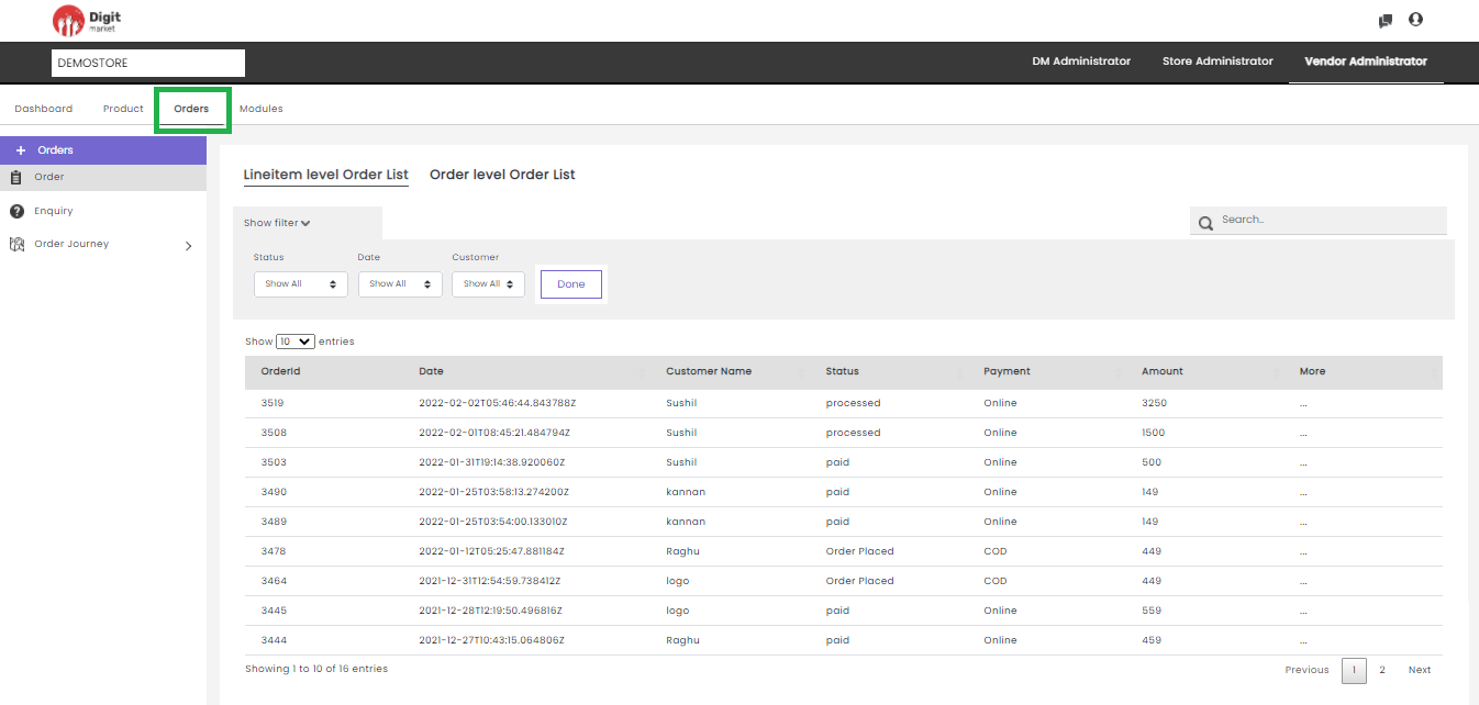
Fig. 2.303 Order List
Digit Market offers the flexibility for the vendors to choose the orders to be processed at the item level or order level.
LineItem level Order List: The vendor chooses to process the order by an individual item. Click the Lineitem level Order List tab to see the order placed at the Lineitem level.
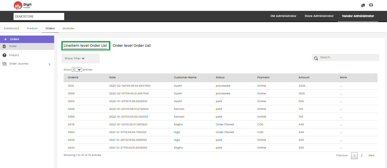
Fig. 2.304 Line Item Level Order List
Here users can refine the order list based on Status, Date, Customer available on Show Filter drop-down, click the drown arrow
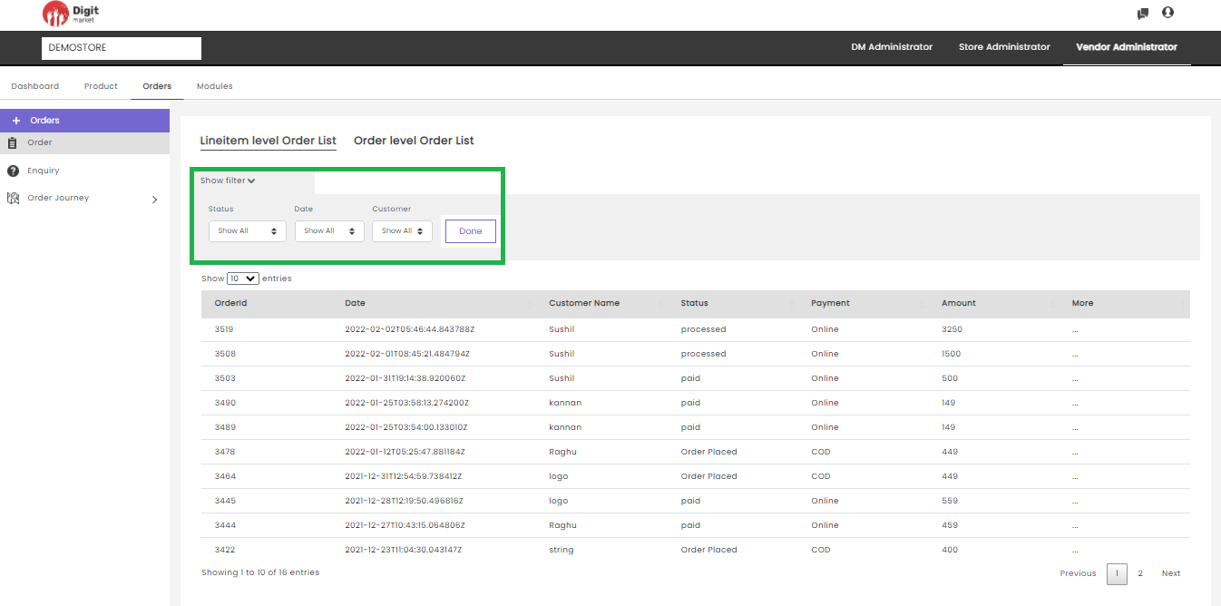
Fig. 2.305 Show Filter
Users can select the required field and click the Done button to apply the filter and the result will be displayed on the order list page. For instance, if a user wants to filter based on ‘order placed’, select order placed from the Status and click the Done button as shown below:
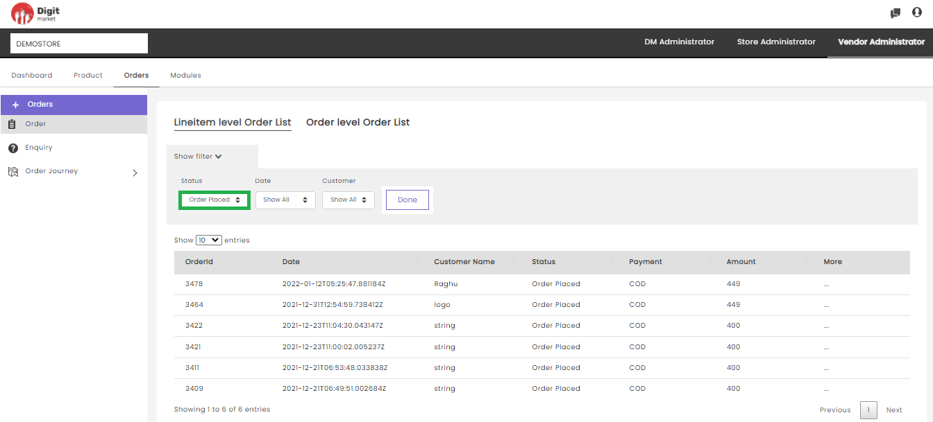
Fig. 2.306 Show Filter Criteria
On this page using the Show entries drop-down list, users can set the number of the product to be displayed on one page. Use Previous or Next to switch between the pages.
Click on any field other than the Orderid on the Order list page the detailed order list will be displayed as shown below:
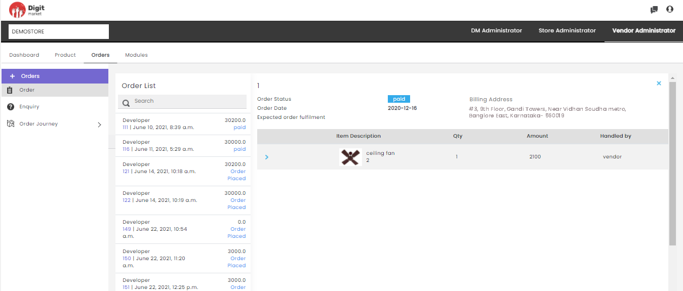
Fig. 2.307 Detailed Order List
On the above page will show the Item Description, Qty, Amount, Handled by. Click the expand icon
will display the current journey module of the item. Here vendor can add notes if he wish to by clicking the edit icon. Also he can take an action to Proceed or Failure in case of manual module as shown below:
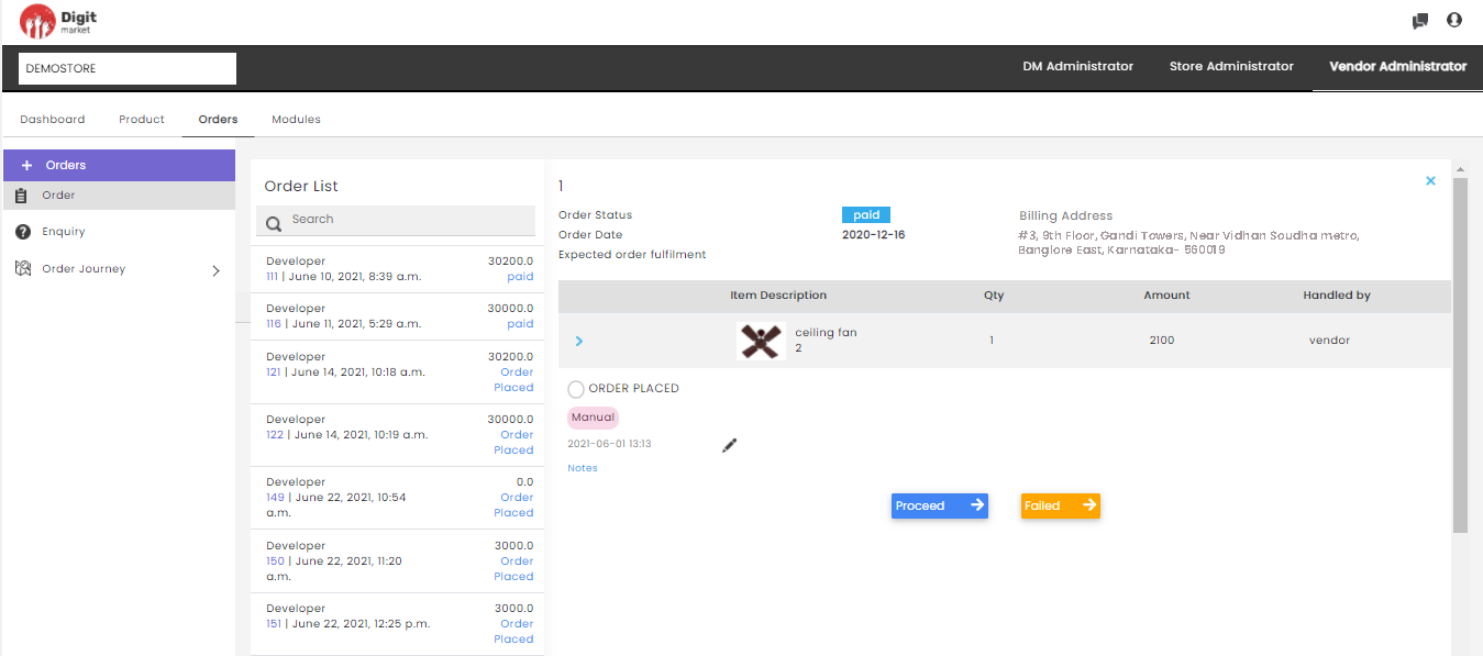
Fig. 2.308 Detailed Order List
Note
Vendor must accept order before processing.Handled by will display the vendor name who is handling the product else it will display Accept button.Click on the three-dot
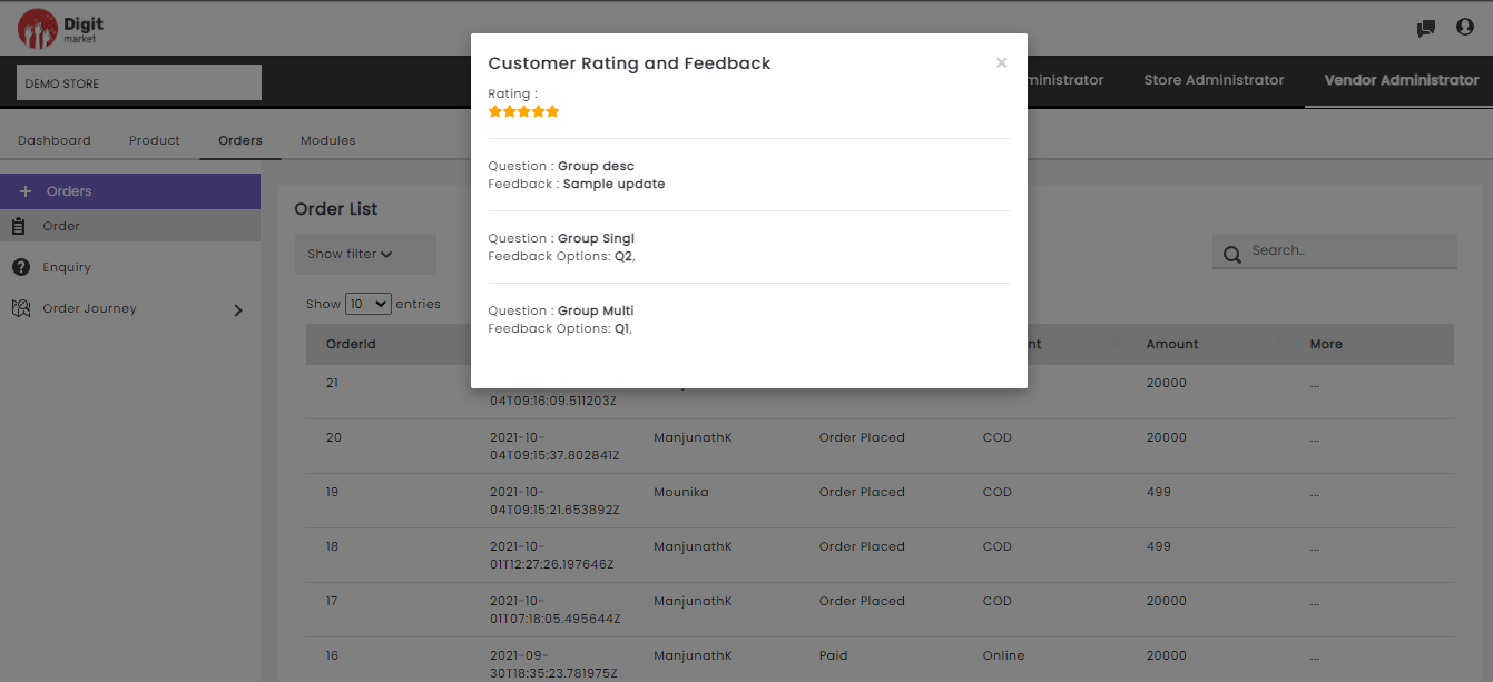
Fig. 2.309 Vendor Rating
If there is no rating provided by the customer it will be displayed as shown below:
Fig. 2.310 No Vendor Rating
Order level Order List: The vendor chooses to process the order by the Order level. Click the Order level Order List tab to see the order placed at the order level.
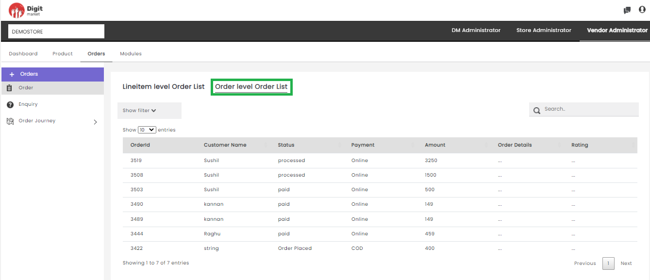
Fig. 2.311 Order Level Order List
Note
The products in the Order level order list must be from one vendor and the order journey must be defined at the vendor level.
Here, in addition to the filtering and searching users can view the below details:
Orderid: Displays the id assigned for the order.
Customer Name: Displays the name of the customer who placed the order.
Status: Displays the current status of the order. Also, if the user clicks on the current status it will take you to Order Journey and the vendor can take the required action for Manual modules.
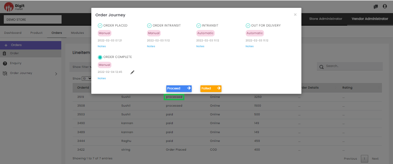
Fig. 2.312 Payment Status
Payment: It shows the payment method.
Amount: The amount paid for the order.
Order Details: Click on the three-dot
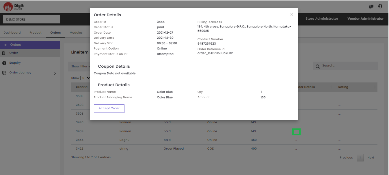
Fig. 2.313 Order Details
Click on the Product Belonging Name to see more details about the order as shown below:
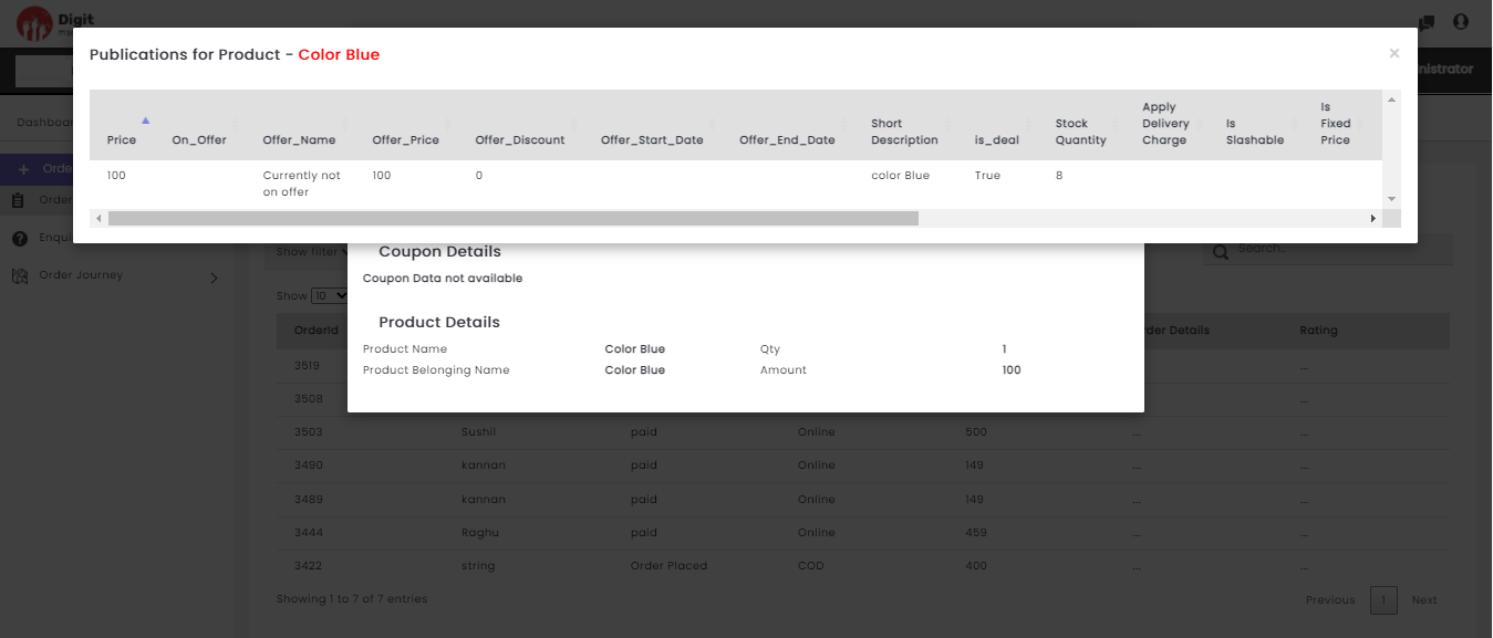
Fig. 2.314 Detailed Order
If the Vendor is not accepted the order the Accept Order button will be displayed in the Order Details dialog. Click the Accept Order button to accept the order.
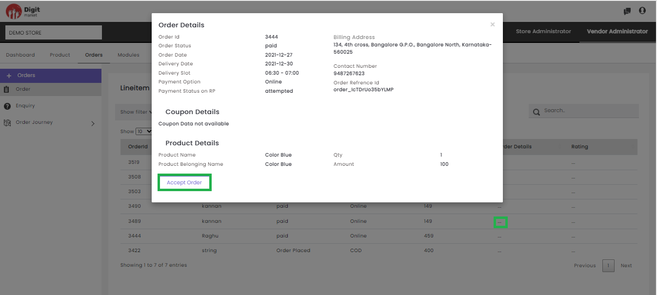
Fig. 2.315 Order Details
Once the order is accepted a success message will be displayed and vendor can view/take necessary action(manual) in the journey module.
Rating: Click on the three-dot
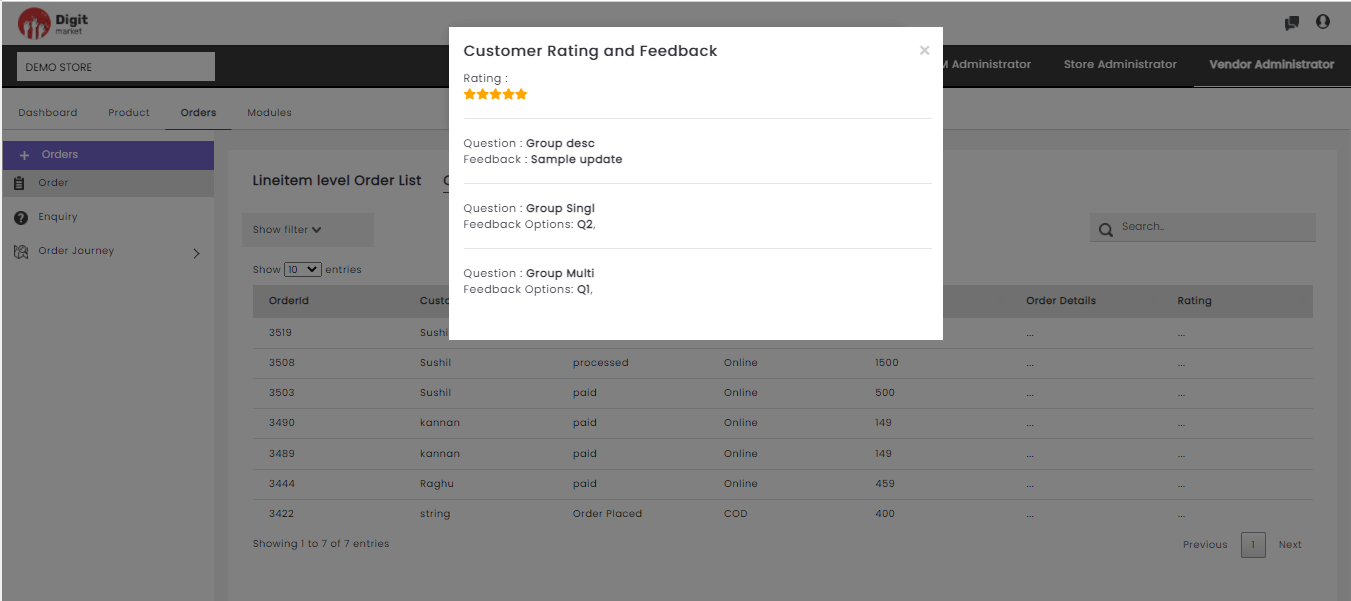
Fig. 2.316 Vendor Rating
Search: Allows users to by giving a phrase or a key value. It is recommended to populate this field with relevant information so that locating through search will be quicker. Click the filter icon
to apply the filters to aid searching.Order: Click the Order tab from the left panel, The Order List page will be displayed as shown on the above figure.
Enquiry: Enquiry helps to communicate with the vendors storefront user queries. The enquiries should be intiated from the front end as shown below:
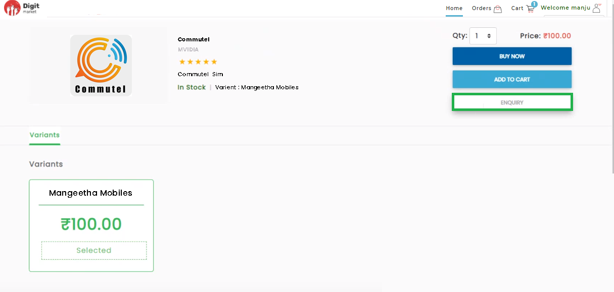
Fig. 2.317 StoreFront Enquiry
Users can typein their enquiry by clicking the Enquiry tab from the frontend and the queries will be visible for the vendor administrator.
Click the Enquiry tab from the left panel, The Chat List page will be displayed as shown below:
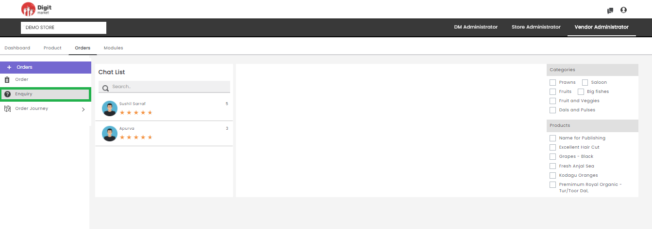
Fig. 2.318 Chat List
On the Chat List page, all the Vendors with their ratings and number of product handle will be displayed as shown on the above figure. Users can also type-in the vendor name in the Search textbox for better searching. It allows users to search store name by giving a phrase or a key value. Users can also filter by Categories and Products by checking the appropriate checkbox. Click on the Vendor name to display the products handled by him as shown below:
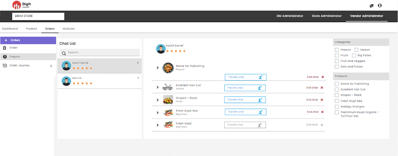
Fig. 2.319 Vendors and Product
Click on the Product to see the chat details as shown below:
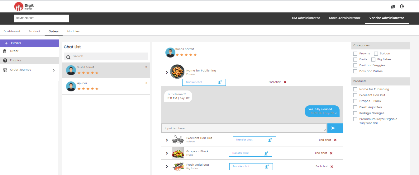
Fig. 2.320 Product Chat Details
Transfer Chat: Click the Transfer Chat, the Select User to Move Your Enquiry dialog will be displayed. Here user can select another user for handling the enquiry and click Submit to move the enquiry or CANCEL to exit.
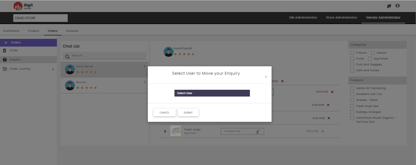
Fig. 2.321 Move Enquiry
End Chat: Click the End Chat, the Feedback for User dialog will be displayed. Here users can provide feedback by selecting appropriate options available also by providing comments. Click Submit to move the enquiry or CANCEL to exit.
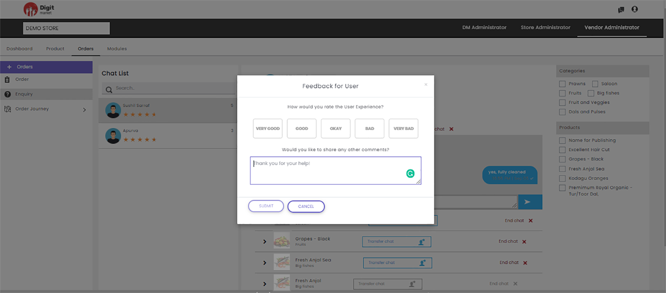
Fig. 2.322 Feedback for User
- Order Journey
- Vendor: Click the Vendor tab from the left panel, the vendor order journey will be displayed as shown below:.
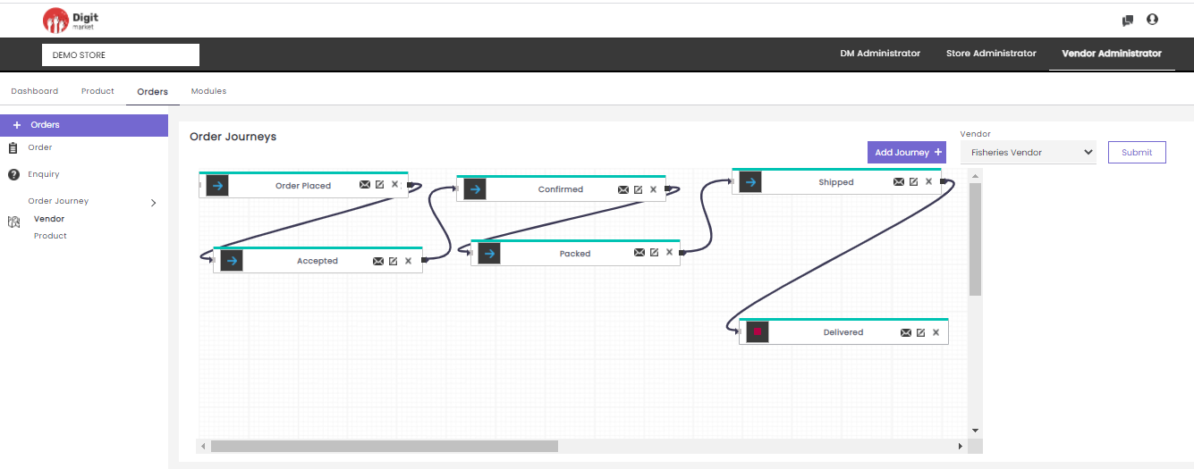
Fig. 2.323 Vendor Order journey
Here users can also perform the following actions:
- Add Journey: Click Add Journey displays all the already created modules in the drop-down. Select any one module, the node will be displayed in the canvas as shown below:
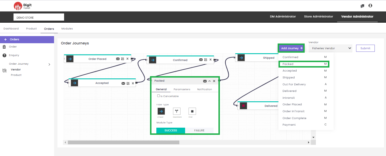
Fig. 2.324 Vendor Order Journey
Depend on the type of module creation it will represent Automatic (A), Manual (M), Custom (C).
Add Journey: In Add Journey, users can create a journey by selecting a module and providing other information like: Flow Type, Module Type. Click the mail icon
to send the notification to multiple vendors, click on the Set notification to see the steps. Click
Click the mail icon
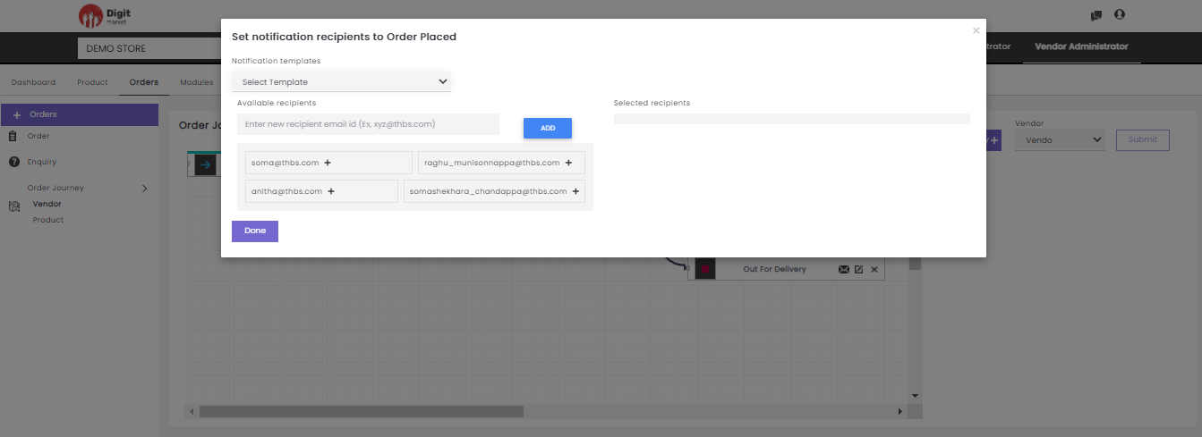
Fig. 2.325 Set Notification Recipients
Users can select the required notification template from the Select Template drop-down. Users can select the receipts from the available list or add the new recipients in the Enter new recipient email id text-box and click ADD button as shown below:
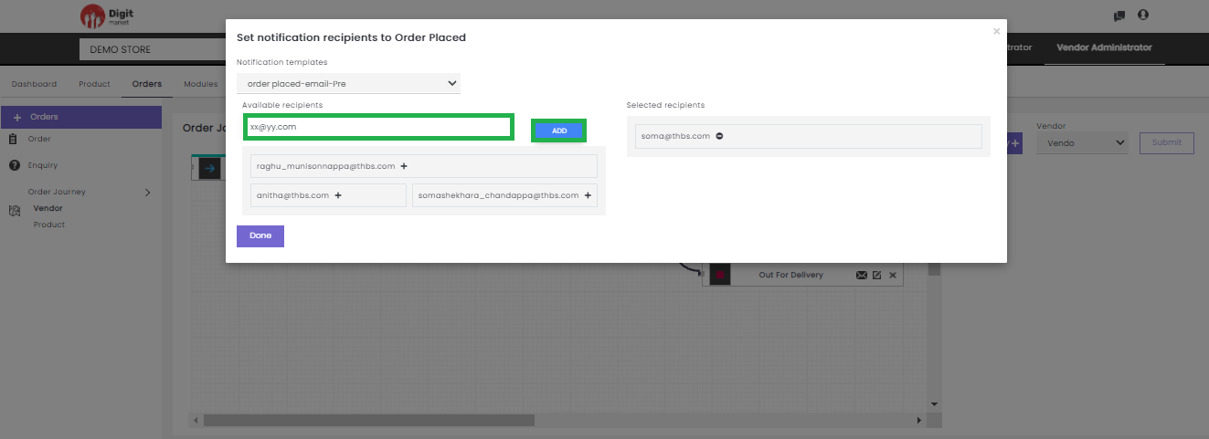
Fig. 2.326 Add New Recipient
Click the plus icon
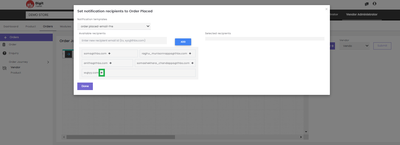
Fig. 2.327 Select the Recipients
Once the recipient is added a success message will be displayed and click Done to save the details.
SMS Notification
Users can select the required notification template from the Select Template drop-down. Users can select the receipts from the available list or add the new recipients in the Enter new recipient email id text-box and click ADD button as shown below:
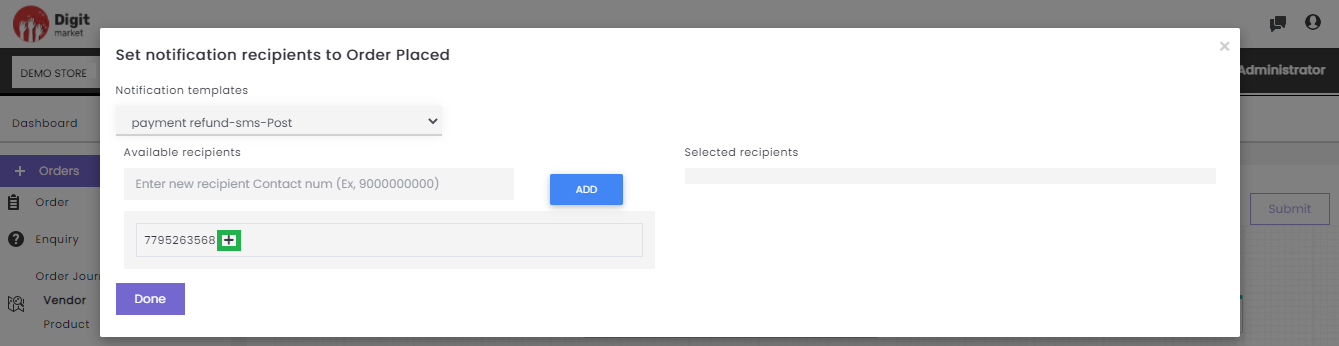
Fig. 2.328 SMS Notification
Click the plus icon
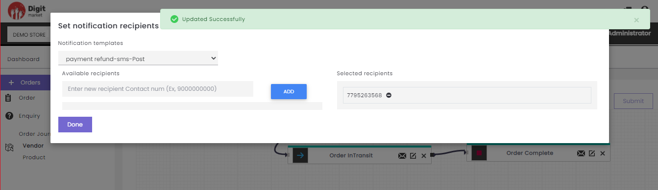
Fig. 2.329 Set SMS Notification
- Vendor: Click the Vendor dropdown field to display all the vendors. Select the required vendor to define the order journey at his level.
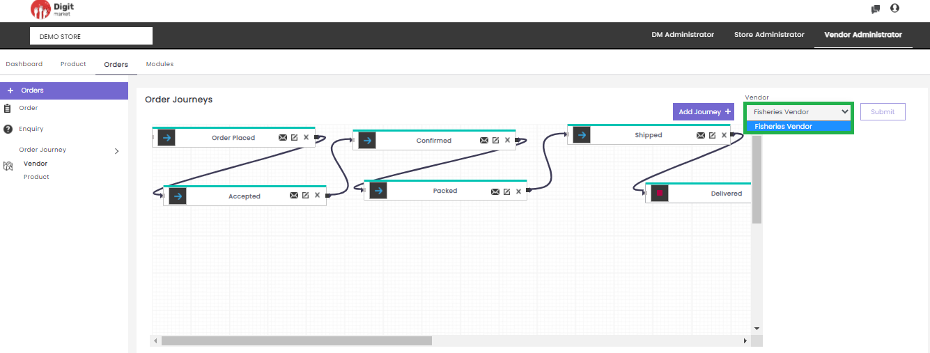
Fig. 2.330 Select Product
- Submit: Click Submit button to save the order journey.
- Product: Click the Product tab from the left panel, the Product order journey will be displayed as shown below:
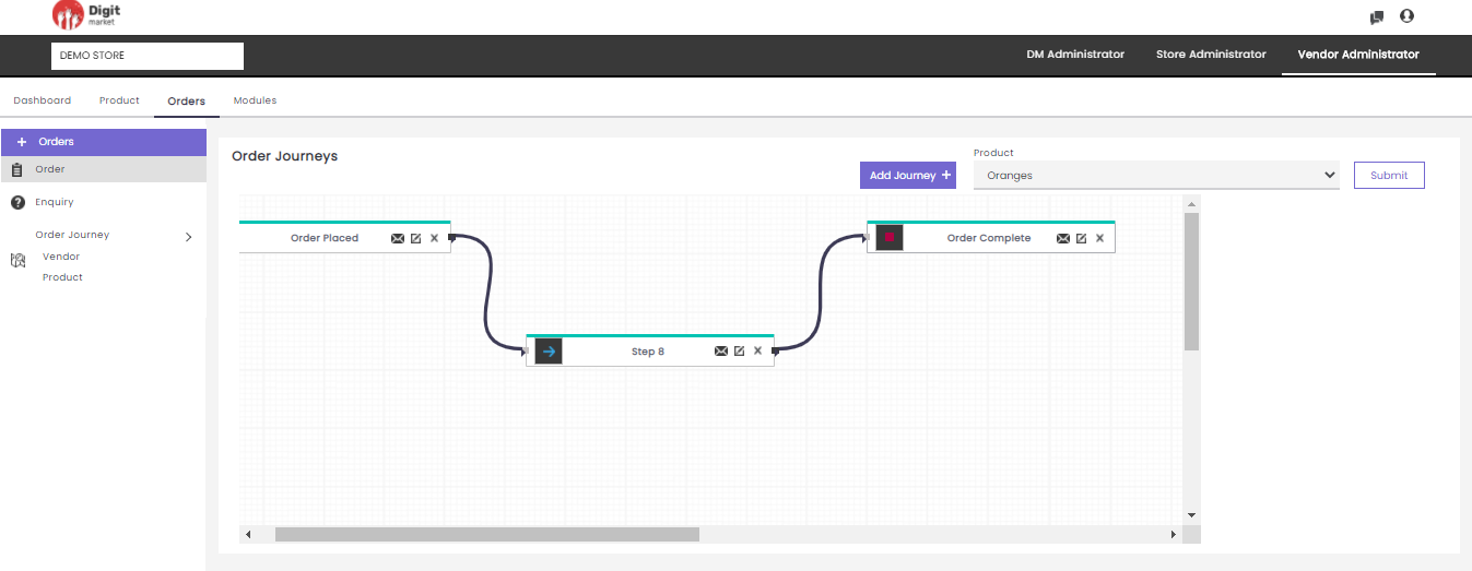
Fig. 2.331 Product Order journey
Here users can also perform the similar actions:
- Add Journey:: Click Add Journey displays all the already created modules in the drop-down. Select any one module, the node will be displayed in the canvas as shown below:
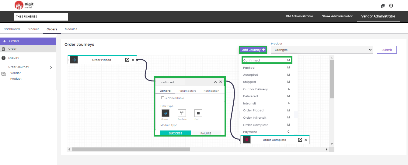
Fig. 2.332 Product Journey
Depend on the type of module creation it will represent Automatic (A), Manual (M), Custom (C).
Add Journey: In Add Journey, users can create a journey by selecting a module and providing other information like: Flow Type, Module Type. Click the mail icon
Product: Click the Product dropdown field to display all the products under the Vendor. Select the required product to define the product journey.
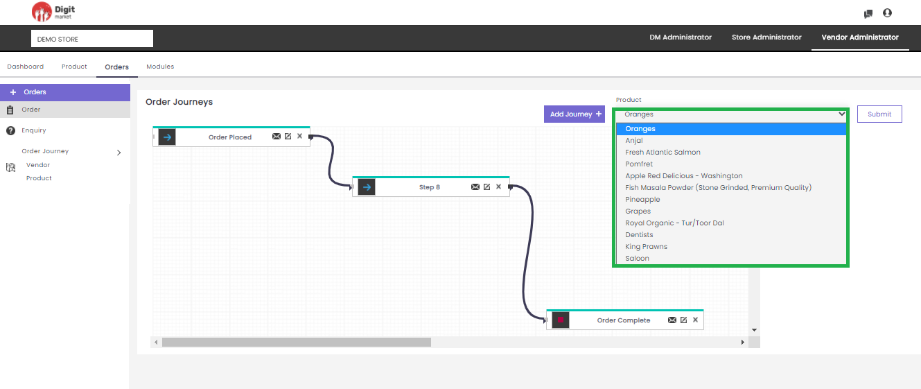
Fig. 2.333 Select Product
Submit: Click Submit button to save the product journey.
2.12.4. Modules
Once you log-in as the Vendor Administrator, click the Modules tab from the main menu the Module List page will be displayed as shown below:
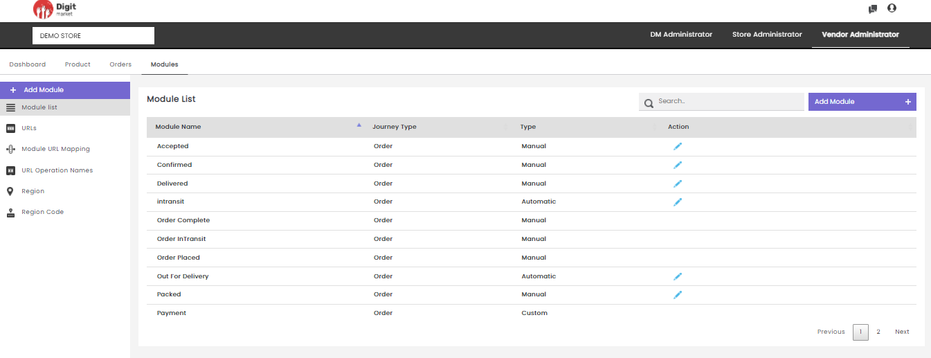
Fig. 2.334 Modules List
The Module List will display all the Modules along with details such as:
Module Name: The name of the module.
Journey Type: Journey type selected from drop-down at the time of creation like: store, vendor, order, set to Third party, set to vendor.
Type: It shows the type of the module like Automatic, Manual, or custom.
- Manual: Manual module requires a DM user to push it through every step by approving or rejecting that part of the flow.
- Automatic: Automatic module are pre-linked with an API for creating the journey by setting the URL, Module URL Mapping and URL Operation Names. This will auto-assign to the succeeding modules. It helps to reduce the manual effort, minimize costs, increase efficiency, and streamline processes.
- Custom: Custom modules will have a logic. These logics are provided by the developer and user cannot modify it. For example mandate payment, this custom module can add anywhere in the journey to check order payment. Once added it will not proceed futher until order payment done.
Action: Click the edit icon
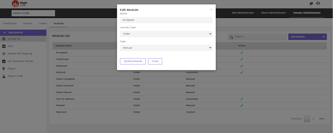
Fig. 2.335 Edit Module
In the Edit Module dialog users can edit all the info and click the Update Module button to update the details or click
Note
Users cannot edit default and custom module
The functionalities like Add Module, Module List, URLs, Module URL Mapping, URL Operation Names are as same Store Administrator. Click here to see the details.
The functionalities like Region and Region Code are as same DM/Store Administrator.
2.13. DigitMarket™ Store Front
DigitMarket™ brings the one-stop shopping of a big box store to your fingertips with its array of products that are available with the click of a button. When using DigitMarket™, you can be sure to find whatever you’re looking for in the marketplace.
2.13.1. Features of DigitMarket™ Store Front
2.13.1.1. Home page
DigitMarket™ homepage is beautifully curated that aids the visitors to quickly grasp what the store is all about, what products/services you offer, and why they should buy from you. Your homepage should reassure such visitors, signposting them to further relevant pages so that they ultimately take the action you want. Click on Home to see more details.
2.13.1.2. Order
This feature is a dominant feature that all users pre-dominantly use in the digital platform.
DigitMarket™ is beautifully designed and looks like the receipt for a given order that includes full details for that order – from what they bought to where it got shipped to. It also shows the order-related features such as: Active Orders, Completed Orders, Cancelled Orders, Check Payment Status, order summary, Write/View order tracking, Cancel Orders, Track Order, Buy Again, Add to cart. Understandably, order tracking is the primary reason why users visit the Orders page where users can view the recently placed order and want to ensure that everything’s on track for the delivery. Click on Orders to see more details.
2.13.1.3. Cart
This feature streamlines the shopping experience by bridging the gap between shopping and buying. The shopping cart allows users to select, reserve, and purchase a product and to initiate the checkout process. Click on Cart to see more details.
2.13.1.4. Login/Create Account
This account creation functionality allows the customer to save data such as order history and payment information and can enable other interactions such as wish list management, and access to special deals. Digit Market platform designed the simple login methods by providing email-id/mobile number so that when a user realizes they don’t have a login they can easily get to Create Account. Click on Login to see more details.
2.13.1.5. Profile
The Profile page will display the personnel information about the logged-in customer such as name, email-id, mobile number and change password etc. The customer’s account is also a great place to offer them access to view their saved Wishlist items. Click on Profile to see more details.
2.13.1.6. Wish List
Wishlist portraits a customer’s way of thinking and allows shoppers to create a personalized collection of products they want to buy, and save them in their account for future reference. A wishlist can be for the house for your process of buying. They act as reminders to purchase things you will need in the future. Wishlist also helps to drive away a lot of traffic in the shopping cart. Click on Wish List to see more details.
2.13.1.7. Favorite List
Favorite Lists are designed uniquely because instead of adding the items to a specified list, users can quickly toggle something like one of their favorite items, immediately putting it onto a separate “Favorites” list. These items would stay on this list even after purchase, making it incredibly useful for purchasing the same item over and over. Click on Favourite List to see more details.
2.13.1.8. Enquiries
This option aids the customer to clear doubts, customer questions, confusion, which are hurdles in the buying process like:
- Clear doubts early on during the purchase.
- Lower the chances of returns.
- Capture genuine leads.
- Update the product page information.
- Negotiate on a good deal.
Click on Enquiries to see more details.
2.13.1.9. Address
The Addresses page lists saved shipping addresses (also gathered from previous orders), with the ability to update or delete. Click on Address to see more details.
2.13.1.10. Category Overview
This refers to the landing page for a top-level category, such as Women or Electronics, which displays an overview of what’s within that category rather than list all the products.
Multiple Category Overview pages may be used if there are more than two levels, such as Women’s > Tops > Sweaters.
2.13.1.11. Category Page
The Category page is the list view of products for a specific category or subcategory, usually displayed in a grid layout. It often includes filters so the user can drill down and find what they are looking for.
The focus of this page is for the user to browse and see a lot of products at once, compared to the Category Overview which focuses on promotion and wayfinding. Click on category to see more details.
2.13.1.12. Product Page
The Product page can also be referred to as the Product Detail Page, this is the individual view of a product with the full product details and pricing. The main call to action is the add-to-cart button. Adding reviews, related products, and user-generated content from social media to this page can help drive customers to add-to-cart. Click on products to see more details.
2.13.1.13. Search and Search Results
This is an inevitable feature to spot a particular product from the wide range of products. The search field is located in the navigation menu. The page is a unique design, implemented with ‘suggested search’ surfaces while the customer is typing to go to a dedicated search results page. Click here to see the details.
2.13.1.14. Shipping
Shipping is the physical movement of goods from one point to another, such as the moving of merchandise from the warehouse to the customer. The shipping page within the checkout should include the form fields needed to gather shipping addresses. There’s often a checkbox field to use the same shipping address for the billing address.
2.13.1.15. Payment
Online payments facilitate instant payments. It breaks the geographical restrictions and let customer purchase even without physical presence. The payment step includes form fields to input payment information.
This step can also include the option to enter gift cards, rewards points, or promo codes, or pay with rewards points or store credit. Click on Checkout Details to see more details.
2.13.1.16. Checkout Review
This is an important step to review all items being purchased, the shipping info, payment method, discounts, and extra costs like taxes or express shipping.
Make sure it’s clear that this is a review step and that the main call to action is to submit the order. Click on Payment to see more details.
2.13.1.17. Order Confirmation
The order confirmation page is the customer’s invoice or receipt. Once the customer submits the order, give them a nice thank you message and confirm that they submitted their order successfully. It’s helpful to display the order details and info on how to modify the order if the user catches a mistake after submission. It will also display while the system processes the order, something could go wrong and the site will need to return an error page instead of a confirmation to explain that an item sold out by the time the order was submitted.
If this was a guest checkout, take the opportunity to prompt the user to create an account to save all the information that they just submitted. Click on Order Summary to see more details.
2.13.1.18. Payment Settings
The Payment Settings (or Manage Payment) page lists saved payment info (gathered from previous orders), and gives customers the ability to update or delete that information. The available payment options are Cash-on-delivery, Card, UPI/QR, NetBanking, and Wallet. Click on Online Payment Option to see more details.
2.13.1.19. Creating an Account
Open DigitMarket™ website, on the top of the website, you will see a taskbar that contains several tabs like: Home, Orders, Cart, Welcome Guest Login/Sign Up.
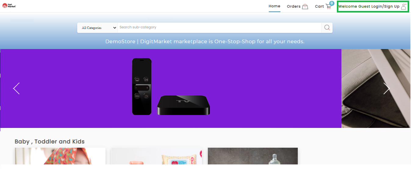
Fig. 2.336 Create an Account
- Login and Sign-up:
Click the Welcome Guest Login/Sign Up. . The Login dialog will be displayed here.
- Here already registered/signed in users can Login, by providing the Mobile Number and Password as shown below:
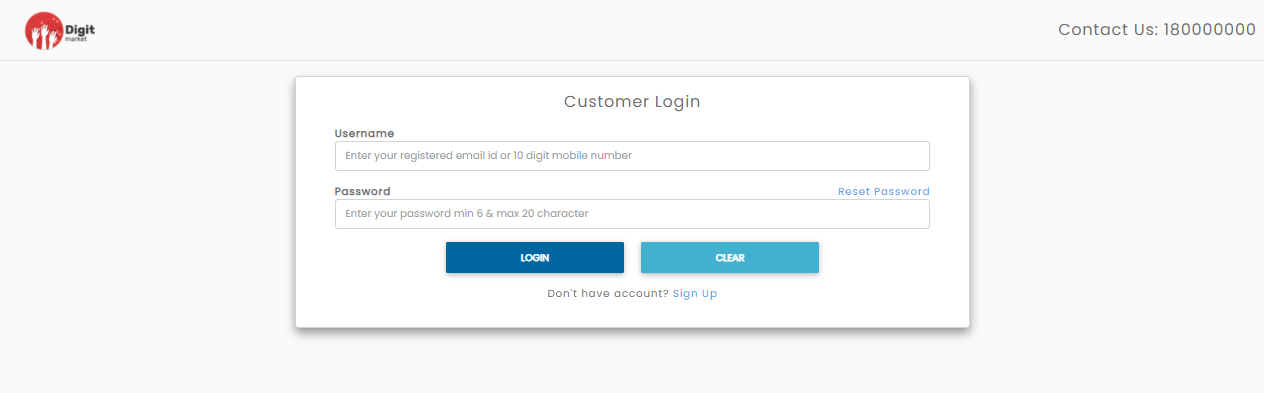
Fig. 2.337 Login
- Click the Sign Up button to create a new account, Customer Registration dialog will be displayed as shown below:
Fig. 2.338 Create Account
Note
Terms and Conditions and Privacy Policy statement will be displayed only if the store has the same. Otherwise it will not be displayed at the storefront.
- Users have to provide all the details and click REGISTER button to create a new account. A success message will be displayed as shown below:
Fig. 2.339 Registration Successful
Once the user is registered user will receive a notification on registered email and mobile number and the user needs to verify his account by clicking on the link. Once the user is verified click Login button to log in to DigitMarket™.
To reset the password user must provide the registered Username and click the Reset Password link, the reset password dialog will be displayed as shown below:
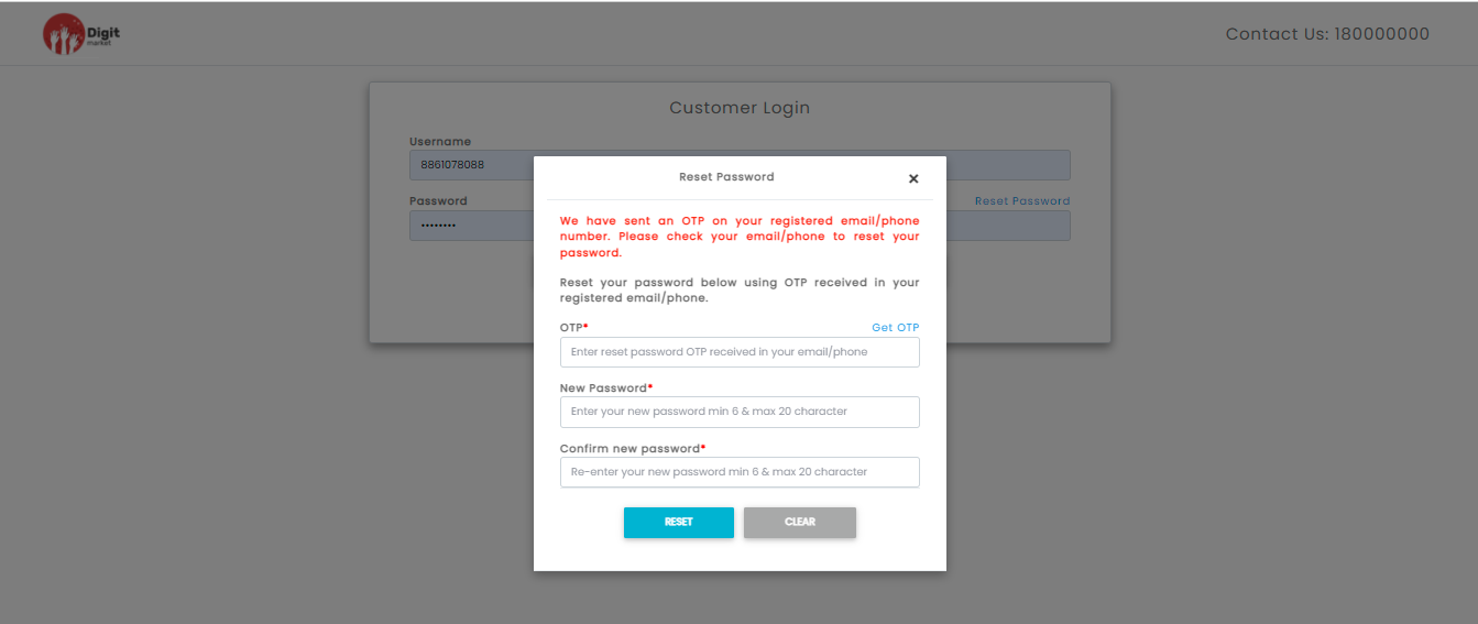
Fig. 2.340 Reset Password
Click the Get OTP link to resend the token. Click the RESET button and a success message will be displayed as shown below:
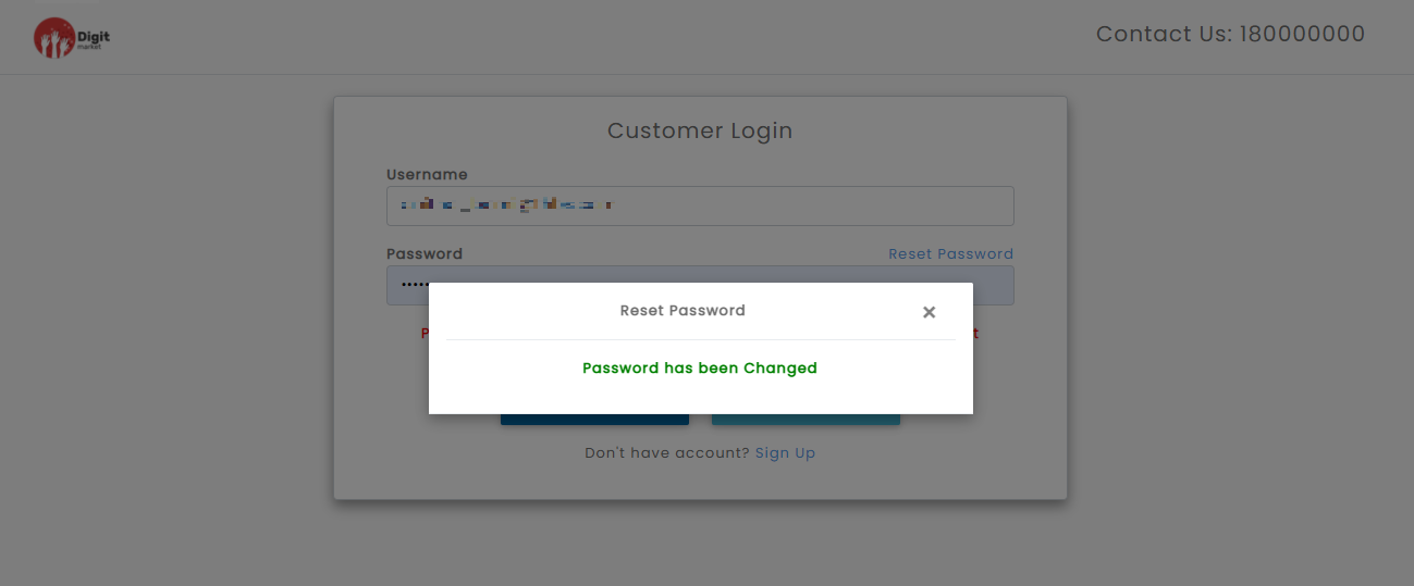
Fig. 2.341 Reset Password
- Home : Click the Home button to display the main webpage of DigitMarket™. This page includes a navigation bar that provides links to different sections within the website. Users can click the Home button anywhere on the website and it will take them to the main webpage.
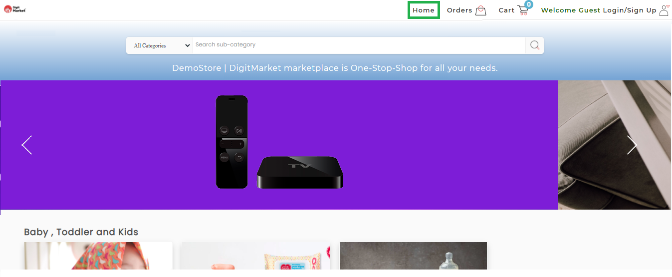
Fig. 2.342 Home Page
2.13.1.20. Browsing Deals of the Day
The Deals of the Day displays the current product discounts for that day/week/month depends upon the expiry of the deal given by the admin. The user may click on the widget to go to the another page,to view, buy, or add to cart.
- Already registered/signed/ users can LOGIN to go to HOME PAGE to view the products which is on deal of the day. Click on Login to see more details.
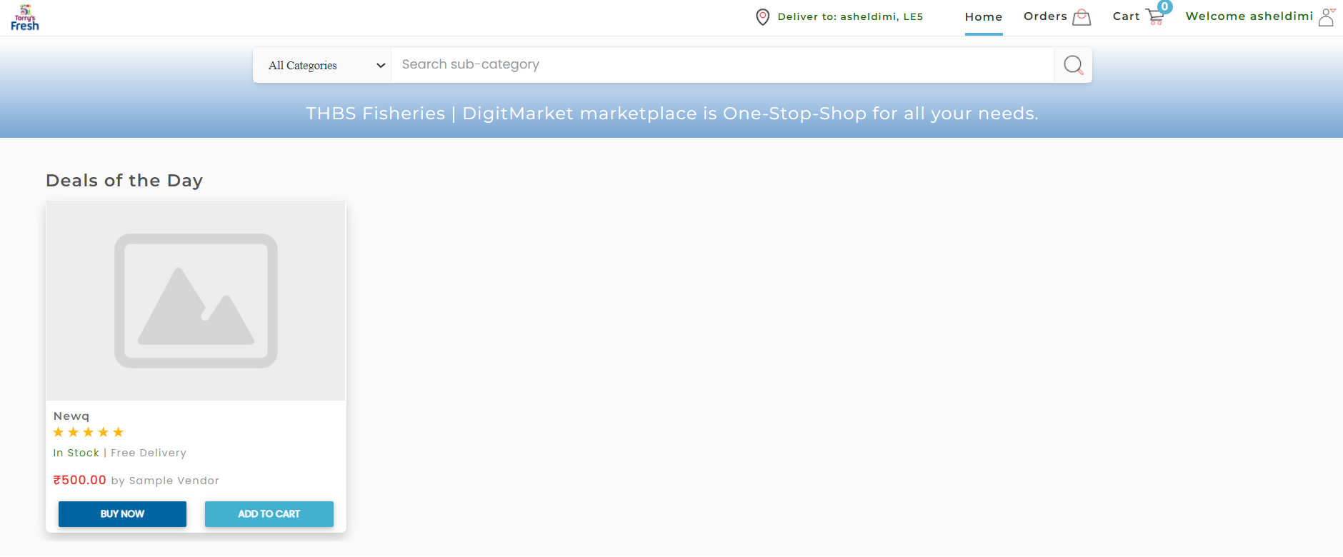
Fig. 2.343 Deals of the Day
- The User can:
- Click BUY NOW which allows users to buy an item immediately at the deal price.
- Click MOVE TO CART which allows to create a temporary list of items by adding it to the cart. This will keep track of the items until you leave our website. Also, you can add another item as well along with this item you wish to buy.
- Click PRODUCT NAME which allows users to go to product’s page that you can read a description,details of product, and other product details such as quantity, photos and other variants of the product etc.
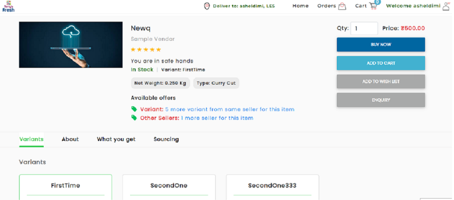
Fig. 2.344 Deals of the day - Product Description Page
Note
The store administrator can add attributes for a product such as Deals of the Day through admin account, and the vendor administrator can make the product visible on the storefront by intiating it. Only such products will be visible on homepage and will display Deals of the Day.
- Once the user selects the product, It goes to product page with the following details as shown below:
- IN STOCK: The availablity of the item is mentioned for the user to place the order.
- NET WEIGHT: The total weight of the product is calculateded as net weight.
- TYPE: The type of product which the user choose to order.
- AVAILABLE OFFERS: Any other offers available to order can be clubed along with this deal is mentioned here.
- QTY: The required quantity of item to order displayed here.
- BUY NOW: This allows users to buy an item immediately at the deal price.
- ADD TO CART: This allows to create a temporary list of items by adding it to the cart. This will keep track of the items until you leave our website. Also, you can add another item as well along with this item you wish to buy.
- ADD TO WISHLIST: It contains the collections of desired products saved by user to their user account. Unless they remove it , it will be there.
- ENQUIRY: Any further enquiries on this product before placing the order can be done here for the user.
- VARIANTS: The different varities of the item is described as variants to the user. So the deal is applicable for all the mentioned variants.
- OTHER SELLERS: Any other sellers that are selling with any other deals or prices for the same product on this website will be mentioned here.
- ABOUT: A short description about the product along with other details.
- WHAT YOU GET: It the about the item what we the customers are going to purchase in detail after buying it.
- SOURCING: The sourcing describes the item being sourced/manufactured from where or vendor.
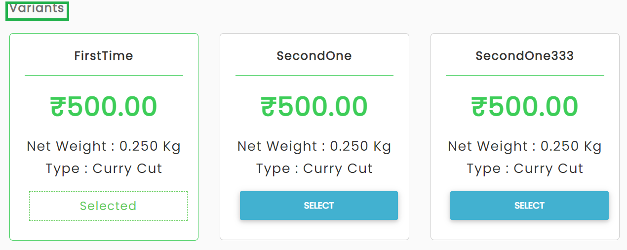
Fig. 2.345 Variants
4. Once the user gives all the details mentioned on the product page, Click on BUY NOW to order the particular product. Rest as described under Orders tab.
Orders: Click the Orders button will ask the users to log in to the DIgitMarket™ platform if the user has not signed-in users else it will display YOUR ORDERS as shown below:
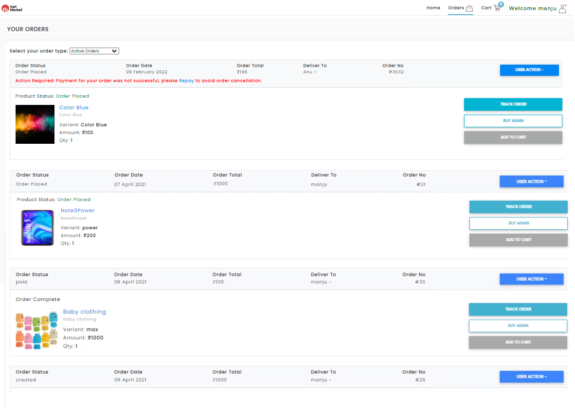
Fig. 2.346 Orders Page
Cart: Click the Cart button will ask the users to log in to the DIgitMarket™ platform if the user has not signed-in users else it will display SHOPPING CART details as shown below:
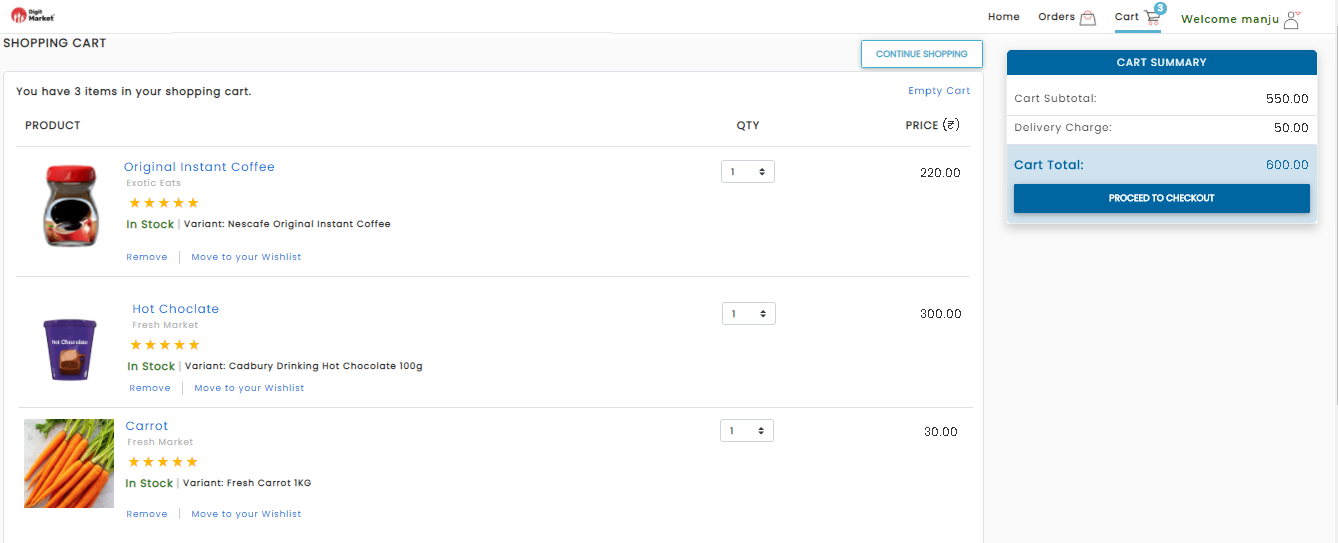
Fig. 2.347 Shopping Cart
- Once the user logs in, click the profile icon
 to see options as shown below:
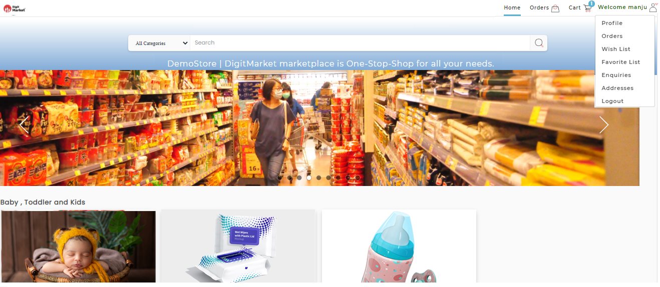
Fig. 2.348 Profile Options
- Click the Profile, allows to view the information about the logged-in customer as shown below:
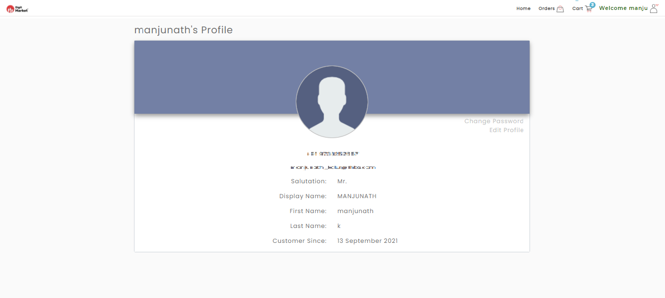
Fig. 2.349 Profile Page
- Click the Orders, YOUR ORDERS page will be displayed as shown below:
Fig. 2.350 Orders Page
On the above page user can initiate repayment if the payment is failed by clicking the Repay link or cancel the order under User Action. A notification will be triggered from the backend to notify the status of the customer. Once the order is failed the product will be reverted to the stock quantity.
Here users can:
- Select the Order Type: This option allows users to see their order type by clicking the Select your order type where users can select Active Orders, Completed Orders, Cancelled Orders as shown below:
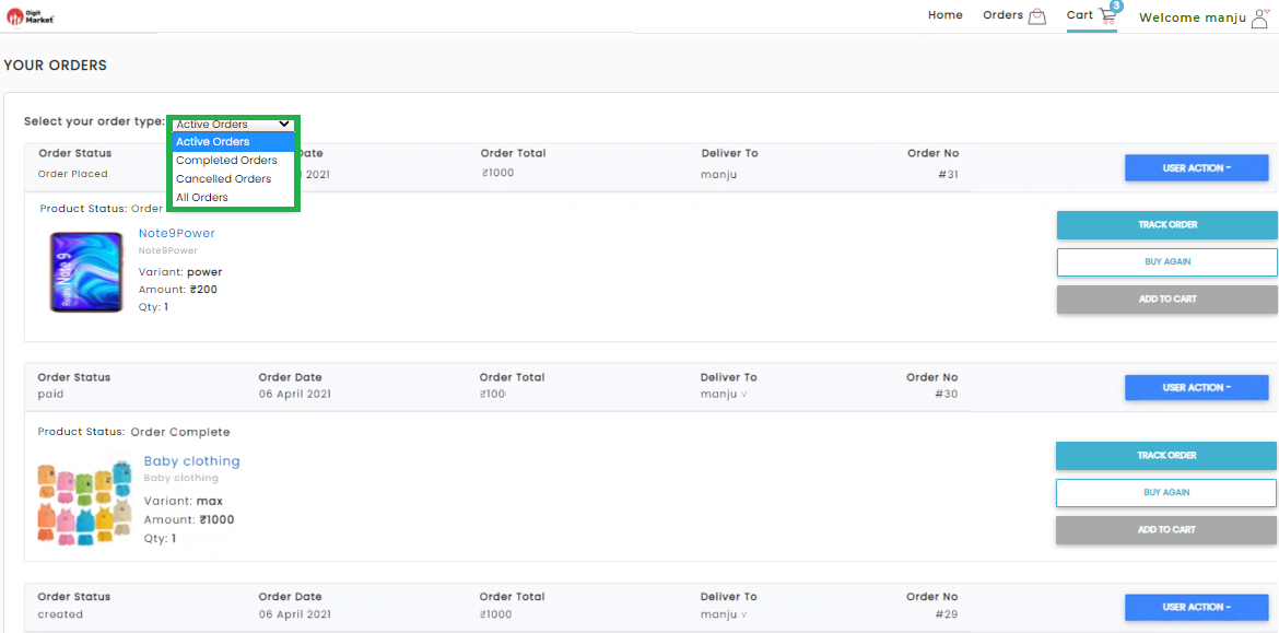
Fig. 2.351 Orders Type
Based on the order type selected from drop down, it will display all the orders in that type. For instance if an user select ‘Active Orders’ it will display all active orders as shown below:
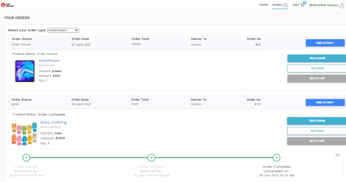
Fig. 2.352 Orders Type
User Action: Click User Action to see Check Payment Status, View Order Summary, Get Order Invoice, Write/view Order Review, Cancel Order.
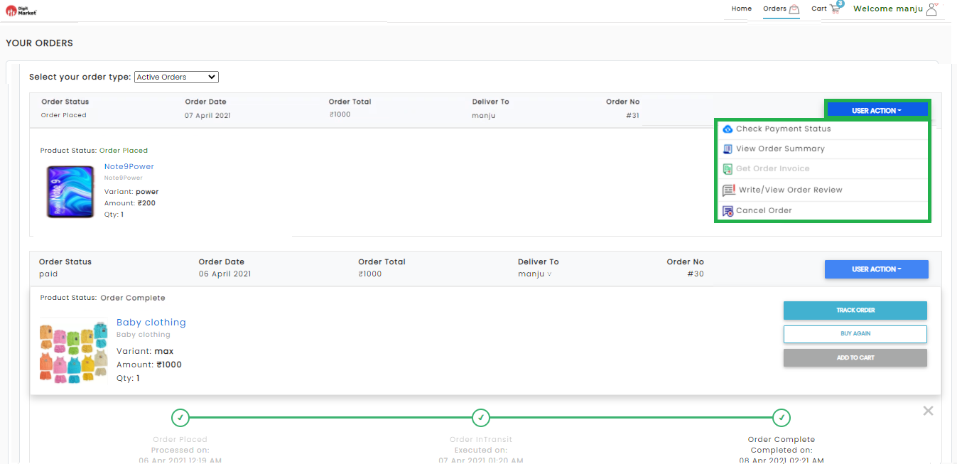
Fig. 2.353 User Action
Users can select an USER ACTION from drop down. For instance if an user wants to see the payment status. Click the Check Payment Status to see the status of the payment as shown below:
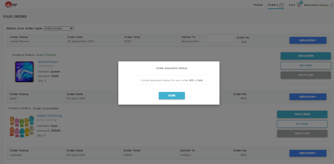
Fig. 2.354 Payment Status
Order Summary: If an user want to see order summary, click ‘View Order Summary’ button in the User Action drop-down to display order summary as shown below:
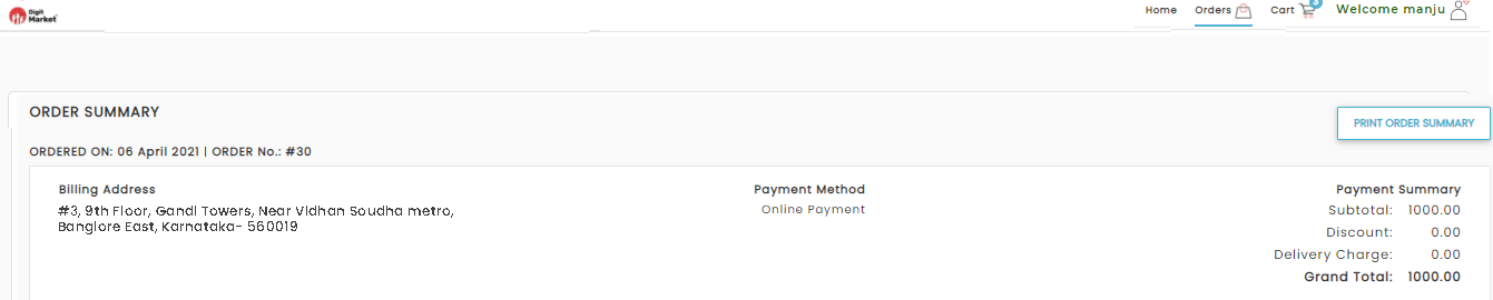
Fig. 2.355 User Action
Here users can print order summary by clicking the PRINT ORDER SUMMARY button.
Write/view Order Review: If an user wants to see write a review , click ‘Write/View Order Review’ button in the User Action drop-down to write and rate the order as shown below:
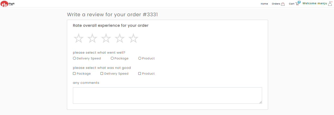
Fig. 2.356 Rate and Review
Once user provide the answere and click Save success message will be displayed as shown below:
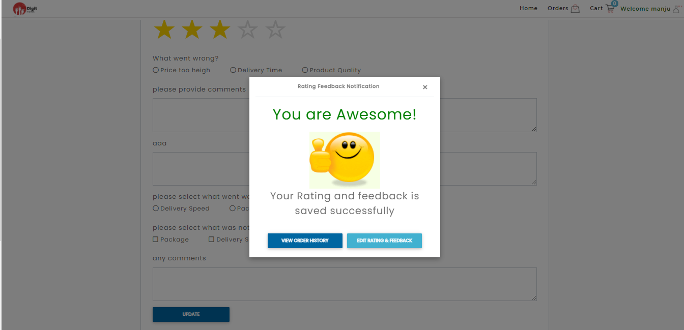
Fig. 2.357 Rating
Click the VIEW ORDER HISTORY will navigate to YOUR ORDERS page where user can cross check the items or click EDIT RATING & FEEDBACK to edit the rating and review.
Note
Based on the ratings provided the questions may vary based on store settings
Cancel Order: Click Cancel Order button in the User Action drop-down in the YOUR ORDERS page to cancel the order and a Cancellation Confirmation dialog will be displayed as shown below:
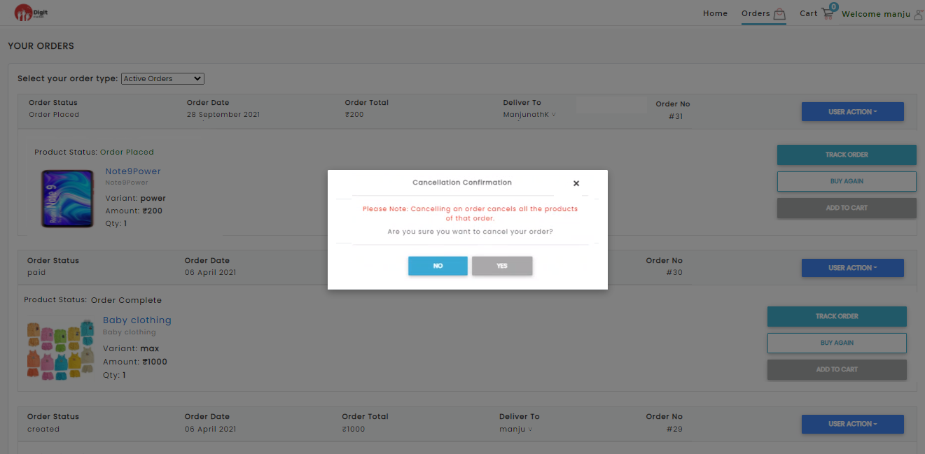
Fig. 2.358 Cancellation Confirmation
Click Yes to cancel or No to exit.
- TRACK PACKAGE: Click the TRACK PACKAGE button to track the package as shown below. Here users can see the progress of their orders. The Green line denotes the order is processed until that checkpoint and grey denotes unprocessed state. Each checkpoint have a name and expected time of arrival.
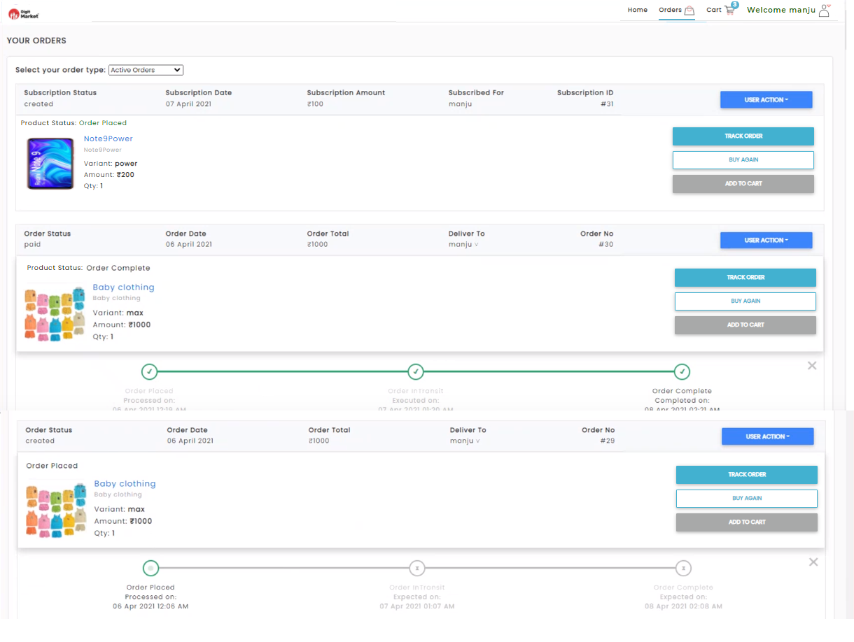
Fig. 2.359 Track Package
- Wish List: It contains the collections of desired products saved by customers to their user account. Click the Wish List, the Wish List page will be displayed as shown below:
Fig. 2.360 Wish List
Here users can:
- BUY NOW: It allows users to buy an item immediately at a set price.
- MOVE TO CART: It allows to create a temporary list of items by adding it to the cart. This will keep track of the items until you leave our website.
- REMOVE FROM WISHLIST: This allows users to remove an item from the wish lists.
- Favourite List: Click the Favourite List button to display the Favourite List page.
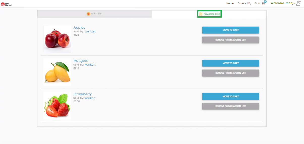
Fig. 2.361 Favourite List
Here users can:
- MOVE TO CART: It allows to create a temporary list of items by adding it to the cart. This will keep track of the items until you leave our website.
- REMOVE FROM WISHLIST: This allows users to remove an item from the wish lists.
- Enquiries: Click the Enquiries button to display the Your Enquires Details page.
- Address: Click the Address button to display the YOUR ADDRESS page.
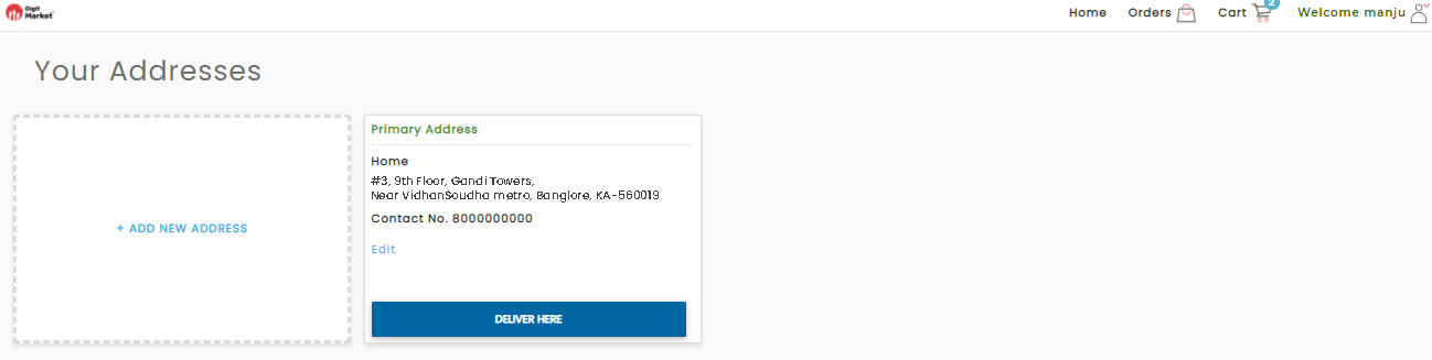
Fig. 2.362 Address Details
- On the above page click ADD NEW ADDRESS to add more address as shown below:
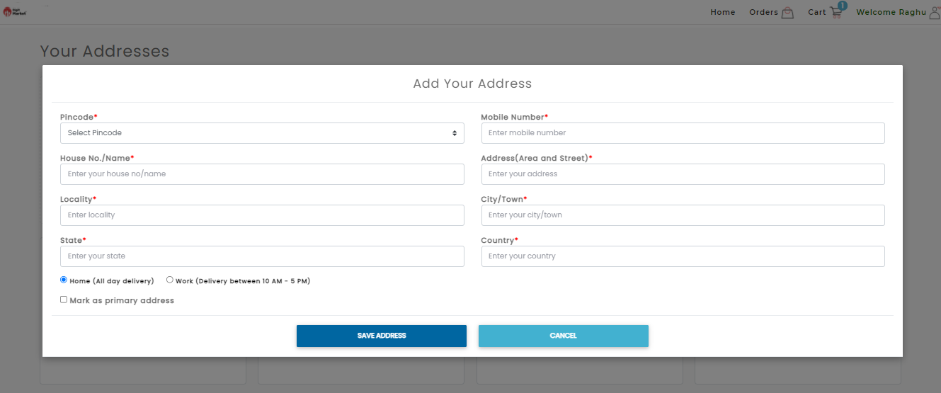
Fig. 2.363 Adding a New Address
Provide all the details and click the SAVE ADDRESS button to save the details and CANCEL to exit.
Note
By default the first saved address will be marked as primary address.
- Click the Edit link to edit the existing address as shown below:
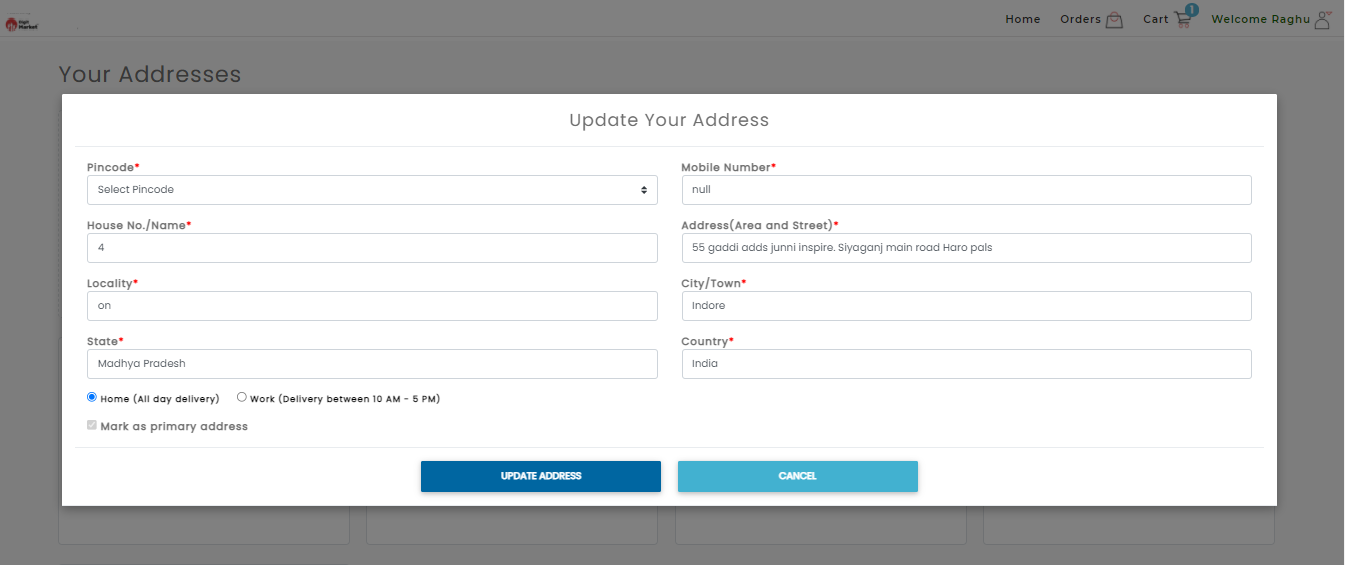
Fig. 2.364 Edit Address
Click the UPDATE ADDRESS button to save the details or CANCEL to exit.
- Click the Remove link to remove the respective address, a Remove Address dialog will be displayed as shown below:
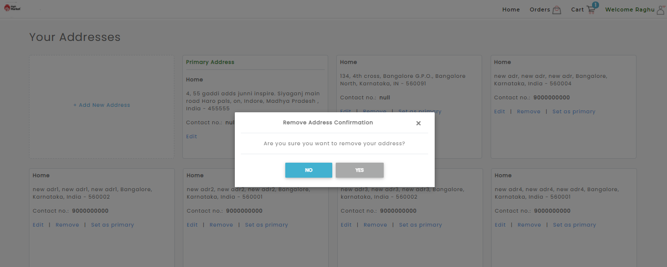
Fig. 2.365 Delete Address
Click the Yes to delete the address or No to exit.
Note
Users will not have an option to remove Primary/Default address.
- Click the Set as primary link, on the respective address to set as primary delivery address, a success message will be displayed as shown below:
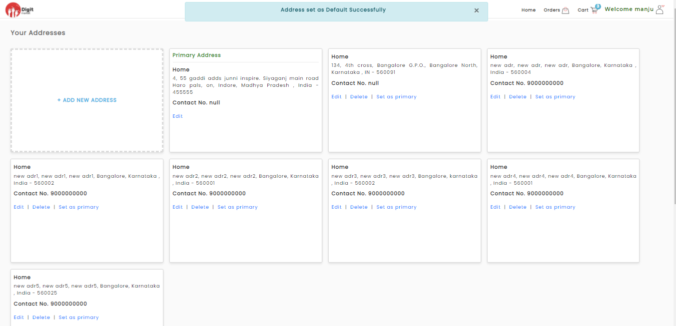
Fig. 2.366 Set as Primary Address
- Click the Log Out button to exit from the store.
2.13.1.21. Using the Search Bar
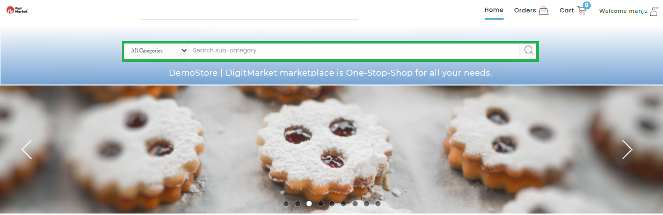
Fig. 2.367 Search
- Locate the search bar: At the top of the page, you will see a rectangular box.
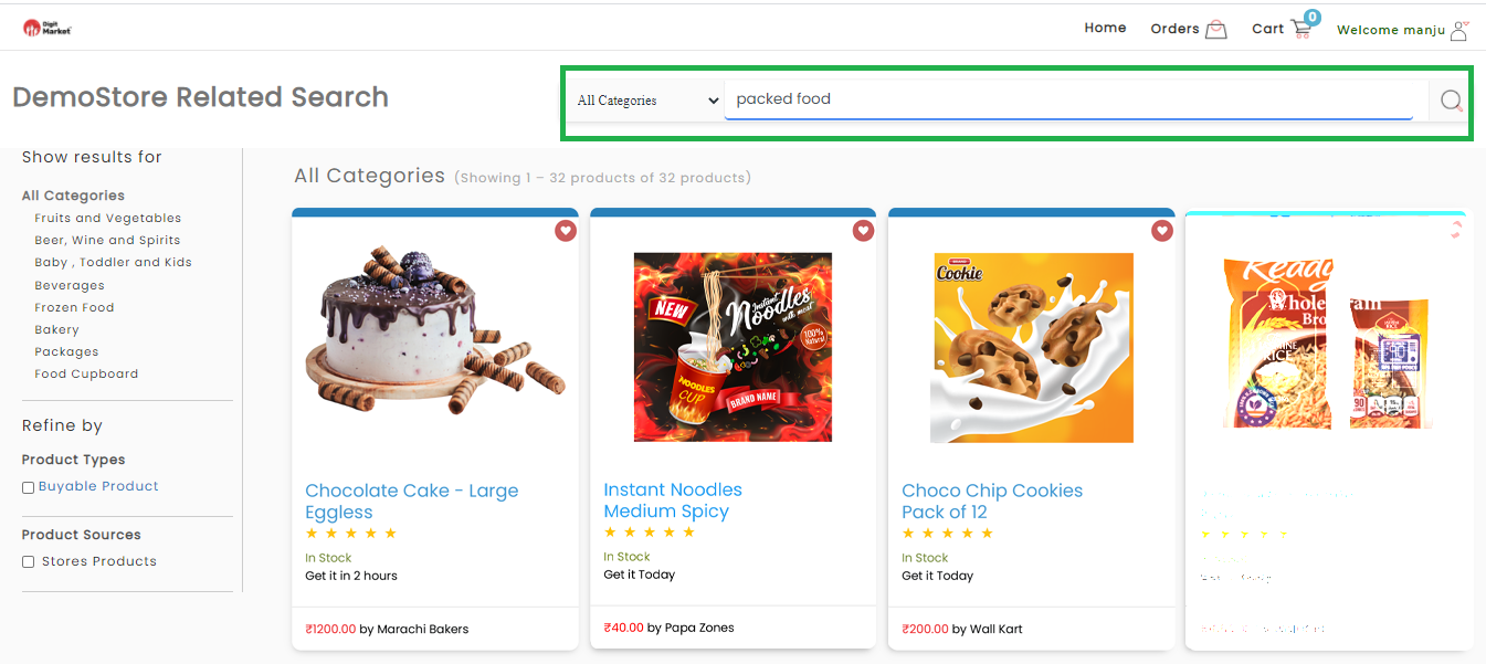
Fig. 2.368 Searched Result
Using the search bar:
- Helps to narrow your results because you are focusing on keywords.
- This feature is great when you have a specific item in mind.
- Type-in your search term, use relevant keywords associated with the product you wish to buy. For example, if you want to buy a packed food scale, you could type “packed food” into the box.
- Press enter: DigitMarket™’s search engine will pull up all products related to your search terms. When you use the search bar, the results include items from all departments.
- Scroll through the results: Using your mouse, review the product
options. If you do not find what you’re looking for, you can also try
different search term. You can limit your results by using the
categories listed on the sidebar.
- Product Types
- Product Sources
2.13.1.22. Browsing by Category
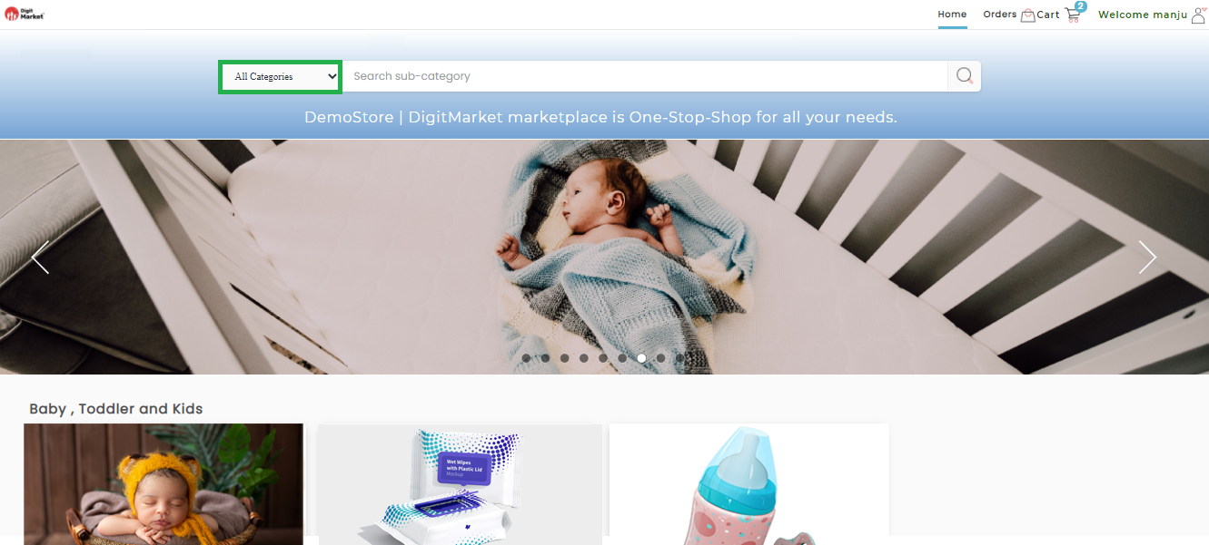
Fig. 2.369 All Categories
- Open the category menu: Click on the drop-down field of All Categories to reveal a list of categories.
- Searching by category will return more results since simple search feature is very broader .
- Browsing by category is best when you have an idea of what you want but aren’t sure of the exact product. For example, you may want to browse by category if you are looking for vegetables but not sure what to buy.
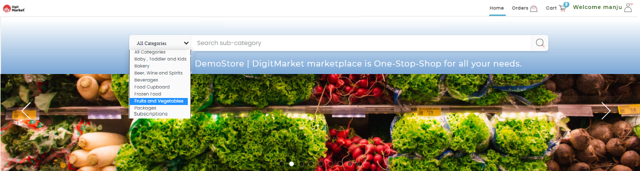
Fig. 2.370 Search by Categories
- Choose your category: If you are looking for a particular
product, pick the category that it belongs in. For example, if you
are looking for Vegetables, then you would click on “Fruits, and
Vegetables”.
- To add a filter and narrow your category choices, use the sidebar on the left side of the page.
- Each category page offers you a selection of subcategories.
- To use the subcategory filters, check the boxes of the filters you’d like to apply.
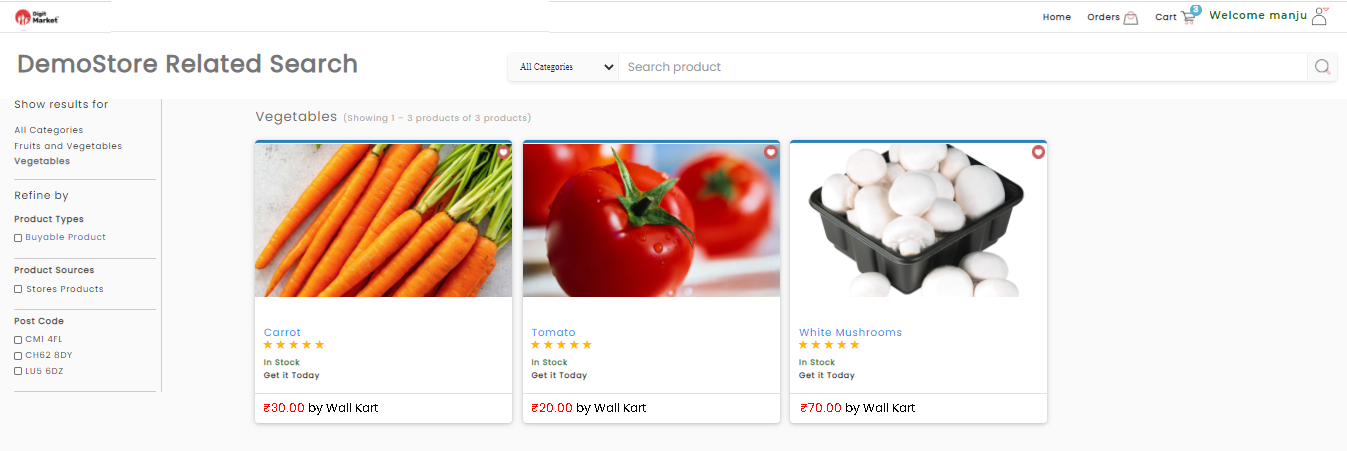
Fig. 2.371 Searching by Filters
- Browse the products: Use your mouse to scroll through the
results. You will see a larger array of products using categories
because DigitMarket™ shows all products that fit the category instead
of focusing on keywords.
- If you don’t find what you need, you can change the filters.
- The fewer sub-filters you use, the more general will be your results. That can be helpful if the product selection appears limited.
2.13.1.23. Selecting an Item
The Category page is the list view of products with a specific category and a subcategory displayed in a grid layout as shown below:
Fig. 2.372 Selecting a Product
Click on the Product Name: This will reveal the product’s page so that you can read a description, and other product details. You may also see additional photos of the product.
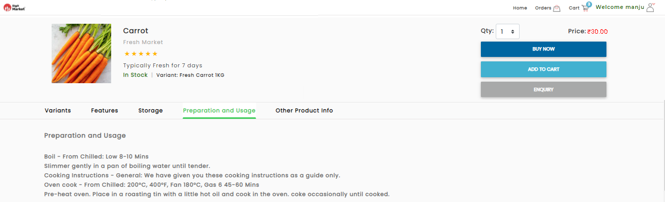
Fig. 2.373 Product Details
Here users can choose
- BUY NOW
- ADD TO CART
- ENQUIRY
- Once the user selects the product, click the BUY NOW button as shown below:
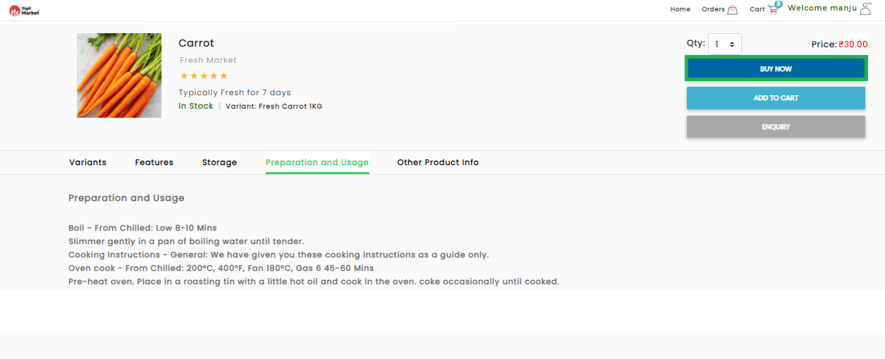
Fig. 2.374 Buy Now
The BUY NOW option will take you to a page confirming the check out details. Please click on Checkout Details to see the further steps. DigitMarket™ will also show you related items that you may be interested in purchasing. DigitMarket™ allows you to set a quantity if you’d like to purchase more than one product
- Click the ADD TO CART button will take you to a page confirming that the item is in your cart and a success message will be displayed as shown below:
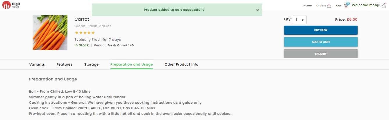
Fig. 2.375 Product Added to Cart
If the user tries to add an already existing item into the cart the success message wil be as shown below:
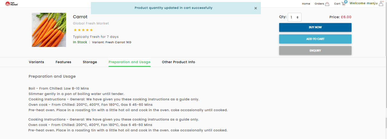
Fig. 2.376 Product Quantity Updated in the Cart
- DigitMarket™ will also show you the related items that you may be interested in purchasing.
- DigitMarket™ allows you to set a quantity if you’d like to purchase more than one product.
- You can let items sit in your cart for an extended period.
Click the cart icon
to see the cart details as shown below:
Fig. 2.377 Cart Details
- Click the ENQUIRY button, a page will be displayed as shown below:
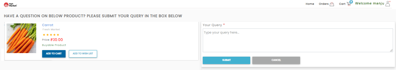
Fig. 2.378 Enquiries
Users can type-in the queries and click the Submit button a success message will be displayed as shown below or Cancel to exit.
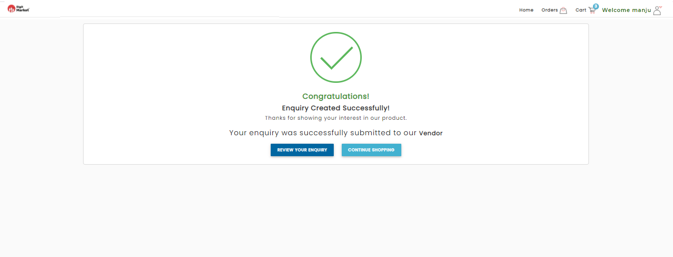
Fig. 2.379 Enquiries Submitted
Click the REVIEW YOUR ENQUIRY button to review the orders in YOUR ENQUIRIES DETAILS PAGE as shown below. Click the CONTINUE SHOPPING to shop other products.
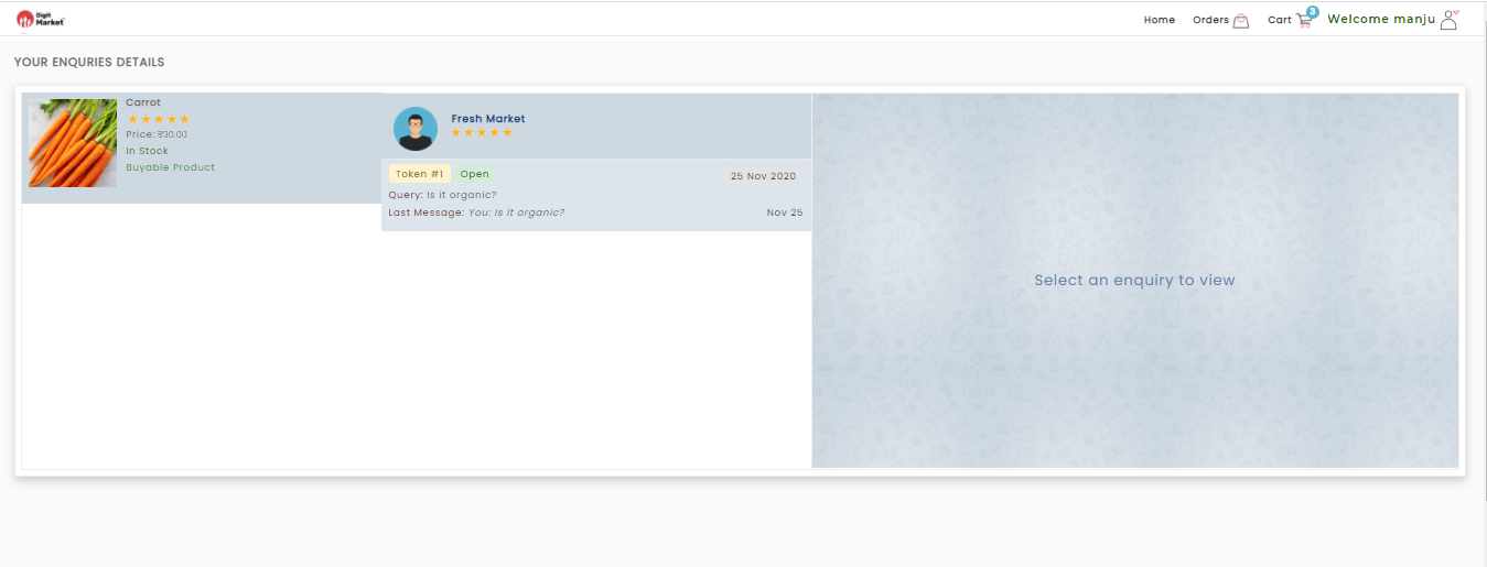
Fig. 2.380 Your Enquires Details
The above page will display the status of the query and click on the query to ask more query as shown below:
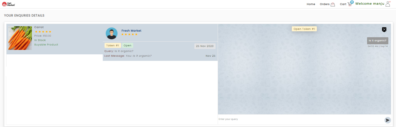
Fig. 2.381 Ask More Query
Click the feedback icon
to provide the feedback on the dialog as shown below:
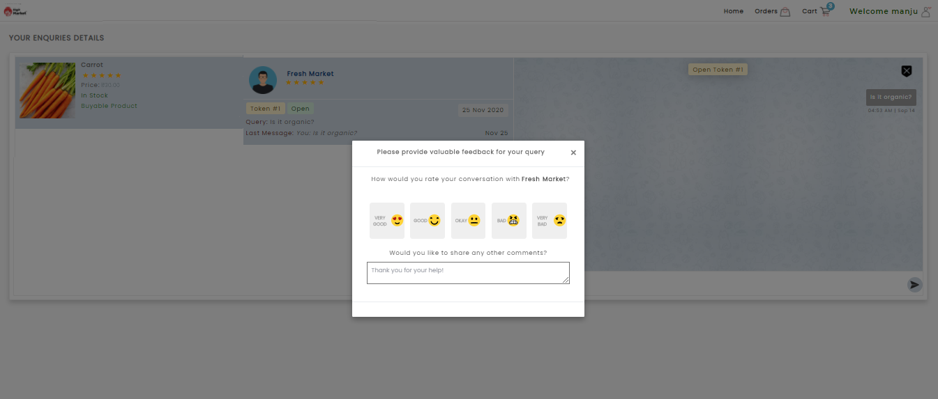
Fig. 2.382 Feedback
Click on the appropriate feedback and click Submit as shown below:
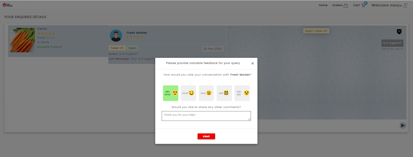
Fig. 2.383 Feedback Given
2.13.1.24. Completing Your Order
- Click the Buy Now button will take you to a page confirming the address as shown above below. The functionality is as same as above, click on Buy Now to see the details.
- Click the Cart icon to review all the items that you are
ordered. Users can change or remove items, and select the required
quantity in the “QTY” box.
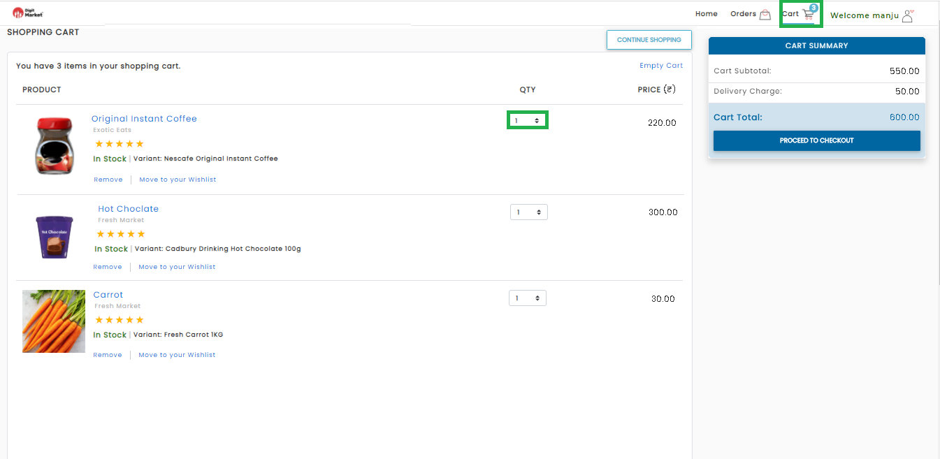
Fig. 2.384 Cart Details
- Click the PROCEED TO CHECKOUT button on the website, this button is located on the right side of the page as shown below:
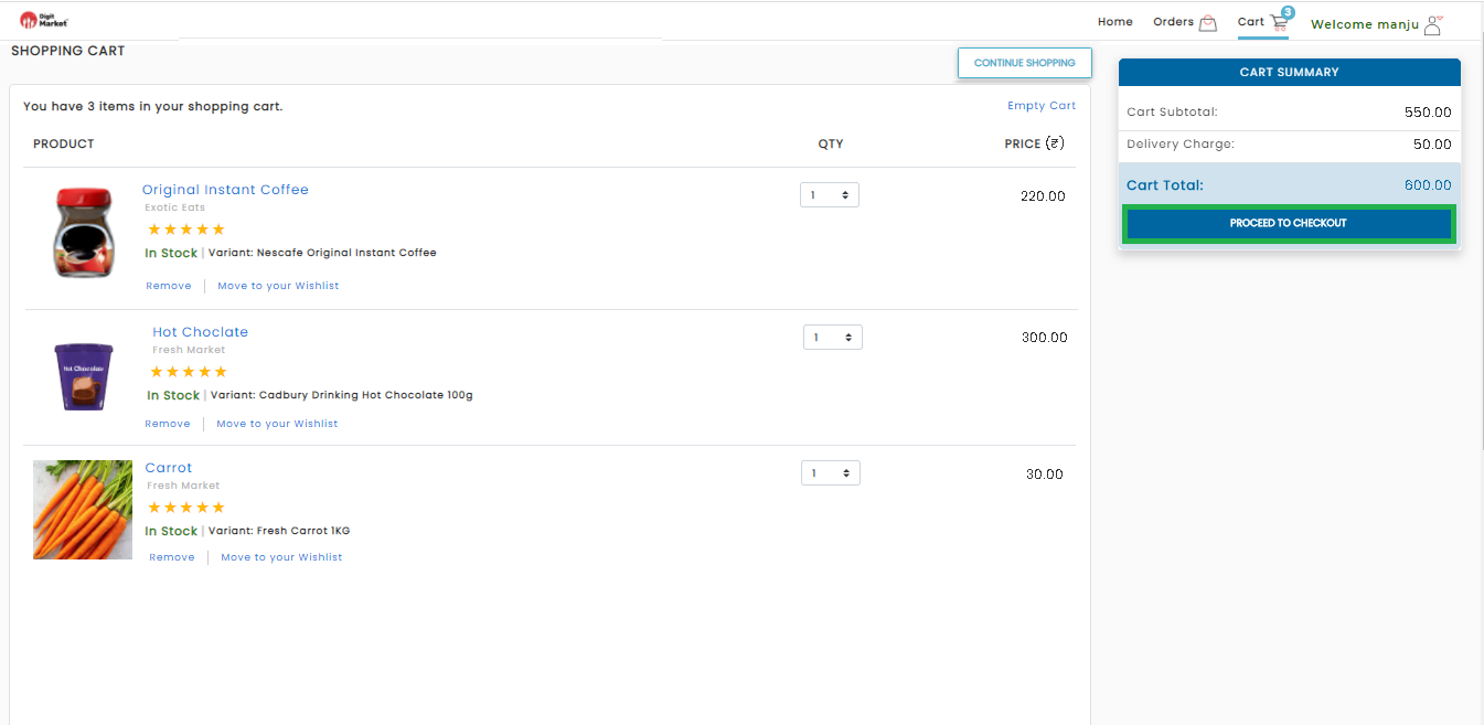
Fig. 2.385 Cart Details
Once the user clicks the PROCEED TO CHECKOUT button. DigitMarket™ will prompt you to choose:
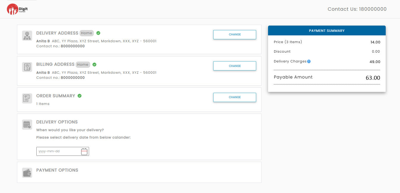
Fig. 2.386 Checkout Details
- DELIVERY ADDRESS: It will show the default delivery address chosen. If the user wants to change the delivery address, click the CHANGE button. It will display all the address and click the DELIVER HERE button corresponding to the required delivery address.
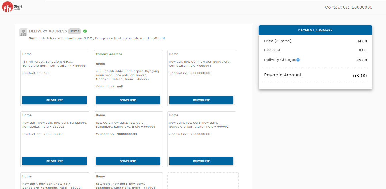
Fig. 2.387 Address Change
BILLING ADDRESS: It will show the default billing address chosen. If the user wants to change the billing address, click the CHANGE button. It will display all the address and click the click the BILL HERE button corresponding to the required delivery address.
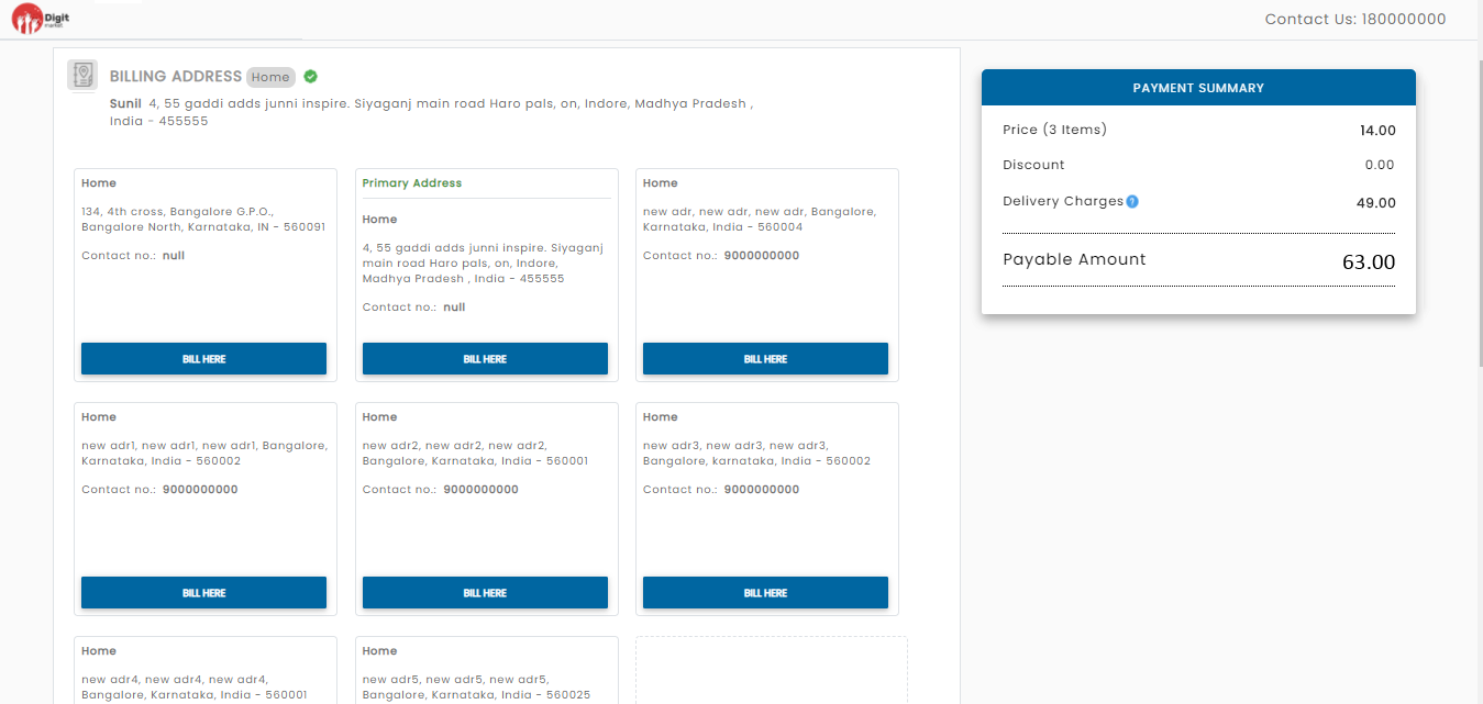
Fig. 2.388 Billing Address
ORDER SUMMARY: It will display the order summary. Click the CONTINUE button to proceed to next steps.
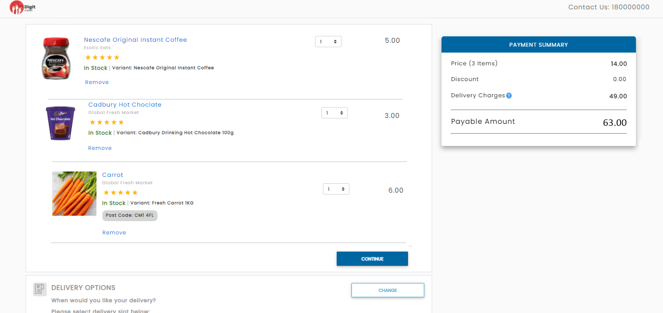
Fig. 2.389 Order Summary
DELIVERY OPTIONS: It allows the user to select the delivery date and time. Click the CHANGE button to select the date.
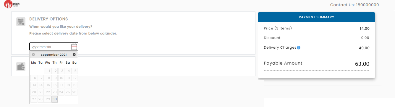
Fig. 2.390 Select Date
Once the date is selected it will fetch the available slots in that day as shown below:
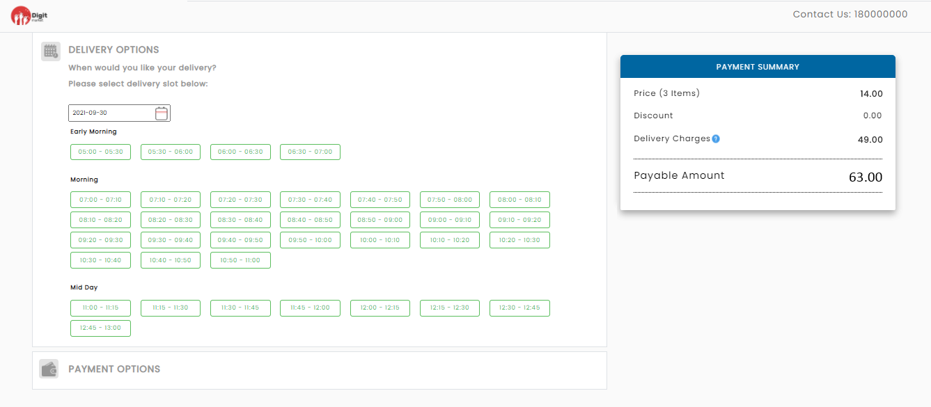
Fig. 2.391 Delivery Slot
Once the delivery slot is chosen, the date and time will display DELIVERY OPTIONS as shown below:
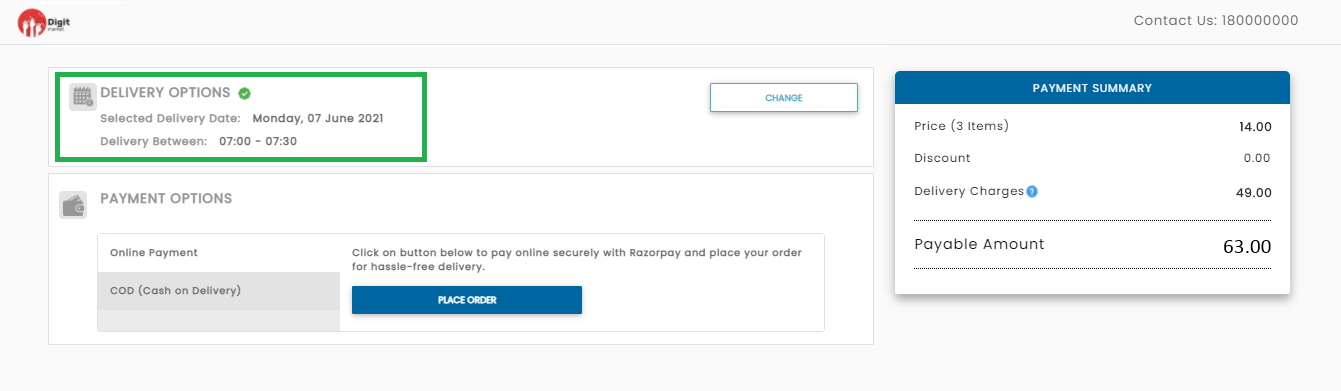
Fig. 2.392 Delivery Time and Date
Note
The payment option will be enabled only after selecting delivery date and slot.
Info icon  will display the delivery charges if any. On hover, it displays a message for above which amount is the free delivery charges as shown below:
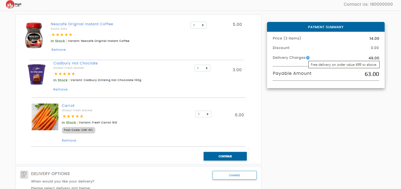
Fig. 2.393 Delivery Charge
Note
Delivery charges are user-specific and customizable at the backend.
- PAYMENT OPTIONS: DigitMarket™ allows users to choose Online payment or COD.
- Online Payment: Select the Online Payment option and click PLACE ORDER button.
Steps for Online Payment Options:
DigitMarket™ allows users to choose more than one payment option, DigitMarket™ will list each of them. Make sure to choose the correct option.
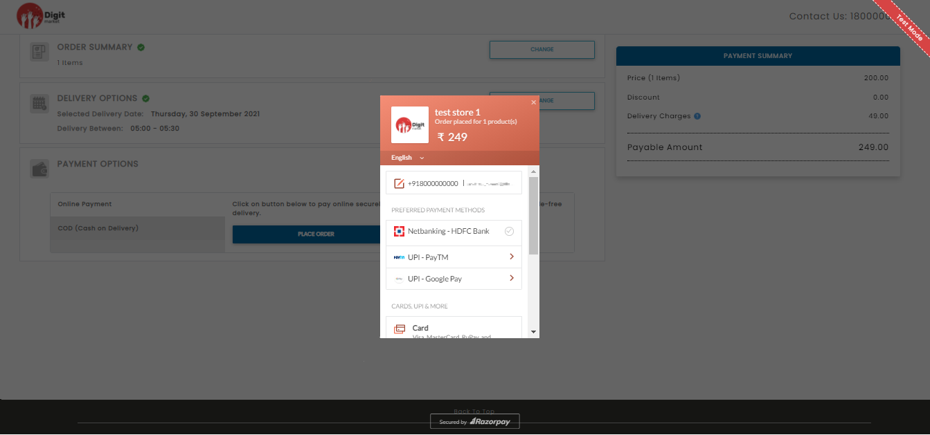
Fig. 2.394 Online Payment Option
Once the users select the payment option and done with payment a success message will be displayed as shown below:
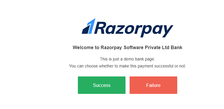
Fig. 2.395 Payment Success
Click Success button to complete the payment and Failure button to abort the transaction. Once the transaction is successful a success message will be displayed with the order id and expected delivery time slot as shown below:
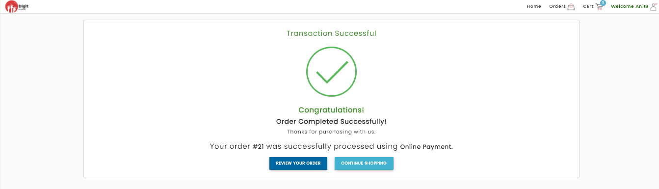
Fig. 2.396 Transaction Successful
Click the REVIEW YOUR ORDER will navigate to YOUR ORDERS page where user can cross check the items or click CONTINUE SHOPPING to shop more.
Check your email. DigitMarket™ will send you a confirmation email to the address that you used to create your account. You can use these emails to track your packages and manage your order.
- COD Options: Select the COD options and Click PLACE ORDER button as shown below:
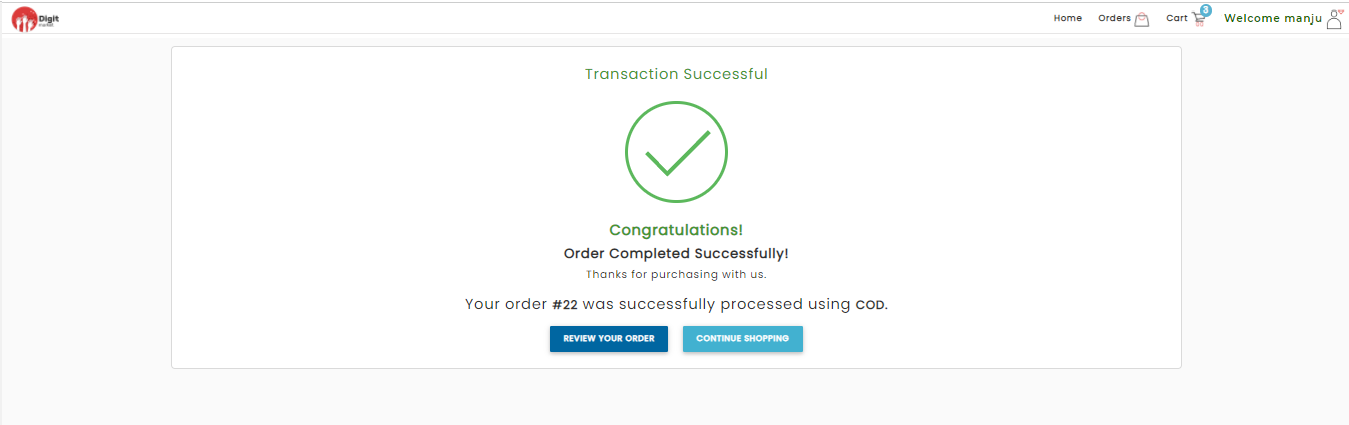
Fig. 2.397 COD Success Message
Click the REVIEW YOUR ORDER will navigate to YOUR ORDERS page where user can cross check the items or click CONTINUE SHOPPING to shop more.